Flex box exercises: Part 2
Introduction
You’ve got the display type, the flex-direction, and justify-content. Time to add a few more properties to the party.
Okey dokey
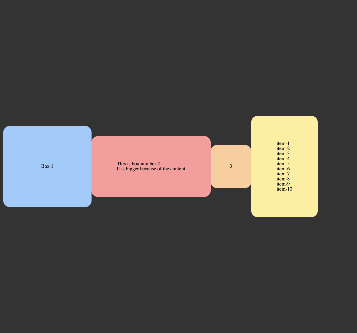
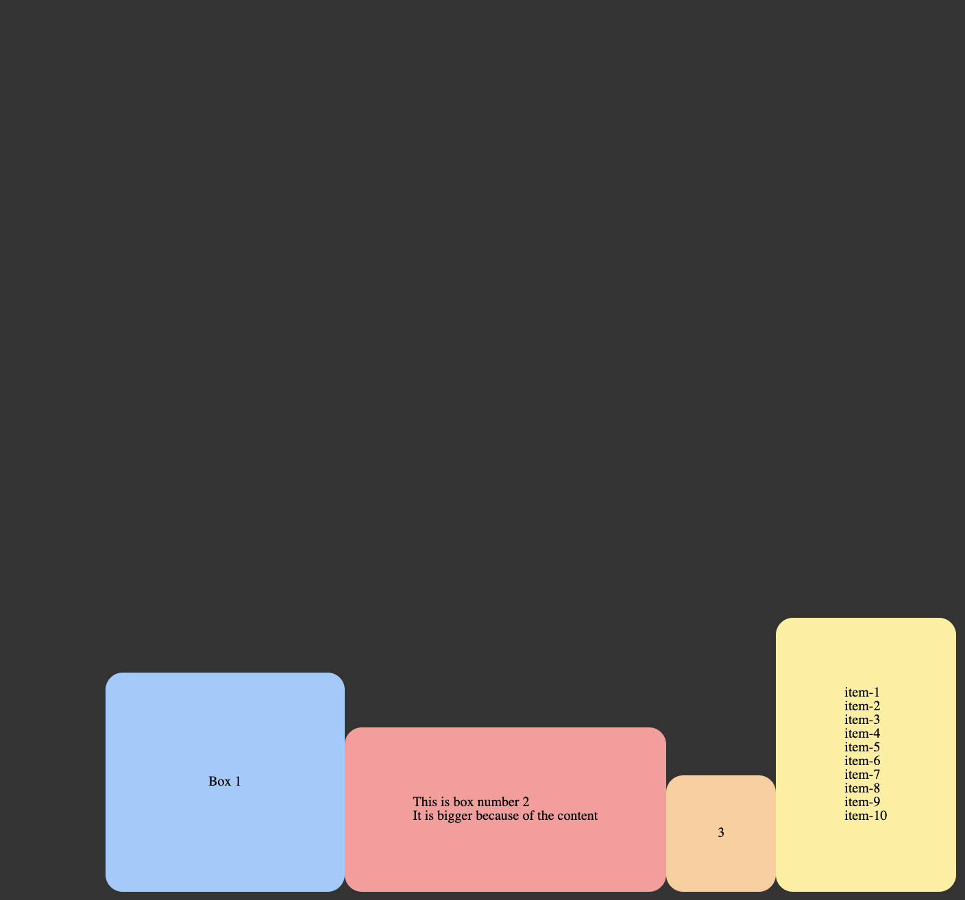
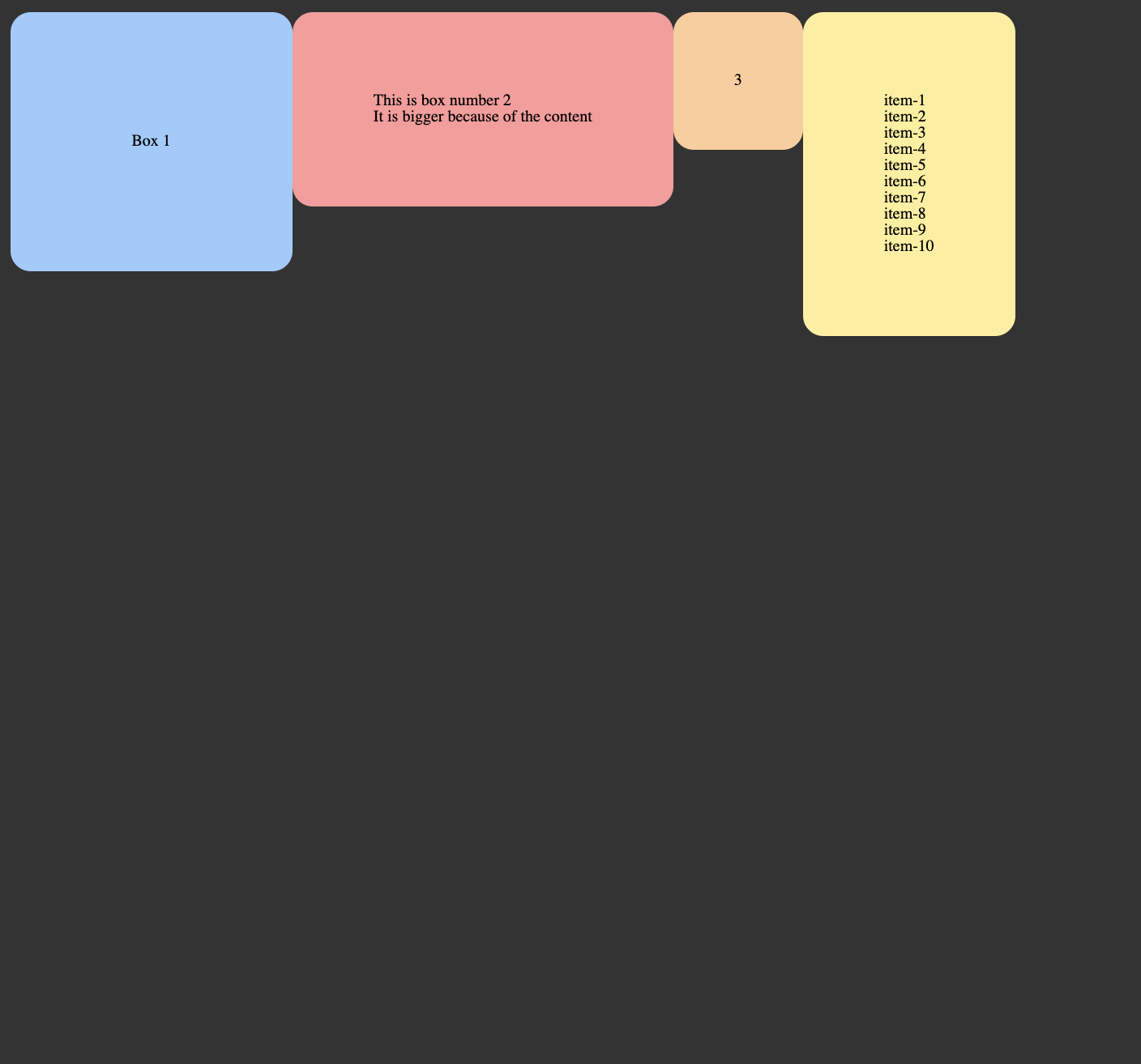
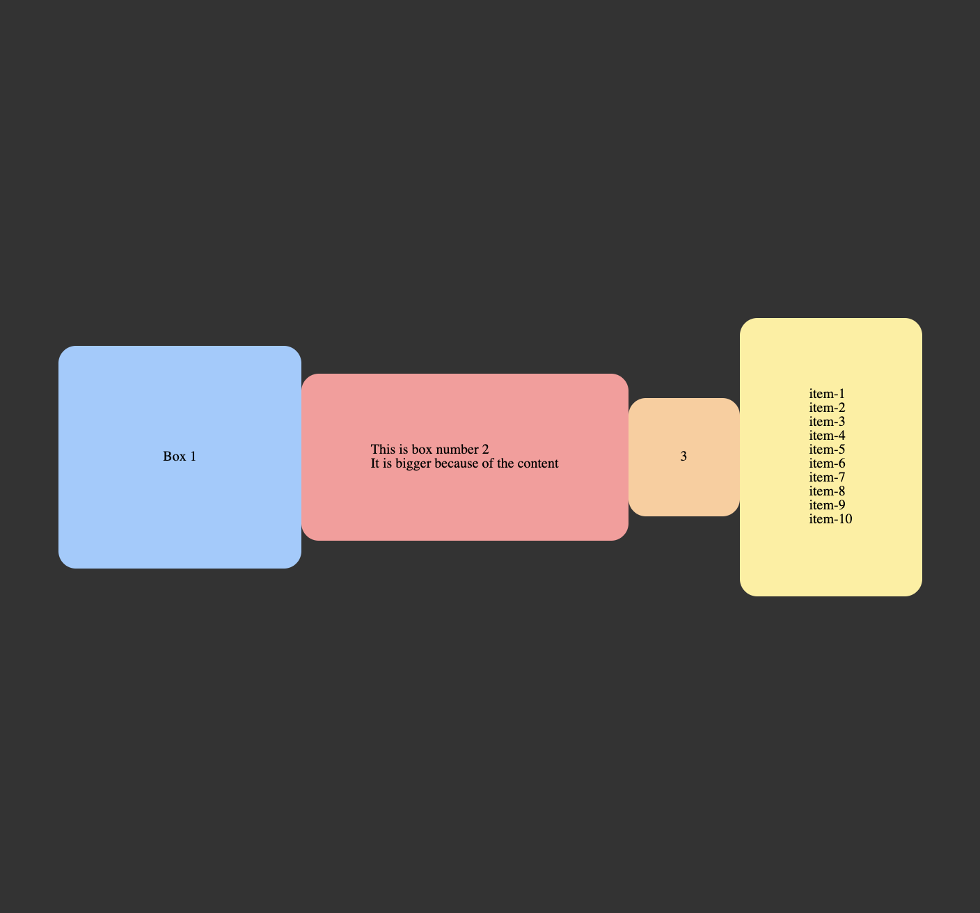
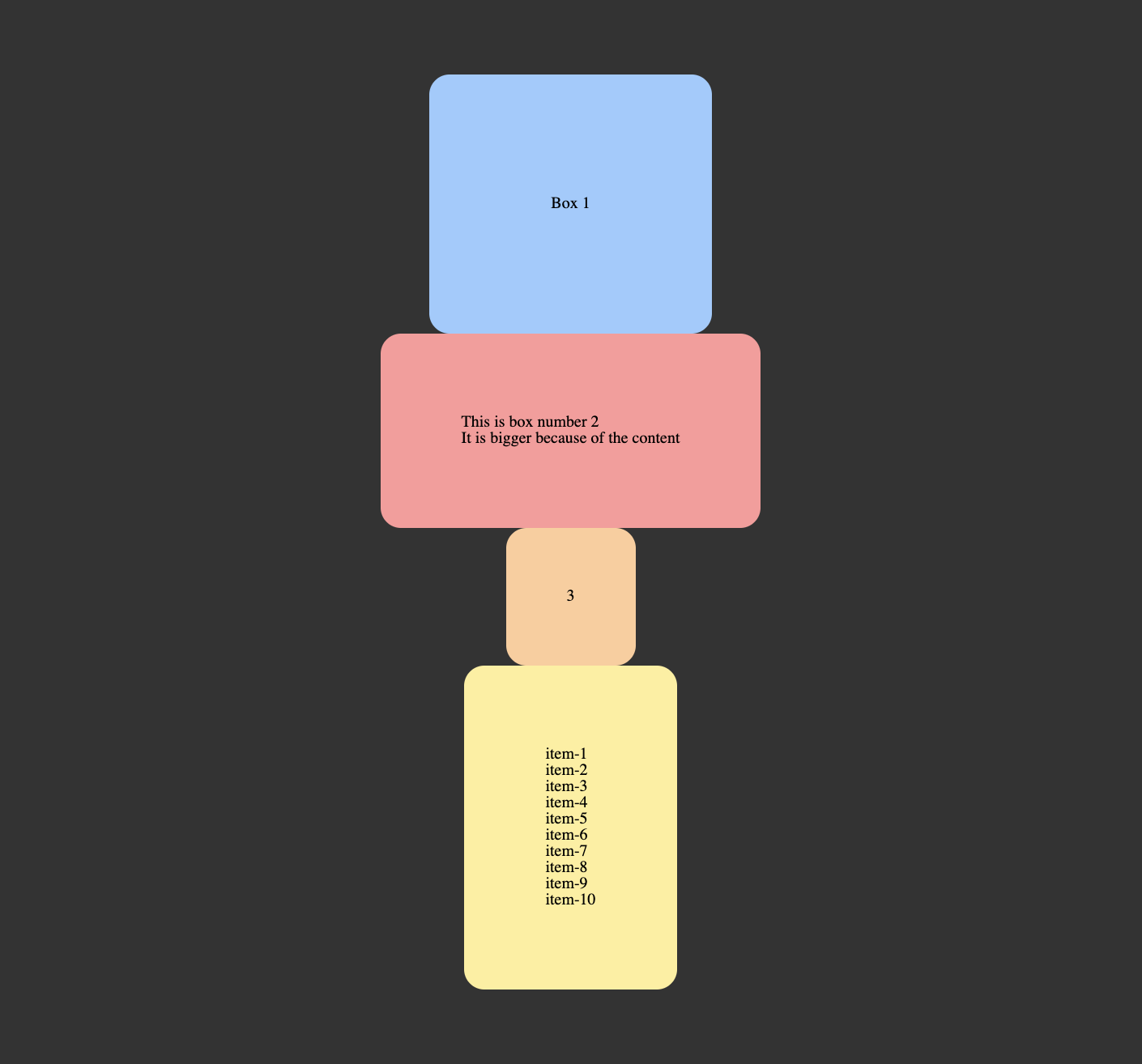
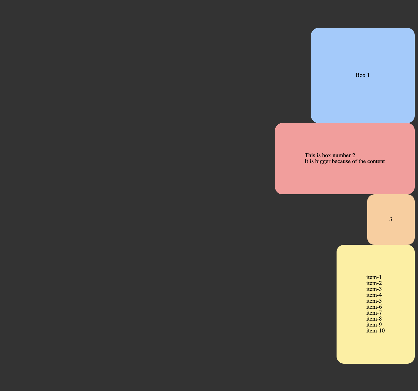
Here are the challenges! You can do it!
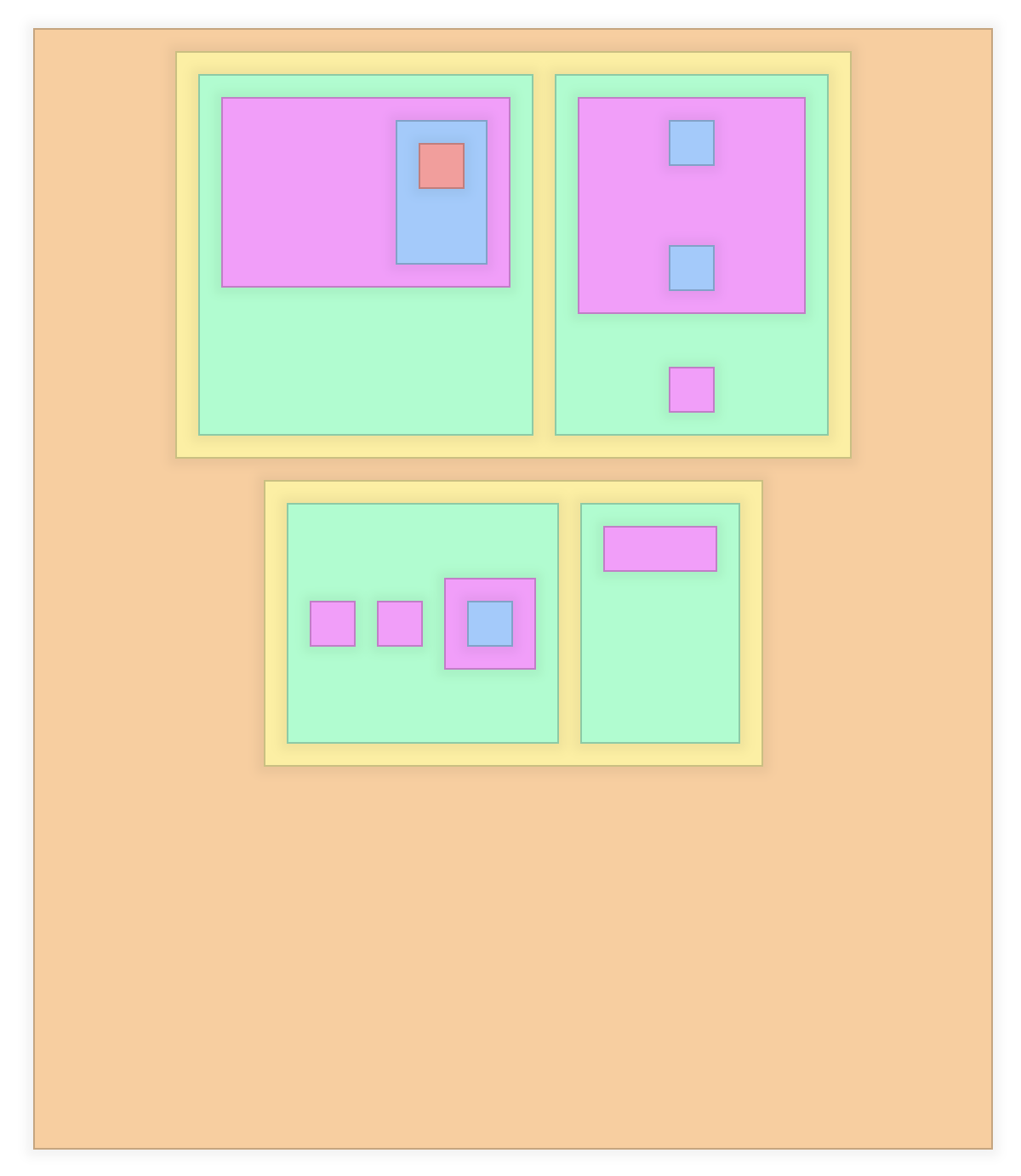
We’ll be getting to some more real-world use in the next lessons. Try not to troll yourself in this little playground. Try your hand at matching the figures below.
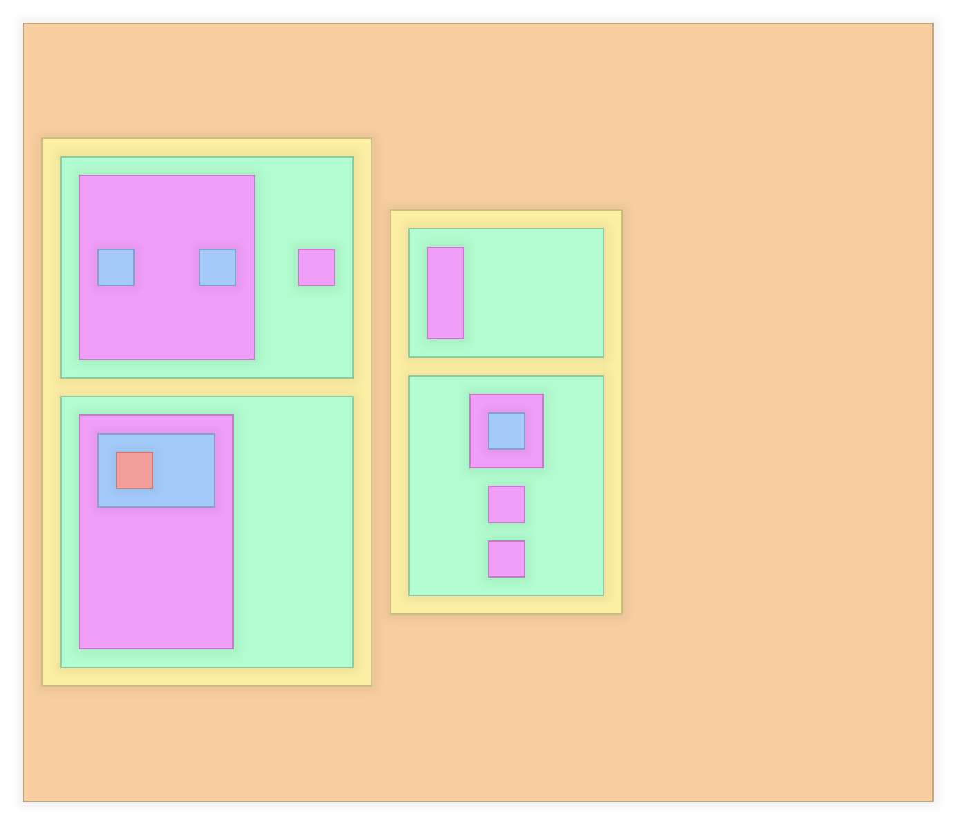
Align items
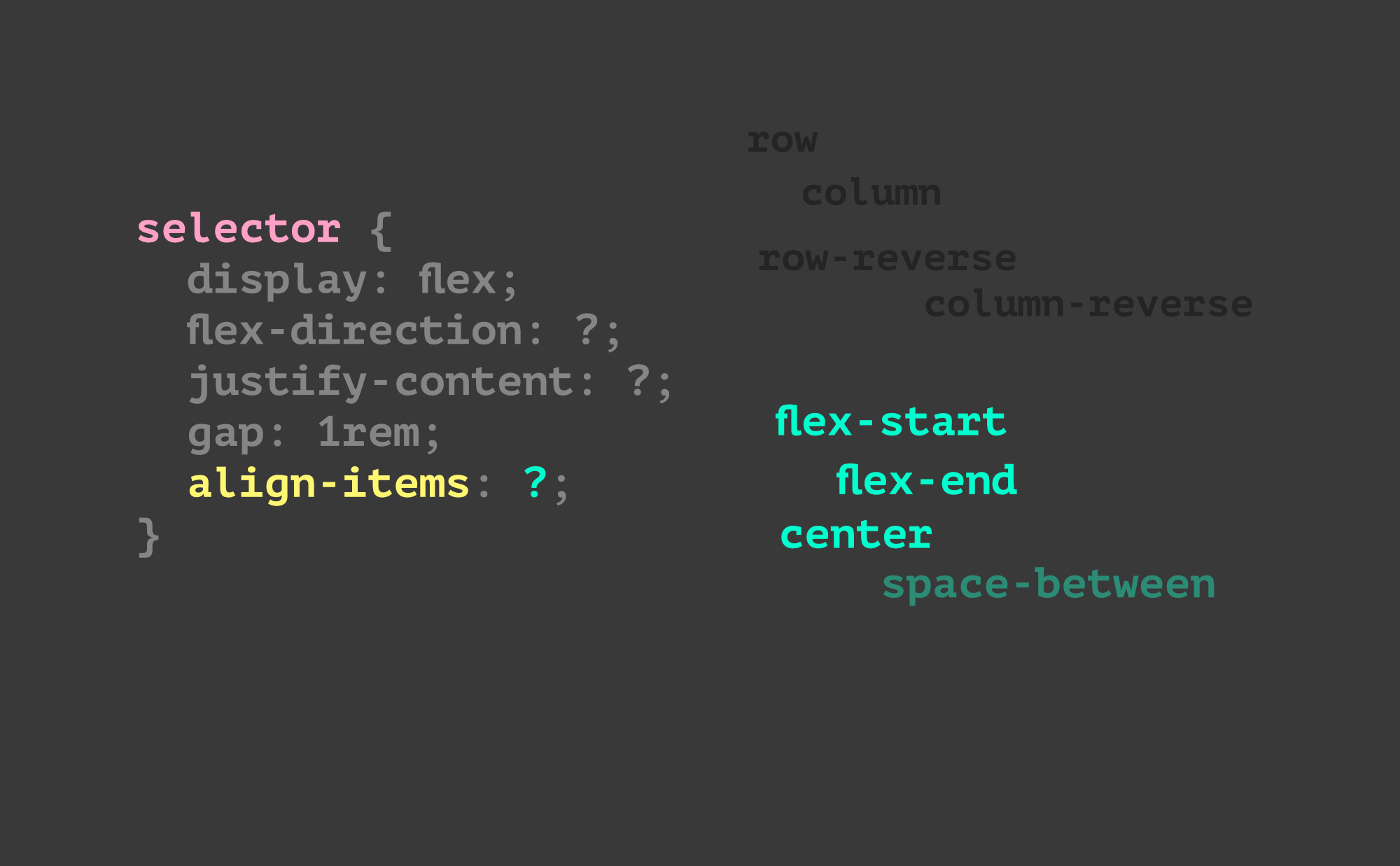
This is the new property to focus on.
Remember – it’s perpendicular to the axis (direction).
Some notes…
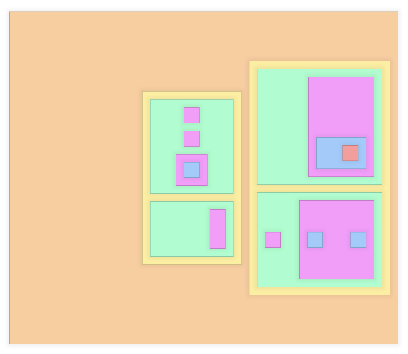
Bigger challenges
Try this out! We can give you more… but we want to see how this one goes first.
Remember, you’ve got to set the display type first. Then you have some ol padding and gap to use. You have flex-direction, justify-content, and align-items. You’ll also need a little min-width and min-height. This is much more difficult then actual page layouts, so – if you can work through this – it’ll be smooth sailing going forward.
How are you going to attack this? What is your process? Are you happy with it? Ask questions!
Variation two
Variation three
Variation four
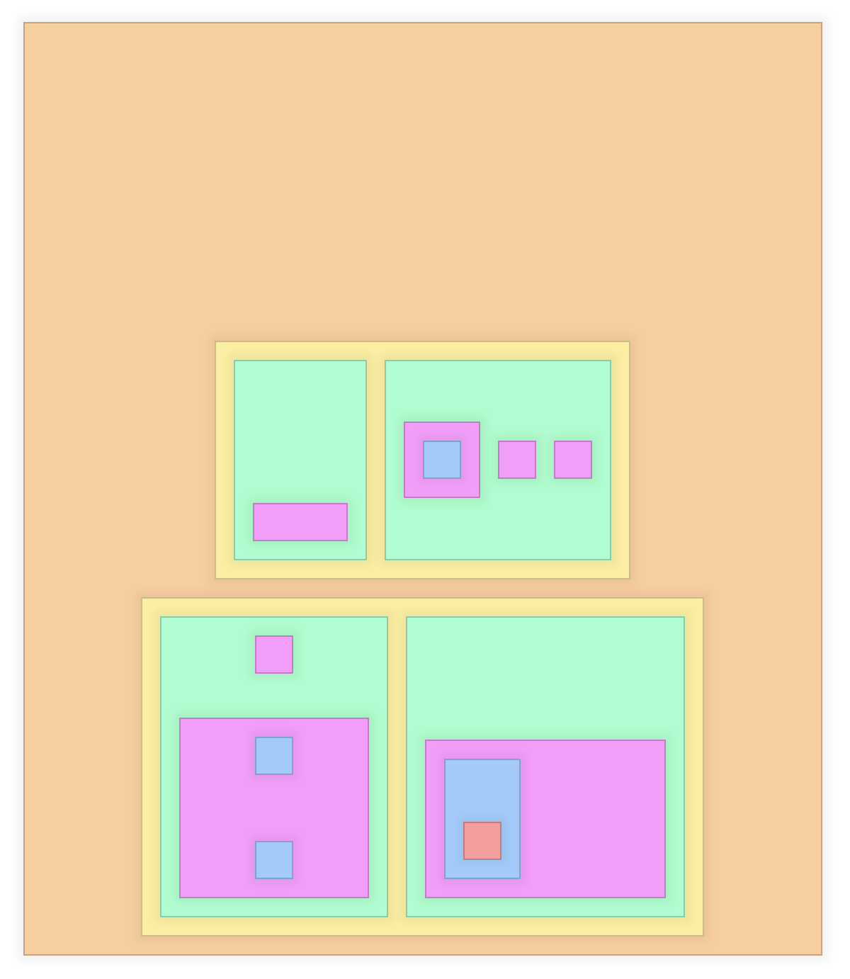
OK
Make the screen smaller and employ flex-wrap: wrap;
Now that you’ve got some things that are wrapping around – you’ll actually be able to see what align-content can do. It seems like it should be called “justify-rows” or something because it’s like the justify-content property – but applied to the rows.
Try it out with start, center, end, space-between, space-around.
It's hard to see what align-content does... without the right setting
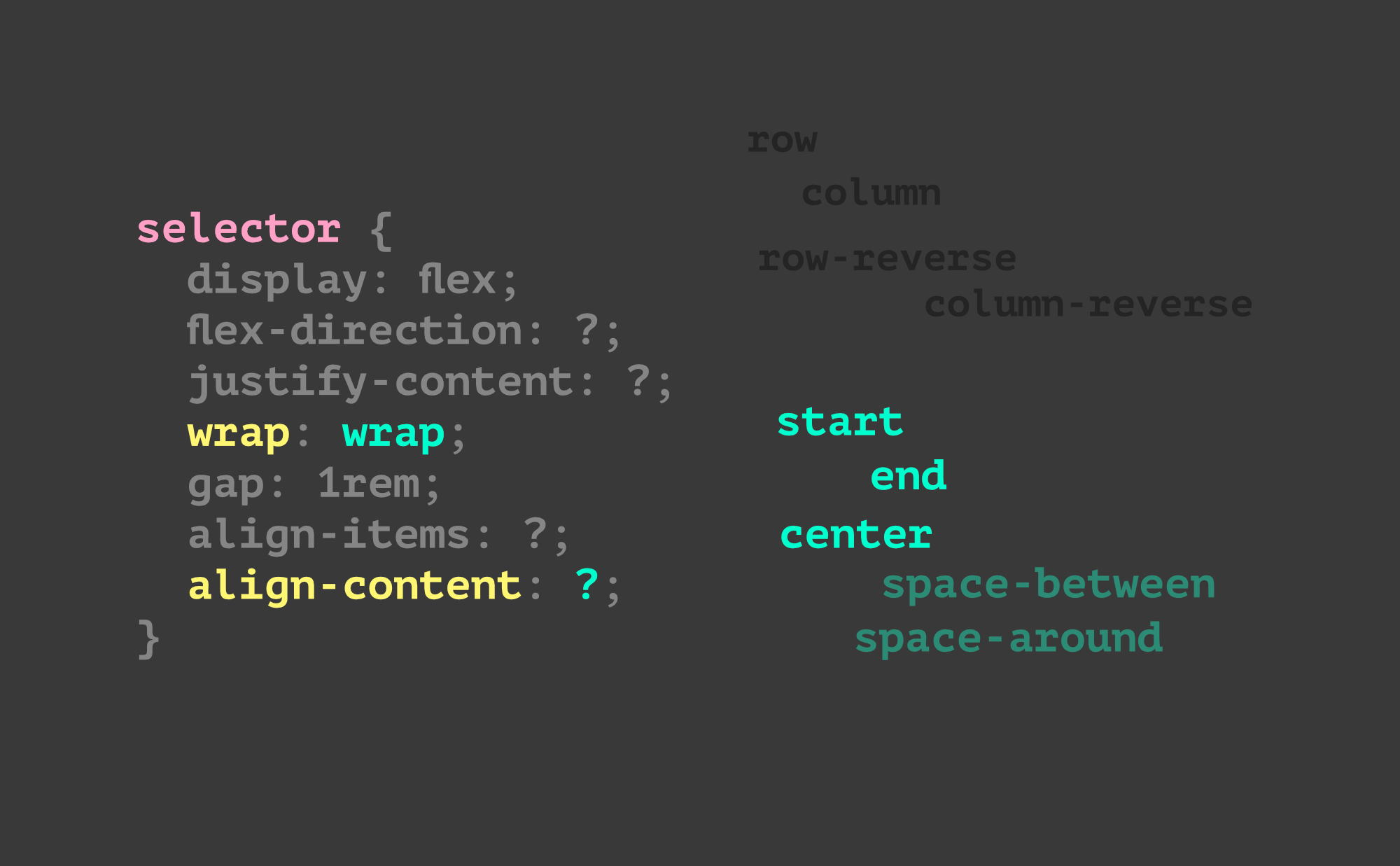
If the parent isn’t larger than the content… you can’t really see what is happening! Give it a try anyway. Make the parent tall or something.
Really… we don’t find much use for it… (yet)
Also: what is the difference between flex-start and start ?
Notes
This part ^ is weird, right? Try removing the min-height on the parent.