Flexbox exercises: Part 1
Introduction
Time to get down to business with the flexible box model. Don’t worry, it’s easier than Twister.
Almost all UI layout comes down to a few flex declarations.
If you haven’t watched the official lesson yet, well – your name must be Dan! So / it’s up to you. But you might like it: https://perpetual.education/lesson/flex-box-1
Setup
A little backstory, and the markup you’ll need for the exercises.
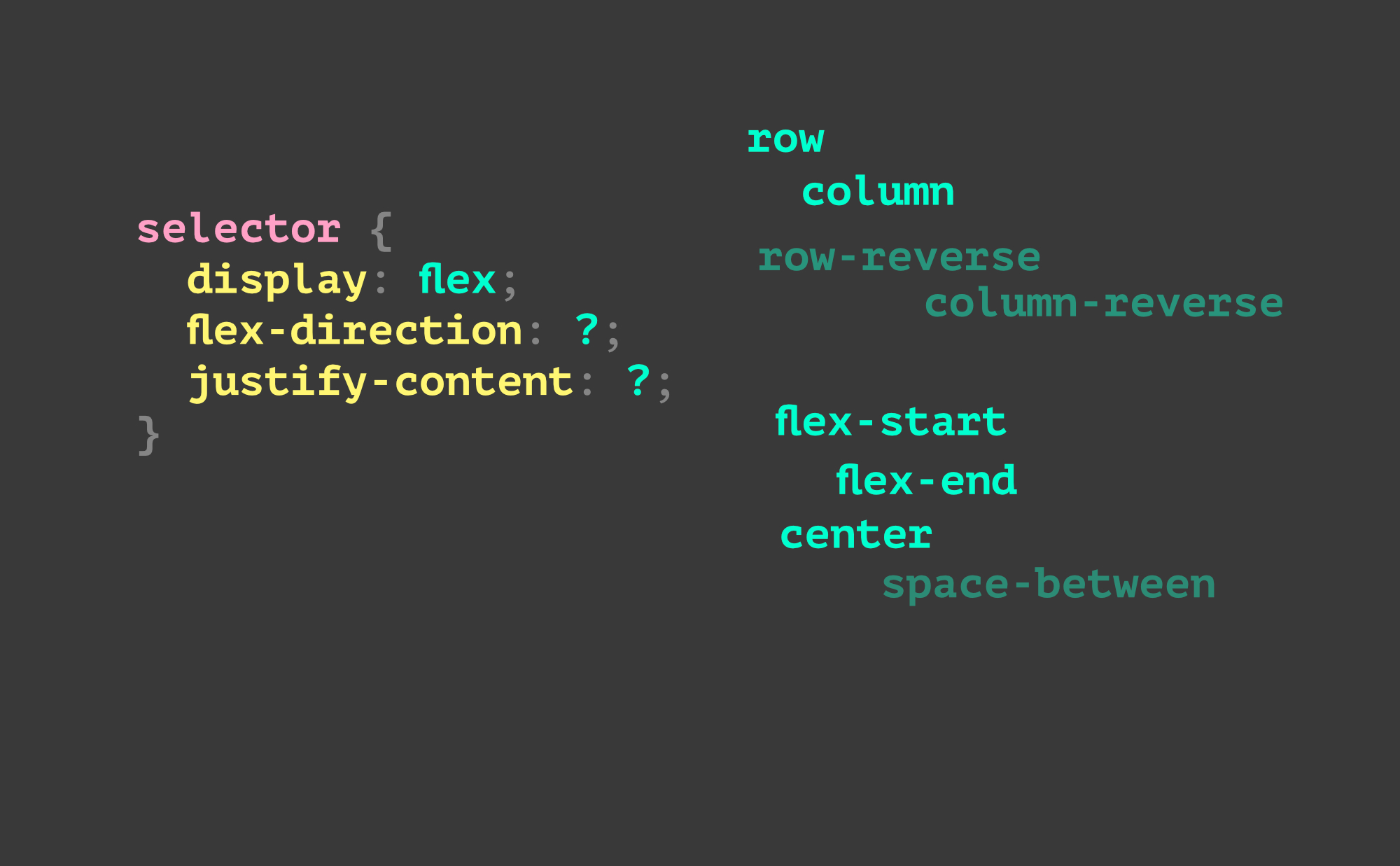
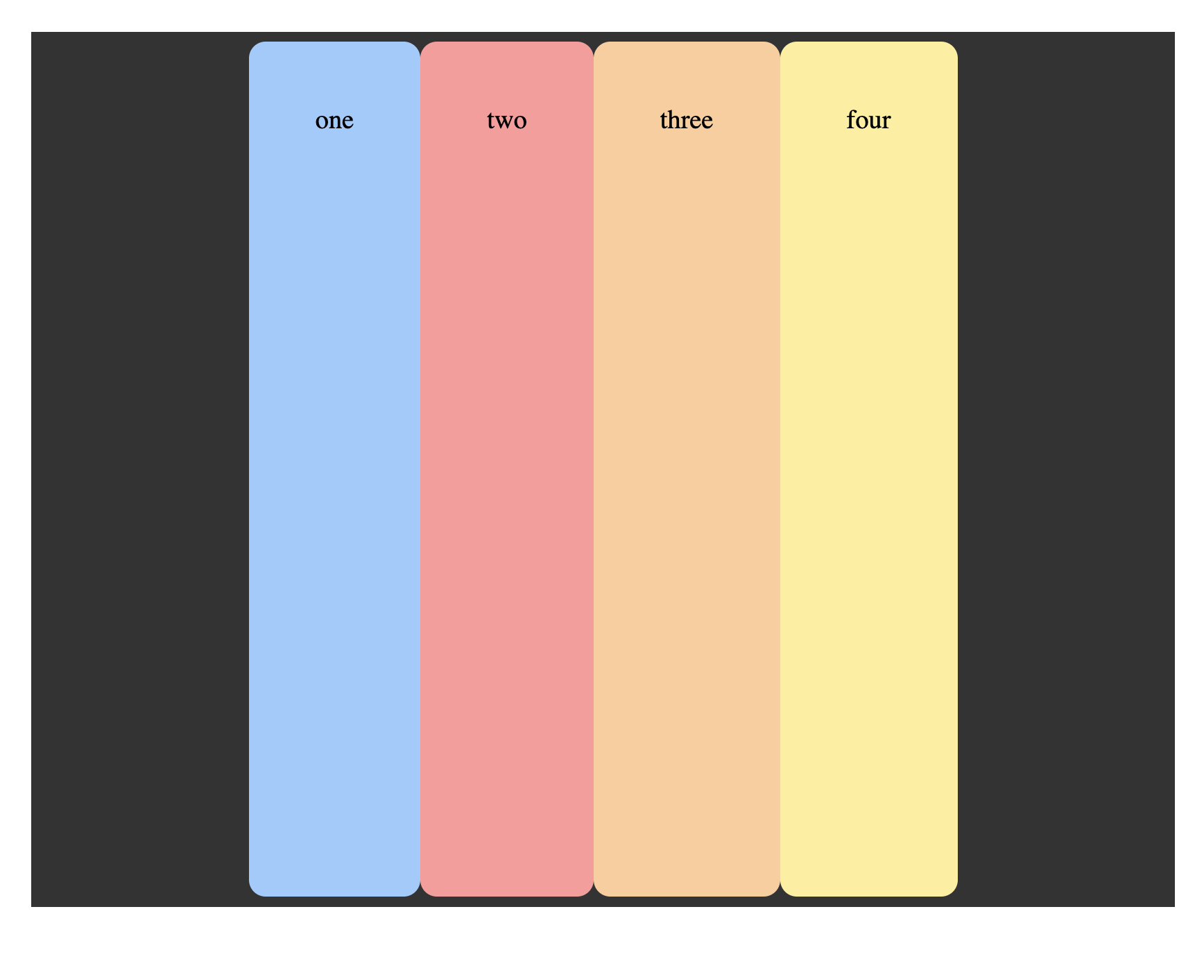
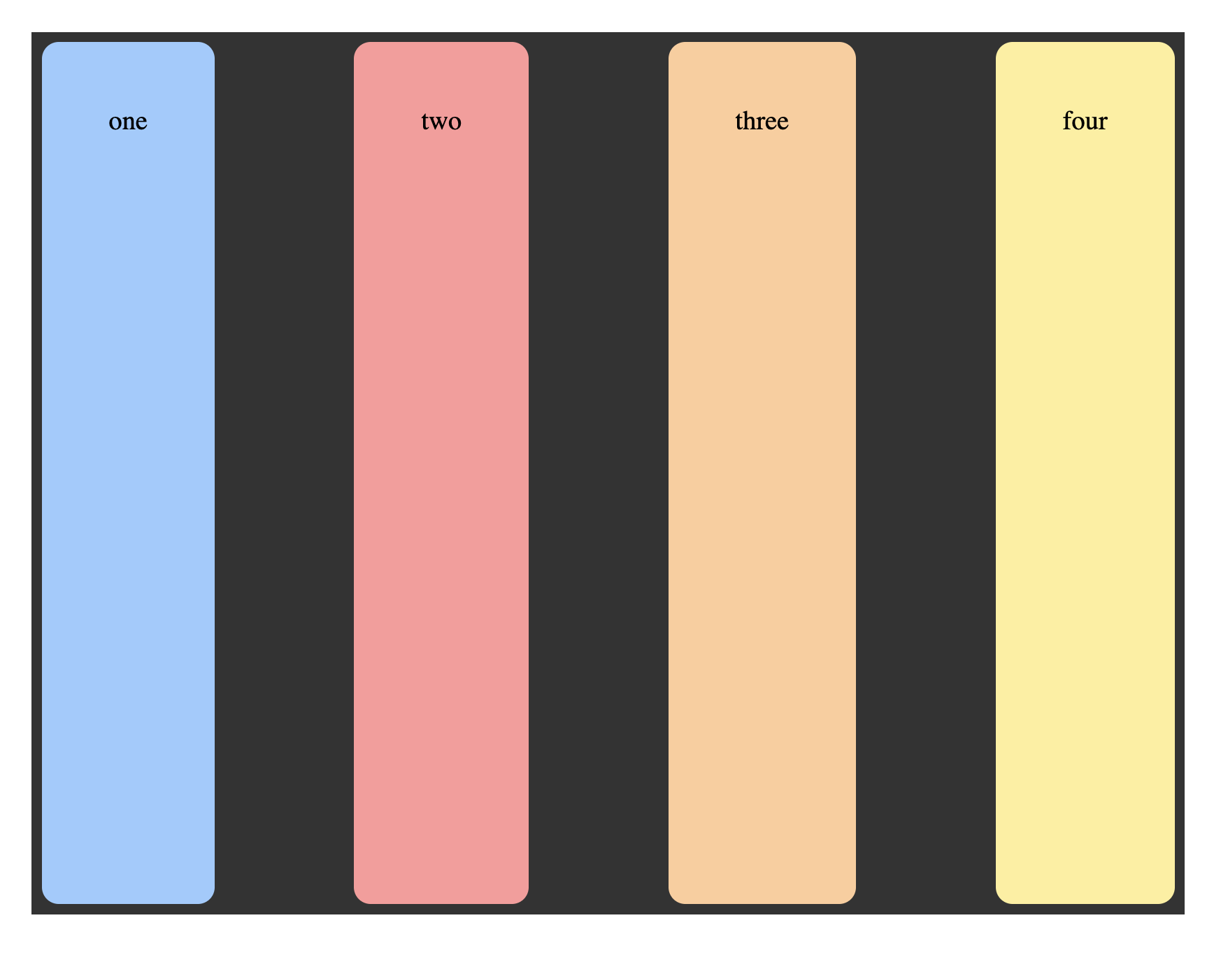
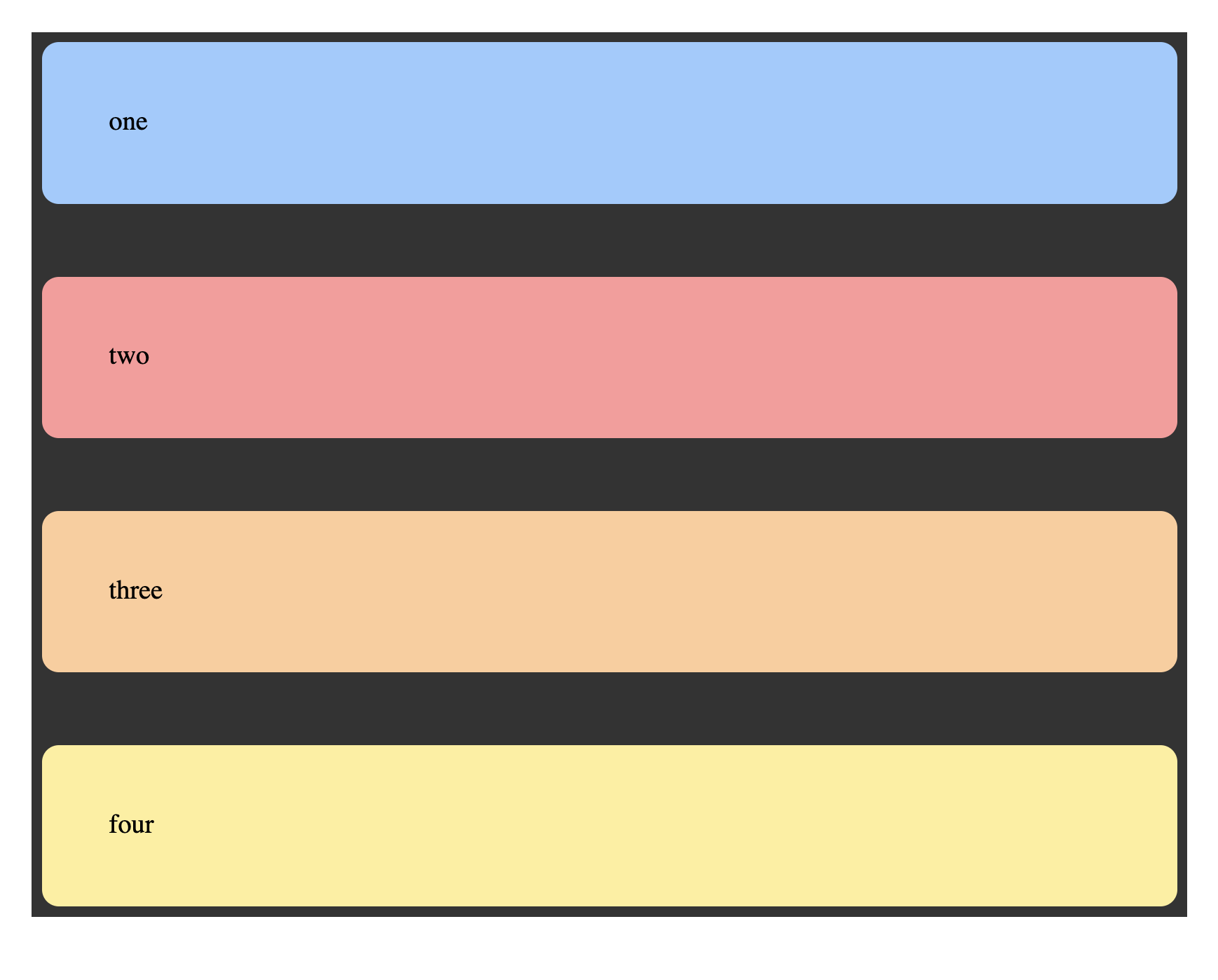
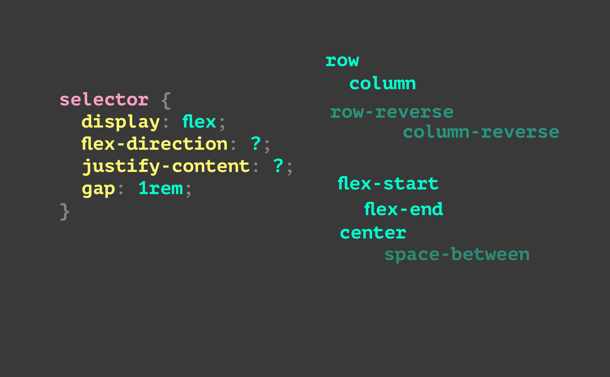
The first few properties
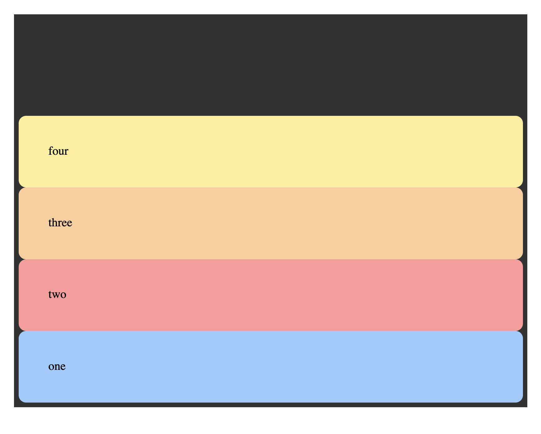
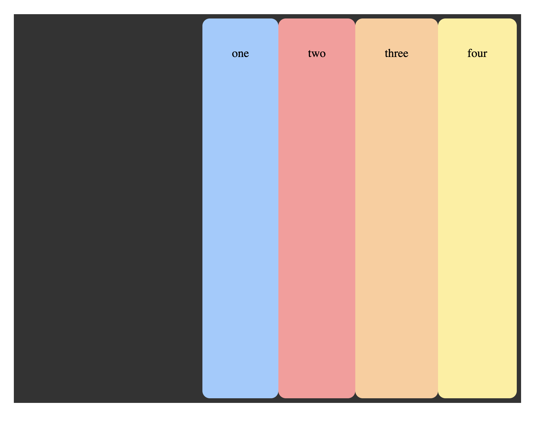
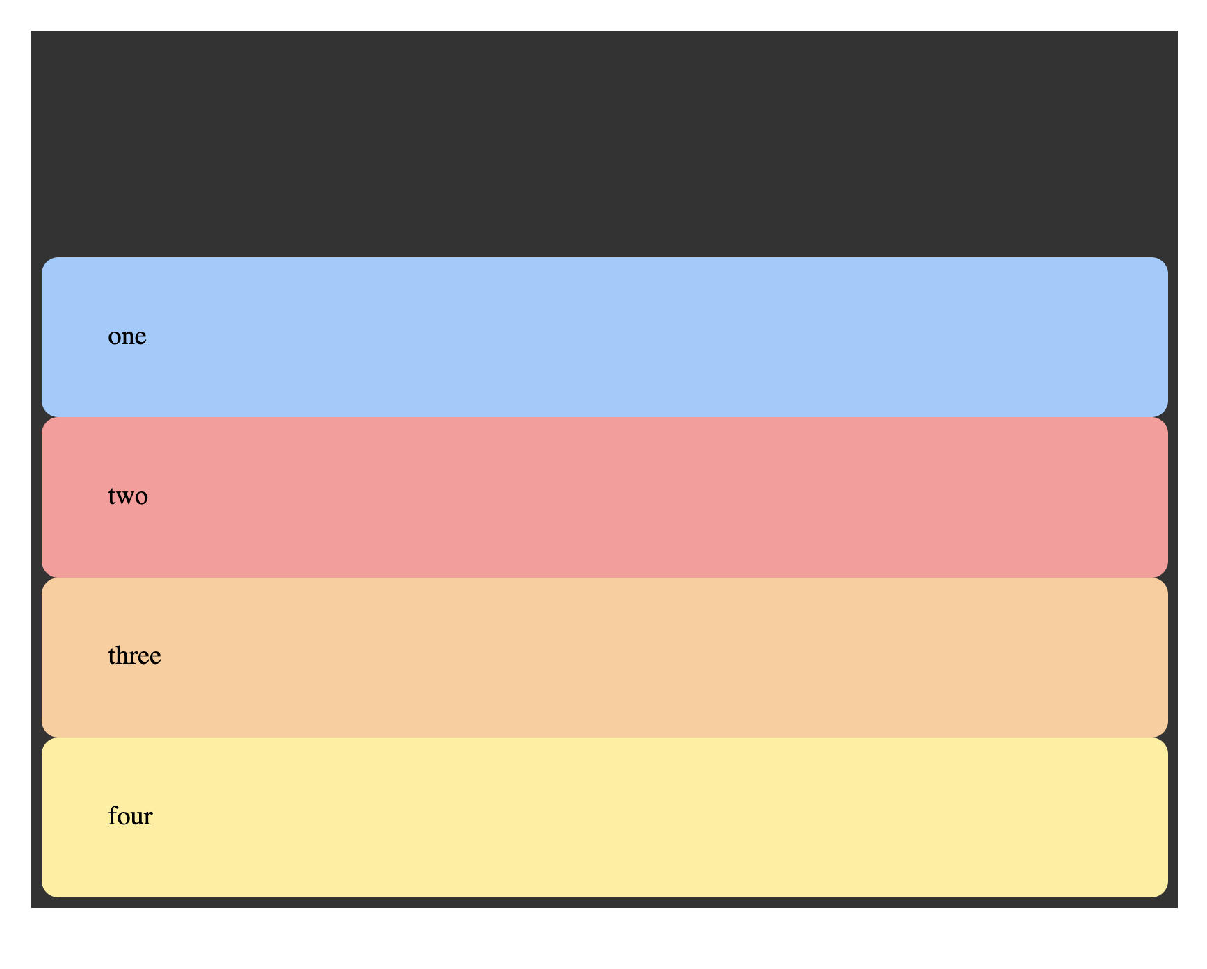
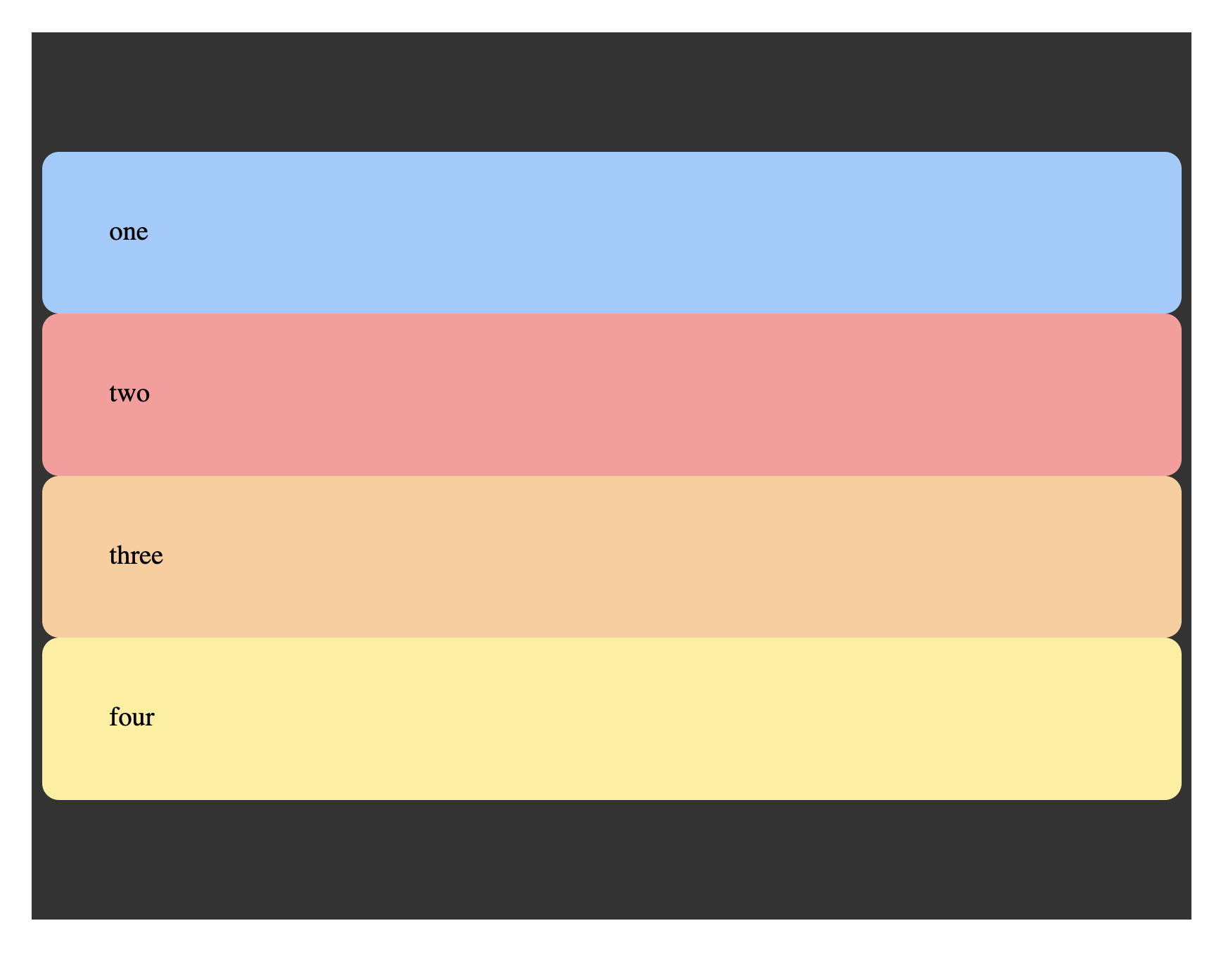
flex-direction and justify-content
Warmup challenges:
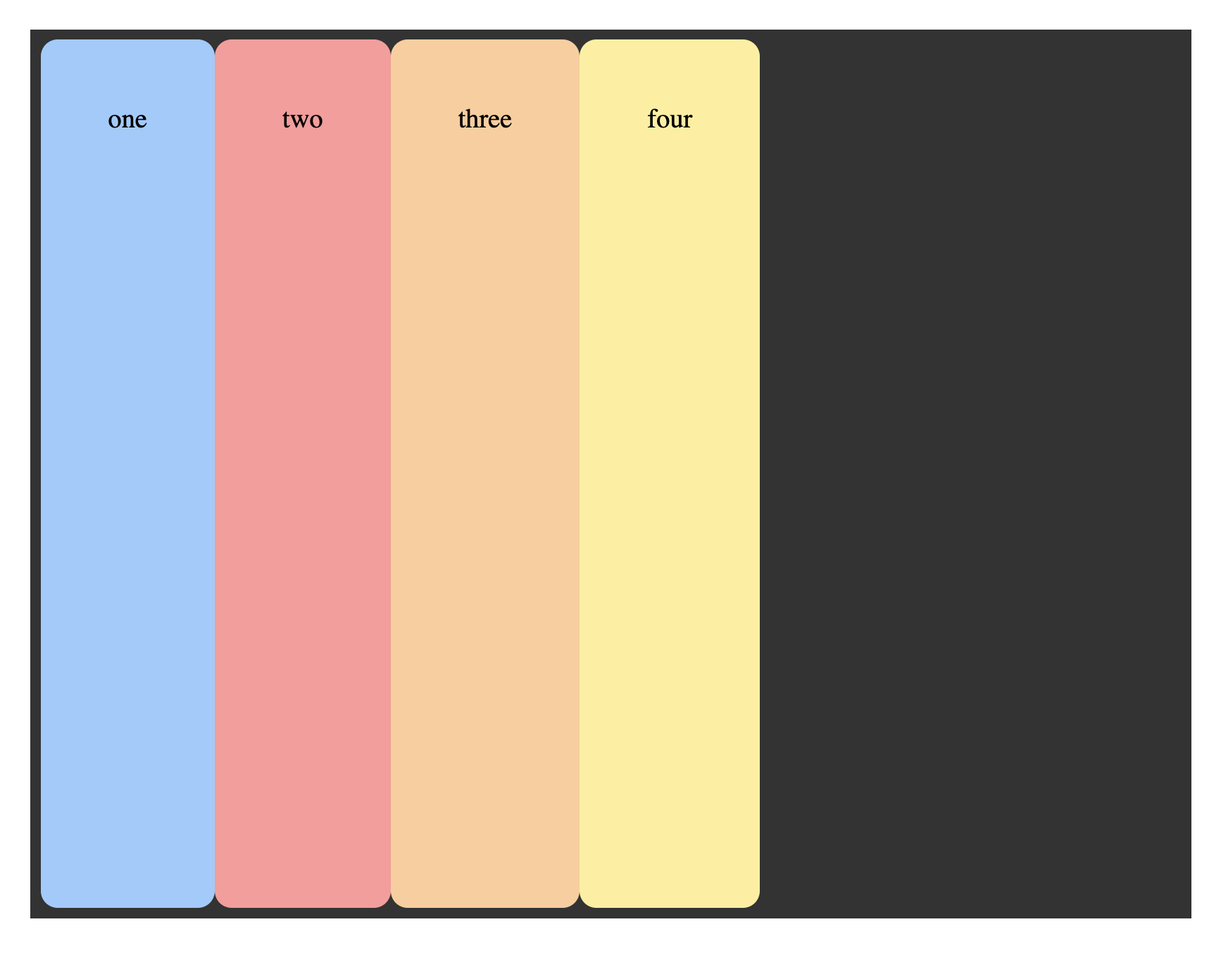
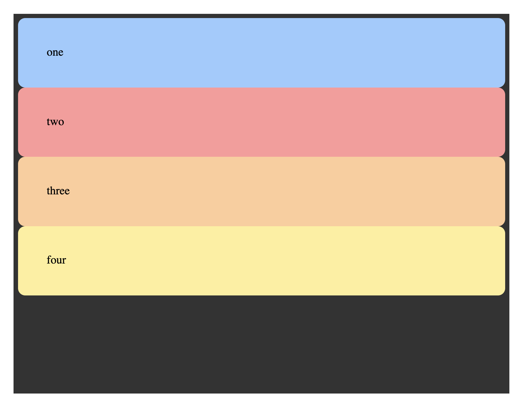
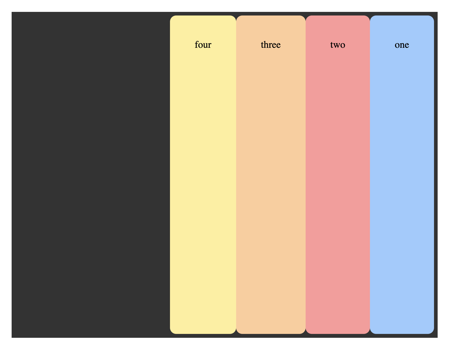
Can you write the rules for all of the following layouts? (without watching any videos?)
Note that the only rules we’re writing so far are for the parent element. Most of the flexbox alignment is declared through the parent. After all, the children should do what they’re told!
A few properties at a time...
There aren’t that many things to learn… so, if you’re searching around too much on the internet for answers: stop. Just take it a few properties at a time and actually write a bunch of CSS. It will be much faster.
That’s all the main combos for now…
But that’s not even all the ways to combine those. Did you find any others?
The big challenge!
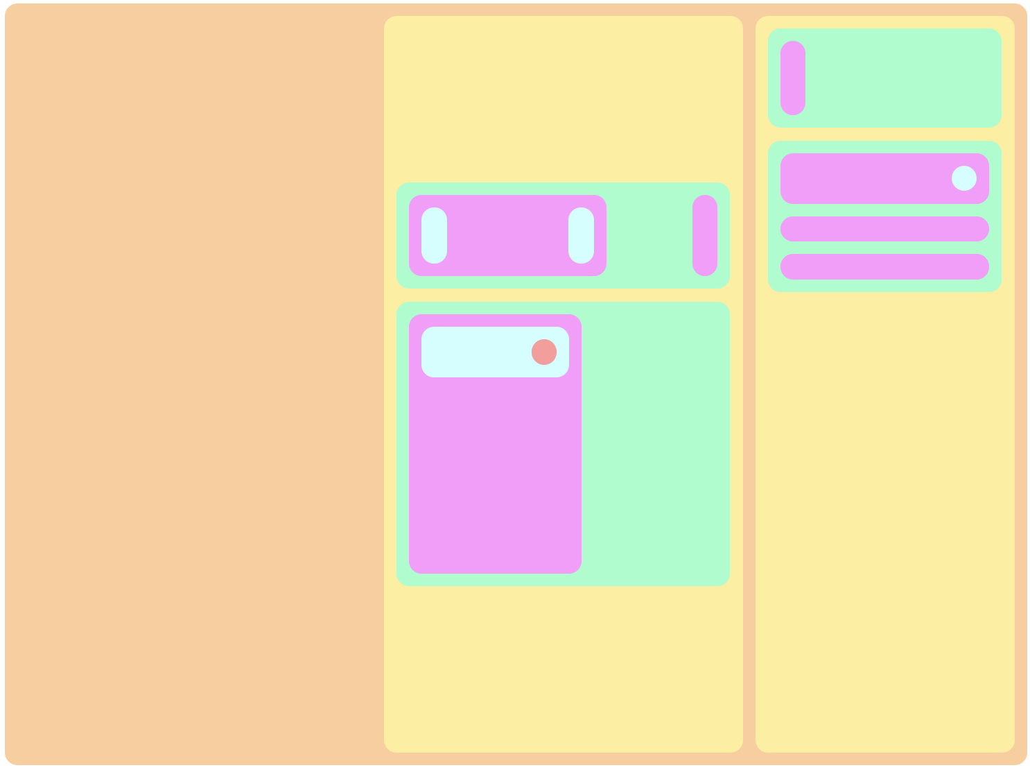
You can make this thing with just the properties discussed above.
Well, – and you’ll need gap: 10px; too 😉
AND you’ll need min-width and min-height percentages for a few children to give the things some shape –
The magic powers that flexbox bestows only extend to its direct children. They aren’t inherited. So, you can nest flex-containers without worrying about their context.
We dare you to try it.
(This isn’t meant to be “pixel-perfect” – so, just focus on the direction and justifying the content)
Once you’ve really given it a good try (and shared it with the group) … and you want to see how we did it, you can view the solution.