Flexible layouts, modules, and components
Lesson Intro
Now that you’ve worked with the alignment features of flexbox – and you’ve tried out the @media rule to query the viewport size and make some layout decisions…
It’s time to practice!
The goals
-
Investigate some responsive/adaptive layouts in the wild
Remember those sites you found when you did your research in the “Research and Destroy” lesson? What layout techniques were you missing then? Can you find some interesting flexible layouts out there to practice implementing?
-
Start thinking in modules and components
Machines and cars and human bodies (and pretty much everything) seem to be made up of smaller pieces. Websites are no different.
-
Combine your flexbox and @media query knowledge to get some practical outcomes
Start thinking in “Break points” – and start thinking about the smallest screen as the MAIN stage.
Key
concept
Component
An ingredient serving to form, compose, or make up a unit or whole.
There’s no need to get too serious about this definition. It’s a “thing” that you compose to build bigger things.
In this lesson, we’re talking about “modules” and “components.” These words are basically the same… but, it’s more helpful to allow them to work together. If a special button or form or small collection of elements is a reusable ‘component’ – then a ‘module’ is a collection of components.
It’s rare to have something that isn’t reusable – and reused many times in a project. In our case here, the component is a piece of user interface made up of HTML and CSS. In the future, a component will be made up of HTML (as the template), CSS (styles as usual), and some sort of interactive functionality with PHP or JavaScript.
We added just 1 chapter in this one – so that you could see where a good mid-point is. If you need to break it in half, that’s the spot.
Our example module
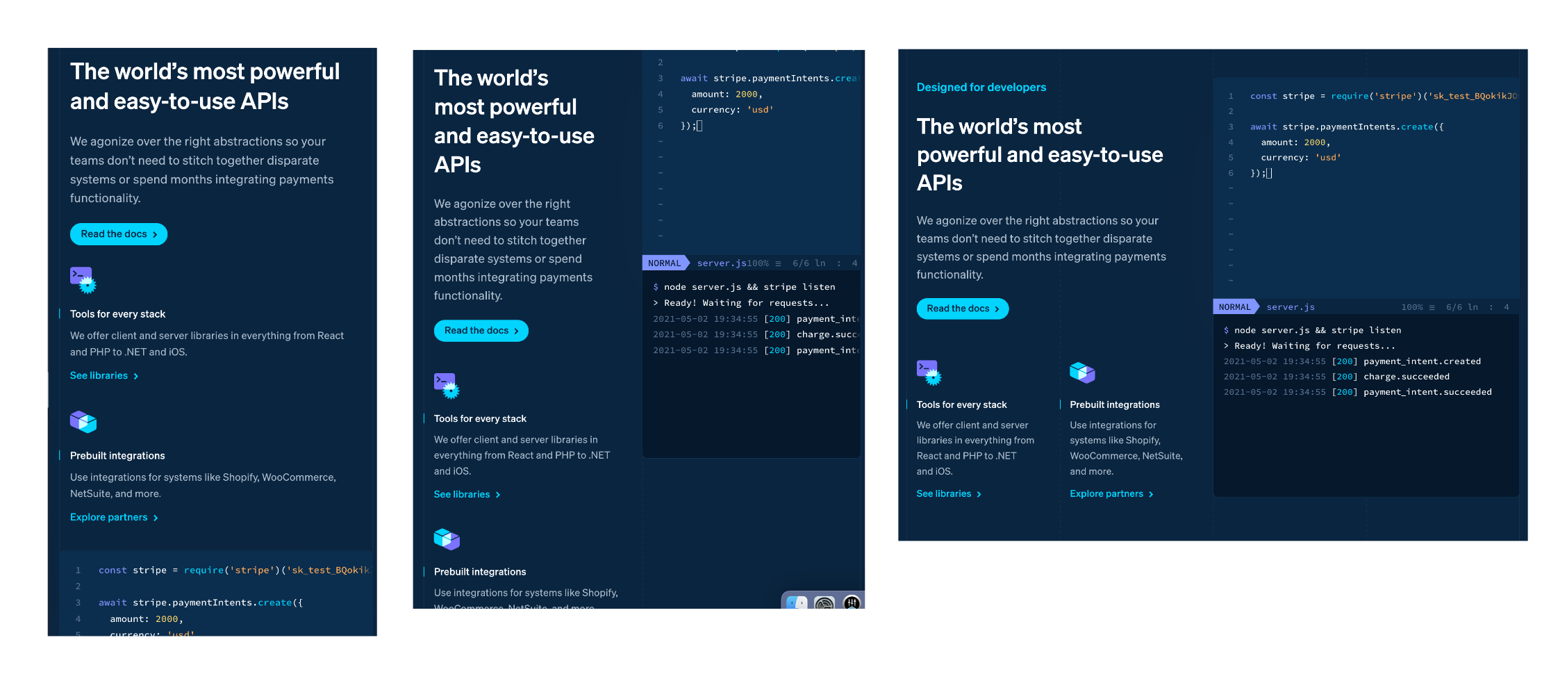
This is a page section from the stripe.com site from early 2021. We thought it was a pretty good example. It has a few break-points and some nested flex-containers.
Div vision
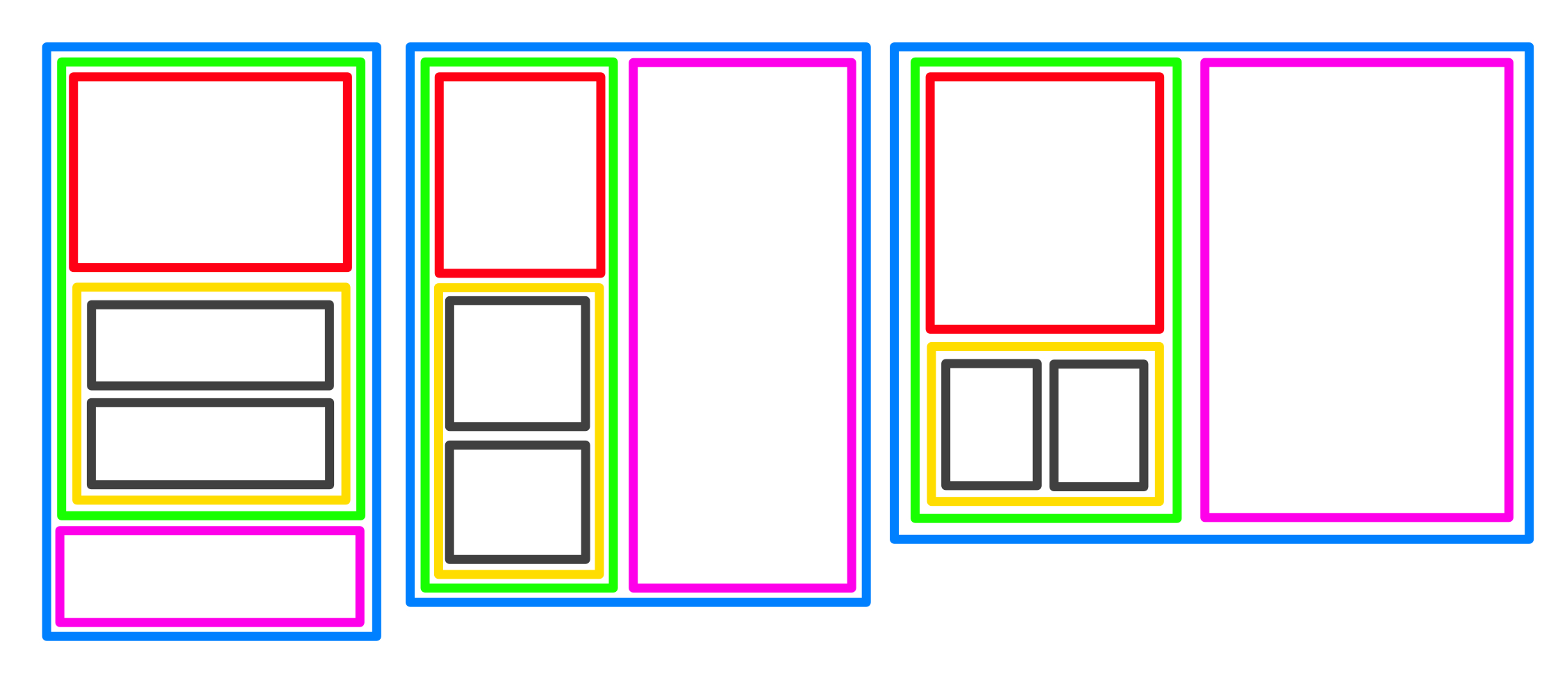
When you are planning out a module/component – you need to think it through on all screen sizes.
If you write the HTML as cleanly as possible – in the classic style for the smallest screens, then you can usually just make a few adjustments as screens allow for more layout possibilities and it just falls into place. It will take practice.
Sometimes your layout will change in a way that is drastically different – and you’ll have to get a bit fancier, but we’ll talk about that when it’s time.
The CodePen from the video
See the Pen HTML cheatsheet 1 / display types by perpetual.education (@perpetual-education) on CodePen.
Everyone knows they can click “Edit on CodePen” – up in the right-hand corner of the embed and play with it, right?
Things you may need
Responsive preparation list (includes the code for a basic ‘grid’)
Exercises
-
Look for responsive modules in the wild
Squish that browser! Find some interesting patterns. If you can’t, let us know and we’ll give you some. Share some snaps with the group.
-
Mock up some ideas for responsive layouts
You can use some things you found on your search, or – you can make up your own. Keep it really loose – and fast. You can totally just draw it on a napkin too. Either way, share them with the group.
-
Write up a "module" in CodePen
Feel free to use custom HTML elements. We’re pretty sure, that they are real. But if you are too afraid… you can use divs with class names.
Set a timer. It’s just for fun. You’ll have plenty of time to practice your HTML and CSS.
Share it with the group.
Don't overdo it!
You’re just supposed to pick out 1 ‘module’ type thing and program it, remember? Not an entire website!
This is a good example of the scope we’re looking for. Just try and use flex in combination with an @media rule – and you’ll be a winner.