Is your portfolio doing its job?
Hi, there. You're not logged in. So, you must be a visitor. Welcome!
What is this? You are viewing one of our supplemental "Stories." In addition to our core design curriculum, we are constantly building out additional resources. Stories are a collection of real work tasks, design history, UX explorations, and work-throughs. Stories are often off-the-cuff and less concerned with production value.
Introduction
At some point, enough people (we’re talking web developers here) were creating the same personal website to showcase their progress as new web developers and an antipattern emerged.
Were they given this template in a Udemy course or coding boot camp? Who knows? If you know where it came from, let us know! But at this point, it’s doing more harm than good.
Let’s break it down.
Don invited Derek to come on the show and give a talk on the subject
And check out DonTheDeveloper’s channel on YouTube.
Timestamps and links
We noted down all the key things from Derek’s talk with Don.
Just folding them up to save room.
1:41: Many people seem to take this source code and change the copy (and usually break the CSS a bit while they’re at it) brittanychiang.com v4
2:15: You don’t need a personal logo just for the sake of having one. Logos are typically designed to create a unified identity for large corporations, helping to humanize an otherwise faceless entity by giving it a recognizable symbol. It doesn’t mean you can’t have one. But don’t prioritize it if it’s not part of your skillset and story. A regular font is just great.
3:00: Do you need a photo? The jury is out. Do you think it will be useful? What you 100% do not need, is a bad photo.
3:19: Greetings and personal statements are a useful tool. But make sure you think about the actual user reading it.
5:25: What boot camps and Udemy courses are showing this pattern?
6:09: Contact form intro
7:59: What pattern does work? (It will be unique to you)
9:00: Networking via cross-linking / indie web
9:35: What do non-desperate working web developer sites look like?
10:10: Lynn Fisher personal website archive
10:58: Unreasonably fancy sites: bruno-simon.com (for beginners)
11:12: Let it unfold naturally. What about basic typography?
15:22: Sarah Drasner, Responsive Huggy Laser Panda Factory
16:15: Learn in order of complexity and master each baby step
16:54: Building your own site will end up proving your skills and it’ll be unique. Using this pattern – will end up proving you have none.
26:14: Just tell me what to do!
29:10: You don’t know what you like?
30:34: Your portfolio can’t do its job – if no one sees it
31:20: Tailing your site: How I got hired at Basecamp, Effort in the Application: sites that got our attention and got Basecampers their jobs
31:33: Prove you can do the job you’re applying to. Make it easy on them. They really want to hire someone.
33:32: Tailor your work and explorations to the role, industry, and specific companies you want to work for.
35:24: Your personal website will keep growing and be something you can consistently share: articles, project progress, explorations, and to build a sense of history and expertise.
36:41: We can see your work. It’s right there. If it’s not made well, we know right away – that you can’t do the job.
36:52: If you don’t know basic visual design principles, get help. Smart people use their resources. That’s a big part of the job. Also, consider learning more about cross-over roles. You can learn basic typography principles a little at a time.
37:48: Projects can be targeted explorations and not full-stack apps. You can make many variations and quickly build out some quantity if you’re clever.
40:14: If your basic HTML is bad on a page this simple and the page isn’t accessible, we can see that. This whole pattern accidentally proves you aren’t a good hire within seconds of viewing it.
43:19: Quantity leans to quality. Be prolific. Just go crazy on anything and it will add up. Not creative? Keep making things and you’ll accidentally start making things you didn’t expect.
46:25: Personal statements / about area / Laser-Focused Positioning Statement
47:49: Less is more. Remember, most working developers don’t even keep up their website. Just show you’re thinking – and that you aren’t a mess – and don’t say, “I’m new, I don’t know what I’m doing!”
50:00: The secret… is that the portfolio is a website. A website has a job. You have to clearly explain what you’re good at and what I can hire you for with confidence. These things are measurable. This project is a system.
52:00: Consider a style-guide page that outlines the goal of your site and how you want people to feel. This will lead the way for all decision-making. Consider having a page with your personal goals.
The pattern
Don’t do this!
Warning (trigger alert) (critical thinking ahead)
If you already have strong feelings about the common portfolio patterns and aren’t interested in re-evaluating or dissecting them… just close this tab now.
This advice is intended for those who want to learn how to be—and demonstrate that they are—excellent web developers. If that’s not your goal, then you do you. The beauty of the Internet and building websites is that it’s an open medium where you can do things your own way – however you choose.
Header
A page header seems like a simple thing, right? Here are some things to consider.
Logos. Do you really need a logo? Are you good at making logos? Is it part of your personal branding across platforms and used as a recognizable avatar? That seems like a useful tool to help people know they’re in the right place. But if it’s not doing that – then it might not be helping. Many times, a web developer creates a logo for their site – but it’s essentially the first graphic they’ve ever made. That’s fun. But you need to be 100% sure that it’s helping – and not just there because you think you need a logo. You can just write your name there in the font you’re using, too. And most people expect it to be a link home – so consider that.
This is expected to be site-wide navigation. So, people need to see it (all the time). If you scroll down (and it scrolls up and out of view), then what if someone wants to navigate to a different page – and then they can’t (because there are no persistent menus). What if your steering wheel just moved somewhere else while you were driving? A quick way to address this would be to set it to position: sticky; top: 0; This is native to CSS now. There are other techniques, like allowing it to scroll away but return when the user scrolls back up a bit. It can be tricky and might force some design decisions you didn’t plan for. This is a concern for the vast majority of websites and you need to prove you’ve come to some solid conclusions on it.
What about on small screens? If the list of links isn’t going to fit, you’ll have to address that. Will you have some type of menu page? Or a menu by the footer you can scroll to – or a button to toggle the visibility of a mobile/small-screen menu? Will it be a dinky little animated fold-out up in the corner that flashes and cuts off the letters as they scroll into place?! Or will it look really smooth, like a native app? How will you handle the toggle? Will I be able to tab and my keyboard to use it? What icon will you use and why?
What about accessibility? Have you run through your site with a screen reader? Are you using the correct semantic HTML, such as header and nav? Does anything need to be labeled? Do you know what a skip link is – and why your users might benefit from it?
Some people put their social media up there. Is that where you want to direct people to first?
People often use in-page hash links to scroll down to that part of the page instead of having individual pages. That’s not necessarily a bad thing. But having some dedicated pages helps prove you can do both. What if you want to send people to your contact page? And you send them to mysite.com#contact – and they get there and it quickly scrolls past your info and name and they just land on a contact form with no context. That’s not the ideal situation. In either case, a common interface clue is an “active” style on the link associated with the current page, section, or route. These things matter.
It’s just a header, right? There are many patterns. And if you haven’t run into many of them (and you’re not thinking through these pros and cons) (and the constraints of the medium), then you’re probably not ready to have a web developer job yet. Maybe you’re thinking, “Well, I’m not a front-end developer,” or “Well – I use a UI framework, so I don’t need to know that” – and if that’s true – then you probably don’t need to read this page. But if you are looking for web developer jobs, know that we can tell if you know what you’re doing just by spending a few minutes looking at and using your site’s header.
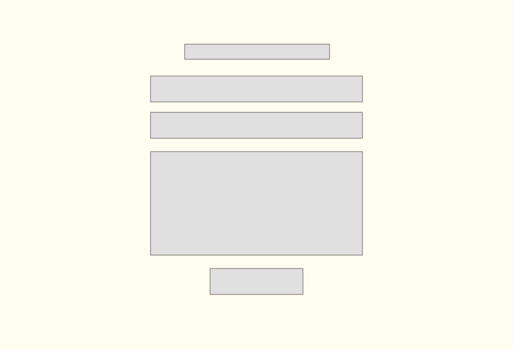
Greeting
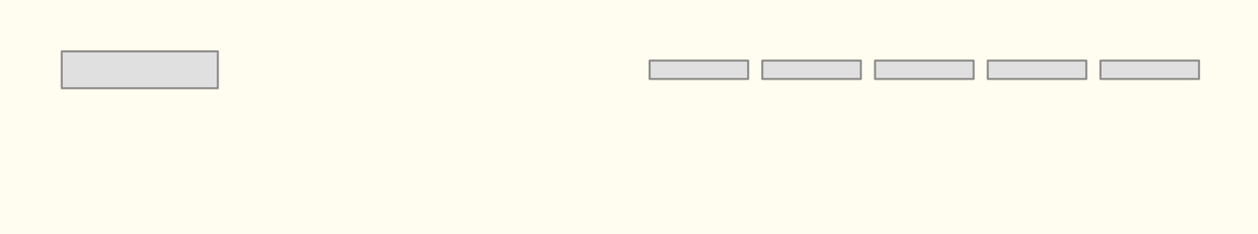
You might meet someone at a meetup. You might hand out a business card. Someone might see you online and track down your website. So, one of the main goals of this site is to say, “You’re in the right place. I’m this person.” Just like in real life, messing up an introduction is easy. So, why do so many people have a giant photo of their face that looks like it was cropped out of a family portrait from the 80s? Why does it seem like it’s taken with a fish-eye lens? Why is it low resolution? Why does it have a big, thick black border when nothing else on your site does? Why isn’t it properly aligned to anything? And again, why is it so big? Why is it a circle? Why isn’t it composed? Get a visual designer to help you if you can’t tell.
The phone in your pocket has a very nice built-in camera. And you’ve got to have at least one friend or family member who knows how to use it.
Do you really need a photo? What if the person sees it and hates your haircut? What if they see that funny tattoo you have and hire you just because you both love Care Bears? You never know. But if you can’t take a good picture, don’t add one. If you want to add one, might we suggest you take a photo of yourself doing your job? What if it showed you working with computers?
“Hello! My name is Derek. I’m an aspiring developer. I really enjoy learning new things and I make websites that look beautiful.” Oh really? So, you’re trying to be a developer. And I’m going to be paying to learn how to be one? Doesn’t everyone strive to make sites that don’t look bad? Everyone feels like we have to write some greeting here. But because everyone feels that way, then everyone ends up with this same anemic paragraph. Working developers don’t write things like this. And you need to present yourself as a competent developer – and not someone just hoping someone will give you a chance.
Pair that up with a “contact” button and a bunch of social media icons, is this really the first impression you want to be giving off?
What do you really do? What do you want? Help us find out if we’re a match. Give us something to think about. If you’re a super nerd for animations – bring it. If you’ve been writing blog posts about interesting database architectures or SVGs (or anything) – then maybe that is what should be here. What makes you unique? How do I tell you apart and find someone to hire – if everyone has the same bad photo and insecure (or overly confident) intro paragraph? If you’re doing something interesting – put THAT here. If you don’t have anything to show, well – you might not be ready for a job as a developer.
Tools
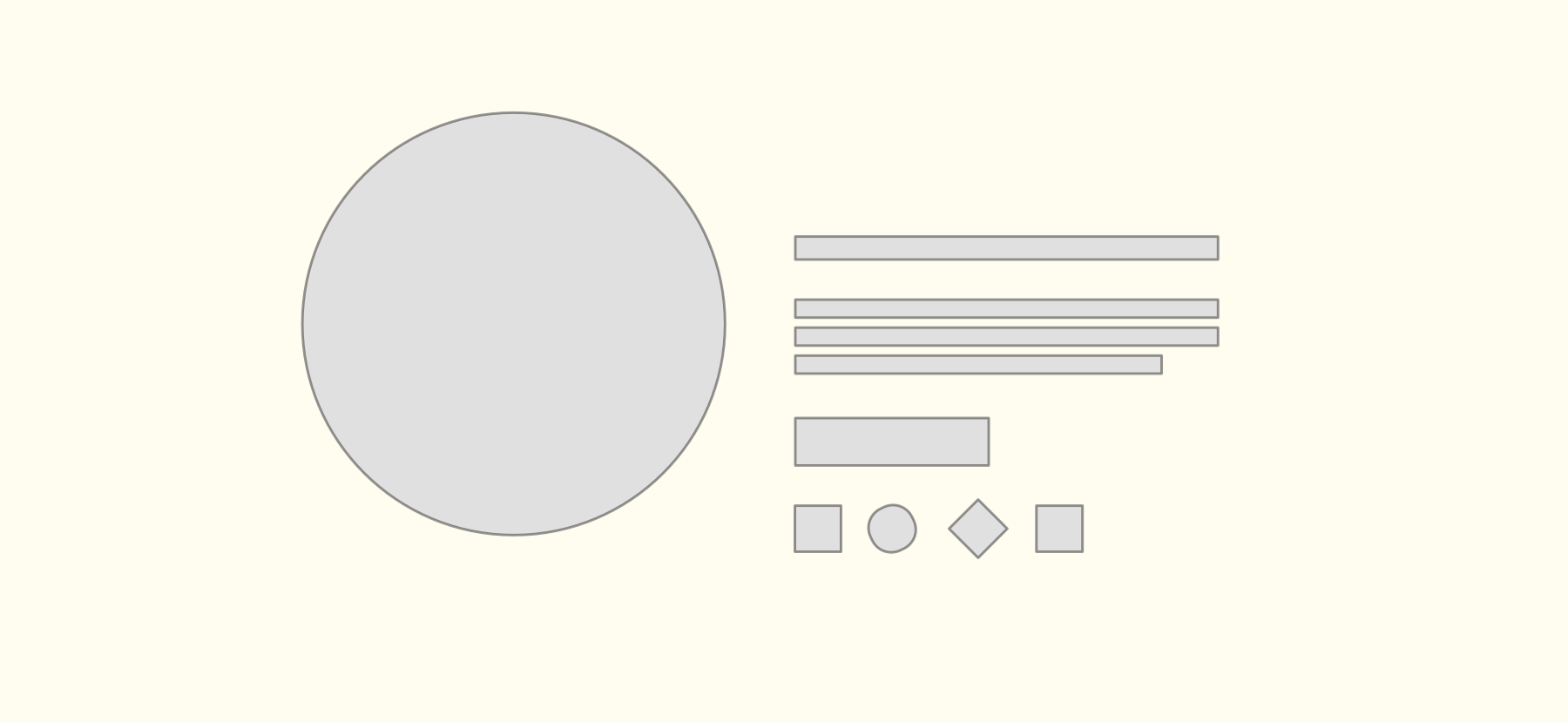
People tend to have this list of language icons. The World Wide Web Consortium (W3C) introduced the HTML5 logo in January 2011 to promote the use of HTML5 and other open web technologies. Logos are helpful symbols to recognize things and build a community behind them. That’s great. But – you don’t need a list of tool, language, and framework logos. Just because you’ve used HTML and have an icon on your page, doesn’t mean you know HTML. The actual website itself (the one we’re looking at) will prove if you know HTML. Writing “AWS” and “Docker” or whatever (just because you used it a little) ends up just making you look naive and like a noob. And you might be relatively new. You might be naive. But we don’t think there’s a good reason to present that to everyone.
The things you’ve built will showcase the languages and tools naturally. If you’re doing some writing about your learning journey, this will highlight the tools you’re using. There’s no good reason to list a bunch of technologies you’ve had a little experience with. Less is more. And besides that – all those different logos class and make it feel like an advertisement or a Nascar car.
Skill level
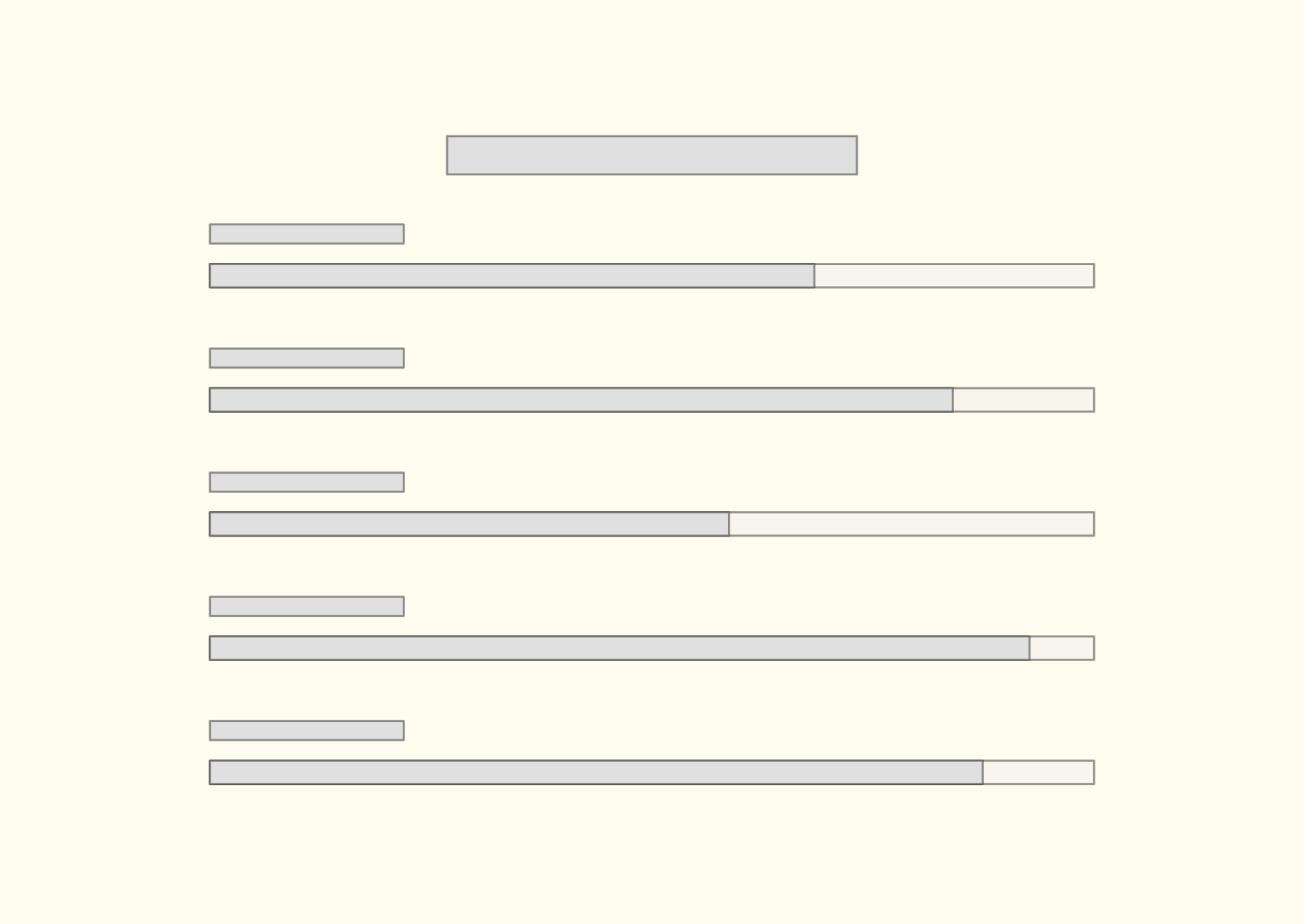
If you have a real love for data and graphs, then please go ahead and find a way to incorporate that. It’s fun. But don’t try and rate your skills in HTML and JavaScript. You don’t know 90% of JavaScript. You don’t know 8/10 of CSS. And even if you did – this metric would make no sense. That’s not even something anyone should be trying to learn. These languages and frameworks to build things. We use as little of them as necessary.
Someone came up with this idea – and it was probably novel and fun. But emulating that is not going to help you out. Why not create a new way to show your experience? What about a timeline? Maybe a Venn diagram that points to which projects show your how your skills and experience were applied? Sometimes people show how many miles they ridden on their bike or how they spend their time between music and coding. If you want to do something creative – do it. Don’t copy this skills-level graph. It’s just going to show that you are completely unaware of how many things you don’t know.
Project list
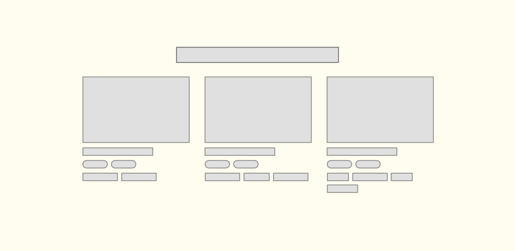
It’s common to have a grid of project cards. And we could probably write a whole book on various way to present your work – but we’ll keep it simple here. Here are the key things to consider.
First off, just like the various technology icons, thumbnails are naturally ugly. You have this website with its own visual language and typography and spacing – and then you shove screenshots of these other websites in the middle of it. It’s going to clash. It’s going to look bad. But there are things you can do. You can make custom thumbnails that hint at what it’s about – but that fit in with the rest of your website. And if you don’t know how to do that – then get help. And you don’t really need to have thumbnails, either. The goal of a section or page like this is to help someone understand your experience and your interests.
There’s usually a link to “the live site” and to the Github repo. Is that what you really want? To just drop them off at the project and hope they like it? Almost every time I’ve ever clicked a thumbnail like this, I’ve landed in one of two situations: either the site wasn’t working because the free hosting put it to sleep, or it was kinda ugly, and to use it, I needed to log in. We spend all this time getting people to look at our site – and then this is what they end up with? Ugly thumbnails and broken projects. They’re not going to log in. And this all just screams, “Student.” Is that really what you want them to experience?
So, instead of linking them directly to the code or the live site – what if you send them to an article or a case study about what you built, why you built it, the interesting situations it brought you to, what you learned, and how that that influenced the next steps? They’re here to find out if you’re a creative problem solver. So… SHOW THEM. Start with this grid of thumbnails pattern. There are other ways to show your skills, interest, and experience. You can share CodePens, articles, and experiments. If you’re really into web development, you should be overflowing with things to show. You don’t always need a full-stack CRUD app – and you certainly don’t need three. Show your depth. It can be in little pieces. Working web developers rarely have a cute little selection of “my projects” from their Udemy course or Boot camp.
Link to the real site at the end of the case study. Take advantage of their attention and tell them the story they want to hear. Make sure your project isn’t asleep. And consider a way to optionally sidestep the real login so they can jump in there and see your project as fast as possible. You could have a guest or trial mode. Don’t forget about the people actually looking at your site and their reasons. Help them understand you and you might just be a fit.
Contact form
Most people (that we’ve met) really don’t enjoy building forms. They’re either hard because you’re building them from scratch or because you have to learn a special form framework. So, it’s interesting that so many new developers have one on their website for contact.
Do you know what the very most important thing about a personal website (when you’re trying to get your first job) is? It’s for them to be able to contact you. So, why would you ever take a chance on screwing that up? People rarely go all the way to ensure that their form has great user feedback. Did the email get sent? Or did the page just flash and reset? What happens if it breaks? Is it getting a server response back? Is it a third party? Who knows. You know what is really solid – and that people are used to? Regular ol email. When someone gets your actual email address, they can use it again. They could send it to a friend. They can send you an email – and they have an official receipt of that. They can find it again if you don’t reply or if there’s a mishap. It’s a lot better for the user and for you.
Forms are also a very nuanced art. People tend to copy what they see other places, and those examples are almost always breaking all the rules. Do you really want to use placeholders instead of labels? Is your form unusable from a screen reader standpoint? Does it highlight exactly how little you know about form design, visual design, HTML, and CSS? We’re not saying you should know everything – but how about you don’t showcase the things you don’t know yet , and you can learn them later on the job.
If you’re going to make a form, do it because that’s what you want to show off. Do it because you love forms, and you love interface design, and you want to show either how great you are at creating universally usable boring forms – or how your unique take on interfaces and user feedback and animation play in. Play to your strengths. Send them a receipt so they have your email. Make it fun. And include your email address right there alongside the form so they can write you that way instead if they want.
There’s nothing wrong with just putting your email address right in the top corner of your website header – or in your footer. You can have it in a global spot so that people are never without it. You can have a specific /contact page URL too.
Footer
For simple sites, it might seem like there’s not much of a reason to have a footer. But I know that if you’re out there looking for work, you’ve been collecting quite a bit of little experiments and you’ve had to come up with interesting ways to organize them. You might have a page for layout experiments, or form/interface experiments, or articles, or HTML canvas things, or GSAP things, or a list of your favorite CodePens. You might have a goals page or a more in-depth about page or links to the various Git repos and projects you use or participate in. You might have a list of your favorite websites or bookmarks for tools or apps you use a lot. And a footer is a good place to have a mini site map. Your global navigation can be just the main few things you want people to see and from there you can link to the other places contextually and also in this footer. It’s useful. But if you don’t have a bunch of overflow like that, then less is more. Don’t force it.
If you are going to have a footer, make sure that it stays weighted down at the bottom on pages with very little content.
Speaking of footers… that’s the end (for now). Do you have anything to add? We’d love to hear about it friends@perpetual.education.