Personal Websites
Hi, there. You're not logged in. So, you must be a visitor. Welcome!
What is this? You are viewing one of our supplemental "Stories." In addition to our core design curriculum, we are constantly building out additional resources. Stories are a collection of real work tasks, design history, UX explorations, and work-throughs. Stories are often off-the-cuff and less concerned with production value.
Introduction
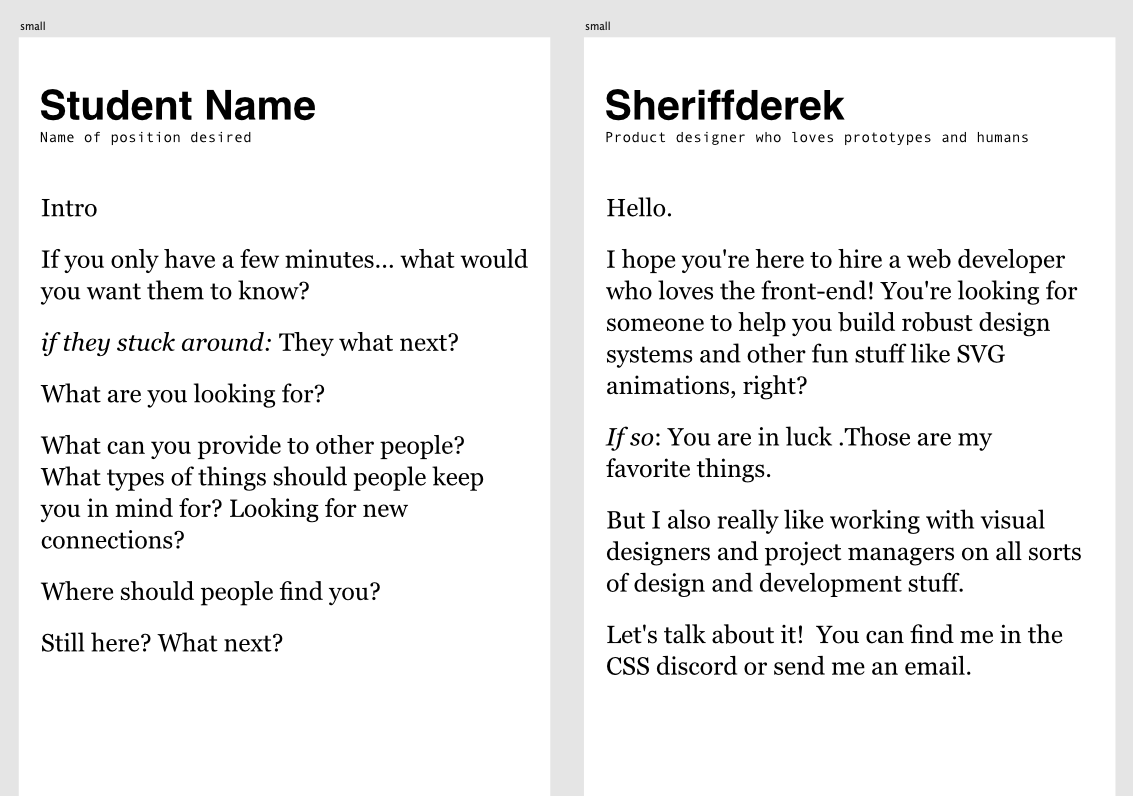
Personal websites: What are they good for? Absolutely something.
Your “portfolio” or business card website or – whatever you want to call it has a very clear job to do. It needs to show that you are professional and explain who you are and what you want and what you provide. It should be as simple as it can be / while providing that service.
There a ton of Derek looking at people's websites and showing the good bad and the ugly - down below...
But first / let’s go over the basics again to set the stage.
A website that is clean and simple and clear / and doesn’t have anything wrong with it — is almost always going to be more successful than a part-finishes “thing” that is trying to be a website. This is really the biggest struggle. It’s much more difficult than writing the code. It’s basically – just reprogramming ourselves. (image incoming)
Basics
Business cards. They have done A LOT of hard work for people over the years. Maybe you hired a house painter or found a babysitter. Maybe you got an awesome lawyer for your divorce at a holiday party.
This teeny-tiny area of physical or digital space / could change your life.
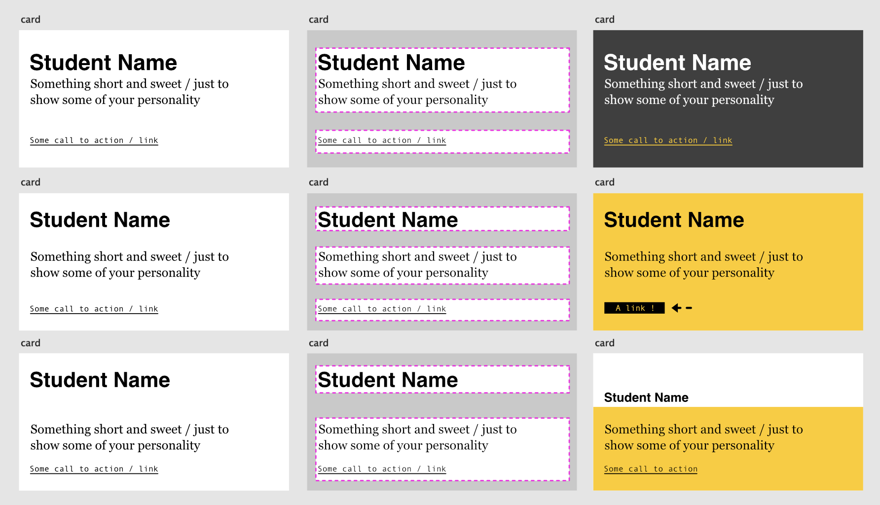
It has the added fun of being very small. This way there are some pretty clear constraints. There’s only so much room. There are tons of ways to make it ugly hard to read. And – only a few ways to make it enjoyable to look at.
You can create contrast with space, weight, size, typeface, and other little tricks. The way things are grouped can help lead the eye through the content. Here are some examples.
But I don't like yellow!
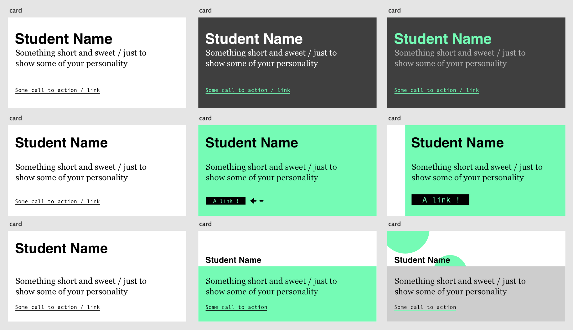
Yeah yeah… OK. You’re going to have to work on that imagination. You can use any colors (or no colors). Surely – you have tons of ideas in your visual inspiration folder, right?
I don't like bright colors!
That’s Ok. Color is often a crutch too.
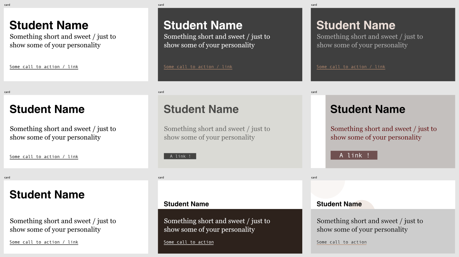
If you can do it in black and white only / then even better! Getting to the goal with as little cruft as possible is ideal.
And you can use colors with much less saturation.
I'm artsier though... I like cursive and paint brushy things...
No. No cursive – or paintbrushes allowed. You can do that later – much later. This is a digital medium. It isn’t hand-drawn. It isn’t about what you feel like you are comfortable with. This is about learning to become comfortable with something new. If it doesn’t feel awkward, you’re doing it wrong.
AFTER you’ve mastered the basics of space and contrast / and the code – then you can try and make it look hand drawn or however you want.
Keep it simple. “More” is just going to make more work – and more trouble at this stage.
Focus on the goals
That’s the job. (to focus on the goal)
Don’t try to be different. Just be good. To be good is different enough.
~ Arthur Freed
Smart people agree.
Don’t try to be original. Just try to be good.
~ Paul Rand
Being “unique” / is most often a way of avoiding the task at hand. If you’re unique – you can’t be compared. And / without measurement – it’s not designed. It’s just expression.
And – you didn’t come here to learn that. If you did, then – let’s get naked – bust out the colorful bird feathers and glue, cover ourselves in blood, and go dancing. (after you finish your website of course)
Content Content Content
It’s really hard to fight the urge to “make a website” with all of the unexpectedly engrained ideas we have.
Consider a book. When you look at a page in a book / you aren’t looking for something really unique. You might not even think about it. That’s all by design.
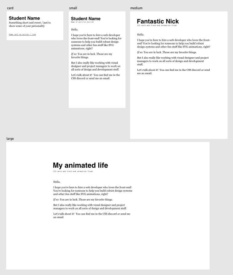
Consider the very most basic content. What choices can you make – with this limited and succinct content / that will make it feel GREAT!?
We’ve talked about space and contrast and alignment. This is the bare basics of “good enough.” Here’s the content. There’s some visual hierarchy created by different sizes and the space between things. It’s always subjective but most people will feel like this length of copy is “doable.”
This is a pretty great website already. What do you think? At least it’s consistent across the sizes. The subtle choices at this stage are usually 10x more important than all of the choices later. We’ll prove it later – down below. This is a stage to take seriously. Jumping past it – will only mean that you have to come back to it later / in a much messier kitchen. Enjoy the simplicity. What can you do – with just these few things to work with?
This is the beginning...
When you’re first starting out / you just don’t really have any “portfolio pieces” and “content” and “whatever” people shove onto their website to fill up the space. That’s GREAT! It’s like your kitchen is super clean. You have all the space to learn and make whatever you want.
Have fun with just this little bit of content. There’s really so much to work with.
Little things
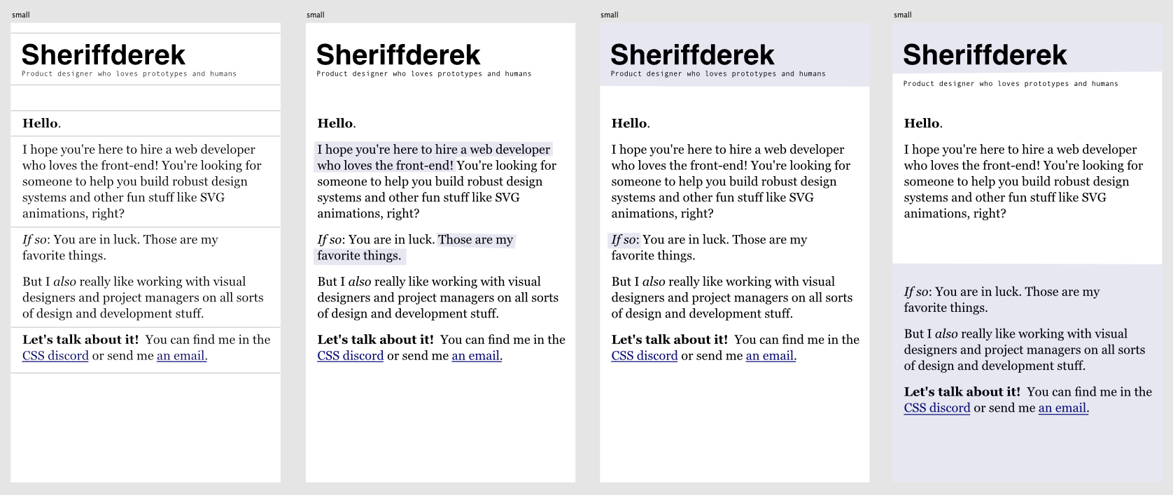
Links need to be visually differentiated so you can click on them. So, that’s some low-hanging fruit. Those usually have some underlines. You could use some heavier weights to draw attention or some italicized words. You can highlight some areas to be playful. Maybe some lines. Maybe the links have colors and could inspire some other color ideas.
What is the most you can make out of this minimal content?
Can you include a bit of your character / and also look professional and clean?
Colors are easy to change
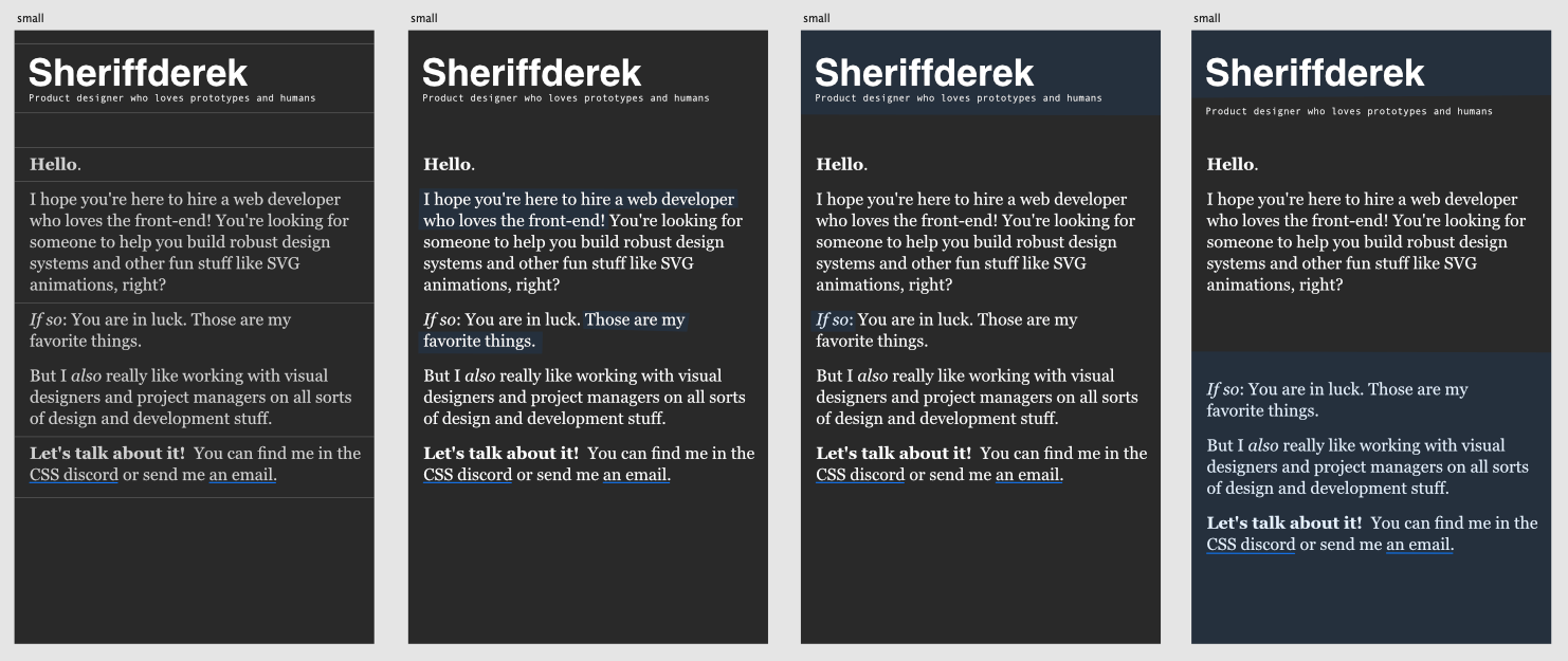
If you can get the spacing in a way that you like / the colors are the easy part. Maybe you want to try it out – in a dark mode. You can make a bunch of versions and share them and ask people what they think.