Styling forms part 1
Introduction
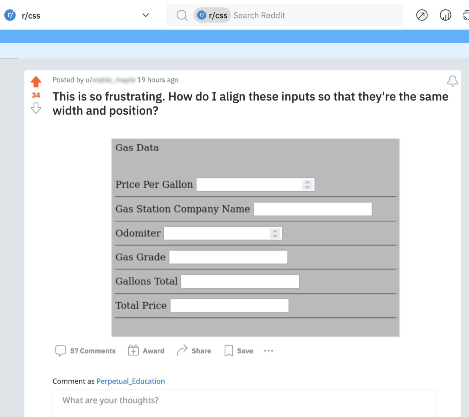
We didn’t learn about styling forms – because you didn’t know how to do anything with forms yet! But now that you do… well, here we go!
The goal isn’t to make you squirm (we promise). It’s to practice looking at the dev tools a bit and to figure out what properties are needed to normalize these buttons.
What properties are there? background (they seem to use the shorthand and sometimes there’s a gradient), border, border-radius, font, seems to have it’s own mind on that one…
If you share your findings, we’ll send you the next video. 😉
A common question
And of course, we always answer it
“What would be even more frustrating – is if it had no logic to it at all. As it stands, there are 2 elements (label and input) which are both display: inline by default. So, they are going – in a line and wrapping like text on a page. It’s naturally responsive and one of the reasons why HTML defaults are so resilient. But it doesn’t look that great, does it? Hopefully, that helps explain the “why” of it.
The bigger problem is that having the labels all the same width will also be pretty difficult to look at. Odometer will have 2″ of space between the label and the input, which is enough to lose track of for a great many people. It’s also not going to fit on a phone where 80% of people are likely to see it. That’s what sounds the most frustrating. What if the labels were above the fields instead? We’ll make an example of each for you. Historically – you’d use a table for this. It sure seems like tabular data. But now you could also use CSS grid to handle it. It would depend on your users and use case.”