Off the grid grids
Introduction
This is in the works! Would you like to help flesh it out? Let's do it!
A normal website
There’s nothing inherently wrong with this website. It’ll do the job. People are used to it. It’s the norm. Everyone starts out recreating this layout. It’s burnt into our brains.
But for this discussion: find something fun and different
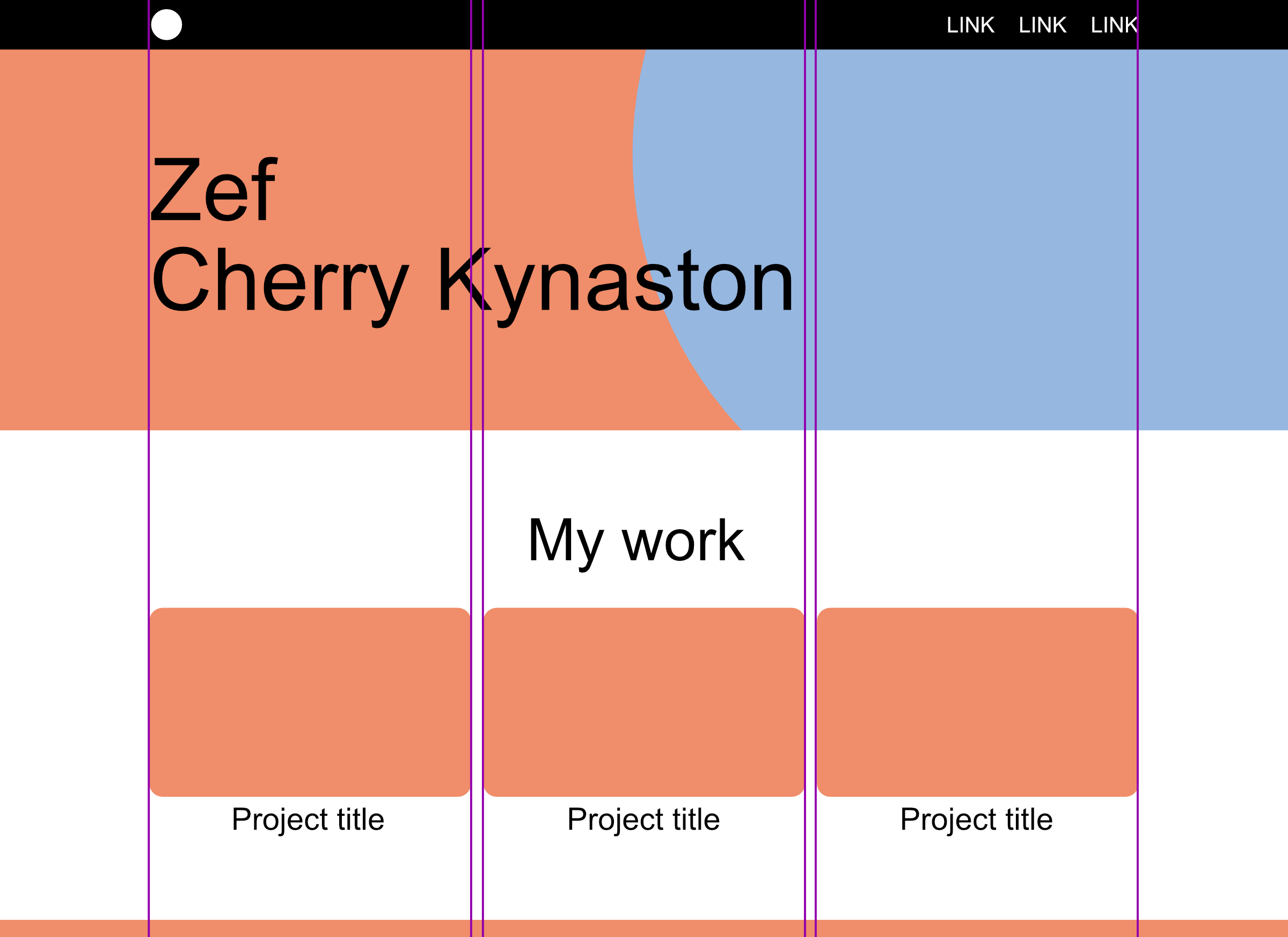
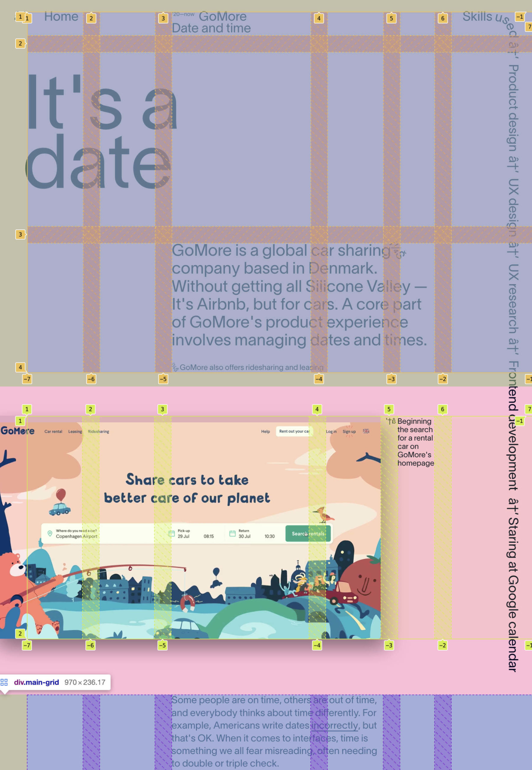
You might find an interesting site and do some investigation. Here’s zefs.website. (It has already changed colors since then!)
Investigation
The home page is a one-off layout. But the case study pages have a lot more to look at and share a standard structure throughout. Well, the point is that it’s not standard. But it is consistent.
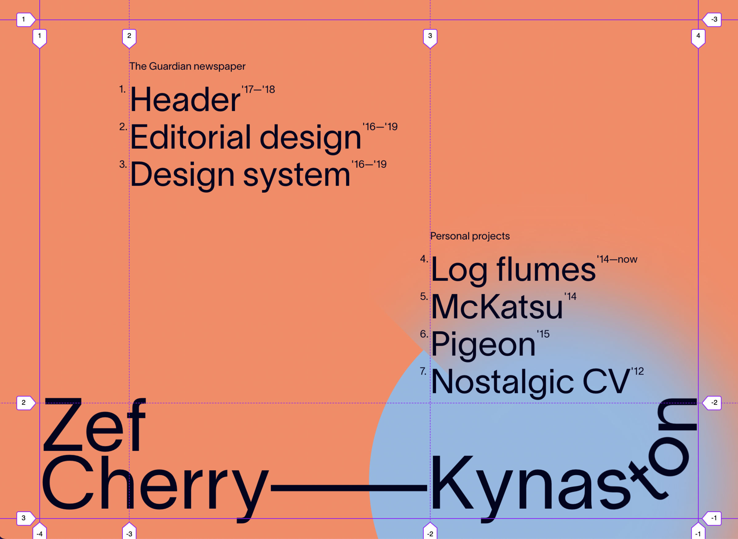
12x grids are great. They break into 12, 6, 4, 3, 2, and 1 parts. But while you are working with that, you might start to discover a hidden other grid within it – and a second layer of constraint.
Mapping things out
What exactly is happening here!?
Figure it out! (Unless your fairy god-mother will do it for you)
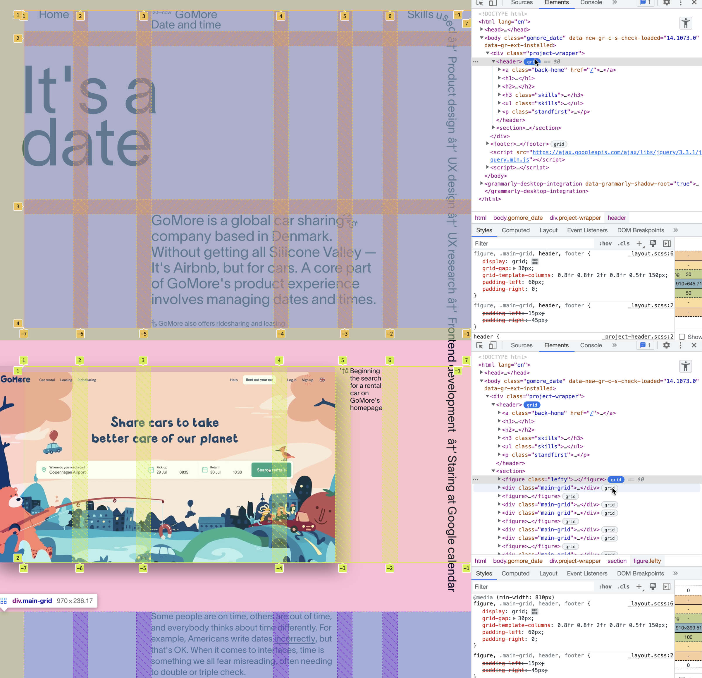
(Cleanshot has a great scrolling capture feature)
How did they come up with this?
Some people are just naturals. Their great great great grand parents were probably architects or something very studious and now that person’s memories got sent along with their DNA. Or some Deity or something. You can decide what you think.
Sometimes people just practice a lot and look at TONS of really great things and build up a sense. Other people just have a knack for making stuff look “cool.” They usually can’t explain it, so – let’s reverse engineer it.
What about starting with a strict 12x grid
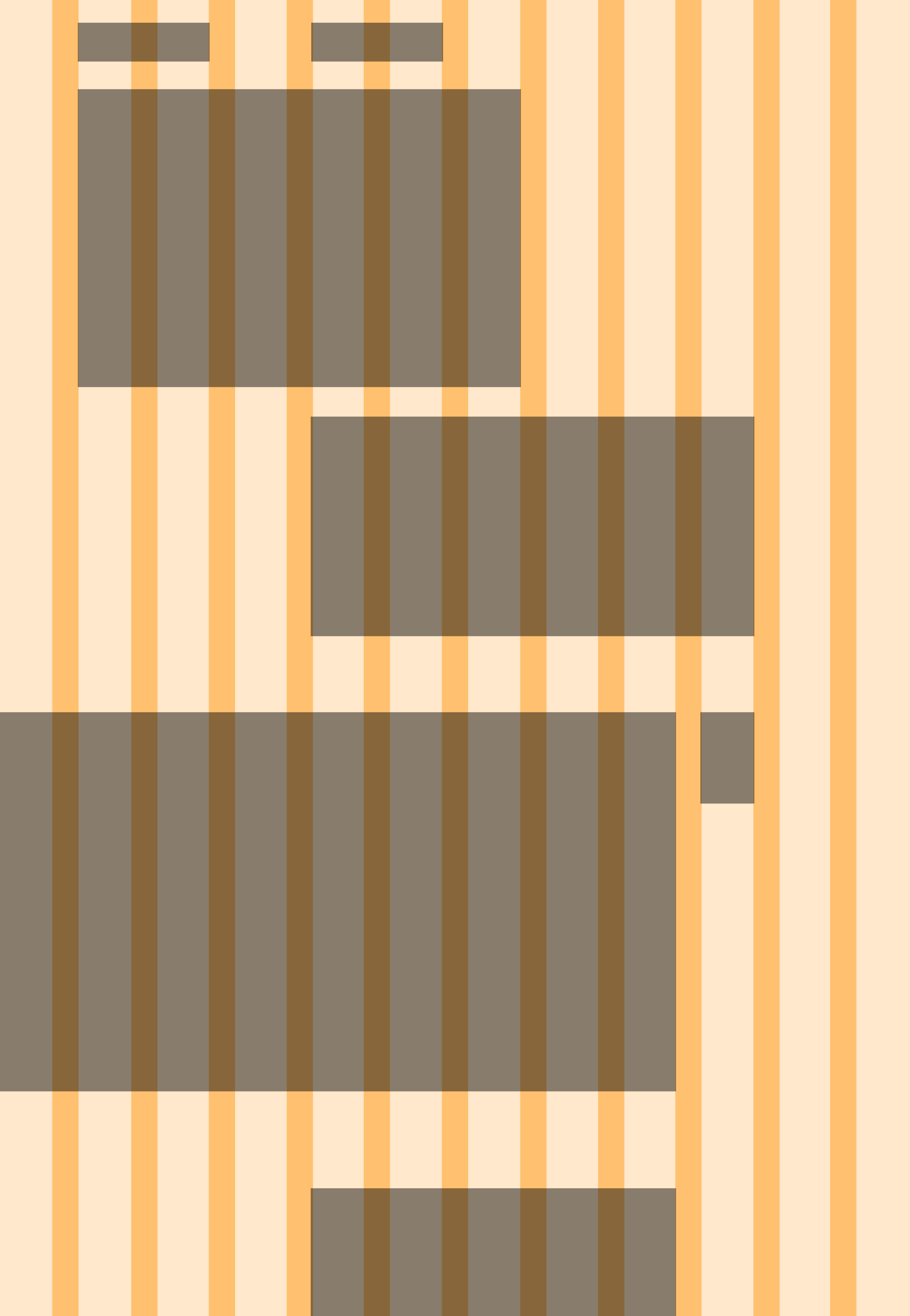
There’s nothing wrong with this! Grids are great.
But we’re just talking about ways to let them speak – and have a little more character. Sometimes you want it to be especially riged! So, there are times for both.
Some patterns
Maybe some of the cells are used in a way that starts to form a pattern. Maybe your content is pushing the grid this way and that a bit. Maybe some of the gutters become really important and the other ones aren’t used that much.
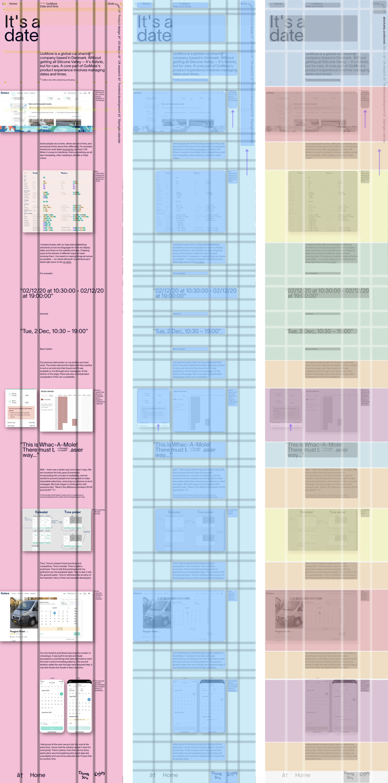
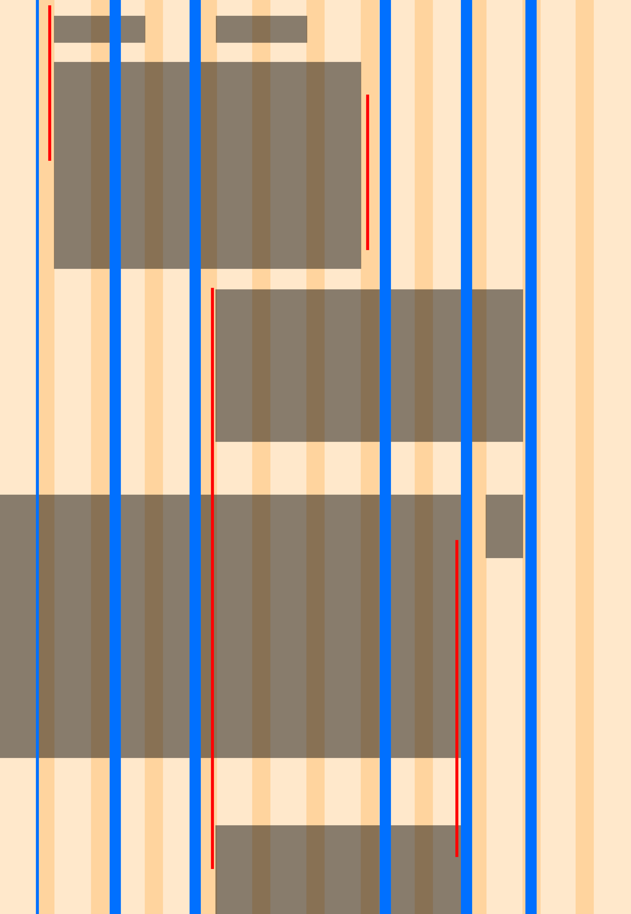
A grid on top of a grid
You might end up with a six-column grid like this – where each column is a little unique.
For one thing, this is fun. But in a practical sense, it adds another layer of constraint. And the more constraint! The less choices / and ultimately – the more freedom? It depends how you see it. But it worked great for Zef!
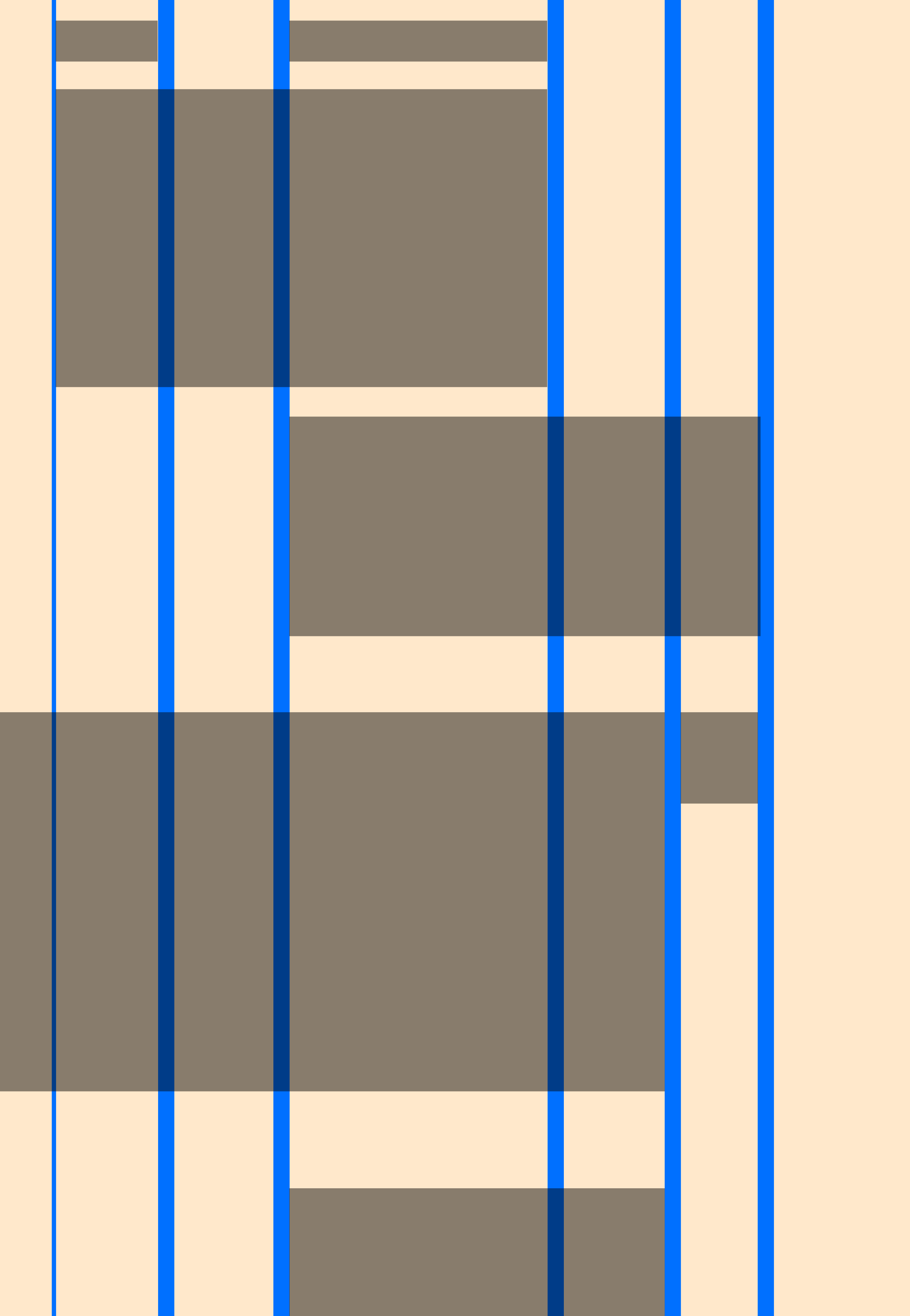
Modules
It’s still a wild west. Zef is mixing in some absolute positioning and other tricks to stitch this all together.
Each of these blocks is a reusable module, just like our responsive layout garden – and all of our pages – and our case studies.
Check out the code. Bonus points: can you figure out any ways to improve it?
Is there anything stopping you from being able to create something like this? Tell us about it.
Also – don’t forget all the other screen sizes 😉
Find more!
If you find any fun examples, tell us! We can add them to this resource – or make some video about them.