Flow content spacing
Introduction
You might not think about “Flow content” – on the daily.
But it’s all the block elements that make up the page. And they need some spacing to work.
So… how to you plan for all of the possible combinations of content in your article?
To start off...
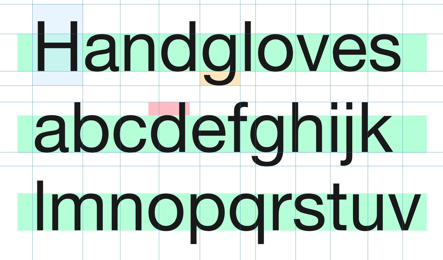
Line-height it weird. How does it work? How big is a character? How tall? How do they work together across lines?
Try selecting one. And then – change the line height.
That’s all. Just a question for you to consider.
Now onto the spacing considerations:
An example
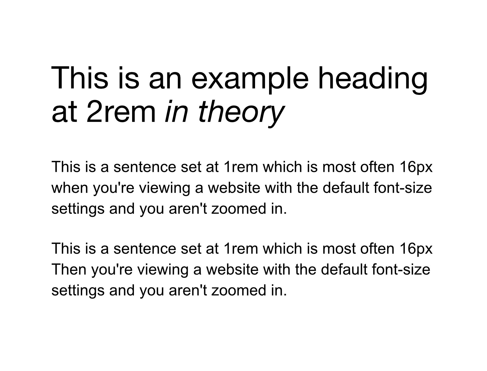
You’ve got your heading and some paragraphs. Without some space, they aren’t going to be a pleasure to read. They may even be painful to read. But here we have the example.
Collapsing margins
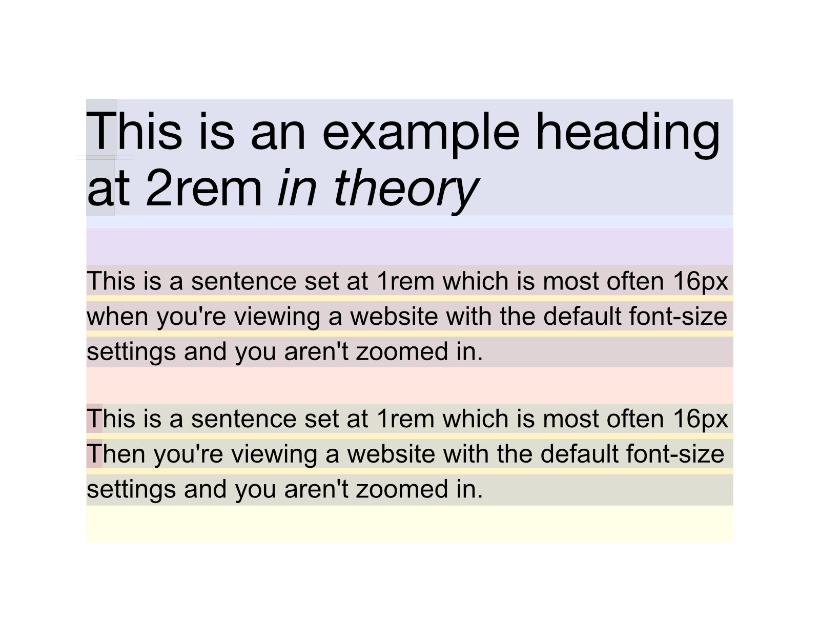
Browsers (as you know) have set some default styles for all the main HTML elements. This is to be helpful. And what if styles don’t load, right? So – here’s what you get.
But the logic system for space is mysterious. However, the rules are simple. All of the elements have some margins set. And the way they work together is that the element with the bigger margin / wins – and takes over and eats the other margin. They call it “collapsing margins” “- and well (naming things is hard), but we think it’s confusing.
Another way to see it
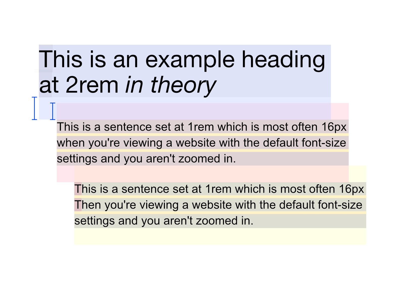
Hopefully, this will help you visualize it.
The heading has a bigger margin-bottom than the paragraph has margin-top. So, the bigger margin is what is applied and the smaller margin is effectively ignored.
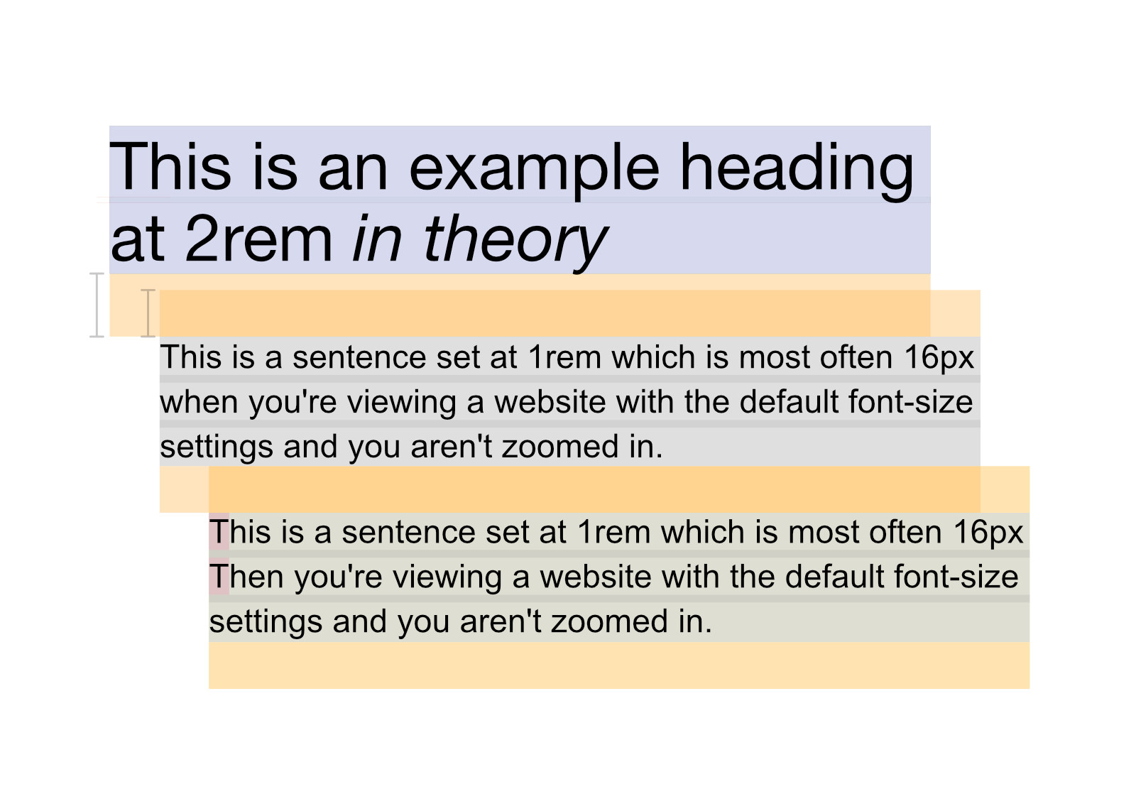
And then just to clarify the margins for those who can make out the colors –
But
That (“collapsing margin”) system is difficult to control. It’s a nice default though.
Instead, we usually zero that stuff out and “reset” (questionably a misnomer) the browser (user-agent) defaults back to “normal.”
And that means – now we have to take charge of the styles ourselves. Luckily – that’s something that matters – and that people pay you for.
Padding
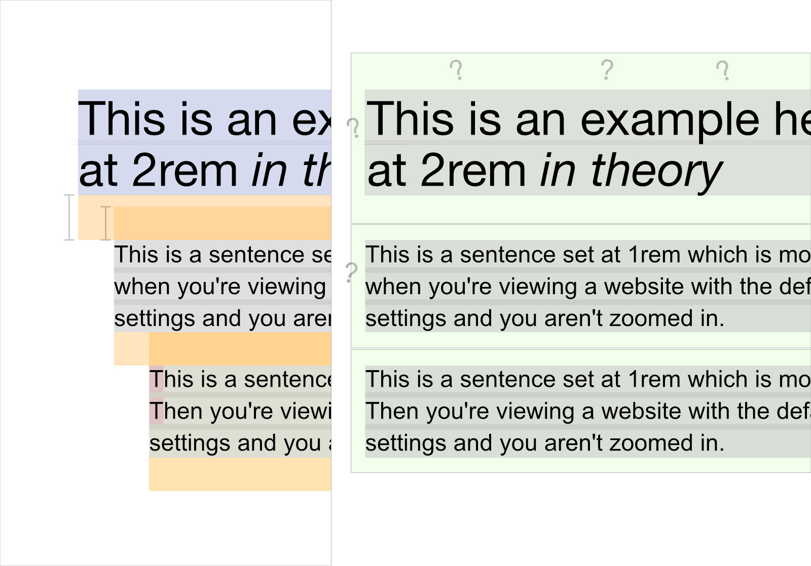
It seems that most people (who don’t try lots and lots of things to understand margin and padding / for days and days) – will likely pick one arbitrarily – and stick to it until it bites them. Sometimes – for 30 years.
Padding – is great. But – in the case The Web / and its basic document structure it’s not always the right move. It can be tricky though. We get it.
Padding if for giving space to an element. And margin is for placing space between elements.
In this case (the case of no stylistic decisions to involve background color and space around headings and things like that) – padding will involve more calculations and cause you trouble.
Reducing
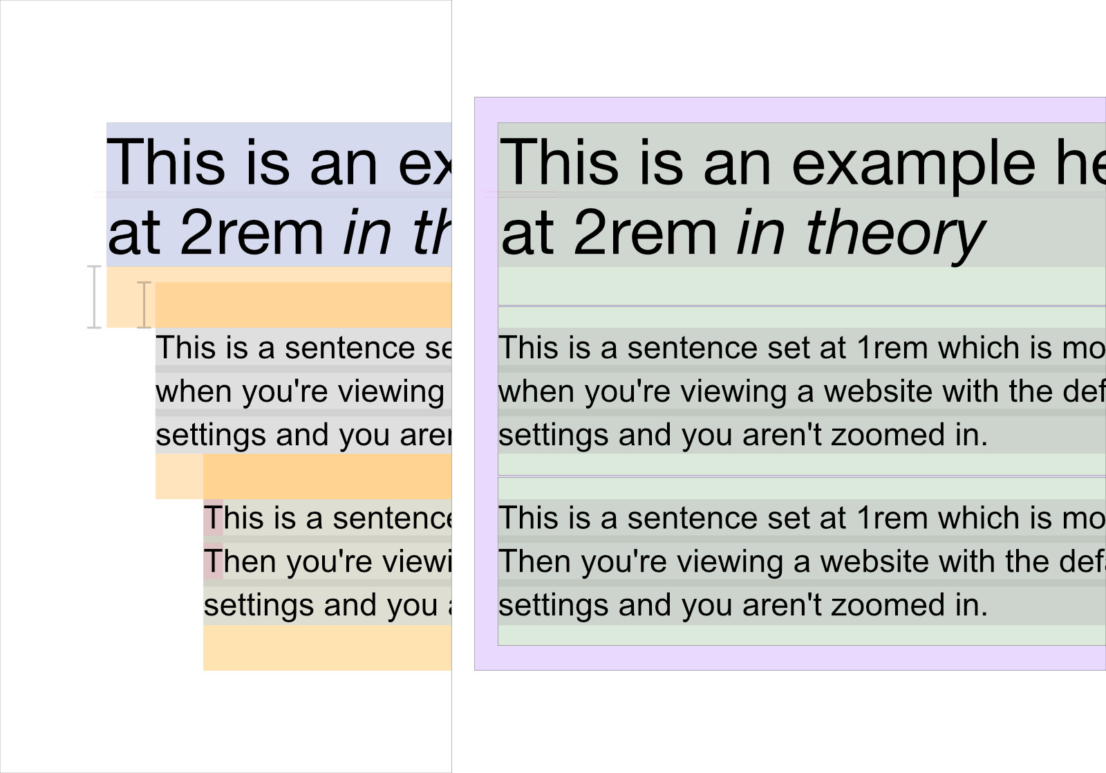
You could simplify and get rid of that outside padding on each of the elements. That would simplify things.
They – they can have the shared benefit of the parent element’s padding.
But - in almost all cases... you should use margins instead
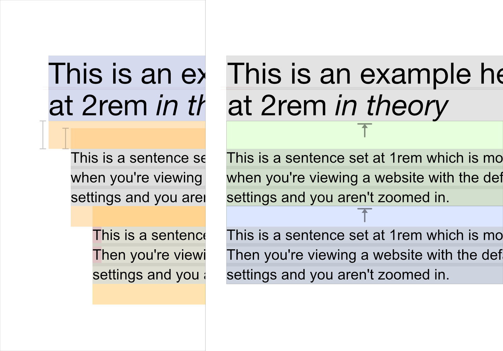
Elements don’t know what come after them. That’s just the way it is. Probably for good reason.
They DO (however) know what came just before them. And that’s why we employ the adjacent sibling selector. You should certainly read Heydon‘s article about Lobotomized Owls.
But that might not be enough control. You tell us. Dig in there deep. If you do: you’ll be near an expert on the subject.