Figma collection composition exploration
Introduction
Here are some explorations on how we can bend Figma collections to our will and get a system that can emulate what we can do in the code.
Nothing formal – Just need a place to link to all these for discussions. (adding examples as they come up in discussion)
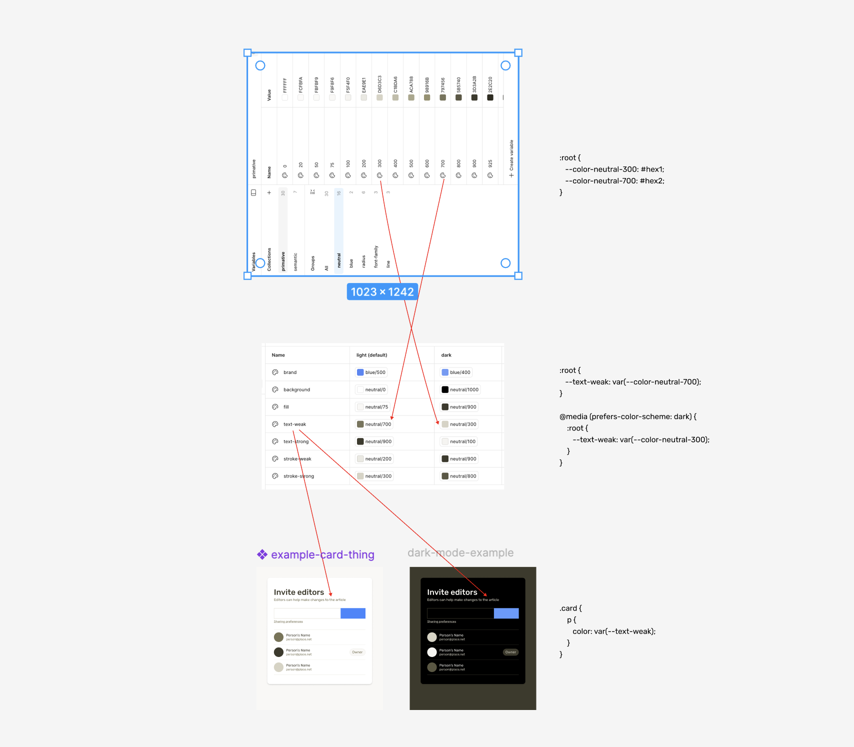
Classic mode example for dark-mode (using primitives)
Using type scales for text styles / type patterns
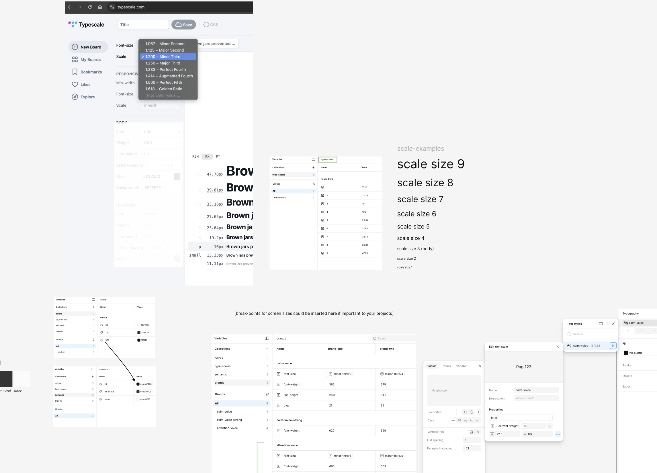
Exploring how using a type-scale could be the basis of the text styles. And in theory – you could have many – and swap them out (need to make part to showing that)
Type pattern concept is something I’m pushing / and was documented in this CSS Tricks article.
Type scales and brand-specific voices and viewport break-points
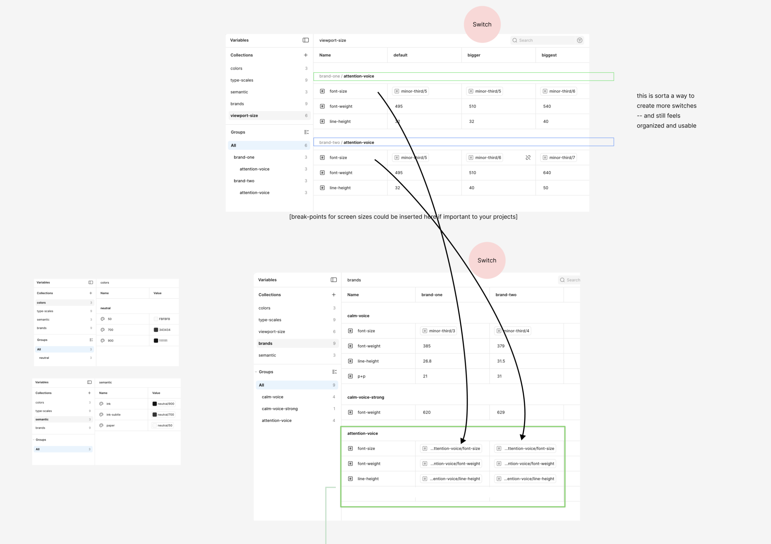
This one explores how to have viewport or a container-size-based collection switch per brand.
This was an unexpected way to do this, but it seems to be working well.
Type, brands, and semantic UI colors
This one builds on the previous examples – – and employs: paper, fill, ink, ink-muted, stroke, stroke-muted, brand-light, brand, and brand-dark – to create basic brand-specific semantic UI application layer.
Type, brand, ui, and mode
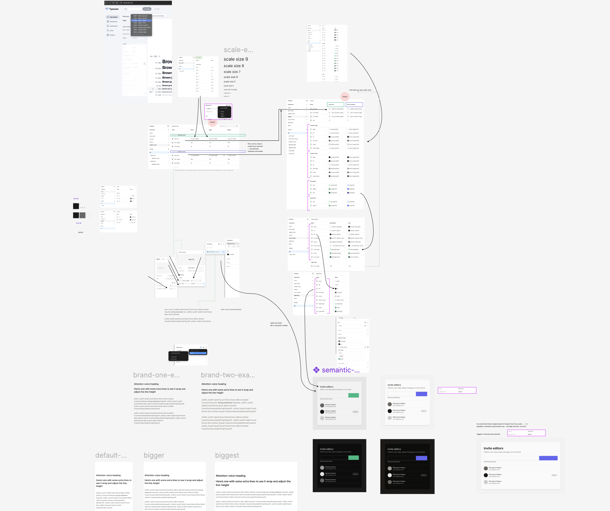
This one is everything so far – but how you could also have a prefers-color-scheme (dark mode) switch too.
Sub-section theme/emphasis exploration
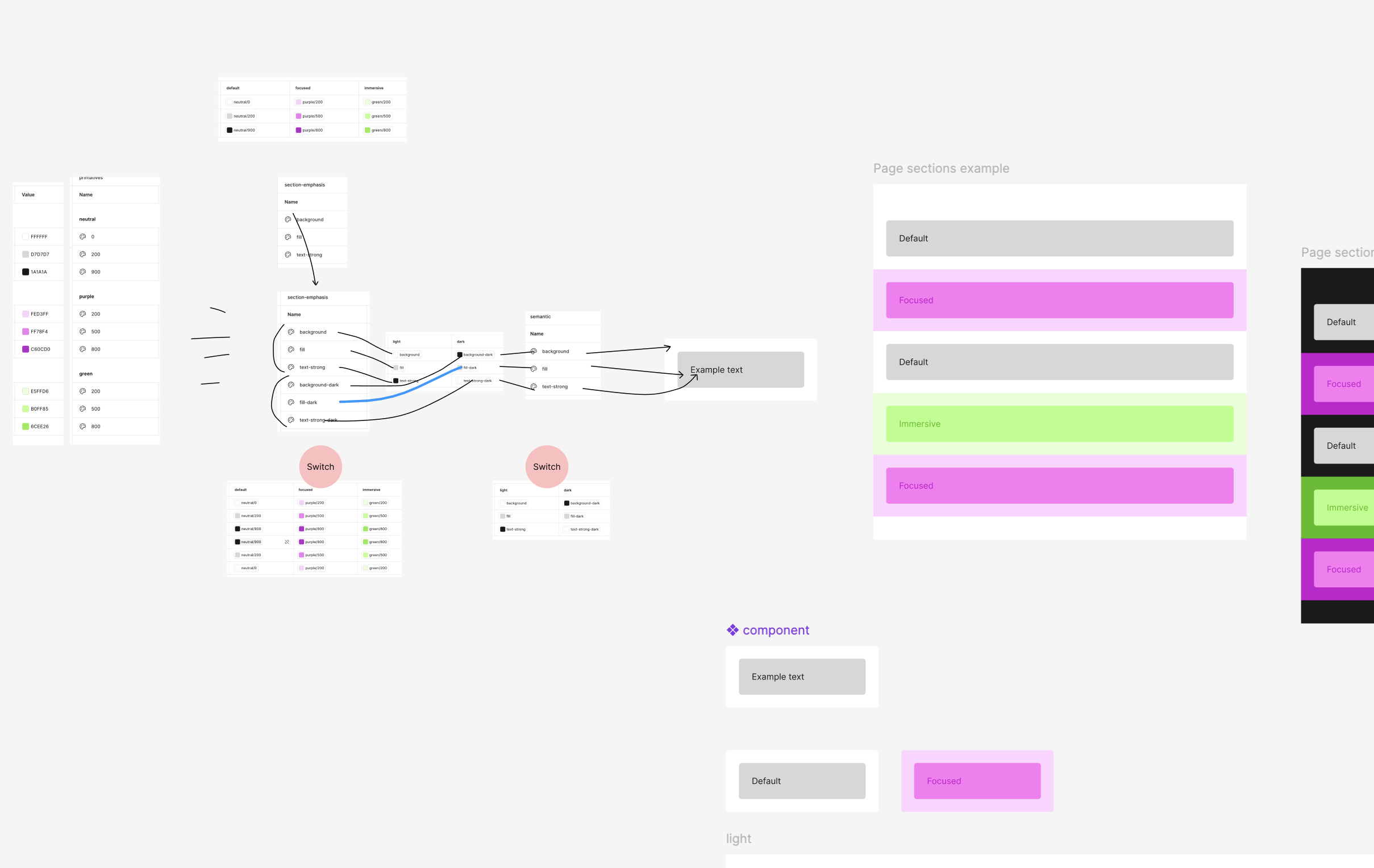
This isn’t connected to the previous examples. It’s exploring how to have per-section themes
Some related Pens:
Many modes / different per brand
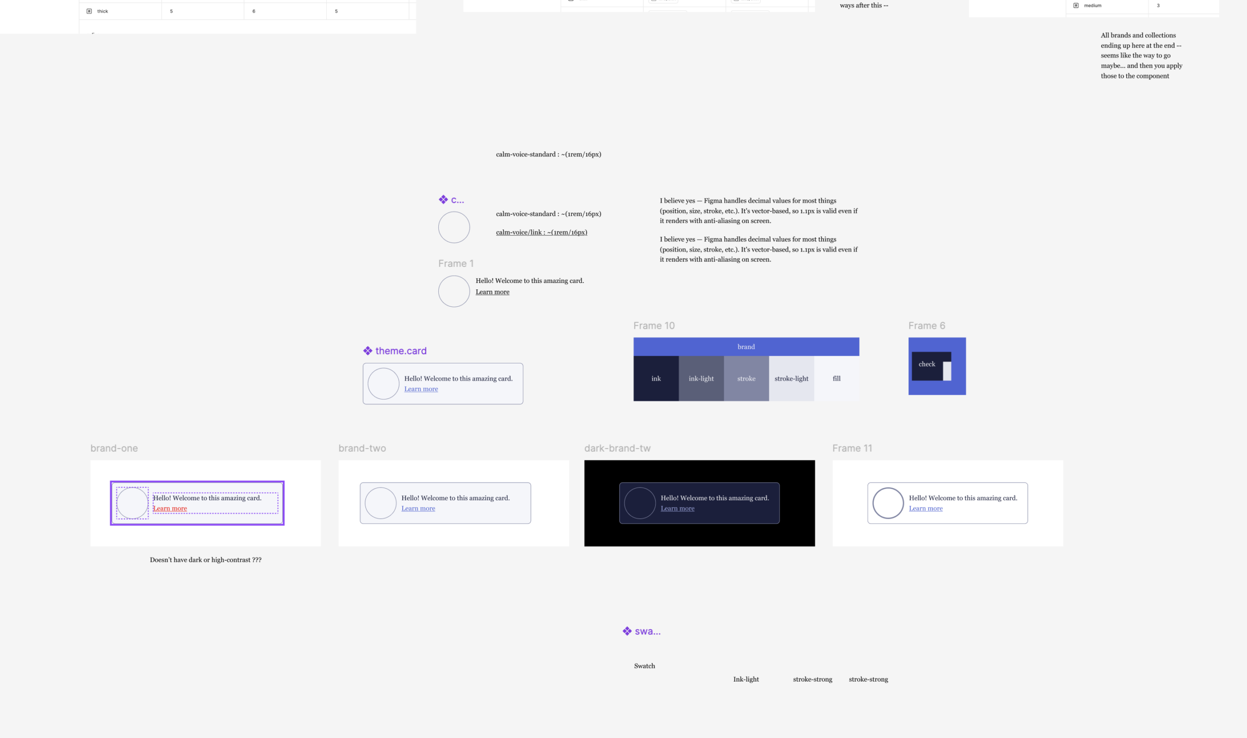
This one explores brands and modes – in the case that one brand has 3 modes and the other brand just has one to start.
Somewhere in the mix of these… having a final “application” type of collection with exactly what you apply to the component – starts to make sense. Then – in theory — you’d never have to reapply them every again – because you could always put something in between the flow — and you have the ends already connected.
Multi project with density, break-points, and color-scheme
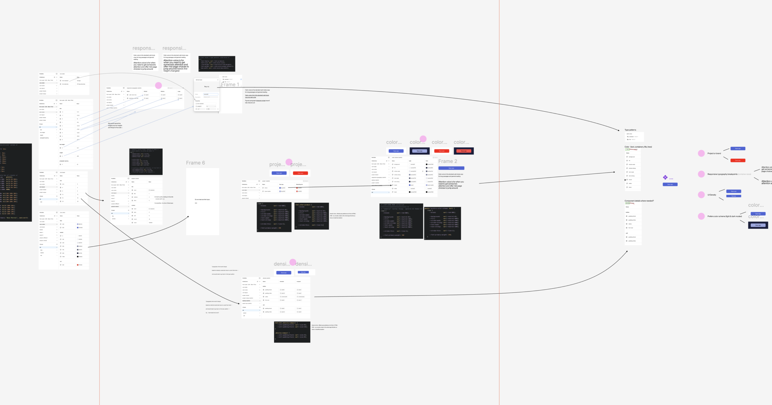
This one was an exploration from a prompt in Sam’s workshop (which was great).
It was for a pretend company that had a few different products and with various modes like high contrast or density choices.
(This one was created before the others on this page)
Here’s a Pen that looks at dark mode + density and how to adjust variable font-weight for lite text on dark backgrounds – that follow this prompt to explore how the Figma collections and CSS differ.
Container query-like options
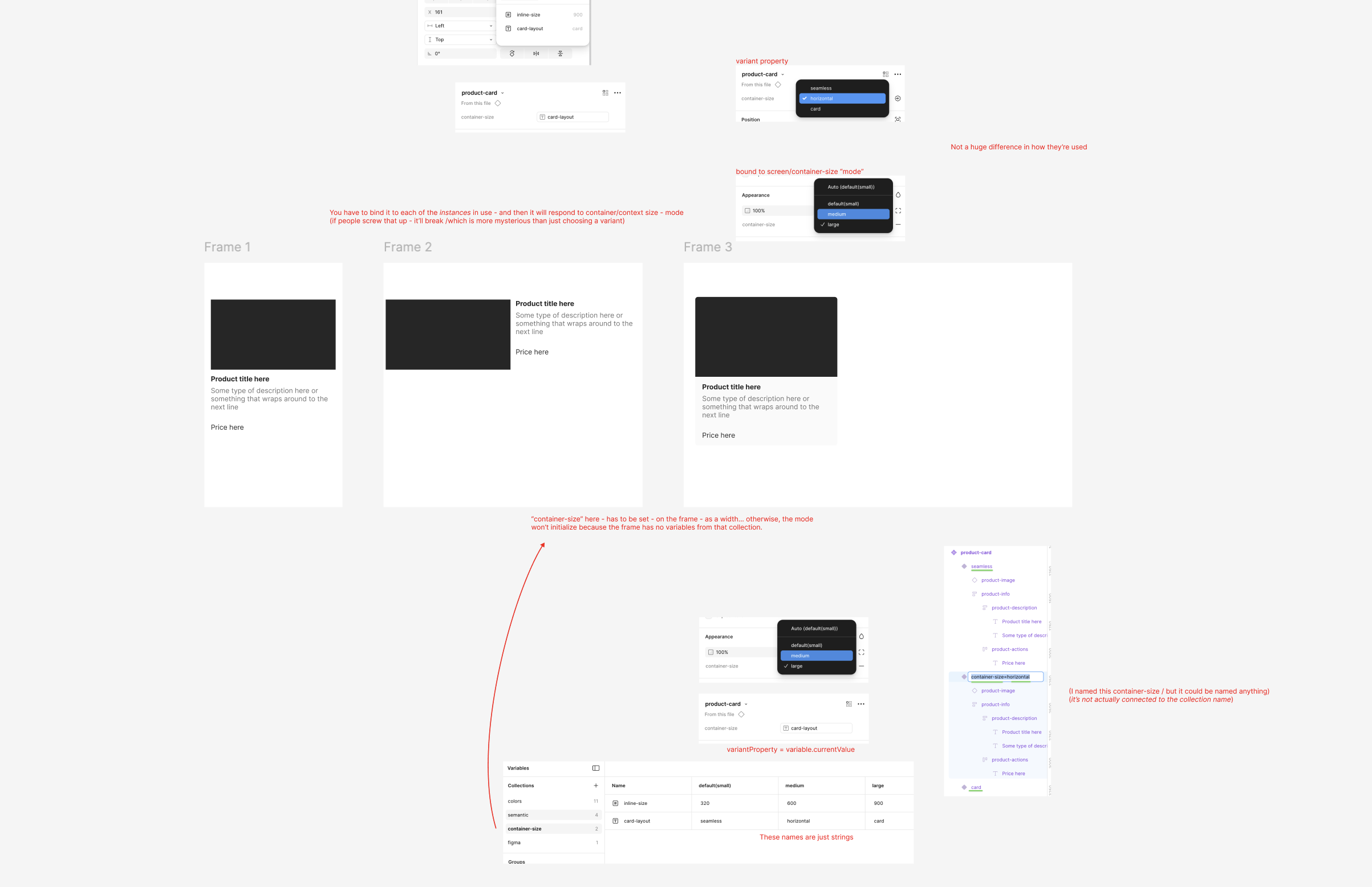
This one feels strange. Every time I do it, I can’t really figure out how it’s working.
- You have to have a component with variants
- Those variants will need clear/unique names like usual
variant=seamless,variant=horizontal,variant=card - Then you also need some break-point-ish collection because the context need to have a variable applied to awaken the mode
- That’s how you get access to other variables in that mode (in this case
card-layout^ with those strings for values at whatever breakpoint you want to use them) - Then you have to go do each instance of the component (not the variants) and bind the container-size value in the sidebar — to the variable of card-layout.
- Now when you put one of those instances that has been bound — in a frame with a container-size set — it should insert the string value for card-layout — where the property=string is set for the variant, (which switches the variant in that set context) (But if it’s not set up – or any of the strings are incorrect / it silently falls apart)