Collapsing margins
Introduction
Let’s see if we can explain this – and get it out of the way…
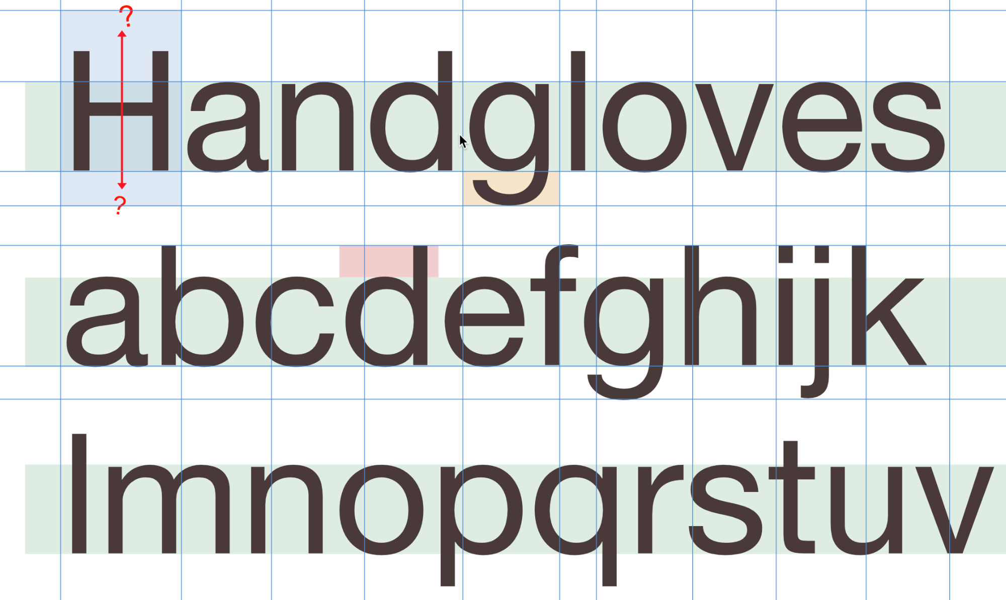
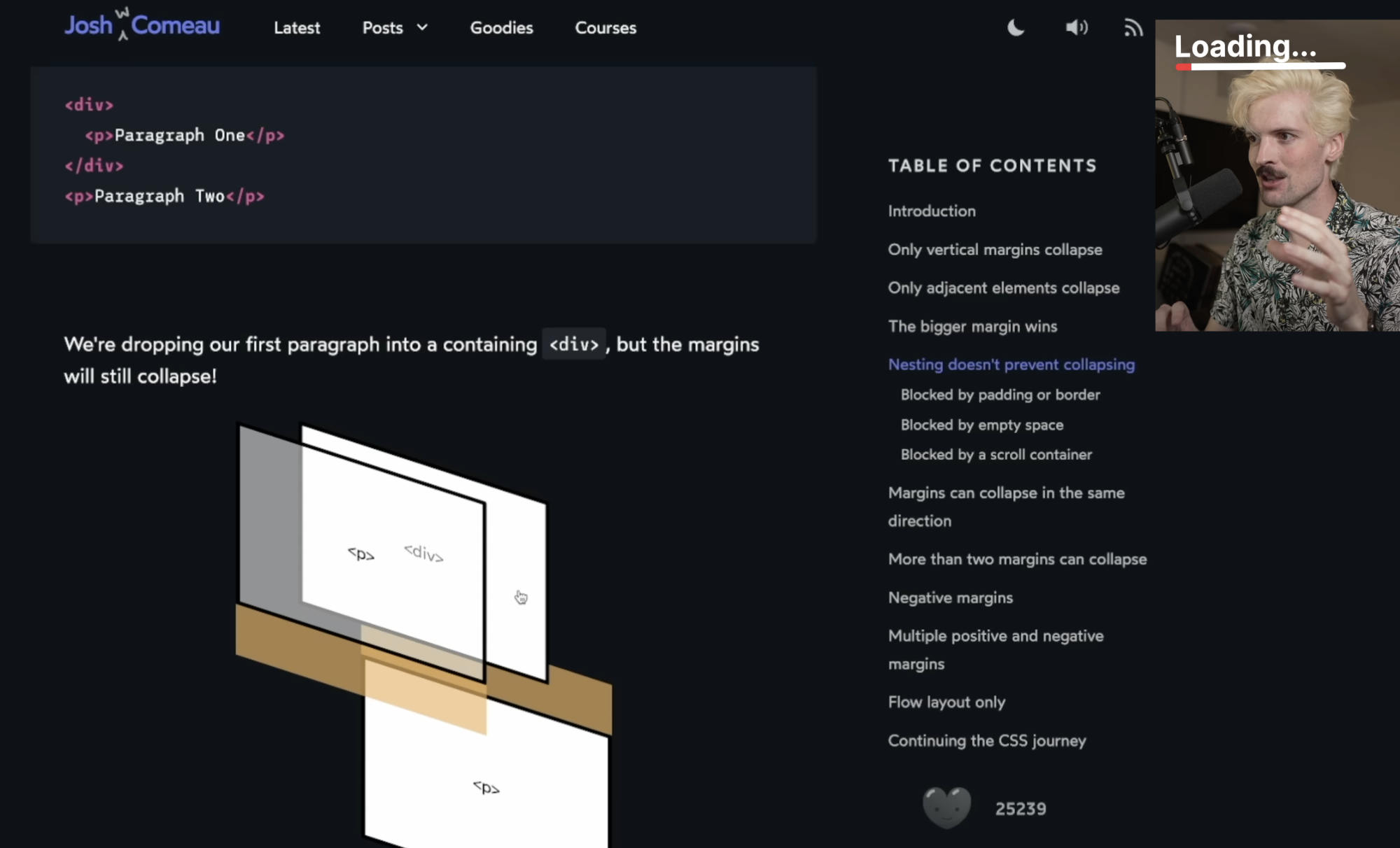
First, check out this situation. What’s really happening? We’re not going to go into that, but here’s a naive diagram investigating. Check out that first line of text.
It’s like the blocks used for printing, right? They have space above and below to account for the descenders and ascenders.
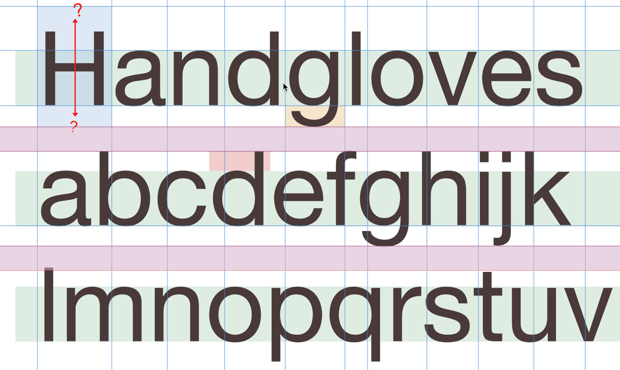
And, they have space between the lines. This is where they’d shove the extra lead slabs to create the space in physical printing. But digitally, it can be expressed in negative numbers too and do all sorts of fun things.
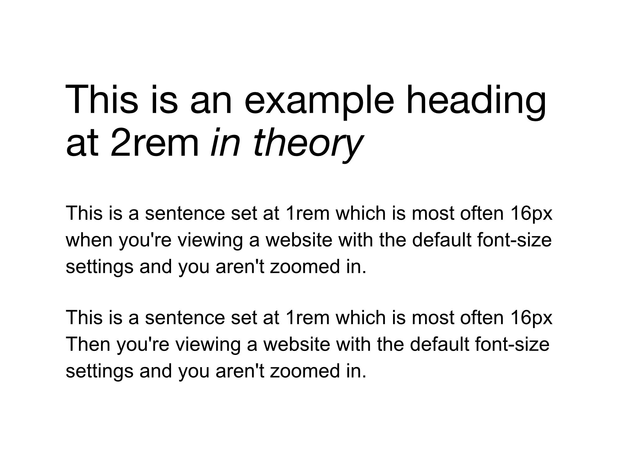
Here is what it looks like when printed in some default fashion.
Note the default spacing here.
If you are color blind, we’re working on some internal tools to allow you to adjust these colors so that they have a clear contrast for you. We’d love to talk to you. Set up a time with us – and you can help us test it! : )
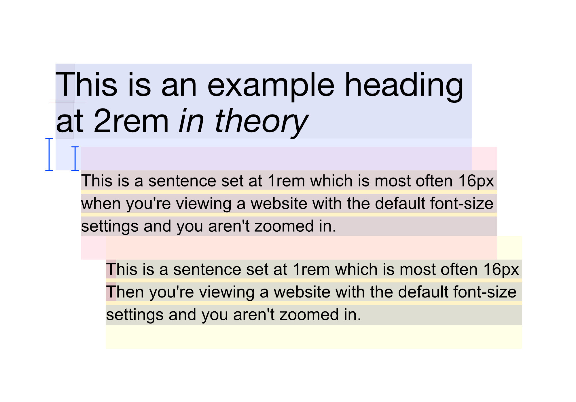
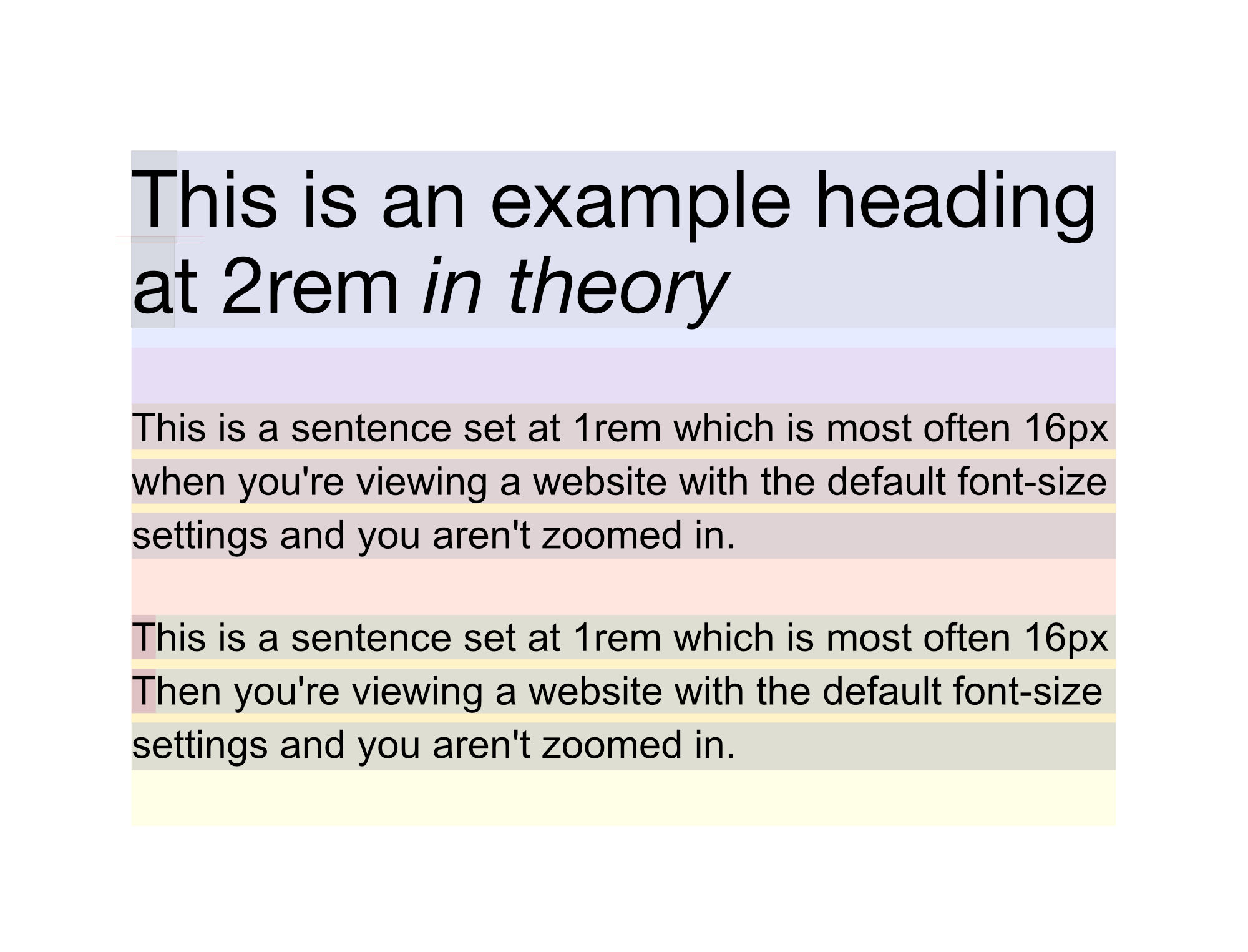
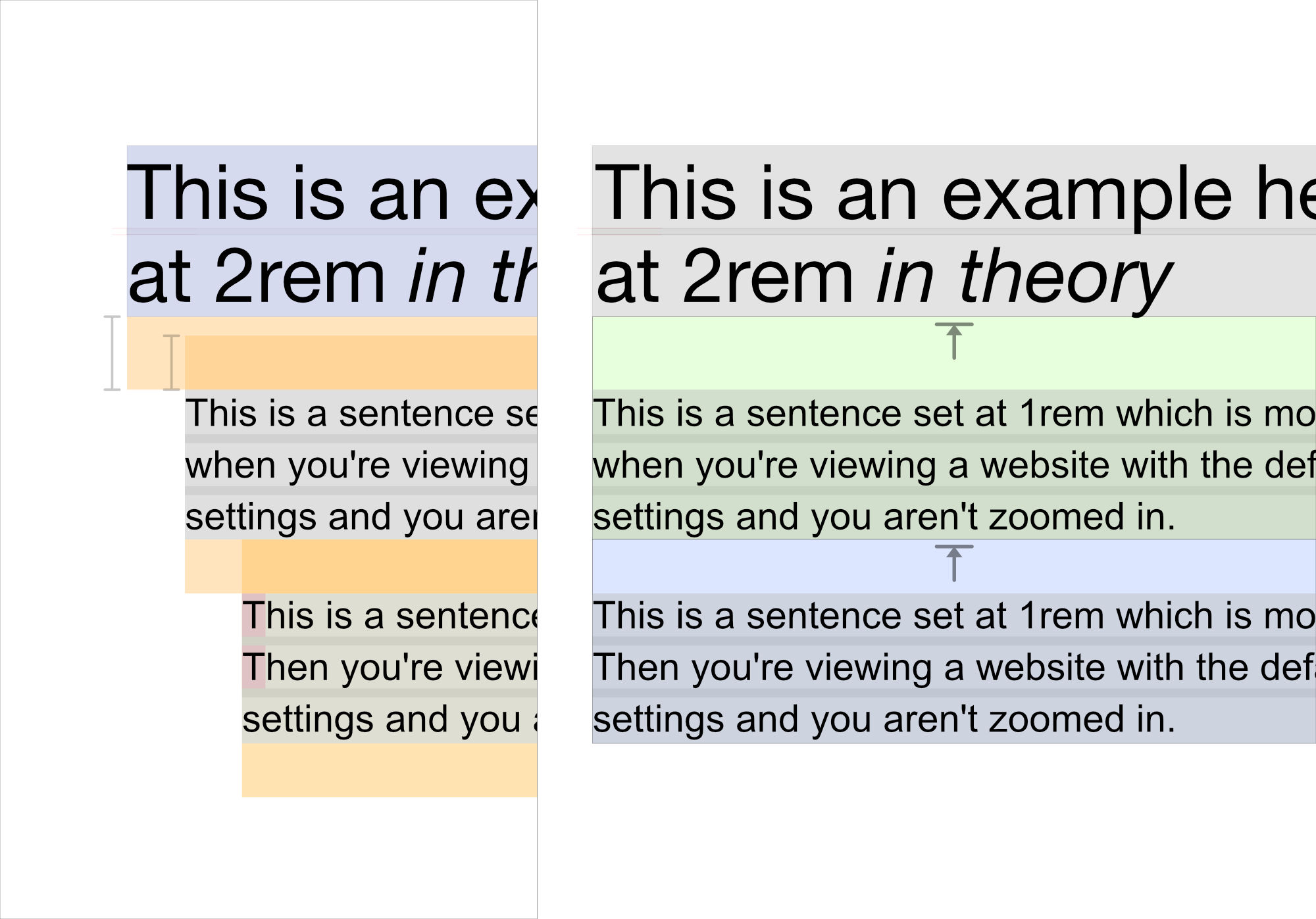
This should show it a little better. Note how the Heading has a margin on the bottom – and the Paragraph has a margin on the top / but they combine and – really, the bigger one is the one that gets put in place.
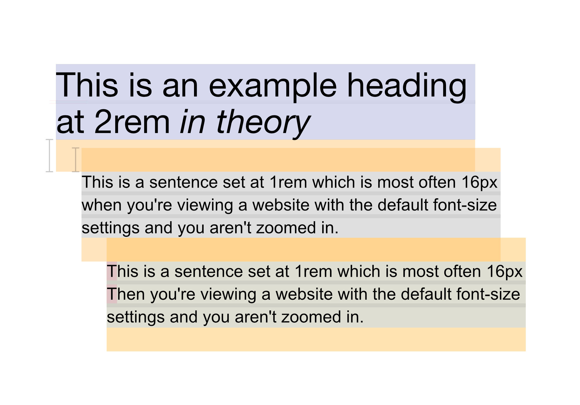
Here’s another colored version more like the dev tools.
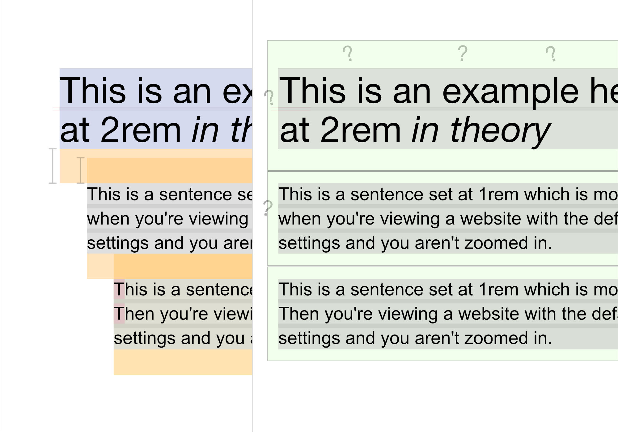
You could put margins around everything but it would be a mess – and you’d have to keep track of a lot of numbers and well, put them on everything.
Instead, you could put some padding around the parent.
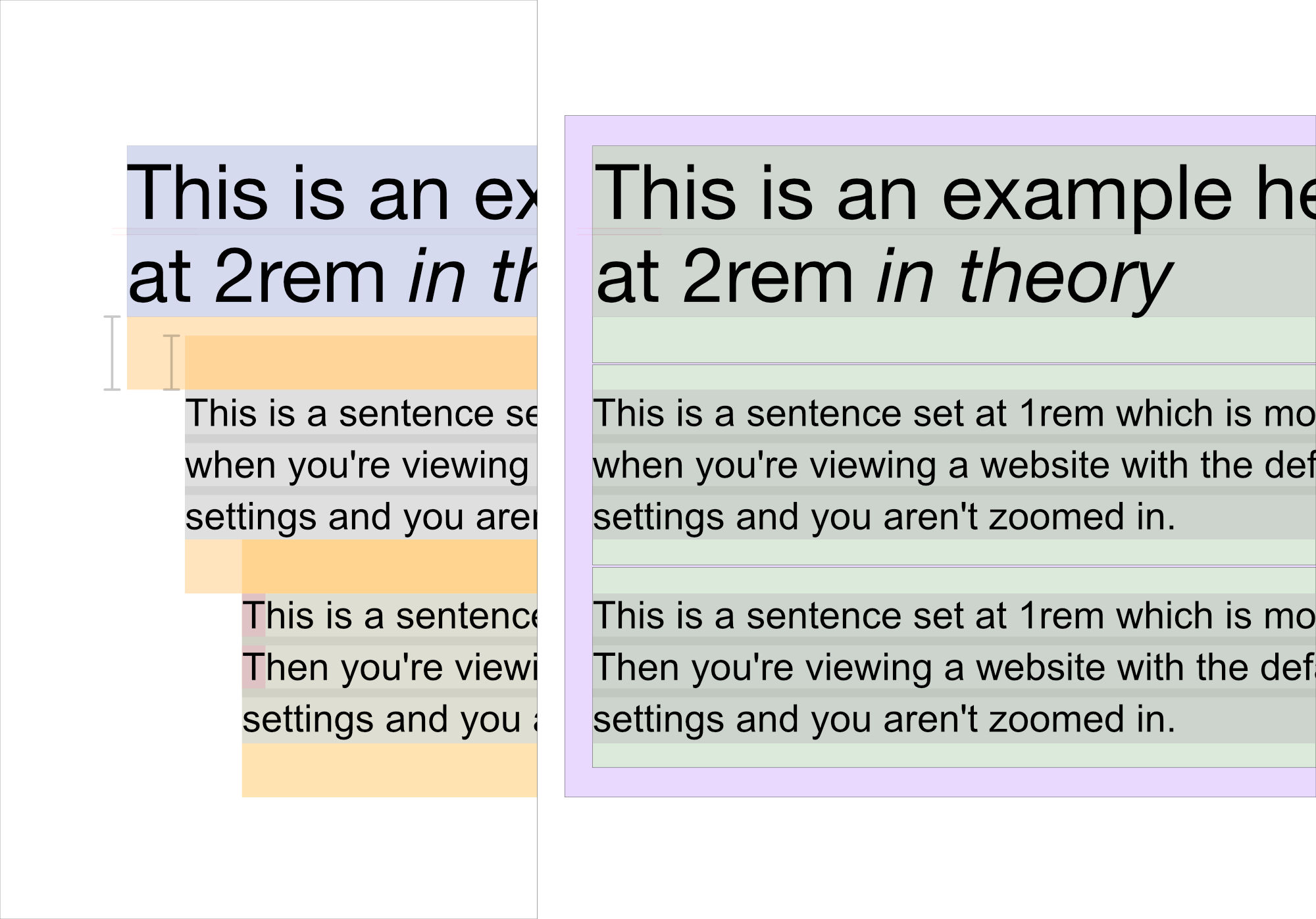
And if you got rid of the default “collapsing” margins, you could put an explicit margin-top on each downstream element instead. This would keep it nice and clear what should be happening.
This is what has worked well for us! Give it a try and report back.
See the Pen NWVxwLW by perpetual.education (@perpetual-education) on CodePen.
See the Pen wvbMpaK by perpetual.education (@perpetual-education) on CodePen.
Watch a real-life adult professional programmer admit they don't understand basic CSS
You can watch Theo have a mini breakdown trying to understand margins.
We’ve never had to really think about this… so, clearly – something is wrong with how people are learning CSS.
The bar is low. If you can understand this… you might know more than most developers already.