Border radius and padding WTF
This is in the works! Would you like to help flesh it out? Let's do it!
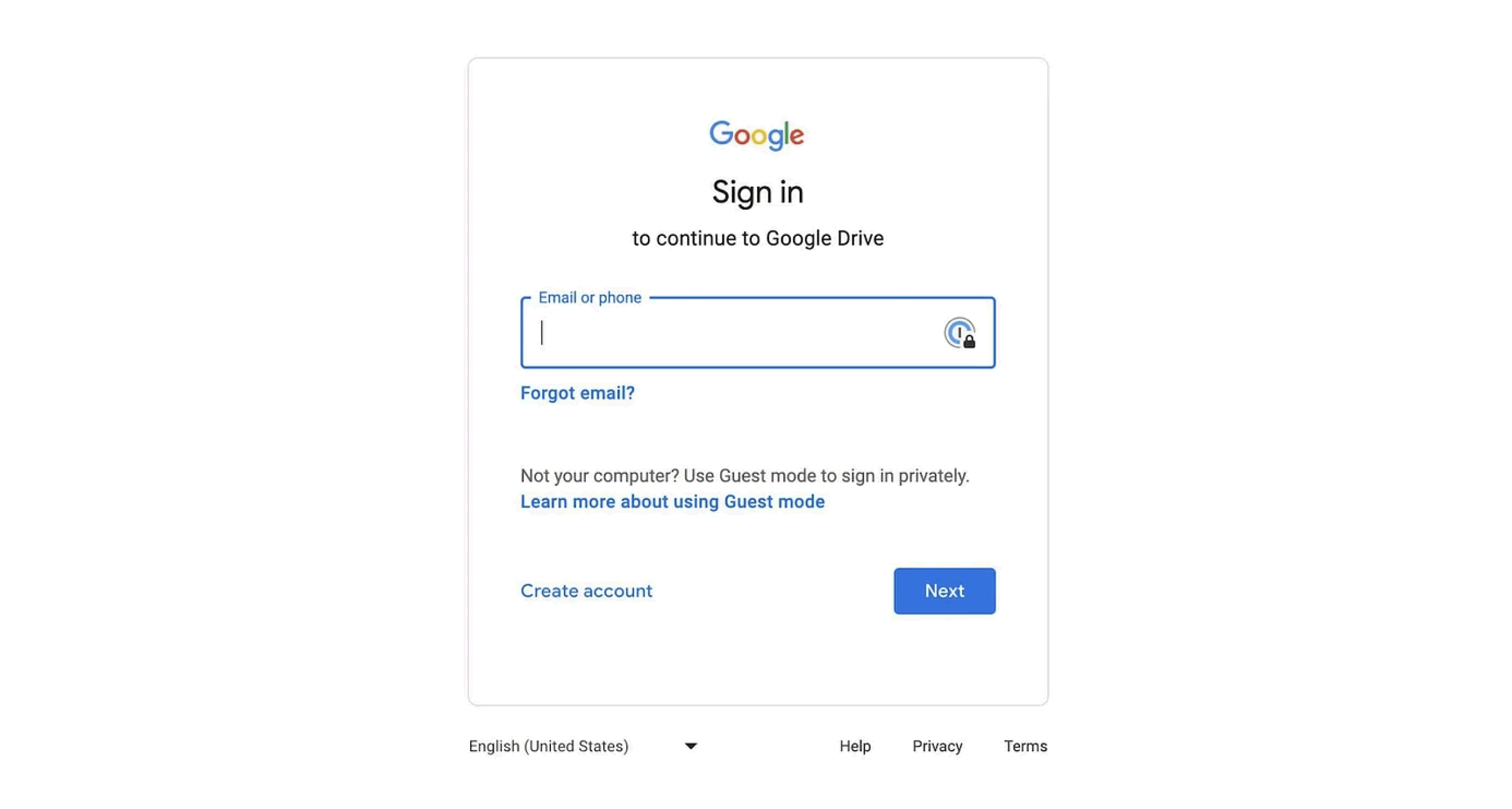
Oh, Google … what are we going to do about this.

What do you see here?
We don’t make the rules.
But we do seem to have some line here. Is it taste? Is it cultural? Or is it a crime against nature? Let’s investigate.
What are the default/go-to things people do?
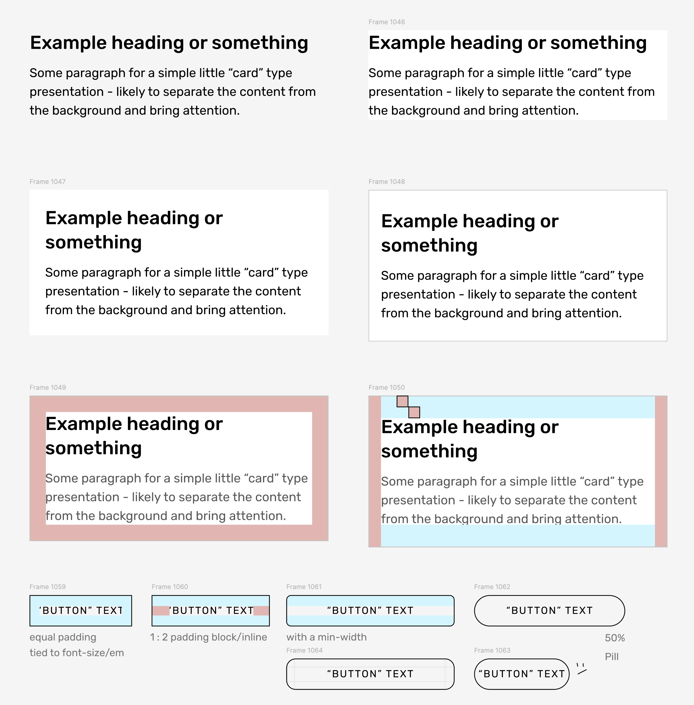
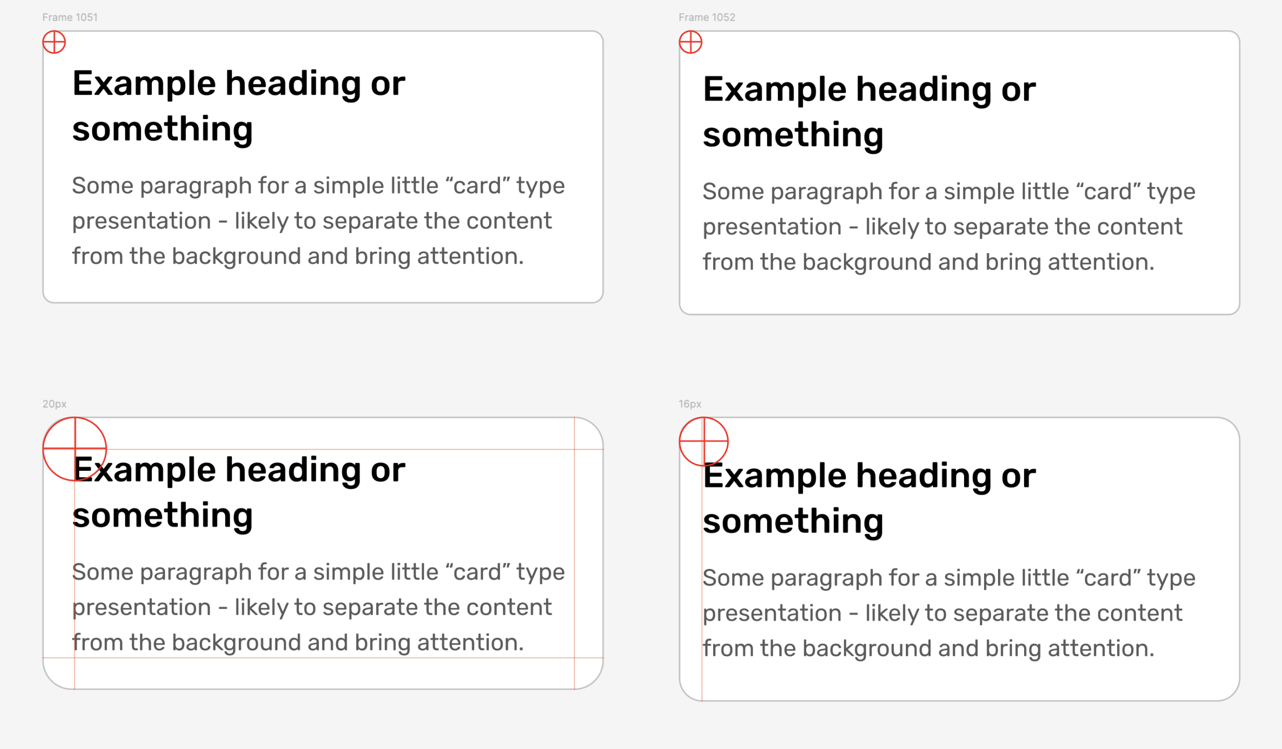
Put simply… people like things that are “Even.” So, putting an equal amount of padding around things in a situation like this — is a pretty good place to start. You could choose a distance based on a consistant number you use everywhere (like 20px or something) – or you could derive it from the font-size and keep it relative. It depends on the situation. But that’s a default (note that the tools; HTML, Figma etc. will have their own quirks and ways of handling line-height that will involve some optical adjustments too).
So, equal all the way around — and then also very common is something like double on top – or in the case of buttons, it’s common to have double whatever is on the top – on the sides. Pretty simple stuff? But also, there are people who have never thought about it (even working visual designers). Does this look nice because it’s “right?” or just because we’re used to it? Or because it’s just the most readable that way? We’re used to books and magazine articles and web pages and school papers and office memos. Most of them have room on the sides so the letters don’t smash up against the edges (and for your hands), room on top to give some breathing space to get aquatinted, and then usually a slightly bigger area at the bottom so the copy rests a little above center on the page (because our eyes seem to like that and we wan to be happy). If you’re in DFTW – they’ll you’ll know all about the history for how pages throughout history were designed and why (to avoid the Devil, of course).
So, if you don’t know what to do, ^ that’s a good default until you start to have some reasons to do something different (and do you really need a “card” anyway?).
Just take a look at each of these and have your feelings.

Which ones feel which ways and why?
Some people will say that “Round means fun and square means serious.” But what do YOU think?
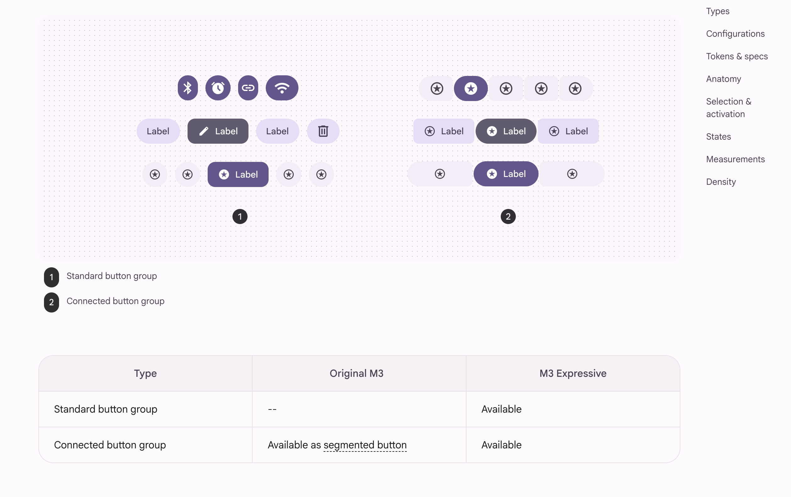
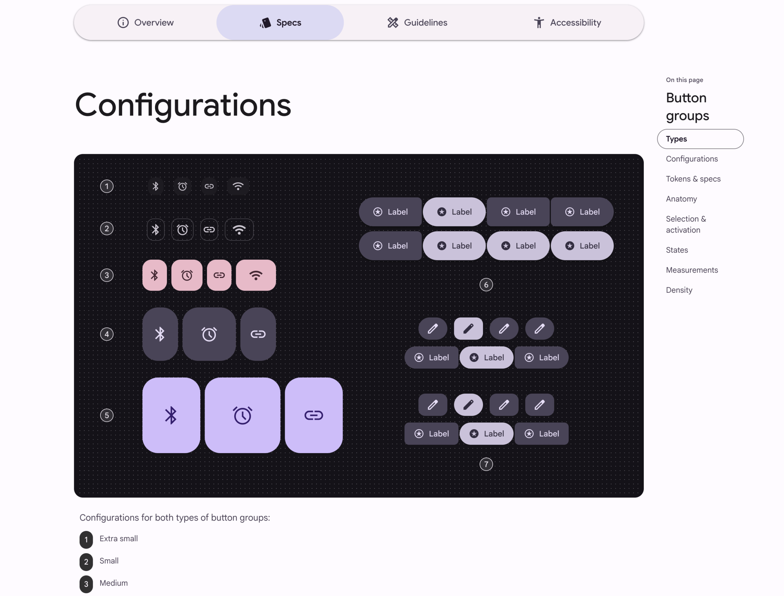
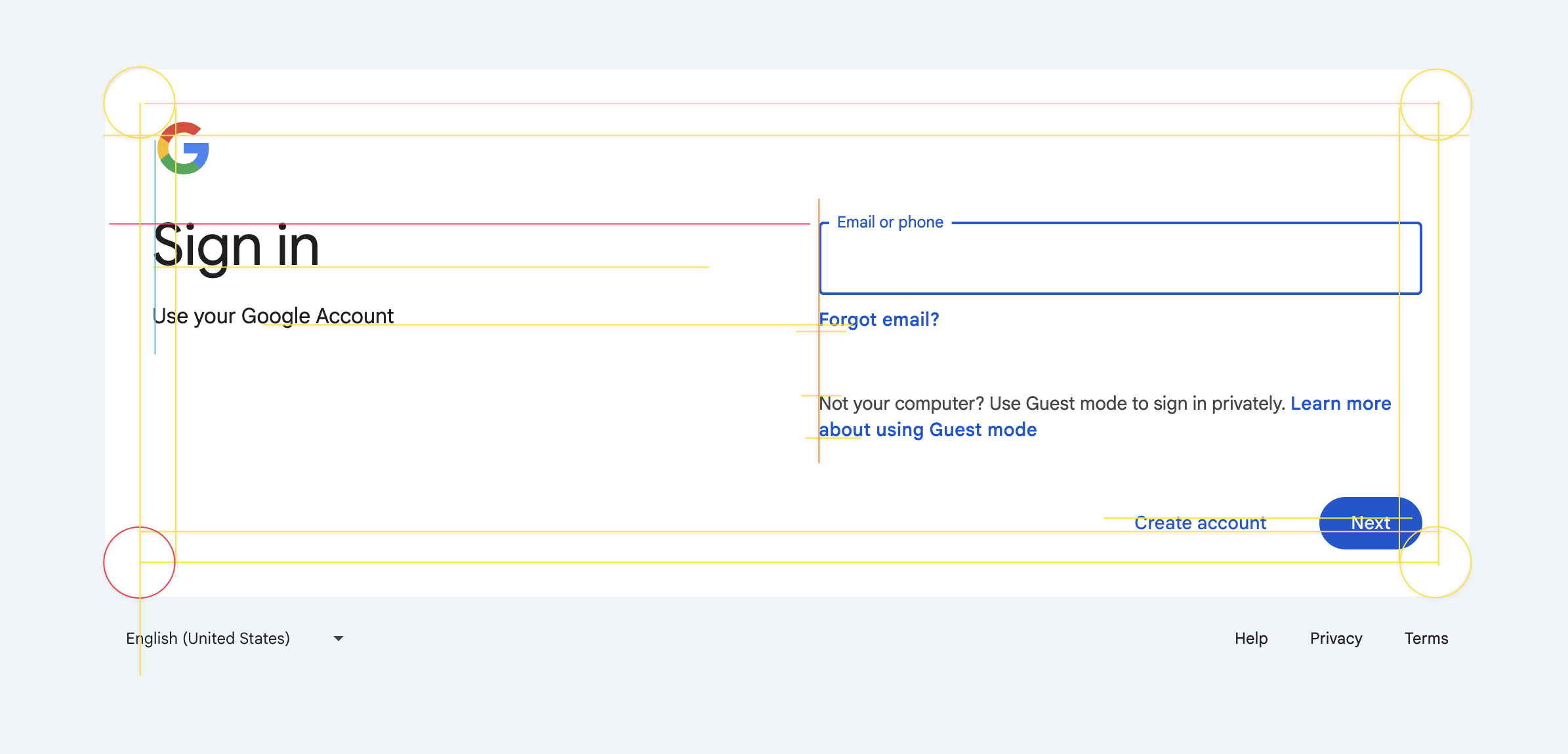
Here’s our attempt to explore an see what spaces and shapes are relating to each other.
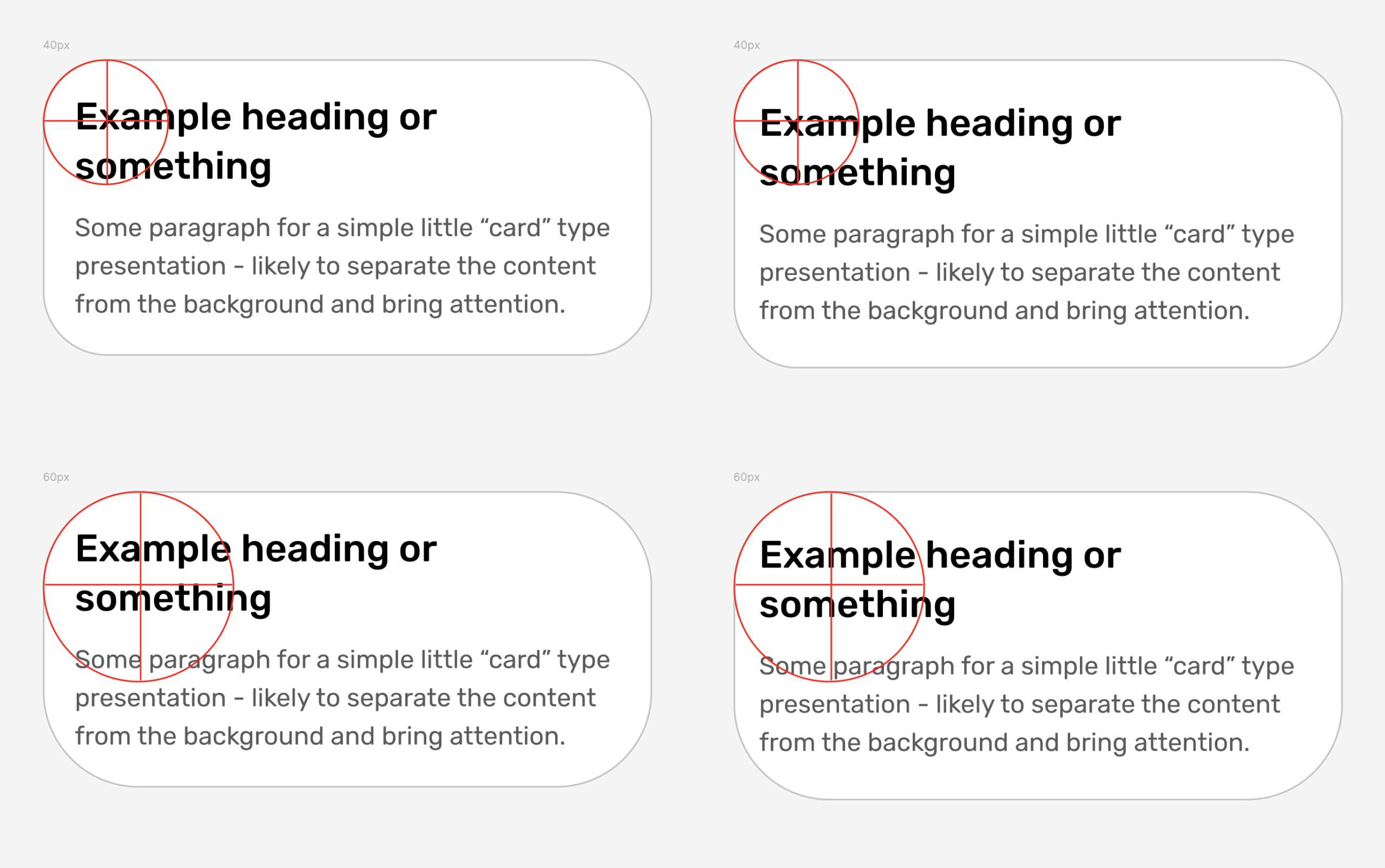
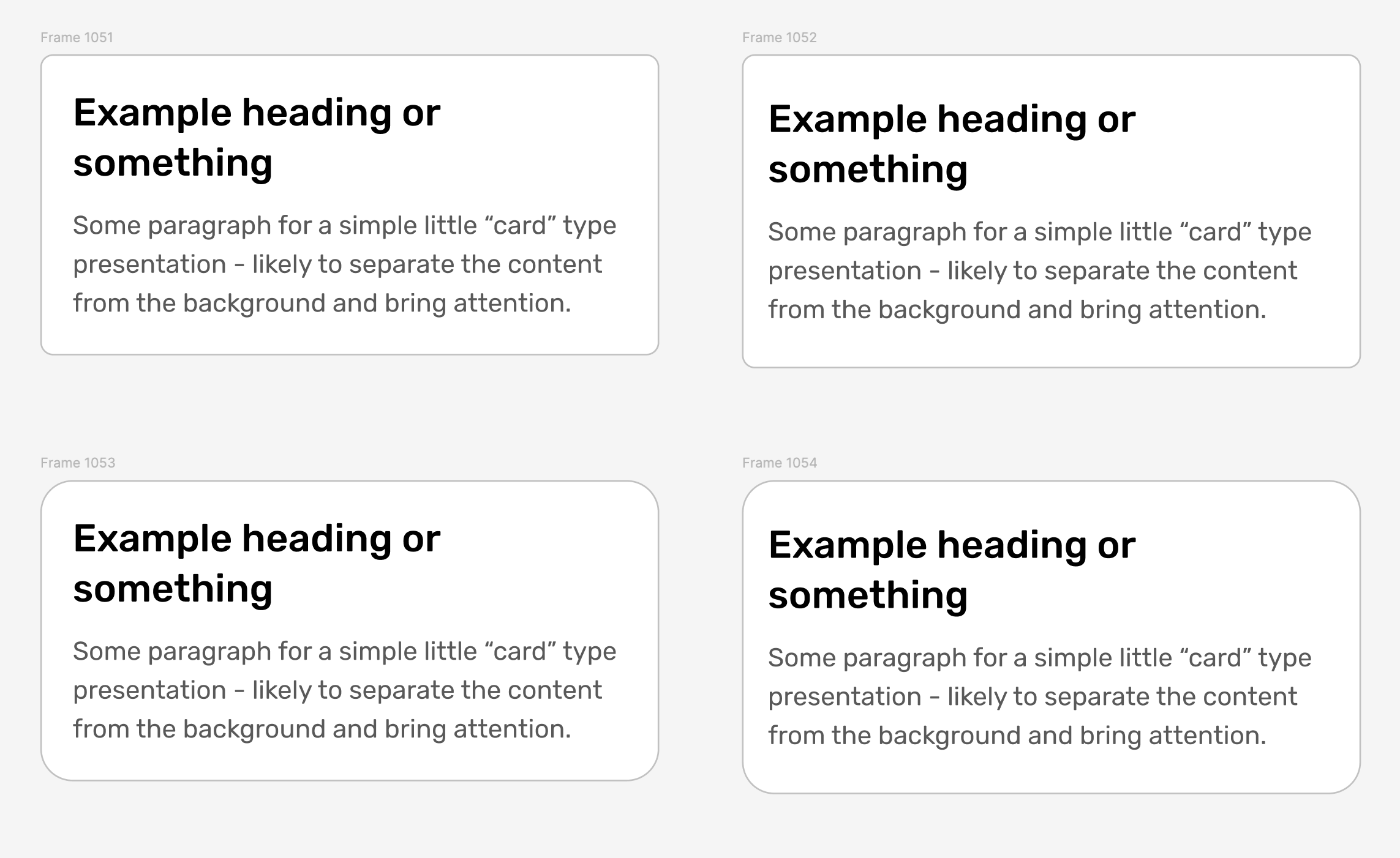
So, we’ll just be honest: We don’t like these. But why? Just because? Are they breaking a rule? What exactly is “wrong” with it (if anything)? Should the radius of the circle always be arbitrarily saved as a safe padding area no matter what?
Just on the surface, it feels accidental. It’s like the CSS is wrong… or there’s a max-height and the text is going to get cut off. It seems like an accident / or something created by a novice. But why?
And the conclusion we’ve come to – is that it must have to do with the arbitrary radius of the corner. What is it tied to? Not the font-size. Not the padding on the top or bottom or sides. It doesn’t follow any rule — but it also does’t really follow anything. It’s unaware that it could be in some type of harmony. And if you want really dig in and break all the rules — go for it / but we bet during that exercise – you’ll actually end up creating more harmony because you’ll be doing it on purpose.
What do you think? Is the “normal” way boring? Might some people be making these rando corners choices to be different? Does it matter? Does it effect usability and readability? Does it change your level of trust in the product/system/company?
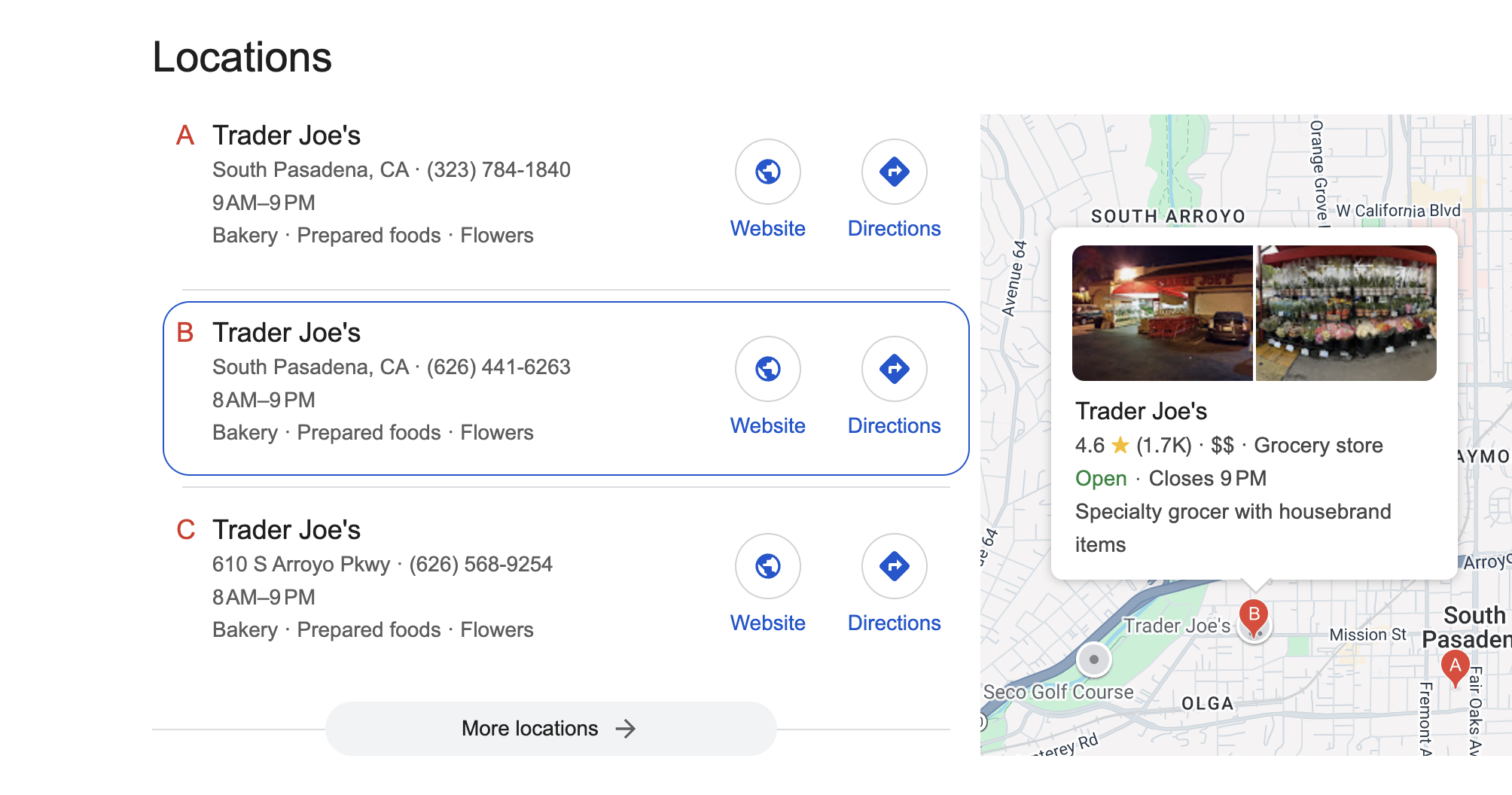
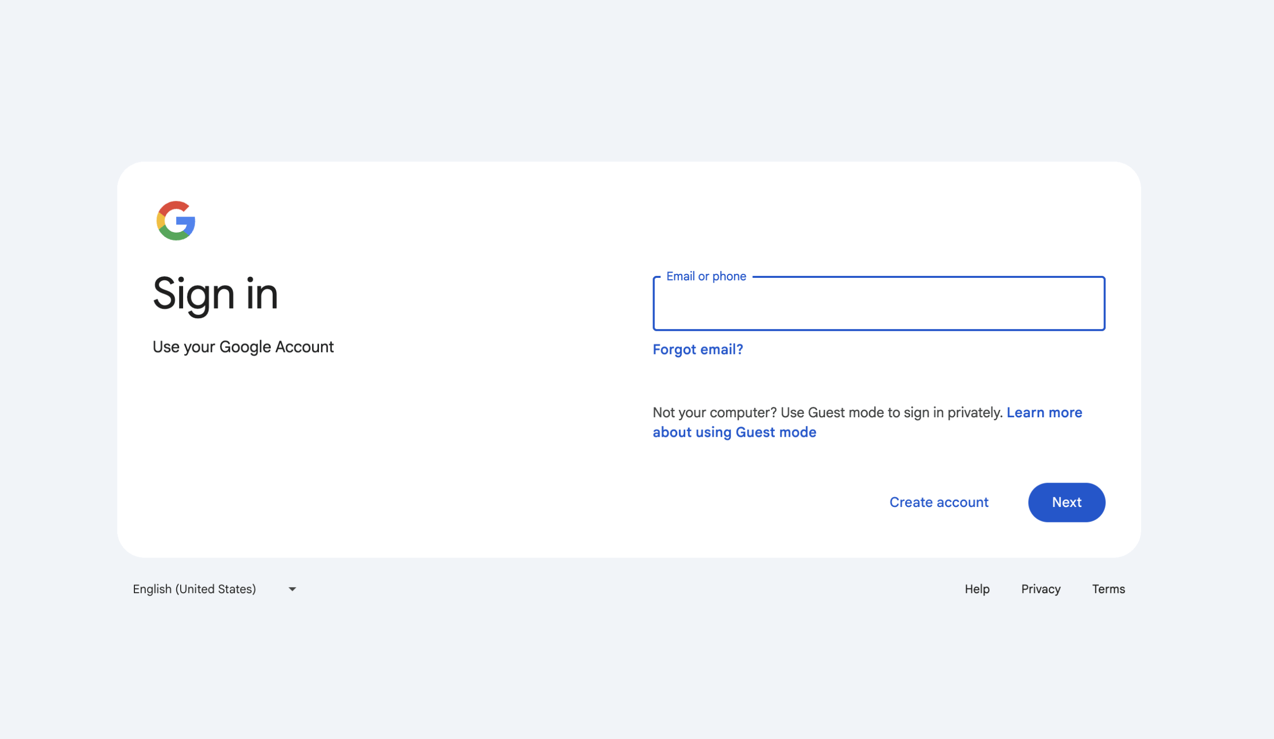
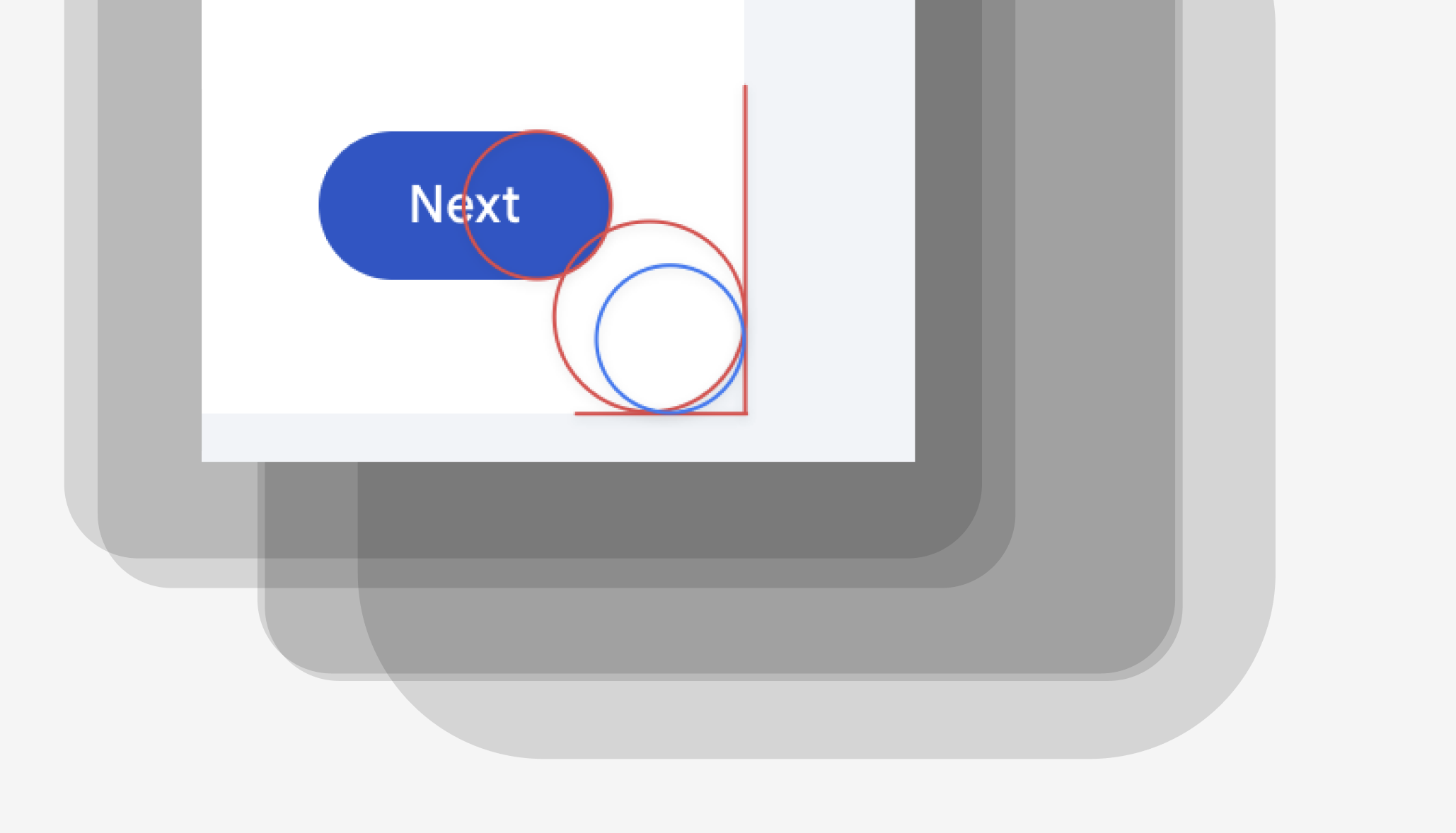
Google recently had some pretty edge UI things come out (notably a new login area with some pill-shapes the were butted up next to each other like these two buttons) that felt wrong. This stuff is hard. Creating a system that has character, is fully accessible, does it job, and all that is really hard. Even Google and its hundreds of expert designers have a tough time balancing usability and whatever it is they are trying to do that makes things weird and often unusable.
The strange login buttons...
We haven’t been able to find this again… so, if you know what we’re talking about — let us know.
Some strange decisions here. But at least it doesn’t have wildly huge corners that don’t relate to any other choices on the screen.
Have you found some “weird corners” out there in the wild!?
Sent the examples to us!! (thanks)
And then nesting corners is a whole other can of worms…

New macOS in 2025? What?
Linus Ekenstam via X