Personal site “PRO” (layout)
Lesson Intro
OK OK. We’ll finally talk about doing the official “Graphic Designer” grid guides.
And it’s fun because it gives you structure and a selection of choices to slot your little chunks of content into.
Part 1
Try ALL the options
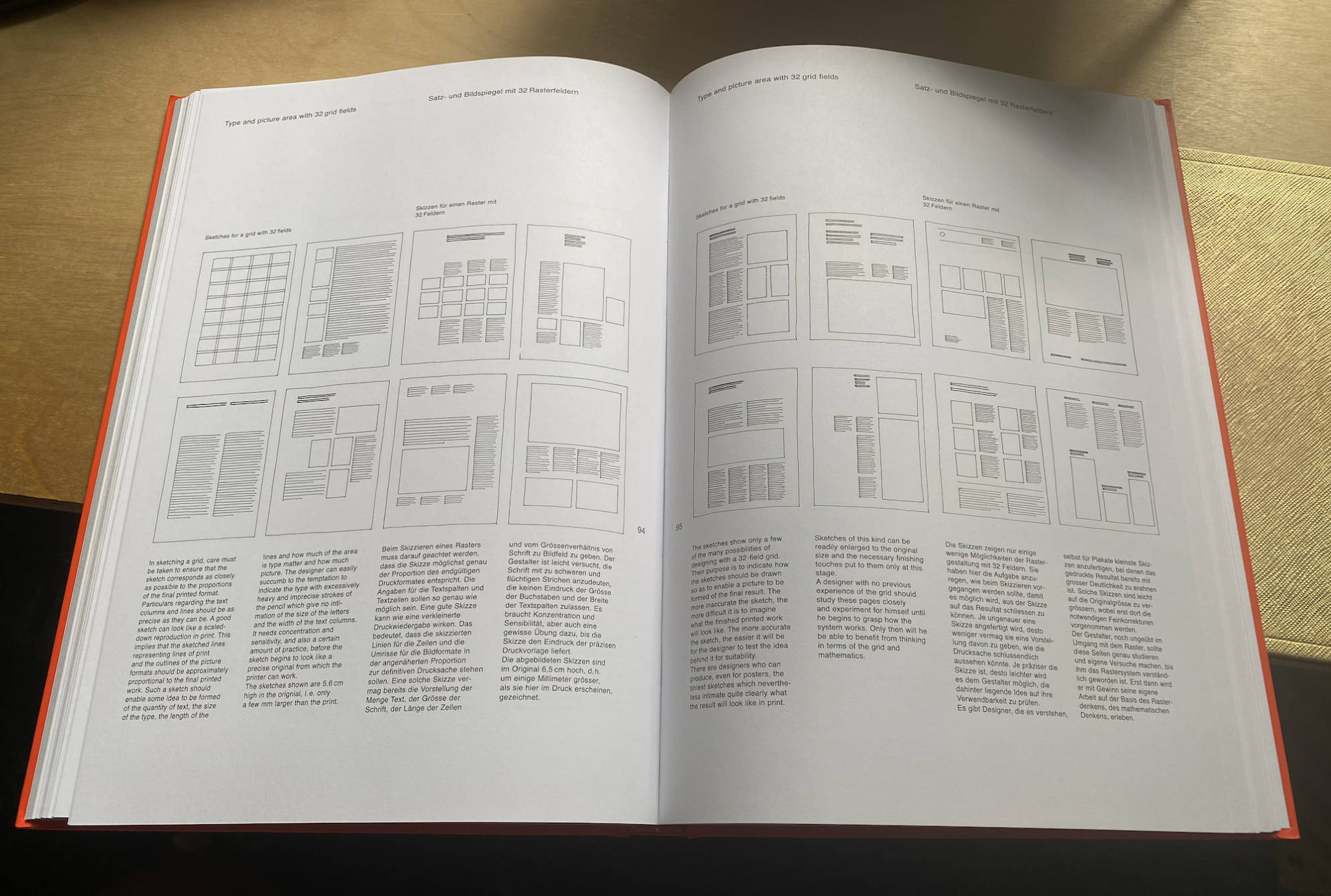
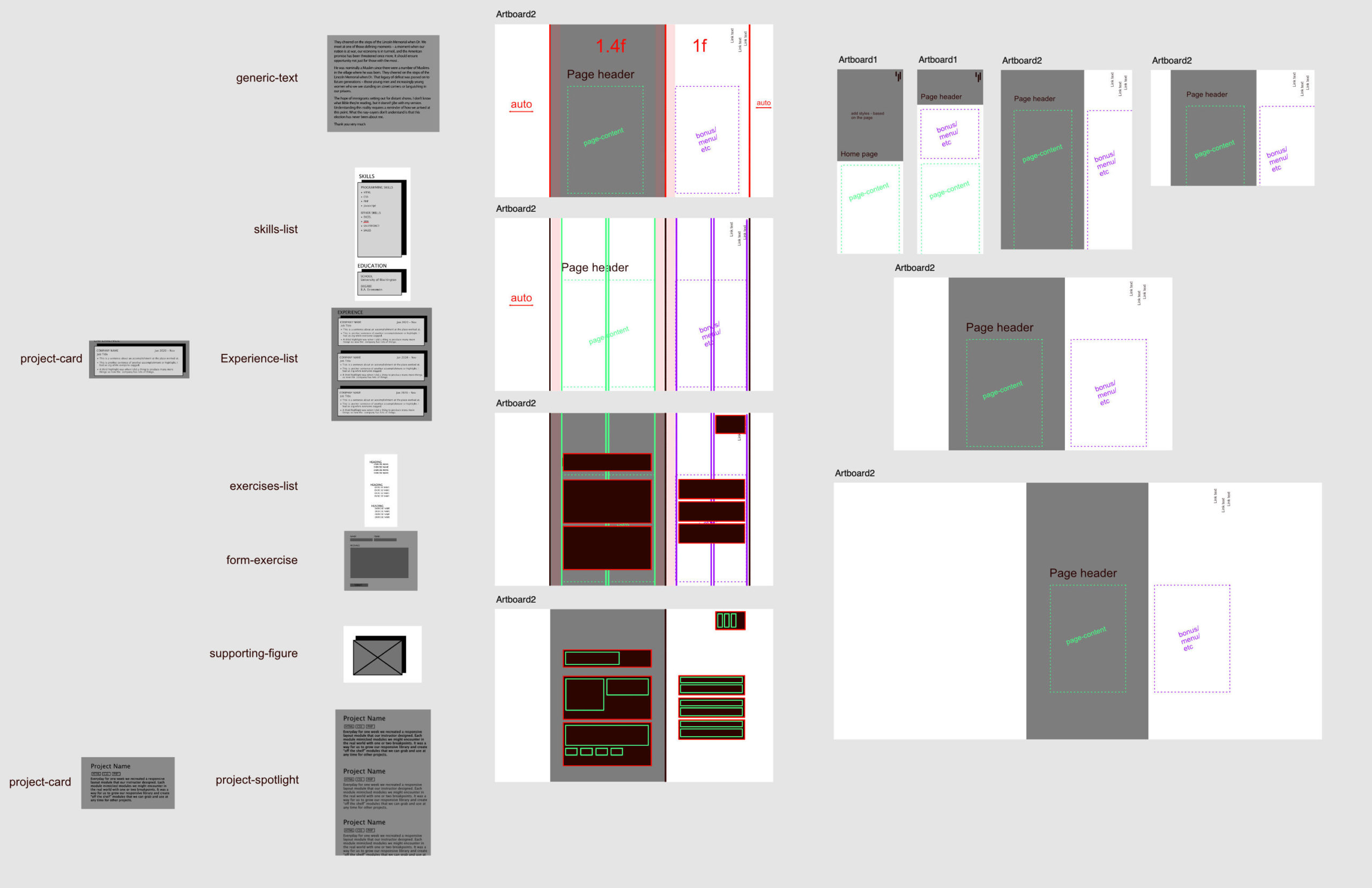
This is a grid of 4 equal columns. The designer will usually have a set amount of text that is already written for the page. That will be a natural constraint. But the number of pictures and the way things are placed or the font size and line lengths are up to the designer to figure out.
You might try hundreds of combinations before you find some that you like (or that work). And even then, they might not work together for the different sections of your webpage.
Try and design from a bird’s-eye view that encompasses all of the pages and modules. There are only so many places where the content will fit in the larger cohesive puzzle. It’s not your job to magically “be creative,” it’s your job to find those places.
You’ve got to start somewhere
So just – start.
Try a bunch of things. Meet up with an instructor and get weird. It’ll be OK 😉
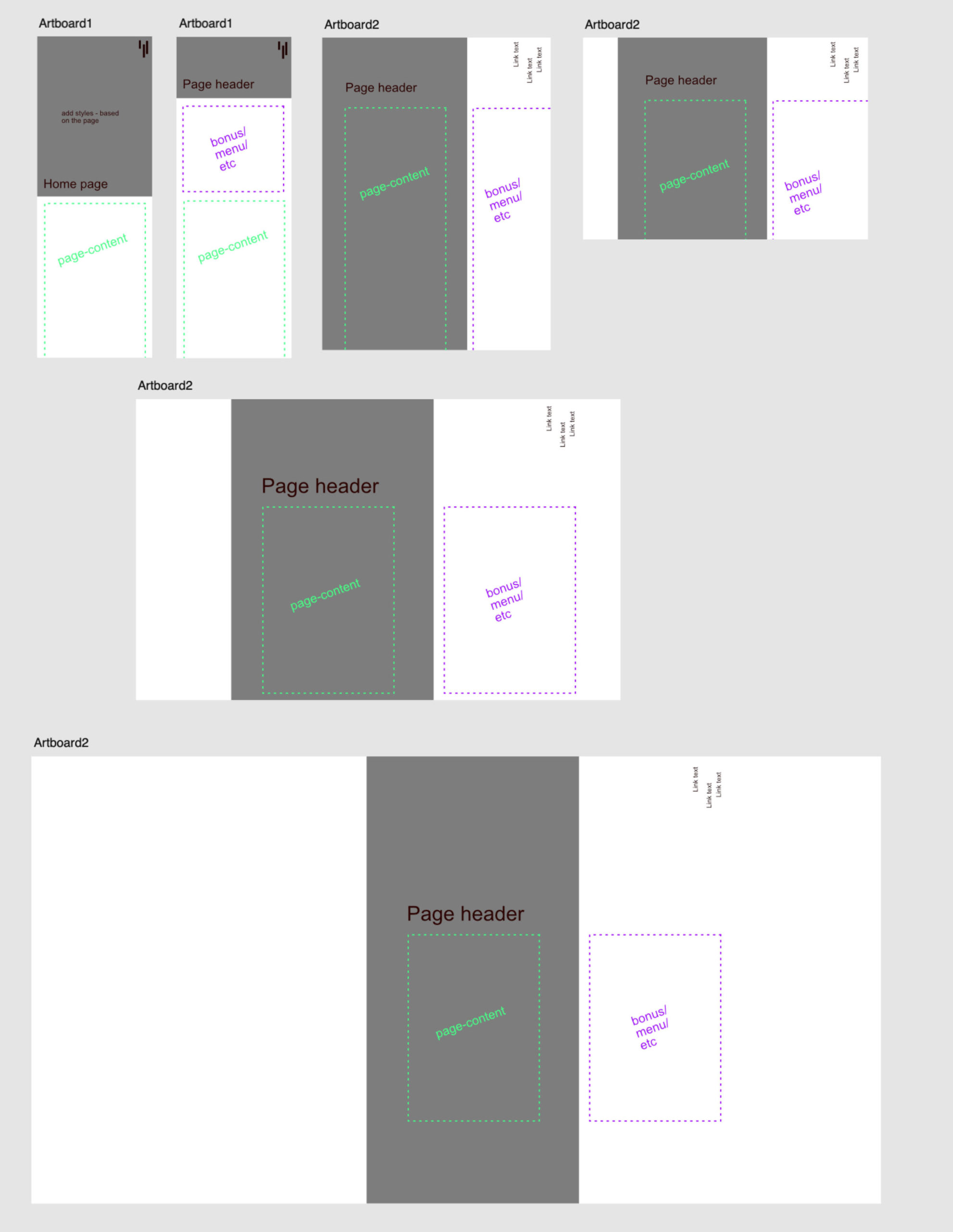
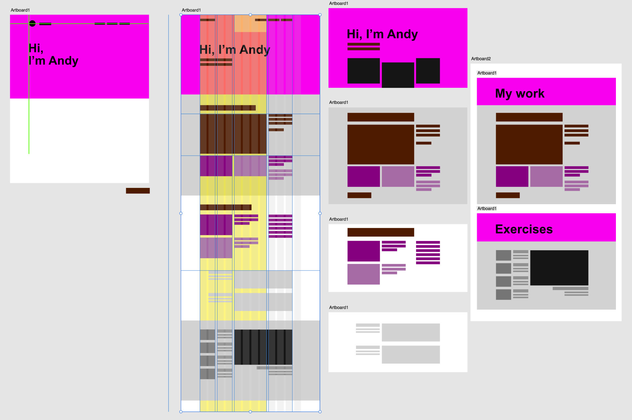
But – we also want you to have an idea of what we expect you’ll end up with over today and tomorrow. So, here are some past student examples.
Ivy says:
To see these images bigger, right-click and open them each in a new tab 😉
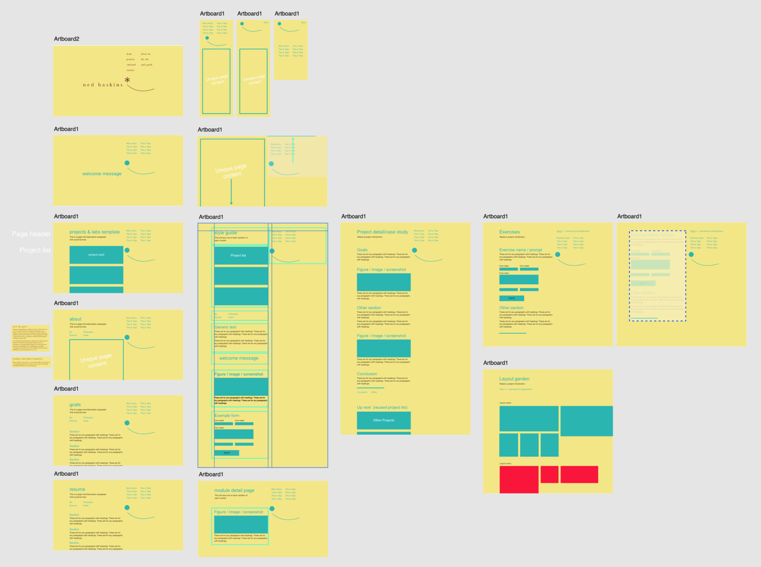
Just the basics
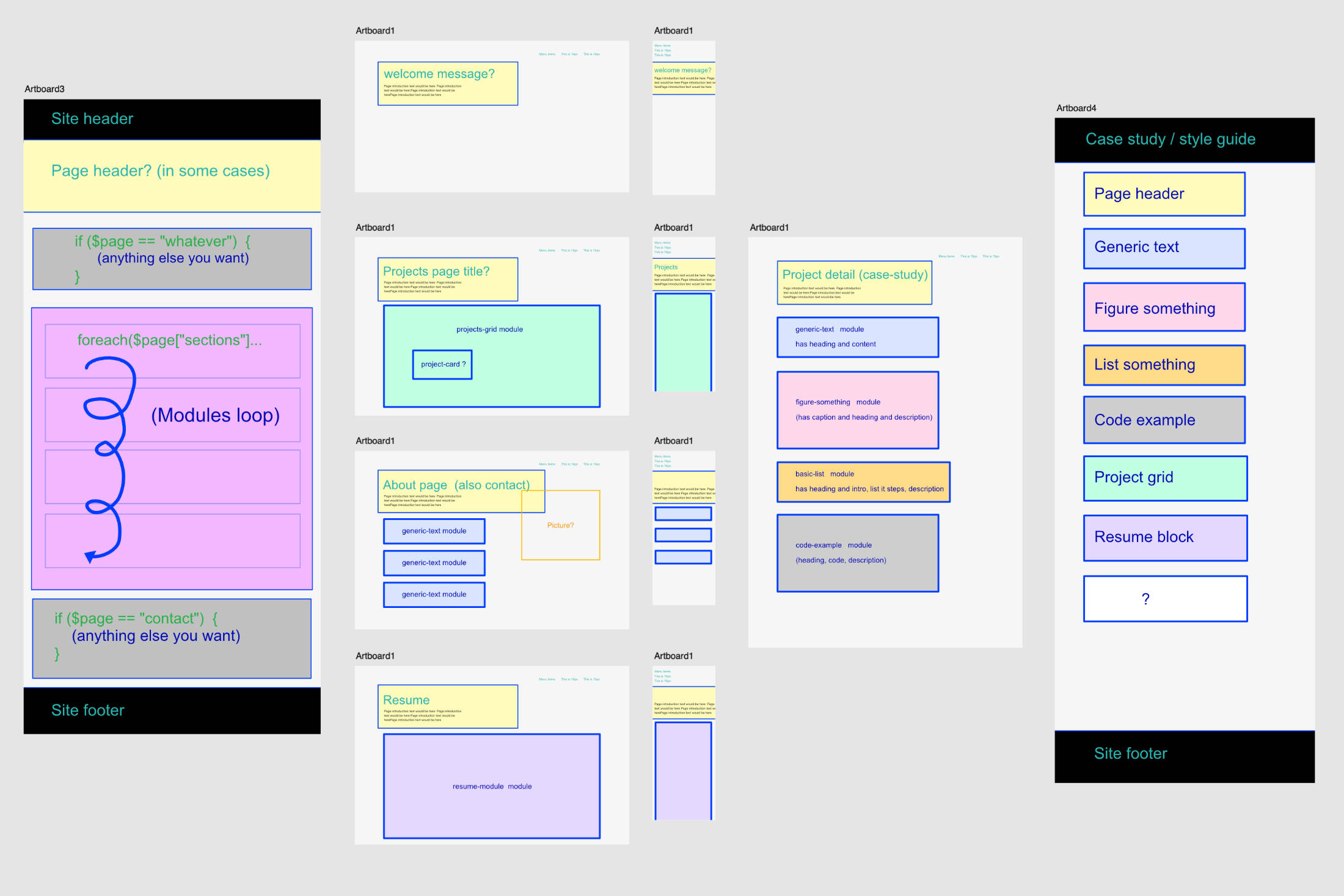
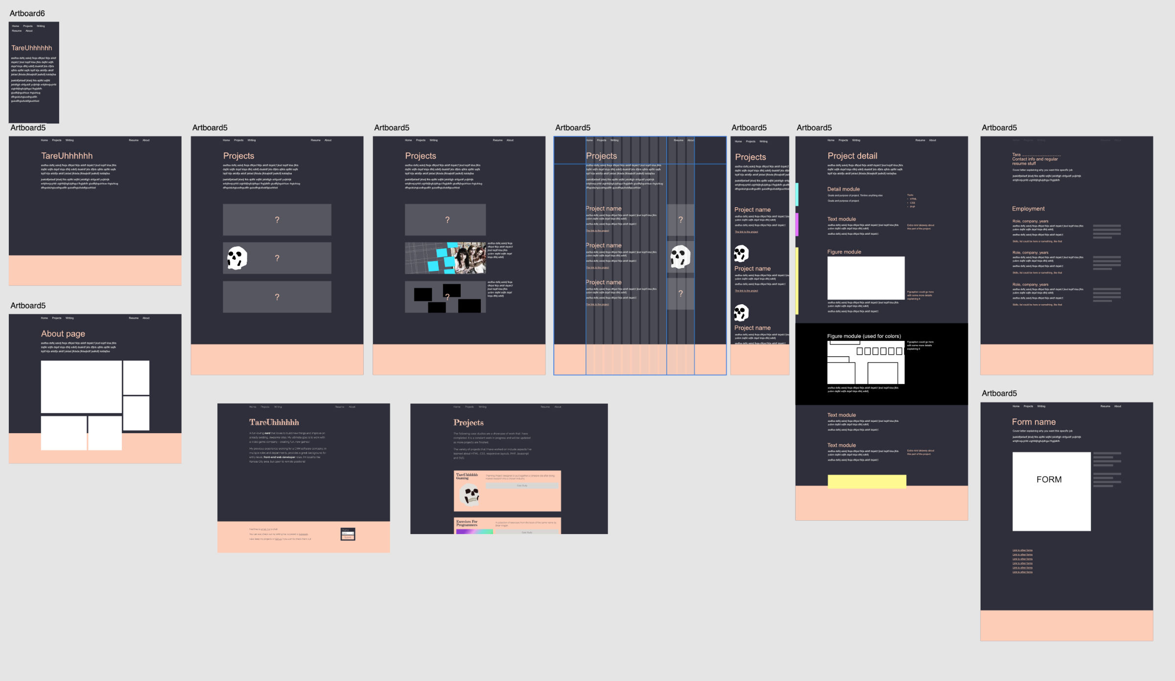
If you don’t have any layout ideas right out the gate, just map out how the site works as far as modules go.
There’s some data, and based on that, it includes the right modules. All those modules have to work together in a cohesive visual style. Some modules might need different space depending on which module they’re next to (just like typography headings and paragraphs and lists)
As silly as it might feel...
You need to figure out what you want, and to help you with that also figure out what you don’t want.
If you don’t do this, then how will you measure if it’s successful? Spend the time to write it out.
If you already have a layout you like, you should still revisit the whole process and refine it
We’re all improving all the time, so it’s important that you don’t get too attached. Take a step back and walk through the process with fresh eyes.
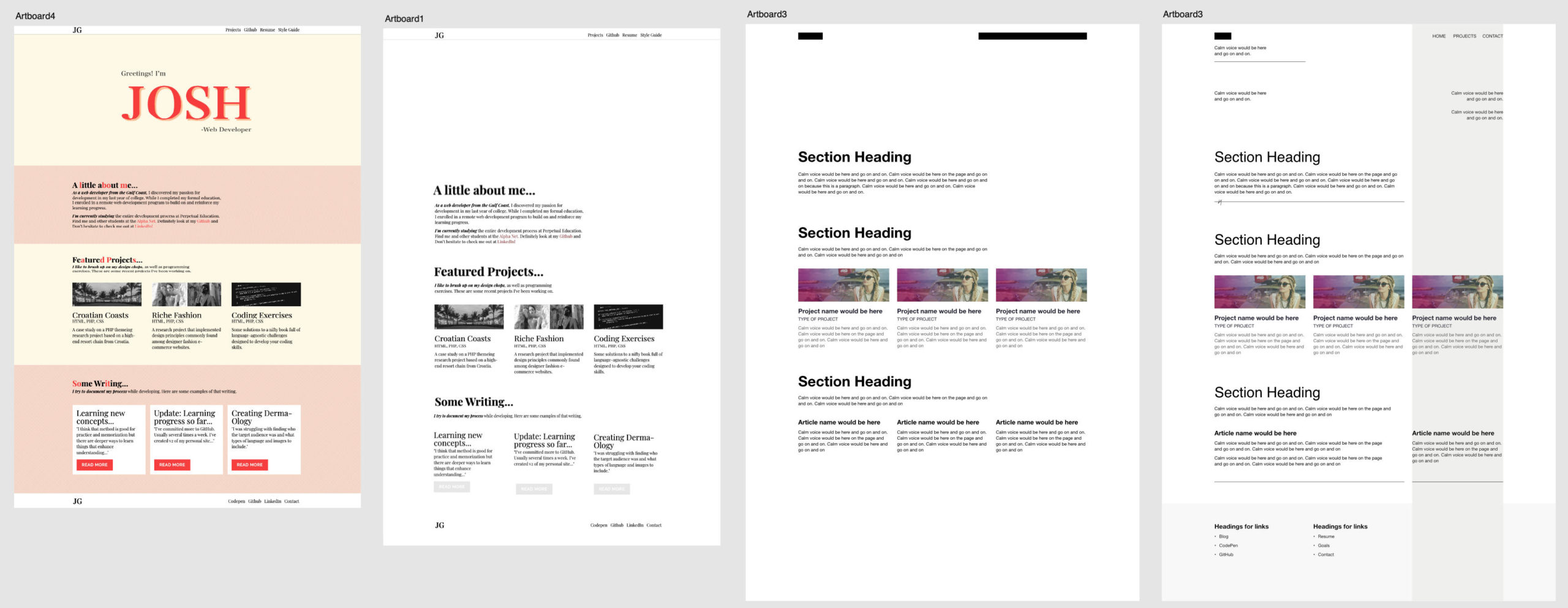
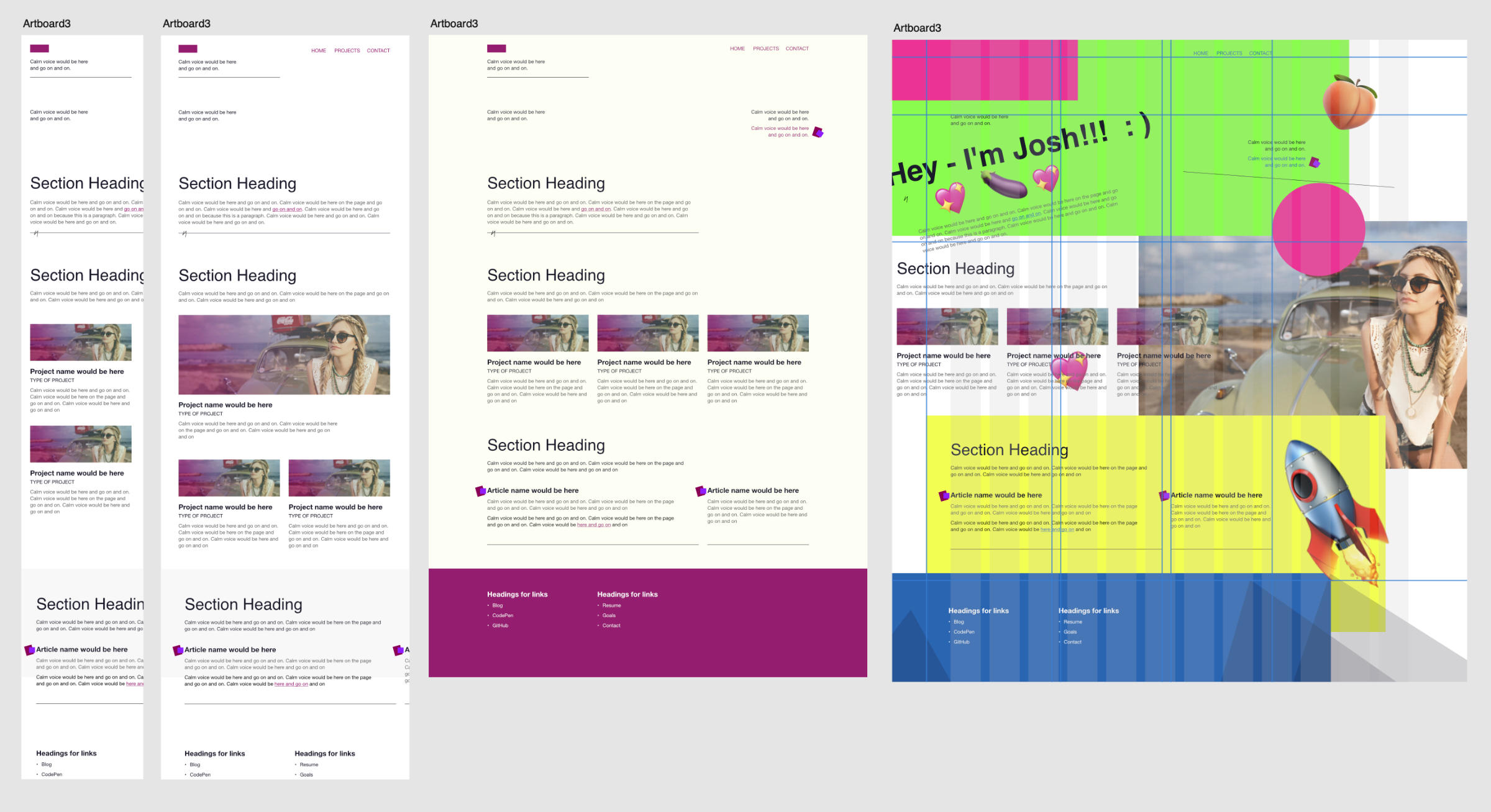
A base 12-by grid
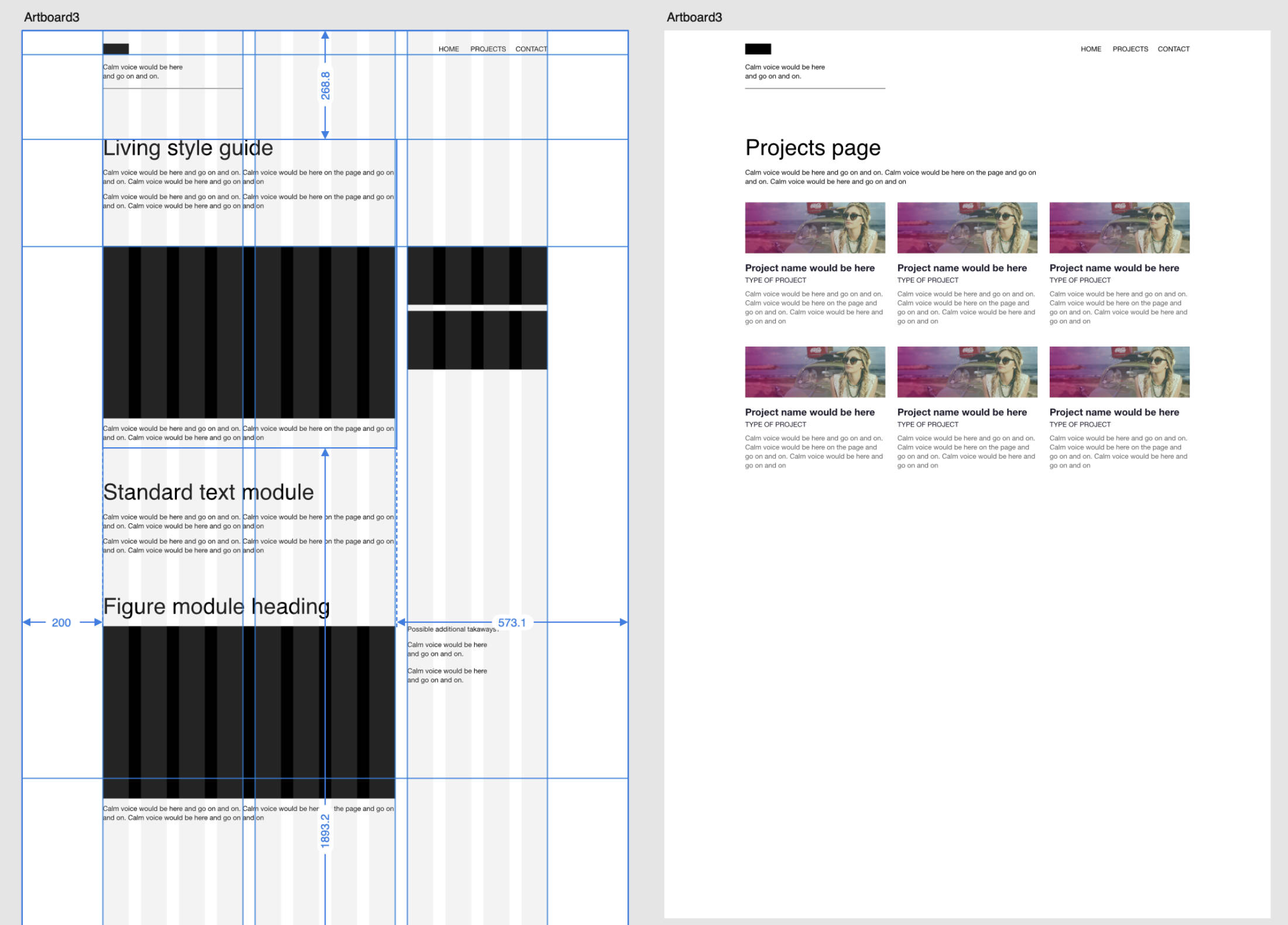
12 is common because it breaks into 12, 6, 4, 3, and 2.
In this case, it reveals a nice use-case for 2/3rds and 1/3rd on larger screens – but also a 3x grid for project cards.
It can be simple as long as it's consistent and works for all pages
Don’t be afraid to keep it simple and align everything to the left. That’s what books do, and it’s working out great.
Plan on making A LOT of explorations
You’ll have to make lots of layouts that don’t work to find the ones that work pretty well. And then some more. And then some more.
Let the content lead the way
You know that you NEED a certain amount of content to tell the story clearly.
The content will only fit in so many ways. So, design a system to hold it. This phase is not about the actual content. You already have that established.
There are some technical details to work out
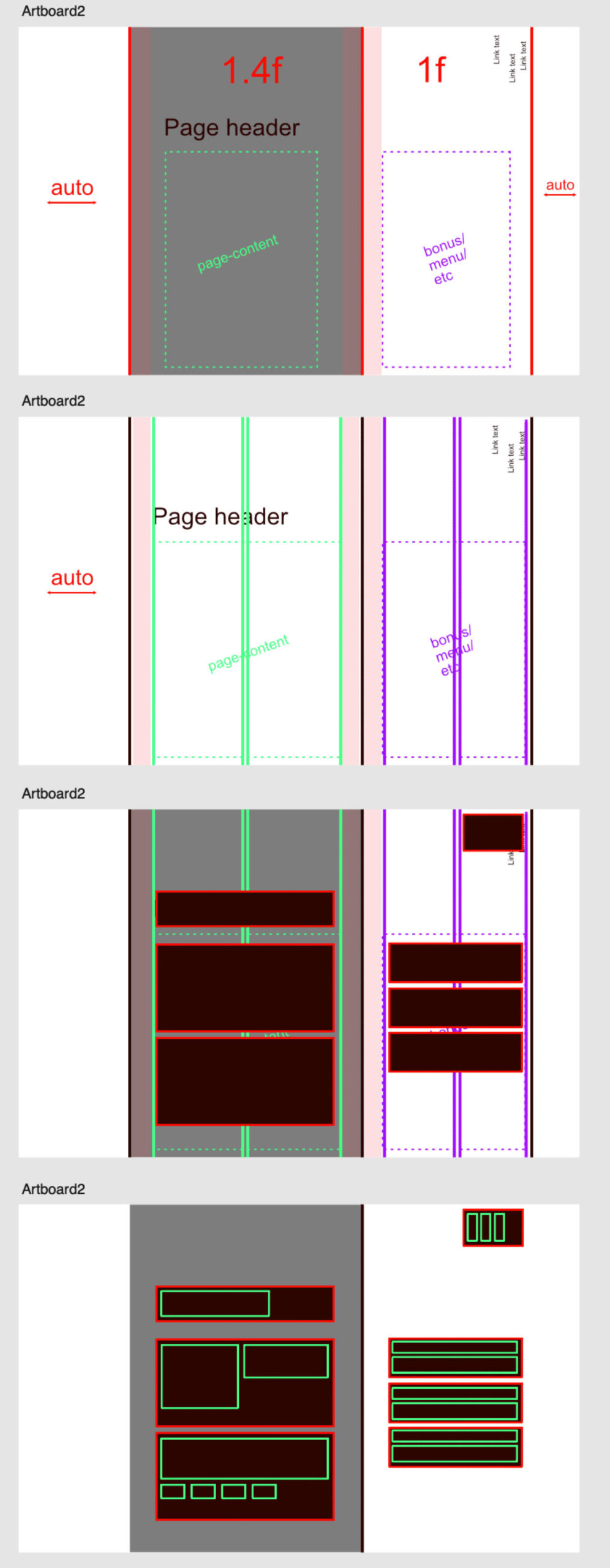
In this case / there are 2 independent areas for content. how is it going to work? Figure it out before you start mashing keys in the dark.
All screen size and on all pages
Your layout system is more complex than a graphic design book. It has to work on many different screen sizes and ratios. So, don’t design something that doesn’t work.
If you have a lot of content - then there will be places to put it!
The grid can feel scary or controlling or stiff or loose – or liberating. It just depends on how you decide to look at it. By breaking things up – there are more and fewer choices.
Rules
If you decide to choose a unique layout with some rules, then great! But you’ll have to decide what they are and follow them.
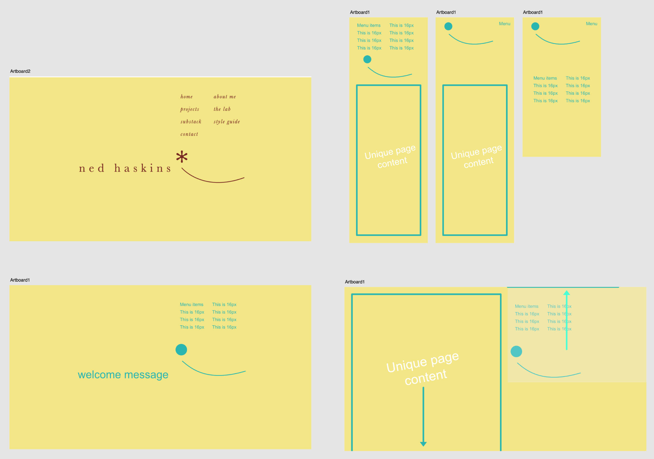
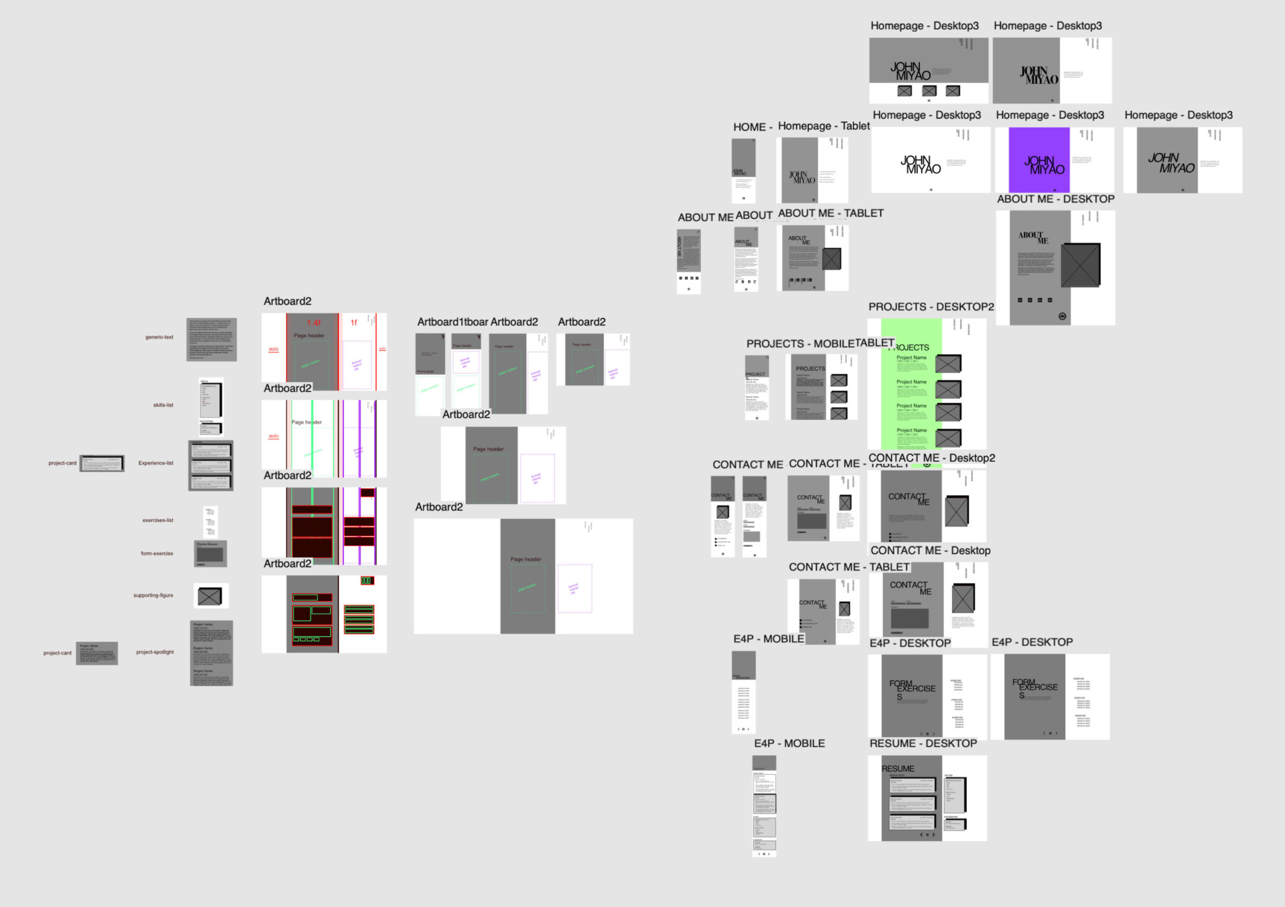
In this situation, the right side is sticky on the top (on desktop), and only the left side of the page appears to scroll.
(also note that we didn’t use the real fonts or necessarily the real colors / so don’t be too detailed)
Don't be afraid to get weird.
Just because it’s a grid – doesn’t mean you can go wild. It’s actually just going to help you do that.
Derek made all of the above while casually talking with students
If you’re stuck – or just want someone else to work through it with you – or straight up just figure it all out for you, that’s totally cool. In fact, we’d say it’s pretty standard.
So don’t be shy. Just hop on a call with Derek or a group and start experimenting. Design is a group effort.
You might have many many iterations
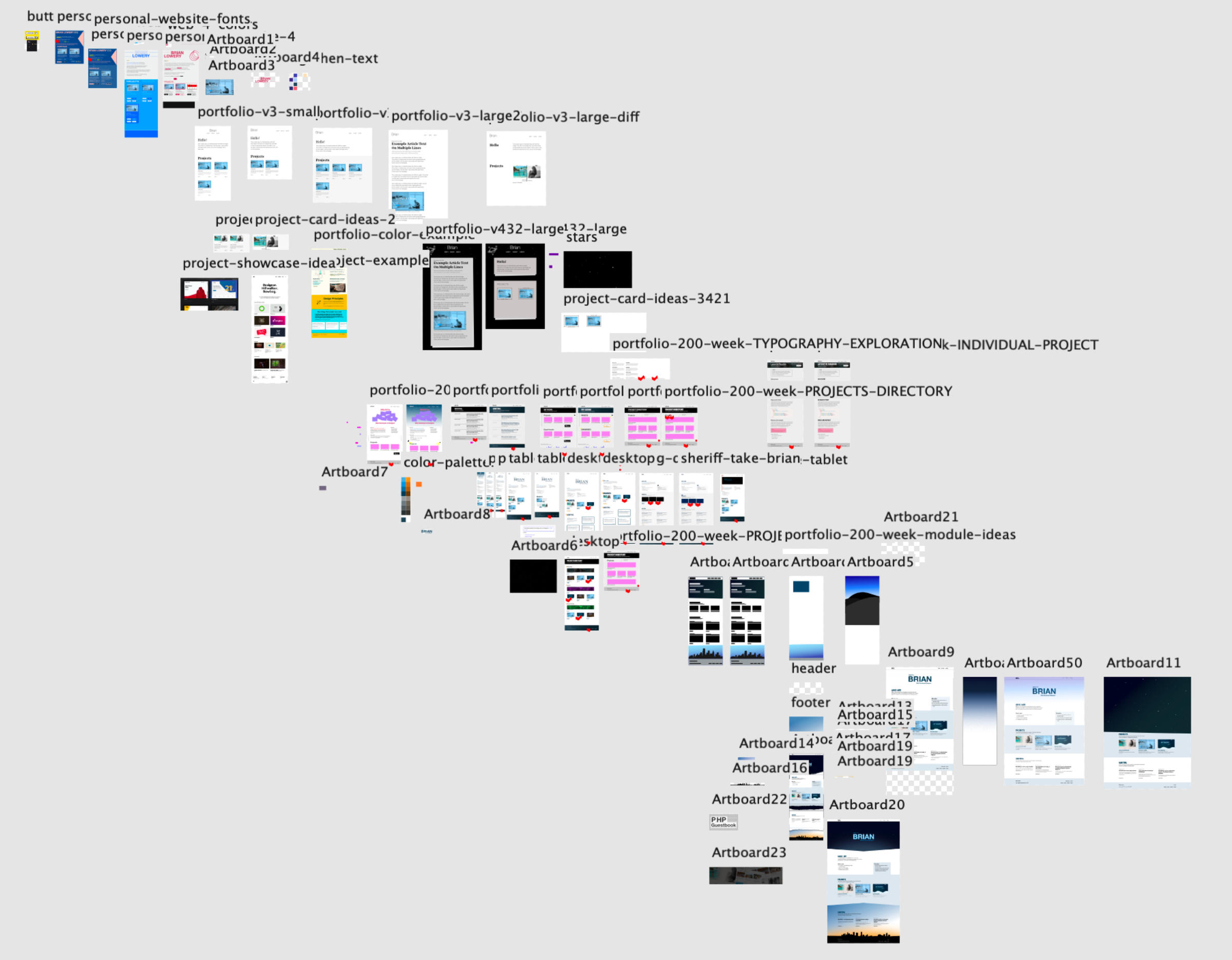
This is about practicing the process. Don’t expect a masterpiece your first or second or third time. 😉
Make sure you stick with the layout-level design. You can focus on the visual-design layer later.