Derek tries to recreate those SuperHi graphics
Hi, there. You're not logged in. So, you must be a visitor. Welcome!
What is this? You are viewing one of our supplemental "Stories." In addition to our core design curriculum, we are constantly building out additional resources. Stories are a collection of real work tasks, design history, UX explorations, and work-throughs. Stories are often off-the-cuff and less concerned with production value.
Introduction
Just tossing this here. We don’t know when or why we made this / and why it doesn’t exist on the site already…. (maybe it does) – but we can’t find it.
It also might not be edited? So – if you watch it, then let us know if it’s safe for work haha.
It also looks like it’s the wrong export ratio.
Part 1?
The home page / for reference
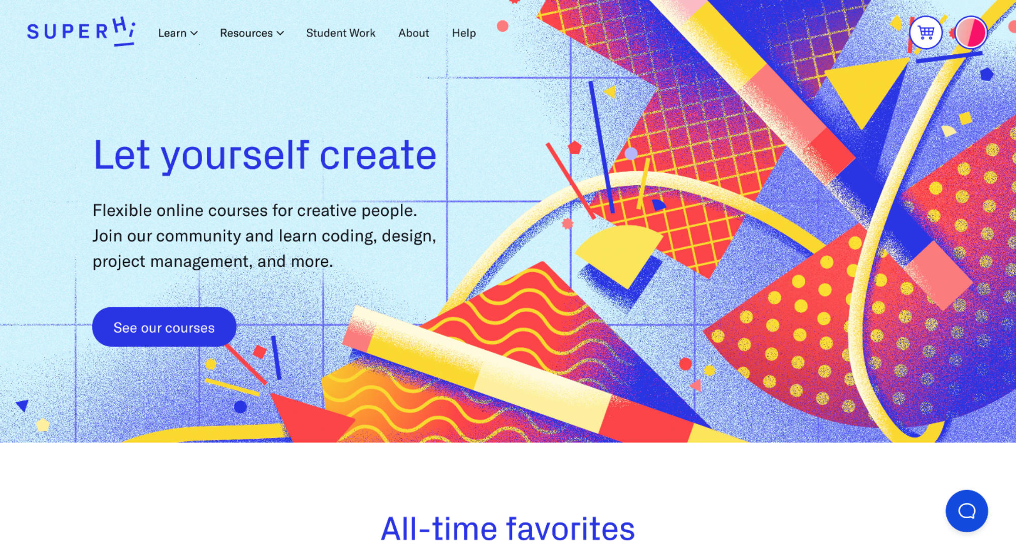
Surely they’ll change their homepage eventually. So, here’s a shot of it. It’s fun!
We really like their first years of design too. We’ll try and pull one up.
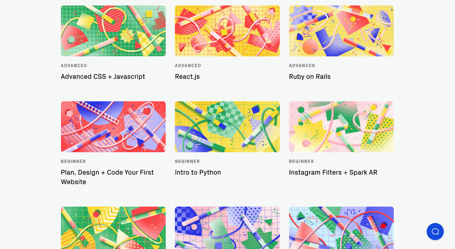
It’s a fun visual language. But – also, note these. Once you put it in thumbnails like this, it’s hard to tell what is what. Does anything have to do with Ruby or Python more than anything else? It’s almost like more visual information is making it more confusing.
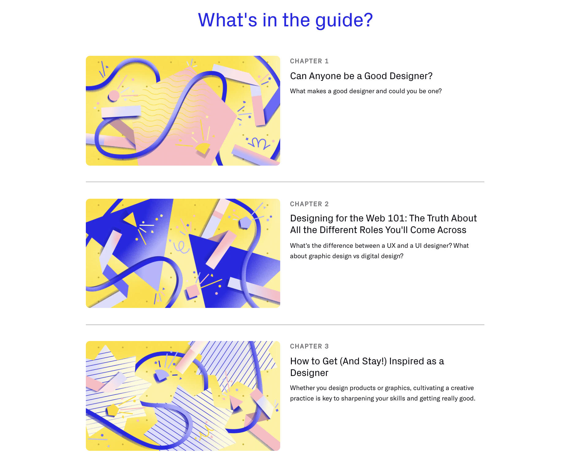
The people at SuperHi are all fun and talented and awesome (As far as I can tell) – and so, we’re not digging at them. But this is an unexpected outcome. Which is what?
Do these graphics relate to the content in any way? What would you do?