Layout Challenge: Simplification: Can it really be that simple?
Last updated: April 27, 2022
Introduction
Here ya go!
The main blocks & the 'sticky' footer
The footer isn’t “sticky” – and that is important to understand. What’s happening is that the boxes are flexible – and that one of them – is free (designated) to stretch/grow and flex itself to fill up the remaining space. This is the first step. 3 boxes – in a box.
Some borders to help
It’s hard to know what is happening – if you can’t clearly see what is happening.
The header
2 boxes in a box.
Welcome area
2 boxes in a box (but this time / with a break-point)
The About section
3 boxes in a box (and a break-point)
The things in the about section
2 boxes in a box (with many break-points)
But... what you really want is...

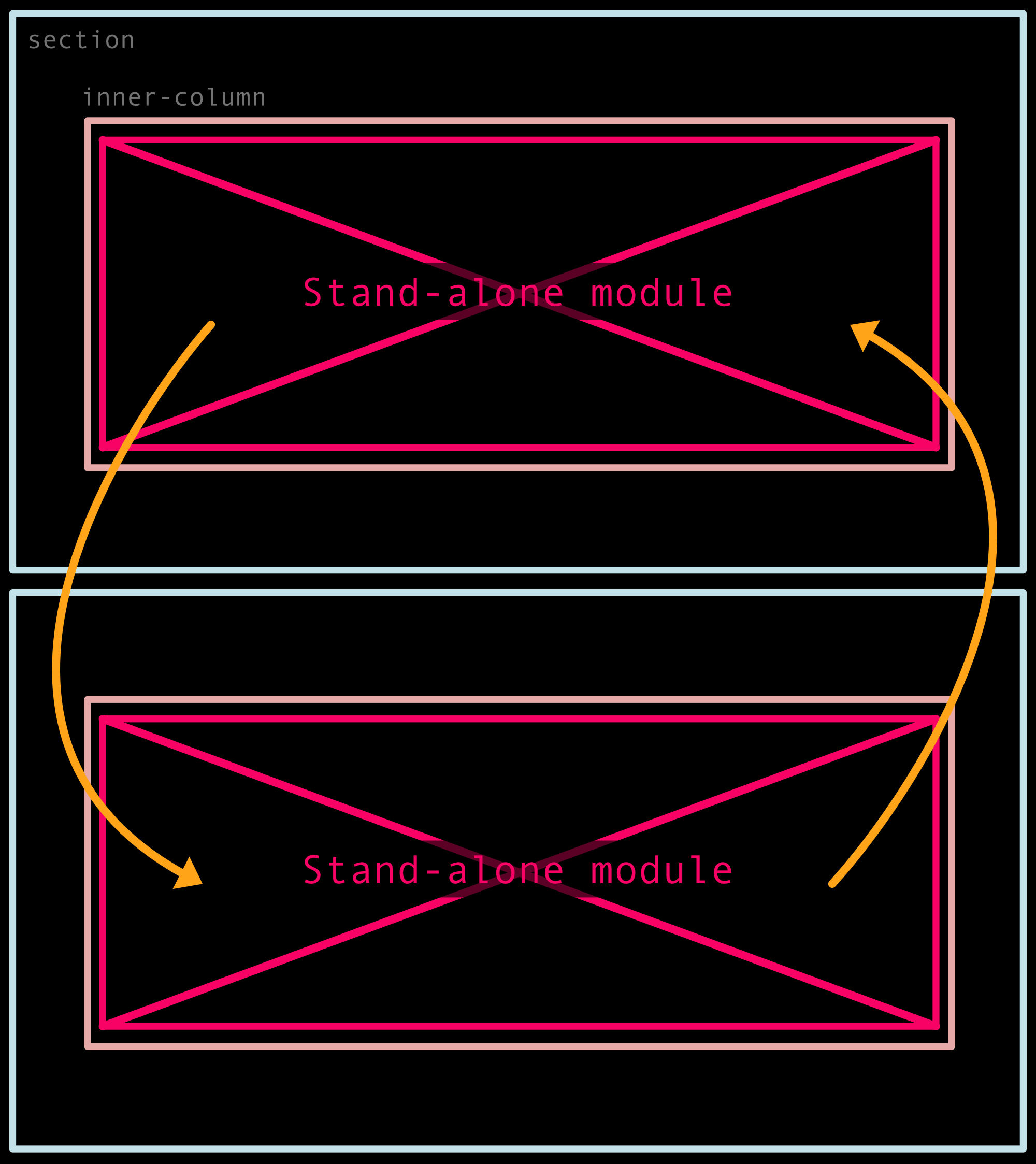
To be able to plug and play with stand-alone modules.
If you keep the page structure separate from the things you place inside of it – then they stay as separate concerns that work together as a composition.