Free responsive layout challenge / workshop
Introduction
After answering thousands of questions about responsive layout, we’ve come to the conclusion that there are only about 10 things you need to know.
The trick is, that if you don’t know all of them – then it’s really hard! but… if you can change your mindset and focus on each of the 10 concepts, then things will open up to you.
If you are 100% new to HTML and CSS...
Then maybe going over this will be the place to start. It just outlines the basic HTML document structure.
Tools and mindset
Before we start, here’s how we suggest you organize your applications/windows etc. and how to think small-screen first. This is a HUGE part of getting on the right track.
The Challenge!
Here it is! We can’t show you the code! Because people are just too tempted to copy it! That’s not what a challenge is about!!! We’ll give you the code at the end – if you really try the challenge.
Quick overview of the challenge
Screenshots of Derek's final version
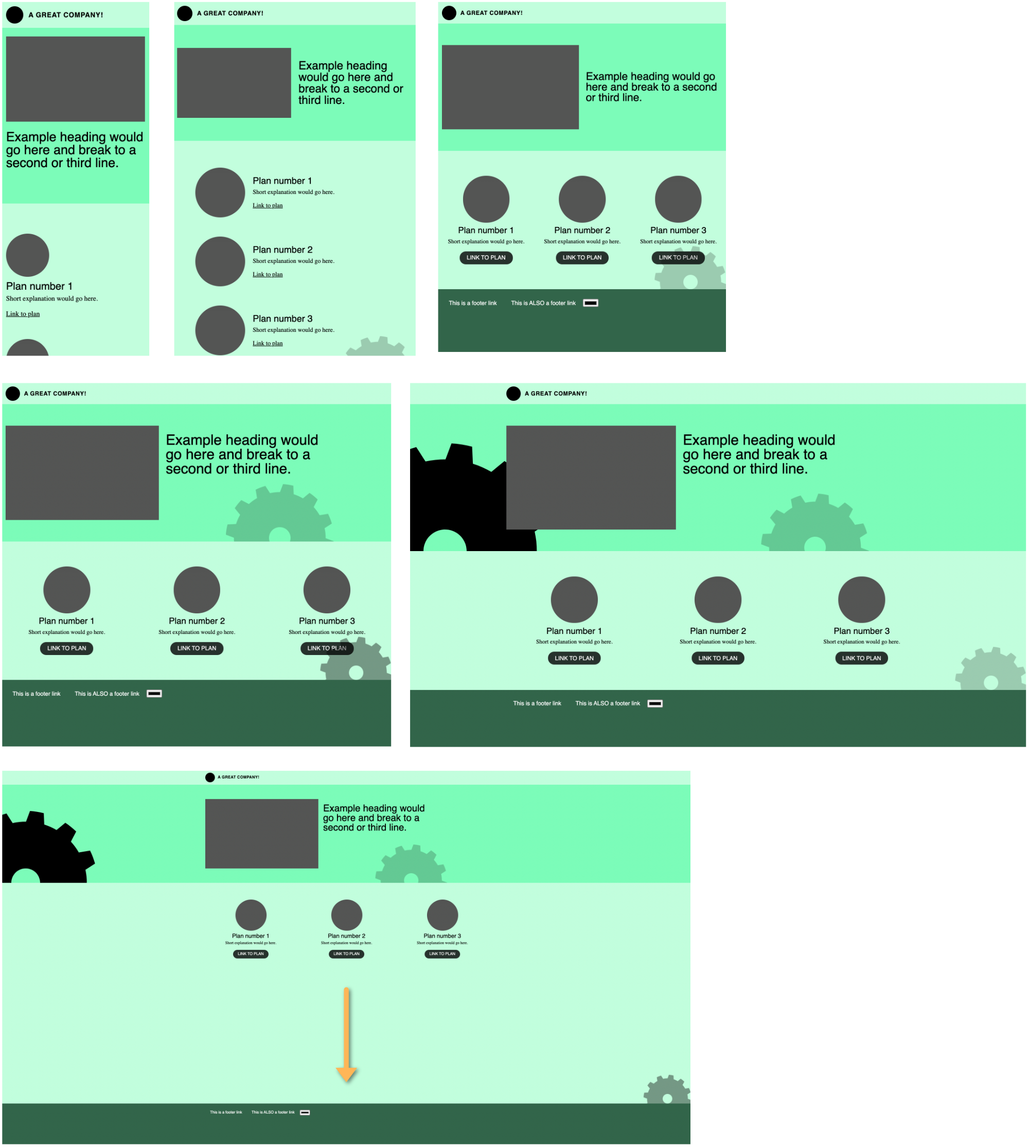
Notes:
- Footer stays at the bottom when the page has very little content
- Colors don’t need to match- but bonus points for custom properties or other quick ways to change the color on the fly
- You can use whatever images you want (not just cogs) and bonus points for SVG so you can change the color with CSS
- … hmm what else?
- Clarified text styles/font-patterns would be great. Seems like there are 3 type-patterns and a logo.
- Don’t use Grid. (even though it is cool and new)
You’ve got this.
Remember, it’s just some boxes. You have your set of tools, all the documentation – and probably the most powerful tool: your ability to ask questions.
Ask early and often. Sometimes you need to get the question out there – and move on while you wait for someone to answer. You can get help on the CSS Discord.
The goal isn’t to “do it by yourself with no help,” – it’s to learn how to do it.
Ivy says: Set a timer!
We use a time-timer.
We suggest you do this in sittings of 30-40 minutes and spend no longer than 3-4 hours on it.
OK
Are you SURE you want to watch the how-to videos already? If not – keep working on the challenge first. You’ll learn a lot more if you do it really badly – first. That’s how you get the “Ah ha!” moments.
If you think it’s time, then go ahead and keep on scrollin’.
OK
Are you SURE you want to watch the how-to videos already? If not – keep working on the challenge first. You’ll learn a lot more if you do it really badly – first. That’s how you get the “Ah ha!” moments.
If you think it’s time, then go ahead and keep on scrollin’.
OK then.
Here we go!
Part 1
(yes – there are many opportunities to use grid here / but we don’t teach that until a later part of the course – because we follow the history of The Web)
Part 2
Part 3
Part 4
So – that’s that!
But we’ve got more challenges if you want them. info@perpetual.education
We’d love to see how YOU would go about it. : )
ALSO… How about doing it again – but with Grid this time?