Confusing moments with “Web designers”
Hi, there. You're not logged in. So, you must be a visitor. Welcome!
What is this? You are viewing one of our supplemental "Stories." In addition to our core design curriculum, we are constantly building out additional resources. Stories are a collection of real work tasks, design history, UX explorations, and work-throughs. Stories are often off-the-cuff and less concerned with production value.
This is in the works! Would you like to help flesh it out? Let's do it!
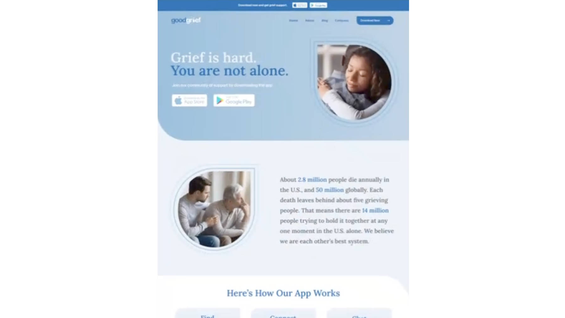
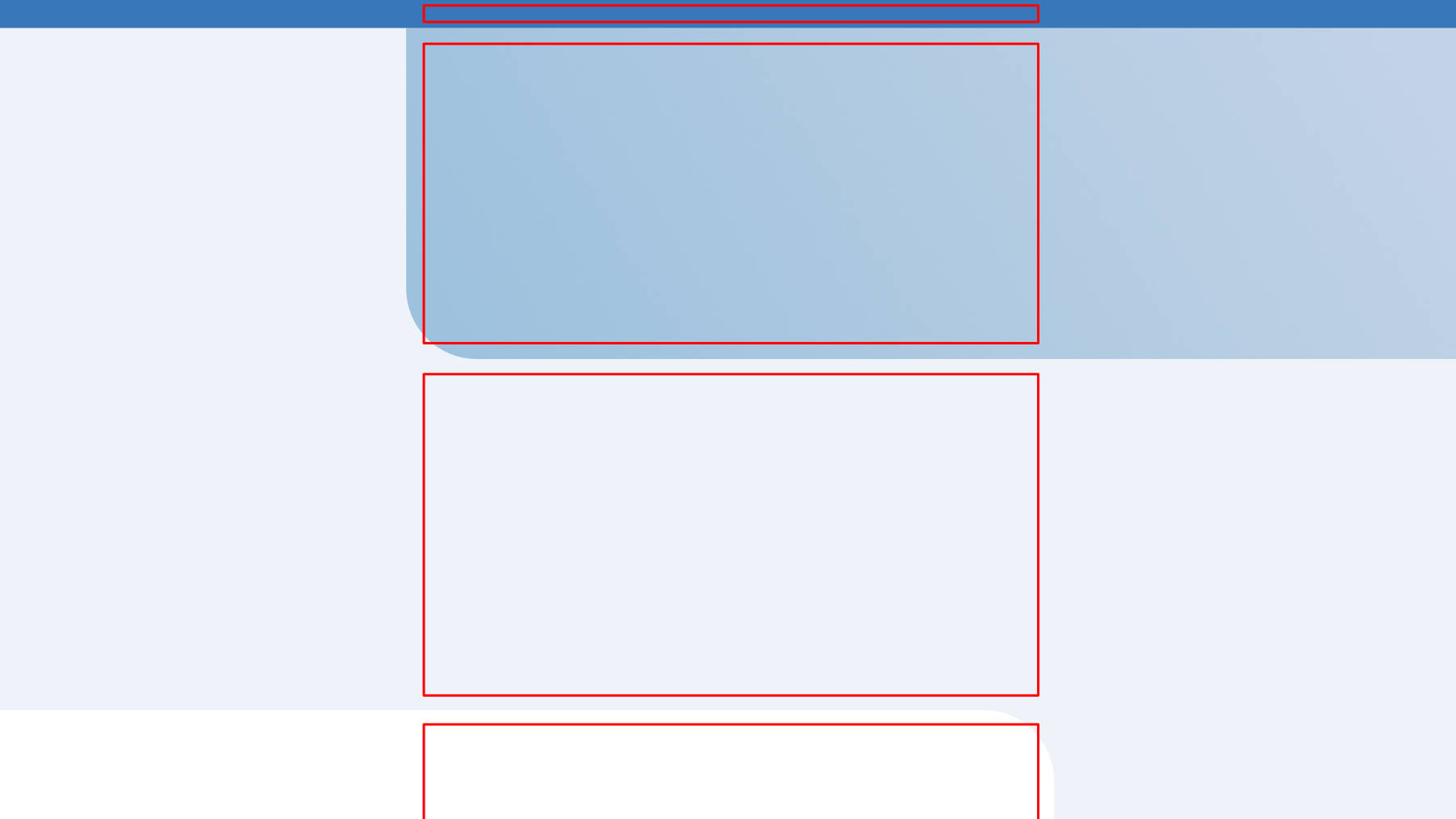
The "design"
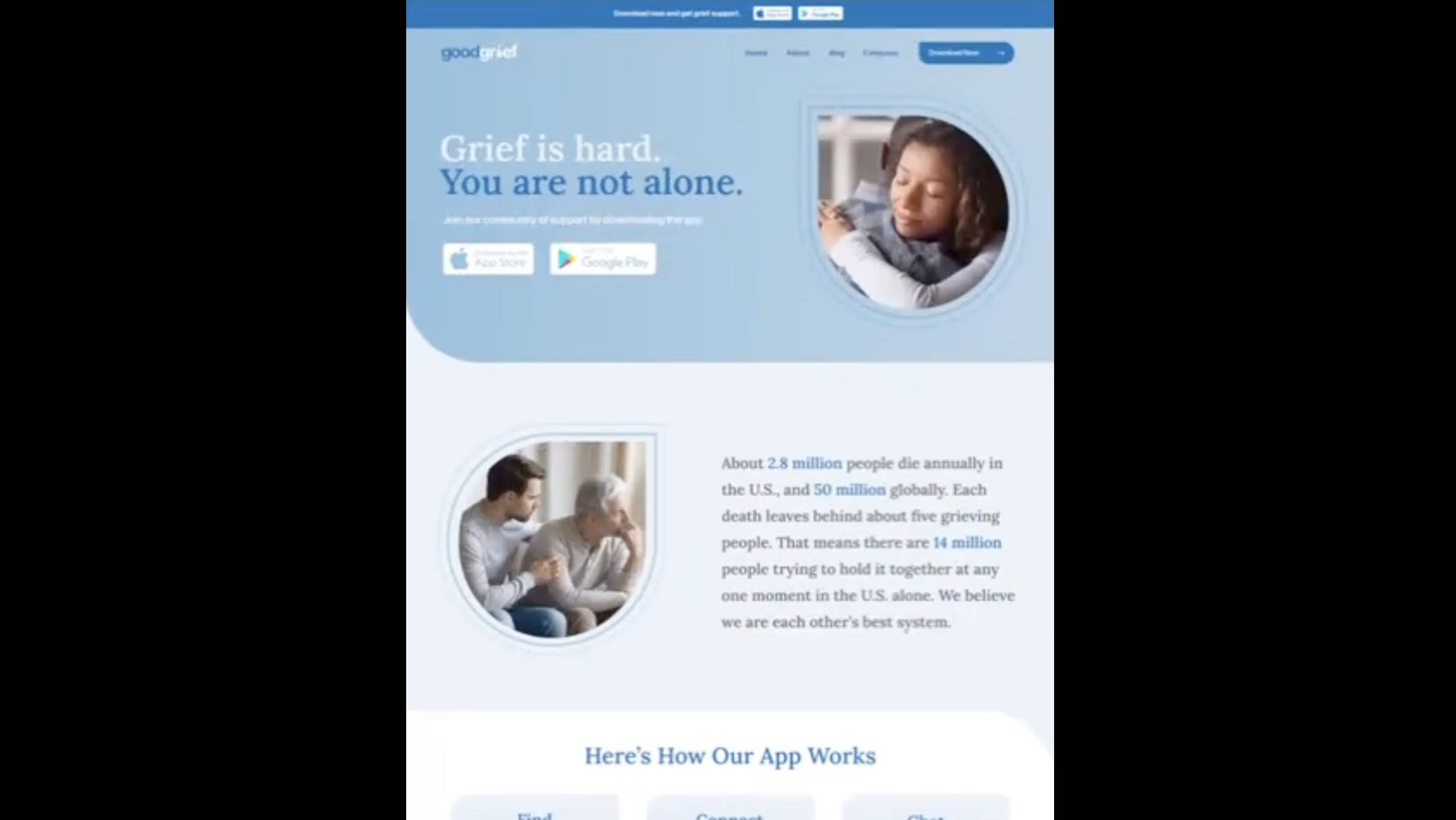
It’s VERY common to be given a “design” like this.
First off – there’s no clarity on what happens on larger screens. And then on top of that, there’s no mobile layouts.
Take a minute and think about how you’d work out that bigger picture page structure in the code.
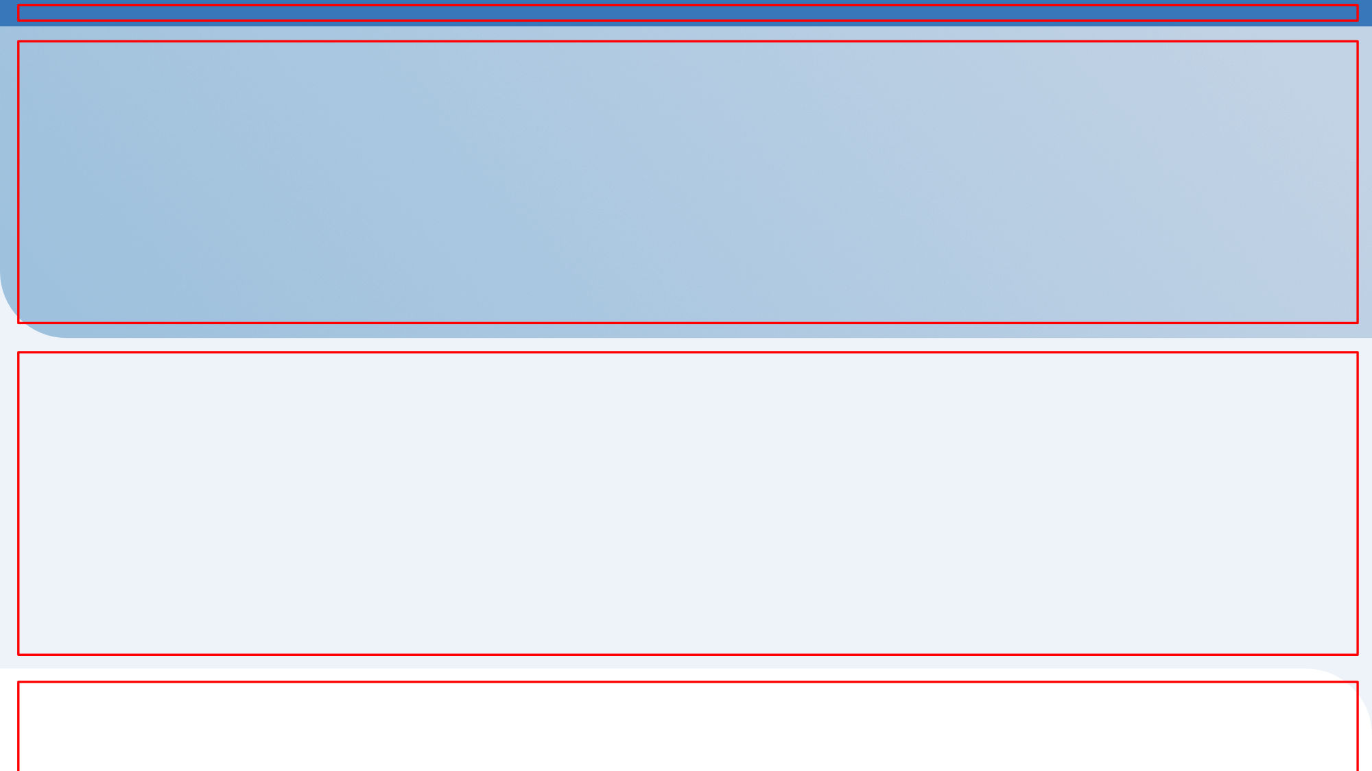
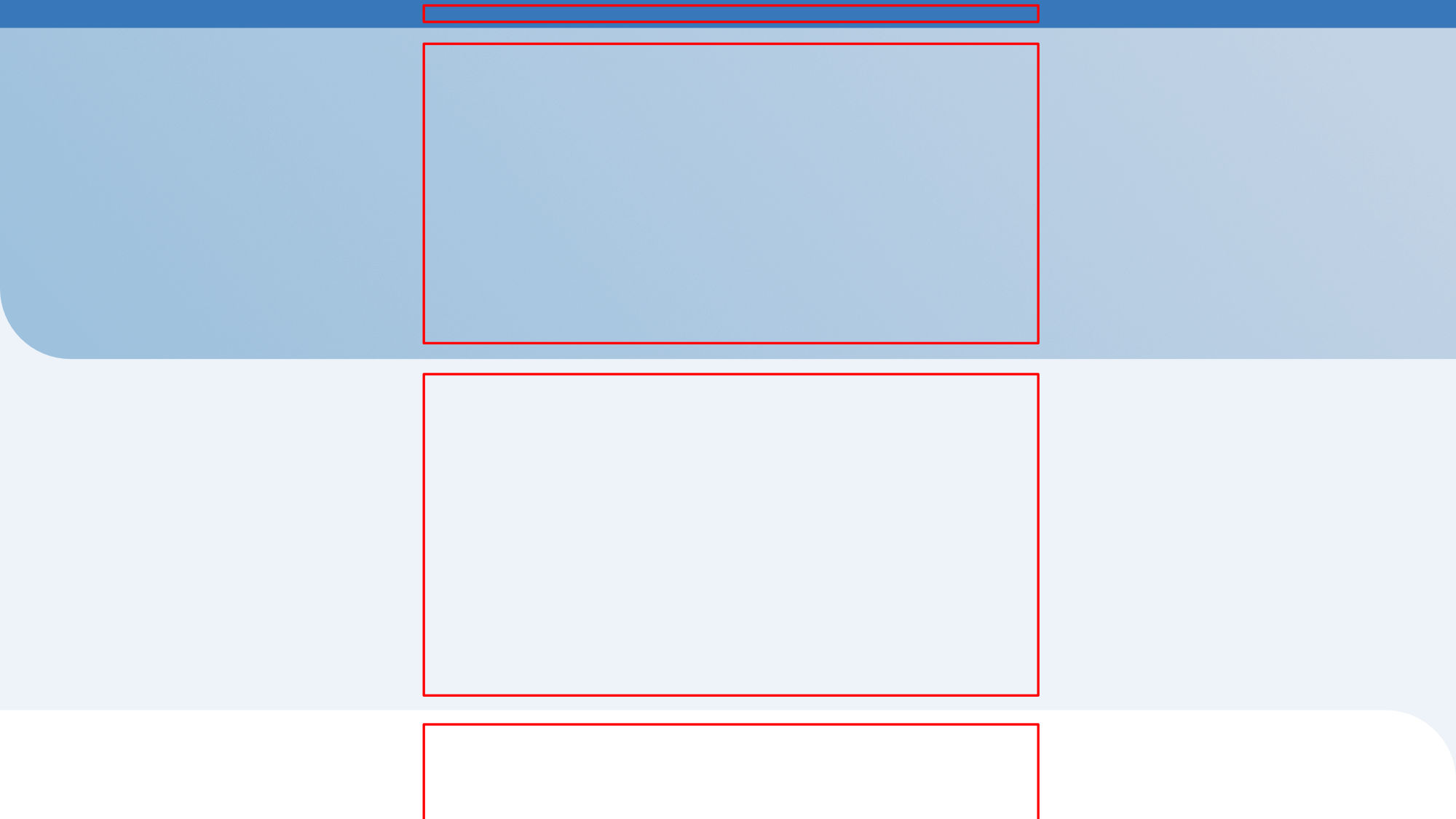
Option 1: white sides
Is is supposed to be like this? With white on the sides?
Option 2: stretch?
Wouldn’t this make everything big and weird?

(just taking out the content to see the layout)
Option 4: stretched with centered content
Like this?
Option 5: blue background

Is is like this?
Option 6: centered with the sides going off
Is it like this??
The interesting part – is that (usually) – the visual designers (the one’s who made this) can’t explain it either…