Responsive image defaults
Introduction
There are many ways you could deal with images. But one way is the best. Well, at least we think so. Let’s walk through the reality of it—step by step.
You're on a small screen! Some modules like CodePen examples will behave differently here. You'll need to toggle through their tabs to see all the code. For the best experience, consider using a bigger screen.
Images!
See the Pen HTML cheatsheet 1 / display types by perpetual.education (@perpetual-education) on CodePen.
This image is 1000px wide. You can see that one is just doing it’s thing, and the other has the width and height presentation attributes set.
We think of “presentation attributes” as the old way to do things that just hung around after CSS came around. But we’re not entirely sure that’s the case.
Key
concept
Presentation Attributes
Presentation attributes, like align, bgcolor, fill, width, and height, control the appearance of elements directly within HTML or SVG tags. They were widely used before CSS became the standard for styling, which promotes a cleaner separation between content and design. While CSS offers more flexibility, control, and maintainability, presentation attributes still appear in SVGs as quick fallbacks for intrinsic styling. However, CSS is preferred for most styling tasks to ensure consistent, maintainable code and better control over layouts.
In this case, the width and height attributes define the dimensions of the image directly in the HTML, acting as presentation attributes. This approach was common before CSS became the standard tool for styling. (note their values have no unit)
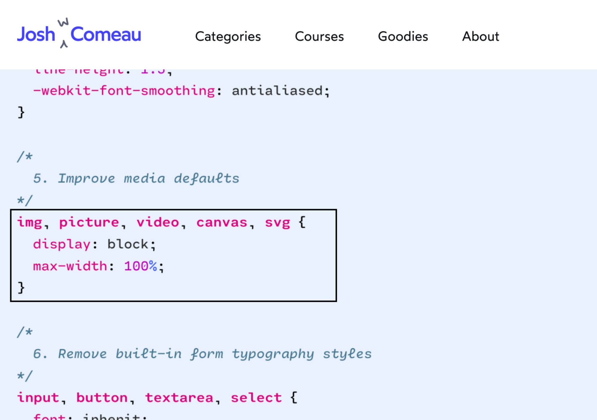
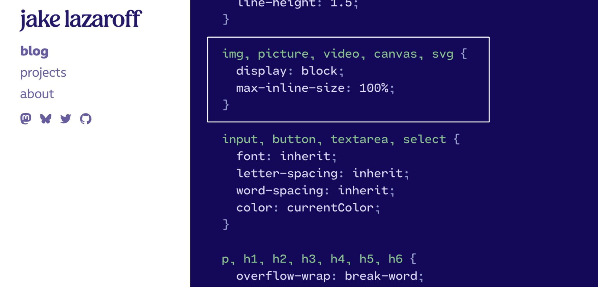
What some people do


joshwcomeau.com/css/custom-css-reset
We’ve tried talking with people about it on Twitter, but they don’t seem interested in having a conversation.

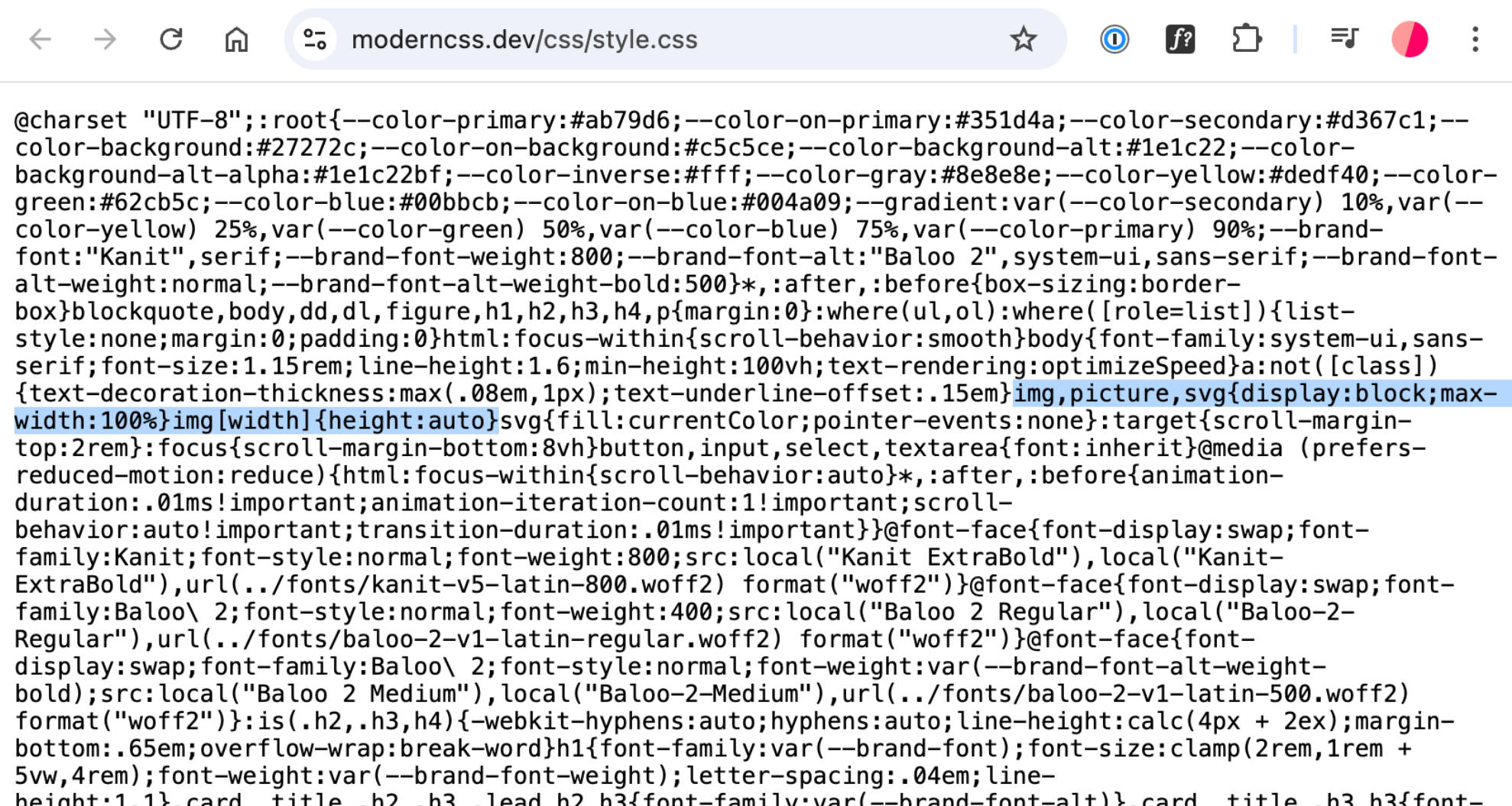
This an interesting reminder that we can target “any img element with a width attribute” like this: img[width] . But does that handle it?

What happens?
See the Pen HTML cheatsheet 1 / display types by perpetual.education (@perpetual-education) on CodePen.
Depending on your screen size, you might not immediately notice the problem here: max-width alone doesn’t account for the presentation width and height attributes. These attributes play a role in certain contexts, especially when browsers or readers need to anticipate the aspect ratio.
You could skip defining these attributes entirely, but we recommend planning for them. This approach becomes especially important for scenarios such as reader modes, lazy loading, or layout calculations where the browser needs to understand the intrinsic size of the element. The browser uses these dimensions to allocate space in responsive grids or when building layouts, preventing layout shifts that might occur as images load.
To establish a reasonable default, you need to account for the most common use cases as well as edge cases. Even though CSS can control the size dynamically, specifying width and height in the markup helps maintain aspect ratio consistency across all viewing modes. This avoids issues where, without defined ratios, the browser may struggle to render a clean layout, resulting in unexpected shifts.
One example is enough
See the Pen HTML cheatsheet 1 / display types by perpetual.education (@perpetual-education) on CodePen.
Explaining the more complex reasons isn’t something we have time for here. But this should be enough to prove the point.
Keep it simple
See the Pen HTML cheatsheet 1 / display types by perpetual.education (@perpetual-education) on CodePen.
Now, in some situations… (rare situations), you’d want to flip this (height/width). But we’re setting defaults for by far the most common situations.
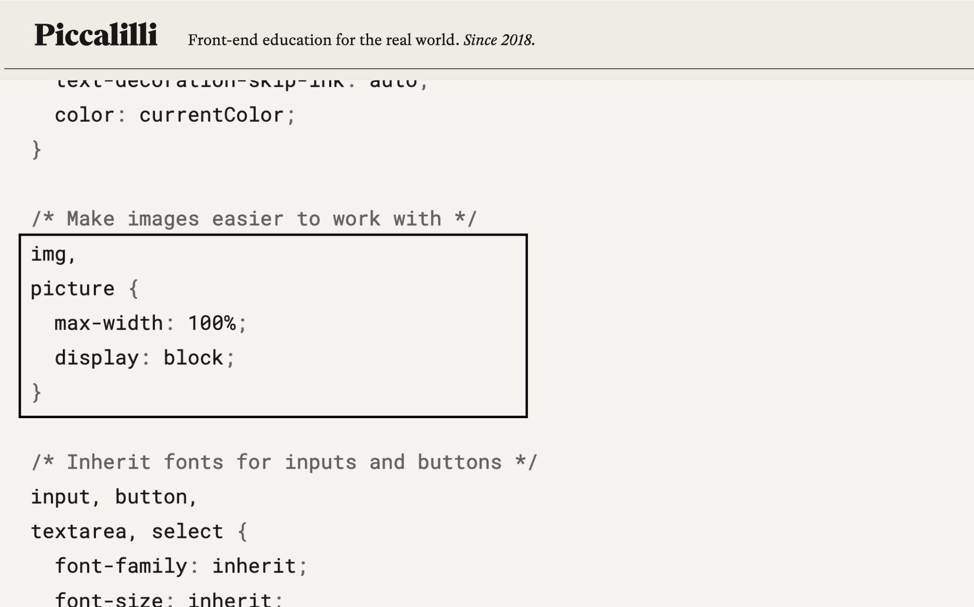
This way, the image grows to fill the parent’s width like standard block-level elements, keeps its ratio, and always adjusts as small or large as needed.
But if you’re going to use this default… then everyone needs to know and understand it. And they need a way to constrain the size and get specific when needed.
Always use a parent
See the Pen HTML cheatsheet 1 / display types by perpetual.education (@perpetual-education) on CodePen.
picture and srcset and things are for another day. But you know what’s a great parent for an img? Picture!
Just one thing to worry about
See the Pen HTML cheatsheet 1 / display types by perpetual.education (@perpetual-education) on CodePen.
If you have this in your reset/preset/setup, then you just have to know it’s always there – and how to set a constraint.
Just let it be easy!
What do you think?
Does this approach simplify things for you? If this straightforward style resonates with you, maybe you’d enjoy learning development and design with the same mindset.