Perpetual Education
Style Guide
Almost every page is going to have an aggresive heading like you see above. It's also very likely to have a 'page-intro' like this. In this case, Welcome to the style guide! This shows how everything on the site will look all in one place.
These intros will likely have many paragraphs. We're setting the stage for the article or lesson plan. It's the Amuse-bouche of this content. It needs to be short and sweet.
Fonts
These are them - for now!
Type patterns
micro-voice()
calm-voice()
focus-voice()
strong-voice()
loud-voice()
stout-voice()
huge-voice()
Color and texture ideas
Normally, I would use names like $color, and $highlight and $alternate, and $color-light... because the idea of the "main color" is different than the actual color. It might change... but in this case there are so many - that it actually makes sense to use their real names, I think...
This 70's kinda rainbow/primary colors kids-classroom - is specific enough that it pulls us all-in.

Old plastic
Section module example with
- Text module
- Figure module
- Video module
Featuring proper semantic grouping, optional hash-links and aria label. This way, on longer articles or resources, screen readers can jump to specific landmark sections. It also allows us to style those sections differently if desired.
Example figure heading

Example description
Video in the works!
Example video.
“There are only two kinds of languages: the ones people complain about and the ones nobody uses.”
― The C++ Programming Language
Should we have a “Quote” module?
Style guide sub pages
Resizable iFrame
This is the description for the iframe.
Newly introduced language features
-
HTML element
Style-guide checker
Default HTML mark color
.one
.two
.three
.four
.five
.six
.seven
check – one-two.
HTML element
Paragraph
<p>This is a paragraph.</p>
If you could only have one element, we’d argue that it should be for paragraphs. They’ll break your thoughts up into manageable chunks.
But what are “paragraphs,” really? It’s contentious.
This is some optional context to explain why we’re showing this —
CSS selector
Class
.welcome {

}
Adding a dot will signify to select elements with that class name.
<section class='welcome'>
Newly introduced language features
-
CSS property
display: grid
.parent {
	display: grid;
}
This lets the element know that it can now harness the power of the CSS Grid layout system.
By default, this will set all child element to occupy 1 grid “Cell.” Those cells will be 1 fraction of the parent width (1fr). (which in this case is the full width)
Note that this will effectively turn off display: flex if previously set.
-
CSS property
Gap
.parent {
 	display: grid;
	gap: 20px;
}
Gap determines the space between elements in both flexbox and grid layout systems. A declaration of
display: grid;andgap: 20px;on a parent element – will put some space between child items. This allows you to avoid the logic of putting margins between things and dealing with unwanted margins on the first or last element. -
CSS property
Template columns
.parent {
    display: grid;
    grid-template-columns: 1fr 1fr;
}
Grid allows you to predefine how its columns and row are set up. This will determine how the cells are arranged.
You can set the template up in many ways. The first step might be to focus on the columns. This property takes a list of lengths (items separated by a space), which will define the ratio of the columns. Try all the things you can think of.
1fr 1frwill set up 2 columns at 1 fraction each. This is effectively saying there is 2 parts total, and each column is 1 part wide. -
CSS property
Grid column
.child {
    grid-column: 1 / 3; // inhabit from grid line 1 to 3 (cell 1 and 2)
}

.child {
    grid-column: span 4; // span the length of 4 cells
}

.child {
    grid-column: 3 / span 2; // start at grid line 1 and span 2 cells
}
And give it a shot with
grid-rowtoo 😉
This is a code example with no optional descriptions
[my thing]
	- type: h1
	- content: "The text..."
	- id: "something-unique"
	- style:
		- color: blue
 		- font-size: 30px
- href: "httpe://perpetual.education"<h1>The text...</h1>
<h1 id='something-unique'>The text...</h1>
<h1 style='color: blue;'>The text...</h1>
<h1 style='color: blue; font-size: 30px;'>The text...</h1>
<a href='file-path-to-request.html'>The text...</a>
<a id='special-name' style='color: blue; font-size: 30px;' href='file-path-to-request.html'>The text...</a>This is the description of the code example – which should explain why they should care.
This is a code example with optional descriptions for the individual snippets
[my thing]
	type: h1
	content: "The text..."
	id: "something-unique"
	styles:
		color: blue
 		font-size: 30px
	href: "httpe://perpetual.education"
The optional description would be here.
<h1>The text...</h1>

<h1 id='special-name'>The text...</h1>

<h1 style='color: blue;'>The text...</h1>

<h1 style='color: blue; font-size: 30px;'>The text...</h1>

<a href='file-path-to-request.html'>The text...</a>

<a id='special-name' style='color: blue; font-size: 30px;' href='file-path-to-request.html'>The text...</a>
The optional description would be here.
This is the description of the code example – which should explain why they should care.
The only new properties you'll need for today's lesson
If you’re looking things up on Google, then you’re just being avoidant. Sit down and just figure it out – with these few tools.
-
CSS property
display: grid
.parent {
	display: grid;
}
This lets the element know that it can now harness the power of the CSS Grid layout system.
By default, this will set all child element to occupy 1 grid “Cell.” Those cells will be 1 fraction of the parent width (1fr). (which in this case is the full width)
Note that this will effectively turn off display: flex if previously set.
-
CSS property
Gap
.parent {
 	display: grid;
	gap: 20px;
}
Gap determines the space between elements in both flexbox and grid layout systems. A declaration of
display: grid;andgap: 20px;on a parent element – will put some space between child items. This allows you to avoid the logic of putting margins between things and dealing with unwanted margins on the first or last element. -
CSS property
Template columns
.parent {
    display: grid;
    grid-template-columns: 1fr 1fr;
}
Grid allows you to predefine how its columns and row are set up. This will determine how the cells are arranged.
You can set the template up in many ways. The first step might be to focus on the columns. This property takes a list of lengths (items separated by a space), which will define the ratio of the columns. Try all the things you can think of.
1fr 1frwill set up 2 columns at 1 fraction each. This is effectively saying there is 2 parts total, and each column is 1 part wide. -
CSS property
Grid column
.child {
    grid-column: 1 / 3; // inhabit from grid line 1 to 3 (cell 1 and 2)
}

.child {
    grid-column: span 4; // span the length of 4 cells
}

.child {
    grid-column: 3 / span 2; // start at grid line 1 and span 2 cells
}
And give it a shot with
grid-rowtoo 😉
Cheatsheet
Here are some notes about the cheatsheet.
Newly introduced settings
- Right click
- Two-fingers mouse/track pad tap
- Hide the Dock
Empty trash
Finder
After you ditched a bunch of that unneeded stuff (thank you for your service), send it away!
You’ll get a little dialog and one last chance to change your mind. Hit return to make it official (not to return it).
Find
Universal
If you’re ever looking for something, click on whatever window or areas you are looking at, and find it!
This works great for searching web pages and most apps will also have something in place to help you navigate based on text input. If you are looking for something in your program/text document, go ahead and search the page.
The goals
-
Example goal heading/title
Example goal description.
-
Example goal heading/title
Example goal description.
Basic text module
Keep in mind / that just because these headings have a hierarchy, doesn’t’ mean they need to be ‘bigger’ to ‘smaller’ in size… that is just a historical convention.
Paragraphs may be few or many. Long or short. etc.
Find
Universal
If you’re ever looking for something, click on whatever window or areas you are looking at, and find it!
This works great for searching web pages and most apps will also have something in place to help you navigate based on text input. If you are looking for something in your program/text document, go ahead and search the page.
Optional content heading
Teaser
Content
List with default styles
A description of this simple list here.
-
List item 1
-
List item 2
-
List item 3
List with type 'step'
Description.
-
Item one
-
Item two
-
Item three
-
Item four
-
Item five
List with checkbox styles
Description.
-
Item one
-
Item two
-
Item three
Rich list heading
The list usually needs a little introduction. The list usually needs a little introduction.
-
This is an item heading
These items need a lot more details than the basic list. That’s usually a mini / not even full sentence. This one can also have strong emphasis and italic and links and things.
-
This is an item heading
These items need a lot more details than the basic list. That’s usually a mini / not even full sentence. This one can also have strong emphasis and italic and links and things.
-
This is an item heading
These items need a lot more details than the basic list. That’s usually a mini / not even full sentence. This one can also have strong emphasis and italic and links and things.
Don't forget that you are full of wonder...
Some general callout content. I’m still not sure how I’m going to use these / or if I’ll need a few different unique modules for this. Currently – ‘warning’ is the default. This is an internal link!
Small Alert
Small alert content
Do not put sunscreen in your eyes
This doesn’t feel good. Please add a realistic example here. Will there be images? Are there any good examples in the wild we can check out?
Remember: Cats are almost always smaller than dogs
Please put a real-world example of how we’ll use this.
Question / prompt. Does that sound fun?
Well, maybe we can answer those questions. Let’s talk.
Key
concept
Biophilia
The hypothesis that “natural” environments can aid focus and concentration by releasing stress. In simple terms – we are natural beings. We have a history of being a part of nature. Nature has natural Rhythms that we relate too – unlike our beeps and dings and LED lighting in cubicles. Makes sense, right? So – adding some nature – and some organic stuff can really change how we feel about things.
WikipediaSome context to how this works… in this case / the term could be “live style guide” – or something / and we could discuss what that meant – in the context of this “live style guide.”
This is the video_module
Here is a description of this video.
Example heading here
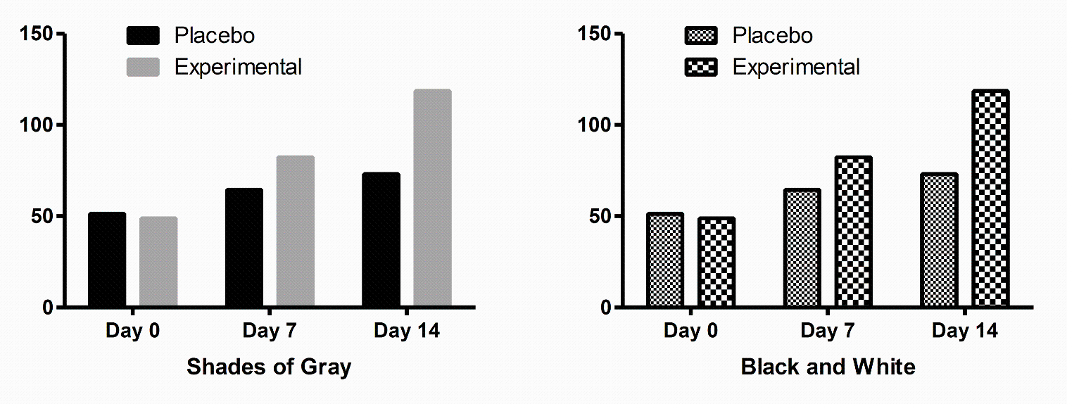
Example description will go here:
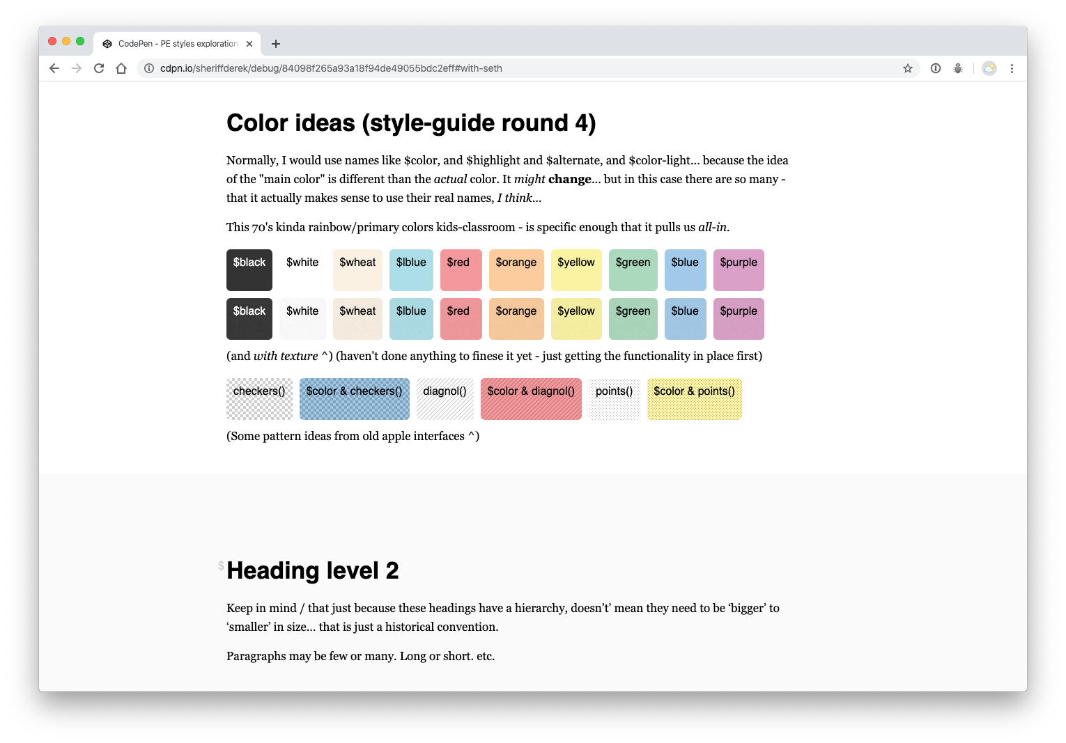
Browser .png example
@pe (source with no link)
Example description will go here:
Optimism can be painful!
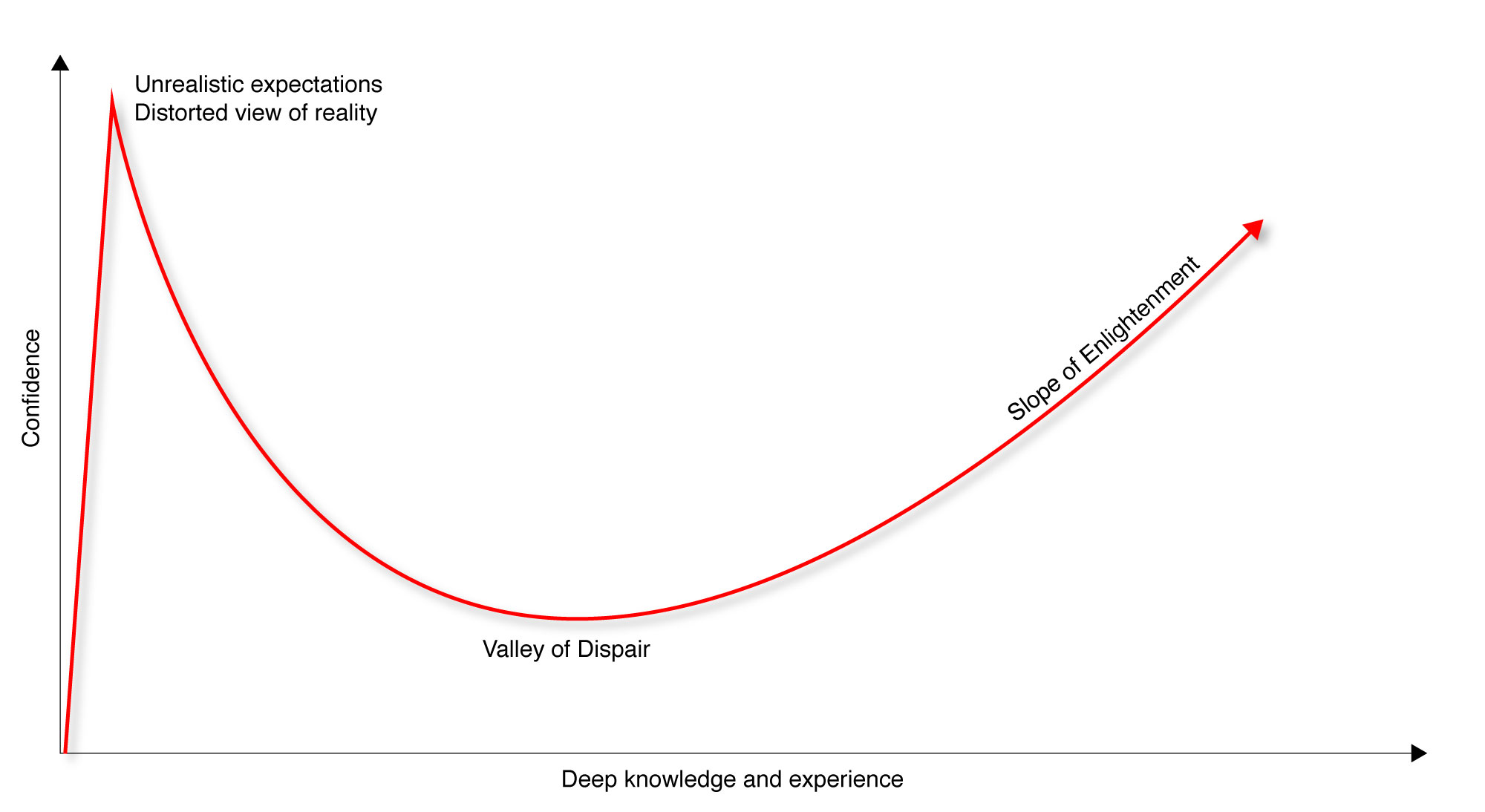
It’s really great that we are confident. I want to harness that power. The problem is – that this Dunning-Kruger Effect – really bums us out! Our powerful feelings and our optimism are distorted. It’s not logical to expect to be the best at anything right out of the gate (or ever). That shouldn’t be the goal. MOST PEOPLE ARE AVERAGE – AND THAT IS OK! “Average” is definitely good enough. BUT – let’s reframe this whole thing. The “Valley of dispair” is TERRIBLE and is 100% avoidable. This red line is ‘confidence.’ Why should your confidence jump around like that? I mean… you can do it. I know you can do it. It’s a fact. Your confidence can be steady.
Heading level 2
Keep in mind / that just because these headings have a hierarchy, doesn’t’ mean they need to be ‘bigger’ to ‘smaller’ in size… that is just a historical convention.
Paragraphs may be few or many. Long or short. etc.
Callout - alert style
Alert Alert! Watch out for something!!!
Heading level 2
Keep in mind / that just because these headings have a hierarchy, doesn’t’ mean they need to be ‘bigger’ to ‘smaller’ in size… that is just a historical convention.
Paragraphs may be few or many. Long or short. etc.
Heading level 3 – maybe as a list title
- This is an unordered list
- That means, that it’s order doesn’t matter
- Sometimes it’s just a list of ‘stuff’ in no order
Heading level 3 – maybe as a list title
- This is an ordered list
- That means, that it’s order does matter
- Most lists have a meaningful order
- Wouldn’t you say?
Keep in mind / that just because these headings have a hierarchy, doesn’t’ mean they need to be ‘bigger’ to ‘smaller’ in size… that is just a historical convention.
Paragraphs may be few or many. Long or short. etc.
Heading level 2
Keep in mind / that just because these headings have a hierarchy, doesn’t’ mean they need to be ‘bigger’ to ‘smaller’ in size… that is just a historical convention.
Paragraphs may be few or many. Long or short. etc.
Take a break
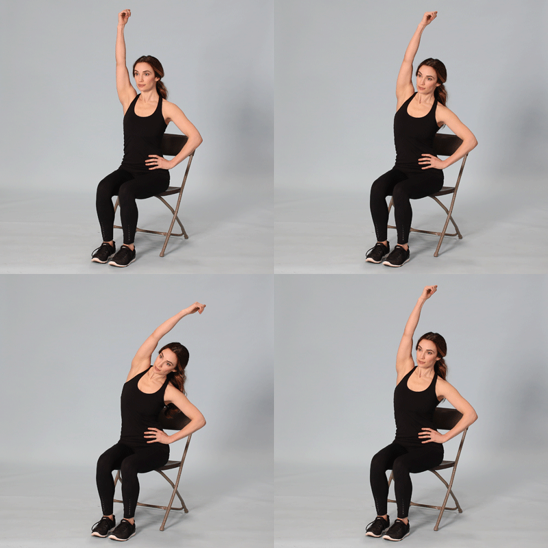
Take 2 minutes to center – and work out your arm with this stretch.
How do you feel
about this?
In conclusion
This is some conclusion copy. I want it to have the option to style this differently than a regular text area – but mostly it’s the same. ; )
Exercises
-
Spend some time throughout the day thinking about x and y
Example challenge description. There’s no time placed on this for (for example)
-
Write up something
Example challenge description.
-
Research companies who do something similar
Some reminders about research and what to do etc. etc.
-
Planning
Planning example. Pull some real challenges from the lessons and put them here
-
HTML/markup type stuff example
Example description
-
Cascading style sheets example
Challenge description
-
PHP example challenge
Challenge description
-
JavaScript challenge title
Challenge description
Lesson checklist
Will lists need descriptions? Probably.
-
First things first, you have to do the first thing – and that thing is here.
-
Second of all – you’ll need to do whatever this thing says.
-
First things first, you have to do the first thing – and that thing is here.
-
Second of all – you’ll need to do whatever this thing says.
-
First things first, you have to do the first thing – and that thing is here.
-
Second of all – you’ll need to do whatever this thing says.