Early grid-like layout exploration
Hi, there. You're not logged in. So, you must be a visitor. Welcome!
What is this? You are viewing one of our supplemental "Stories." In addition to our core design curriculum, we are constantly building out additional resources. Stories are a collection of real work tasks, design history, UX explorations, and work-throughs. Stories are often off-the-cuff and less concerned with production value.
Introduction
This is a common story.
Initial idea
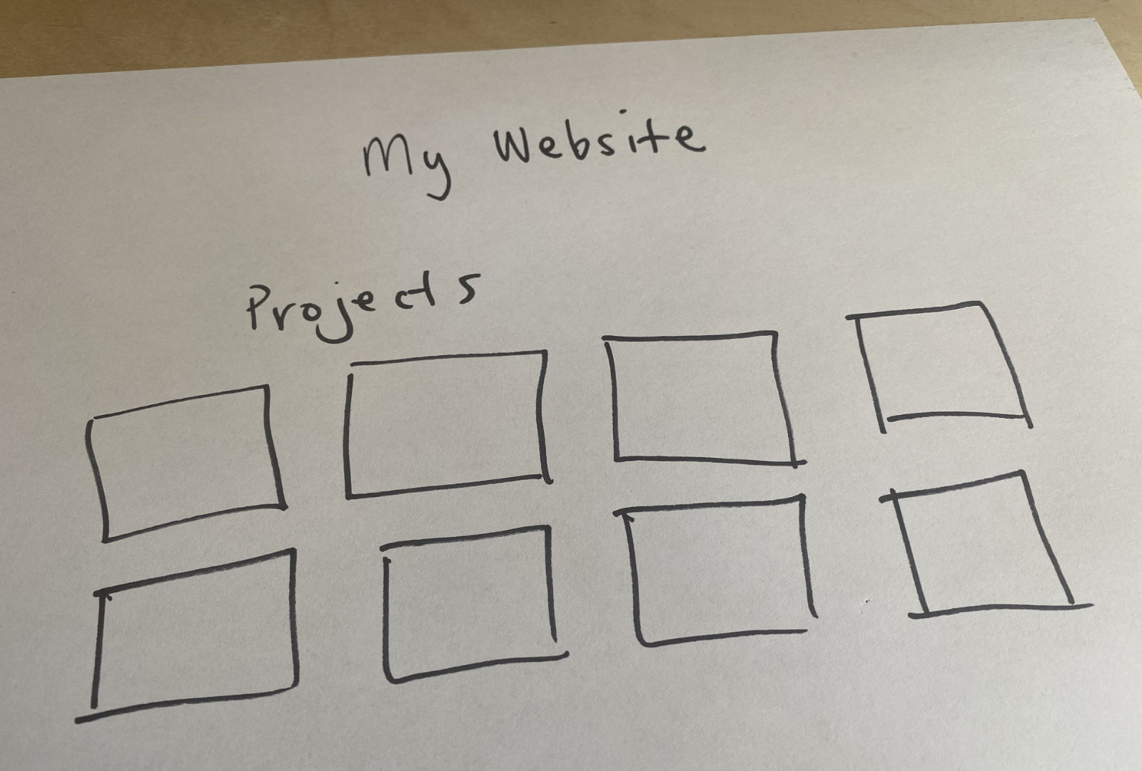
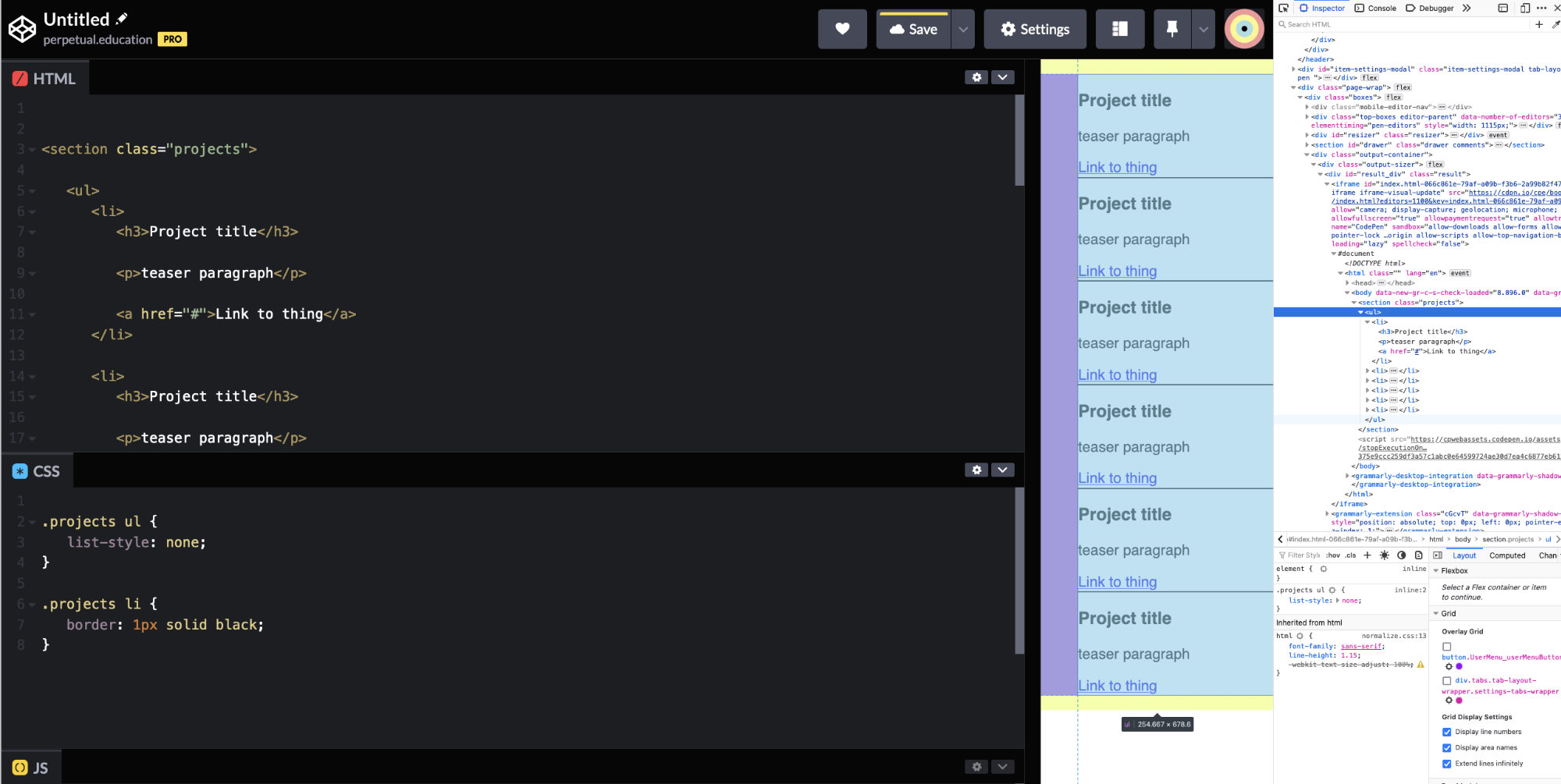
For most students, their first instinct is to put their list of projects in a grid.
So many things are listed like that. So, it’s a pretty normal pattern to try and emulate. But instead of working with the few tools we have (at the start of the course) – they sometimes copy another website’s code, search the web for “make a grid,” or – look at their fellow student’s code. (the last one is preferred)
Magic code!
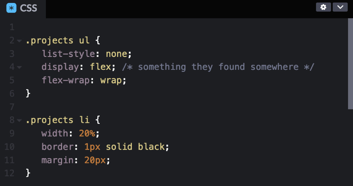
They’ll find some code. And paste it in.
(But they’ll know that they don’t really know what it does)
Would you put something in your mouth – if you weren’t really sure what it was?
And it works!
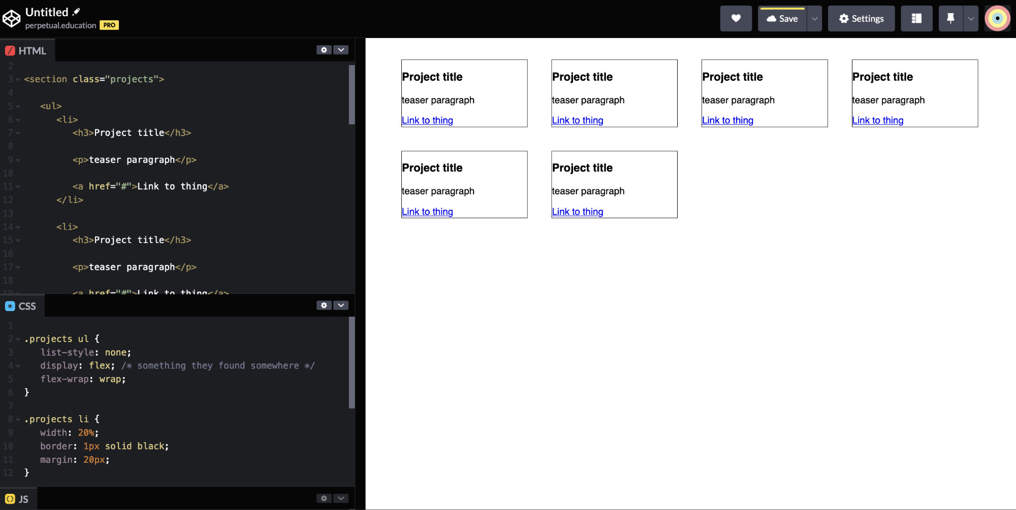
It looks like a grid! They did it!
But
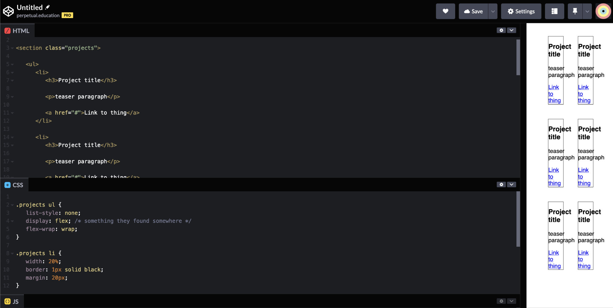
Then this happens.
They didn’t start with the small screen first.
That’s where the majority of viewers will see it as of 2020. But – at any moment – our brains could get hooked into “the system” – and small screens could be gone – and back to a full field of vision type of interface. Either way — building – from a small-screen-first approach – is the way to go.
This is currently totally broken. And of course – the student will want to “fix it” and “make it work right.” Instead of fixing the broken thing – it would make more sense to build it properly – and with tools we currently know and understand.
Remove the things we haven't talked about
It would be best to just remove anything we haven’t talked about – and get back to basics.
The website didn’t start out broken.
We talked about “resetting” our CSS, but people tend to forget to – use it.
There might be a big area on the left. and sometimes people will do very complicated things to try to “fix it.” However, it doesn’t need to be fixed. It’s just the natural way that lists are styled to make room for the numbers. If you want to change it, then you can set margin: 0 and padding: 0 OR use the reset.
reset
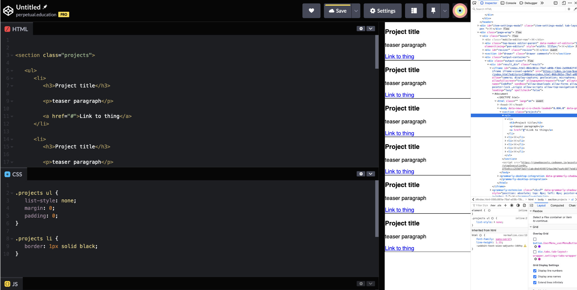
However, it doesn’t need to be fixed. It’s just the natural way that lists are styled to make room for the numbers. If you want to change it, then you can set margin: 0 and padding: 0 OR use the reset.
This will get things back to a nice normal “readable stuff on the page” situation that everyone knows and loves.
But it’s a little tight on the left (and right). Why is that?
You might have a reset – and not be aware of it. Or none. Or have just a few properties set that reset a few specific things – that maybe you aren’t fully comfortable with. So, – keep it simple. Know what it set to what – at a base level. (that’s why the reset is so great)
You can set the body or the section or whatever to have some padding – on purpose. Be in control! At least when you’re building websites.
You really have to make use of the limited space. Maybe just borders in-between and not on the sides.
What about bigger viewports/screens
When it going to start to look bad? This certainly doesn’t look so hot. But the most important thing – is the small screen!
So, what are you going to do about this?
Right now, the <li> are all stacked on top of each other. That’s pretty standard. They are display: block. They stack on top of each other and span the width of their parent element.
Break points
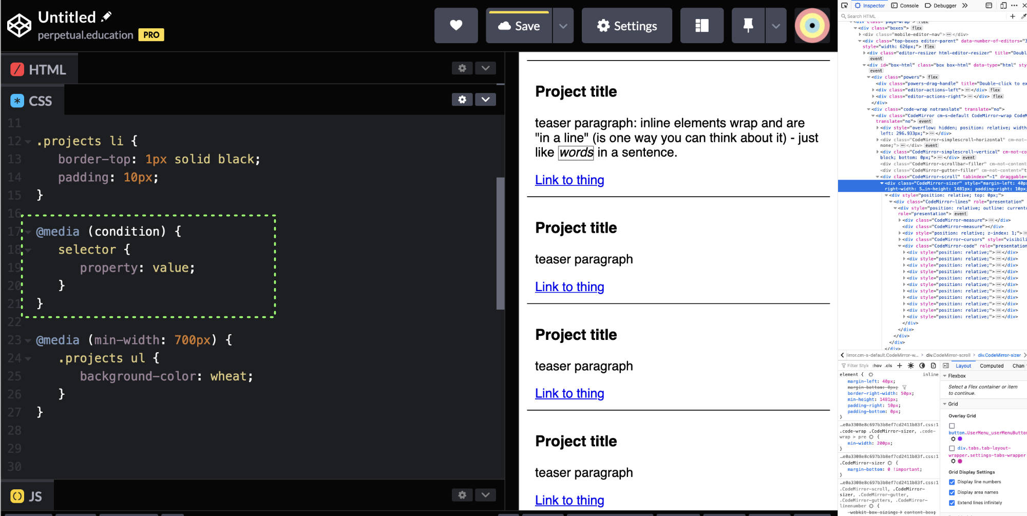
Here’s one way to make a decision about the layout.
With an @media rule, you can check a condition and apply some rules – only if that condition is true. It’s a rule for rules.
note: if you are zoomed in or out a lot – that’s going to change the situation. And the conditional rules might not kick in when you expect.
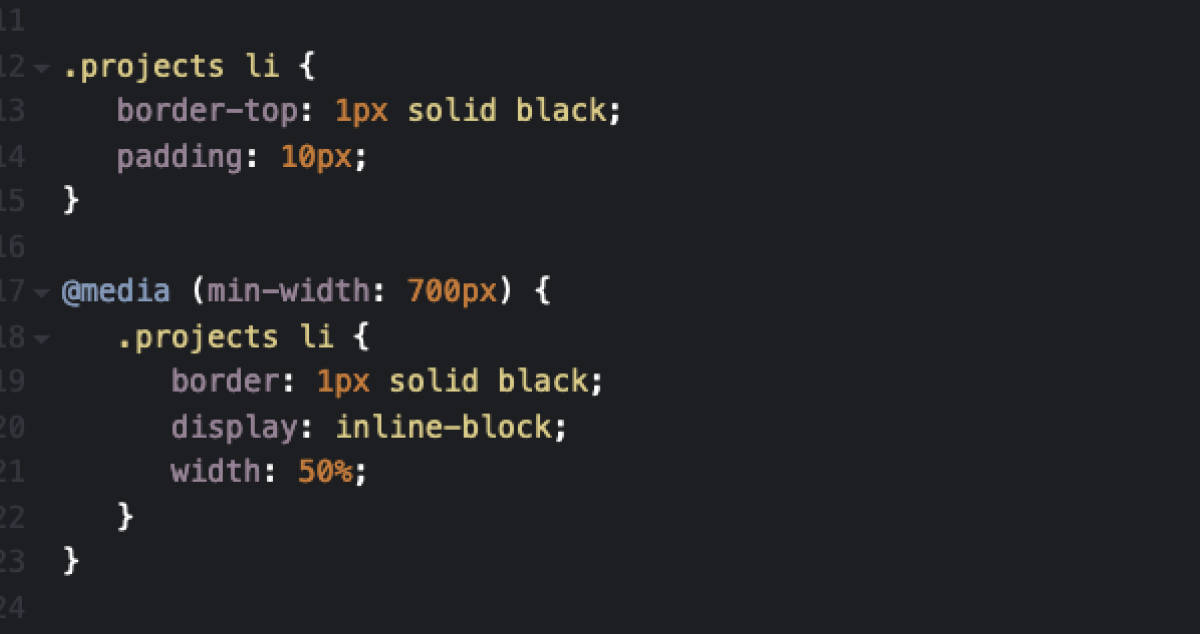
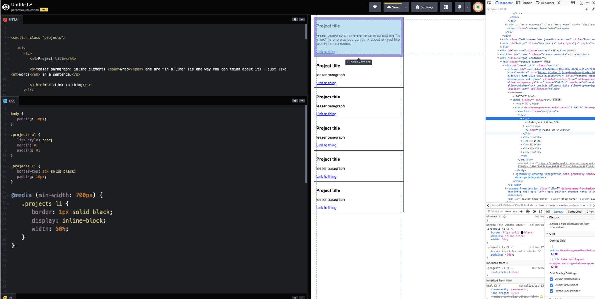
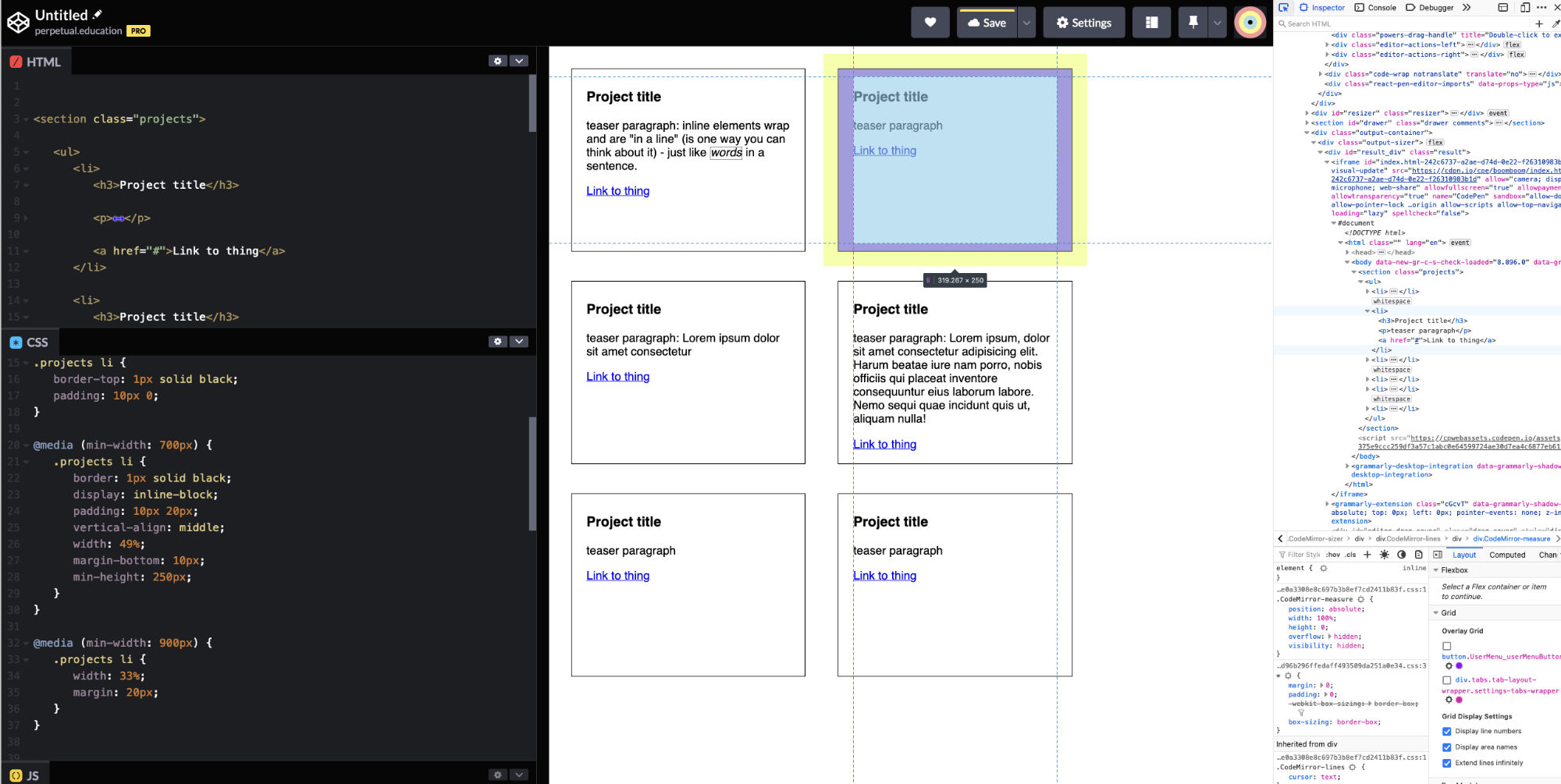
So, if you want things to not be stacked on top of each other – then you have some options. There are inline, inline-block, and block display types. So, if you set the list items to be display: inline-block, then – they’ll have the ability to have padding like a block element- and also to go – in a line – like an inline element.
If you set them to be 50% width (of their parent, right?) – then maybe they’ll act like a grid of items.
hmmm
Sometimes things don’t behave as you expected. And that’s OK.
Remain calm. There is a reason. And you CAN figure it out.
Break time
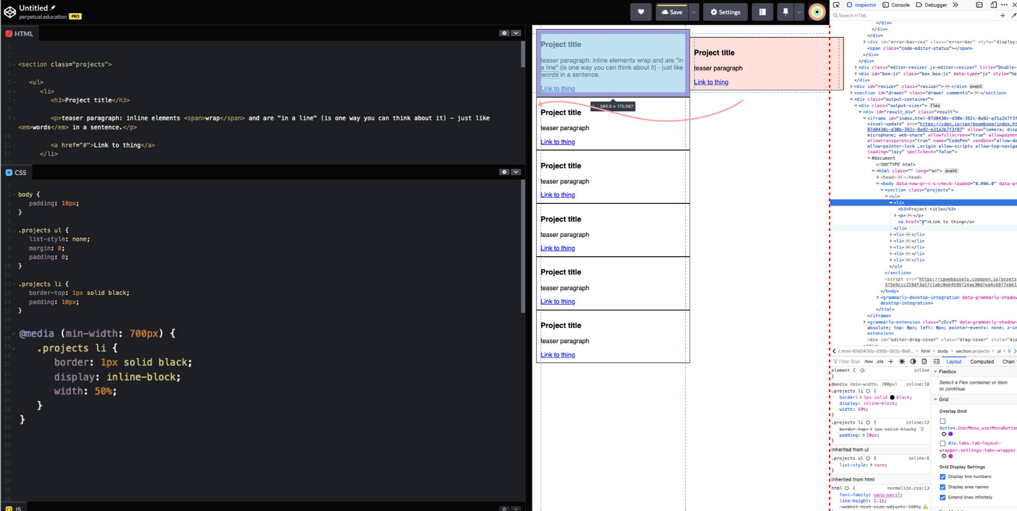
It’s supposed to be 50% – and it is. It is 50% of the parent’s width. But it’s also got the padding and the border size added to that 50%. So, 50% + 20px + 10px * 2 = more than the space available. It just doesn’t fit. So, it drops down to where there is enough space. It’s not what you want, but it is pretty smart.
So, – you should know how to deal with that by now.
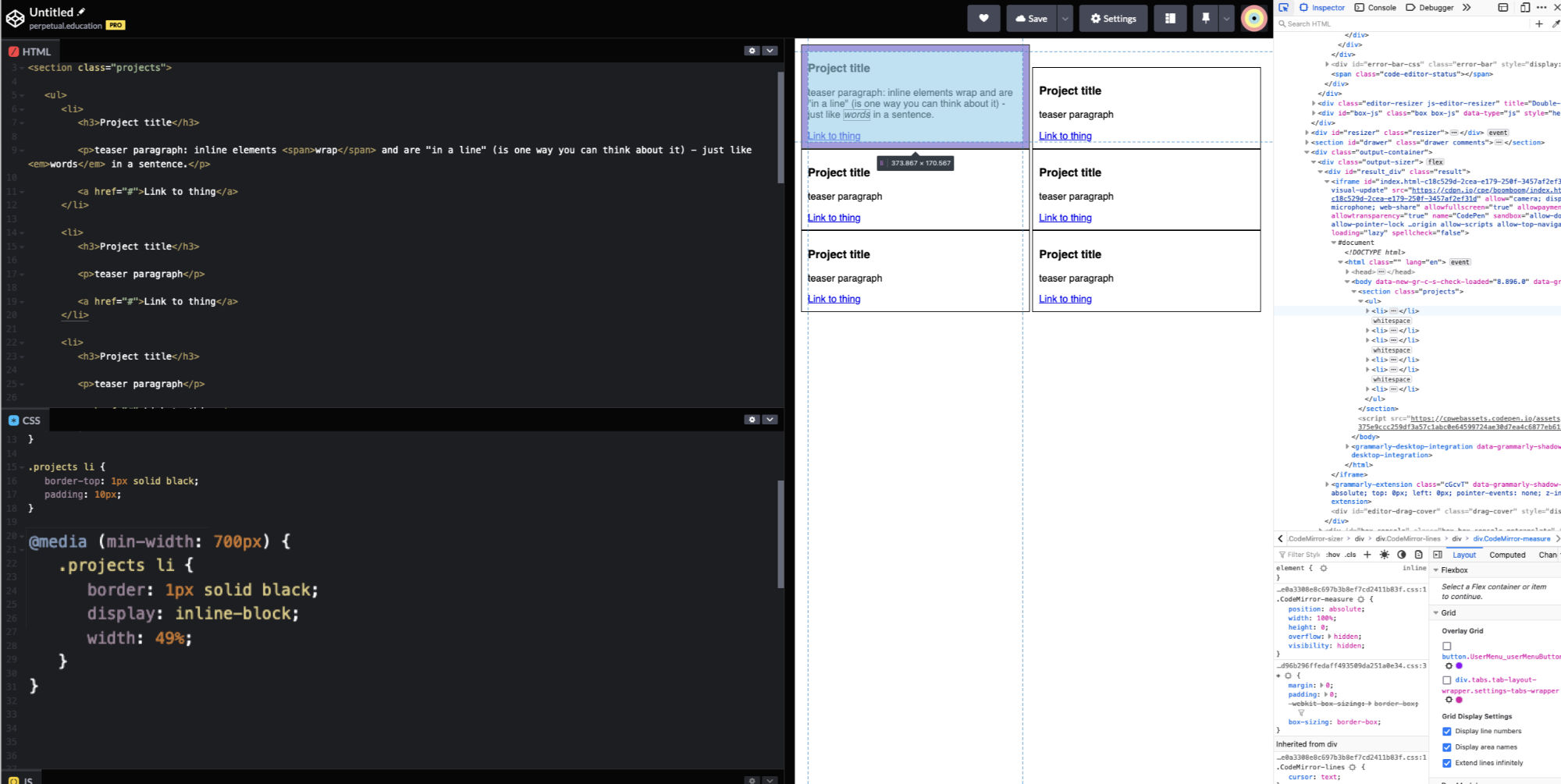
But there’s also another whacky situation that you’ll probably be unaware of. For some reason… there’s a little tiny gap between inline-block elements that throws things off. Boring story.
So, – if there’s a rogue little space… maybe trying 49% might work? It does! (don’t worry – you won’t be doing it like this long-term) (this is more about learning how to work with the tools you have)
But – “why is it aligned like that?” “It doesn’t look right.”
It's doing what you told it to
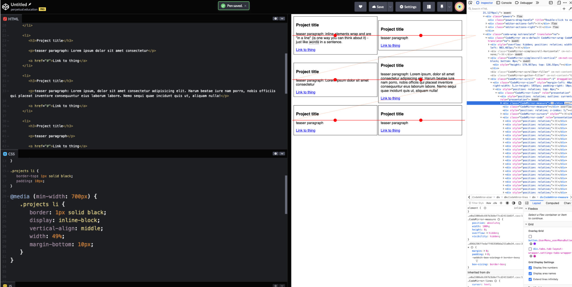
There are defaults for all of the properties. No one tell you that! For example, in this case – vertical-align can’t just be set to “nothing.” It has to have some value at all times. What would “vertical-align: none” mean?
It just so happens that the default value is vertical-align: baseline
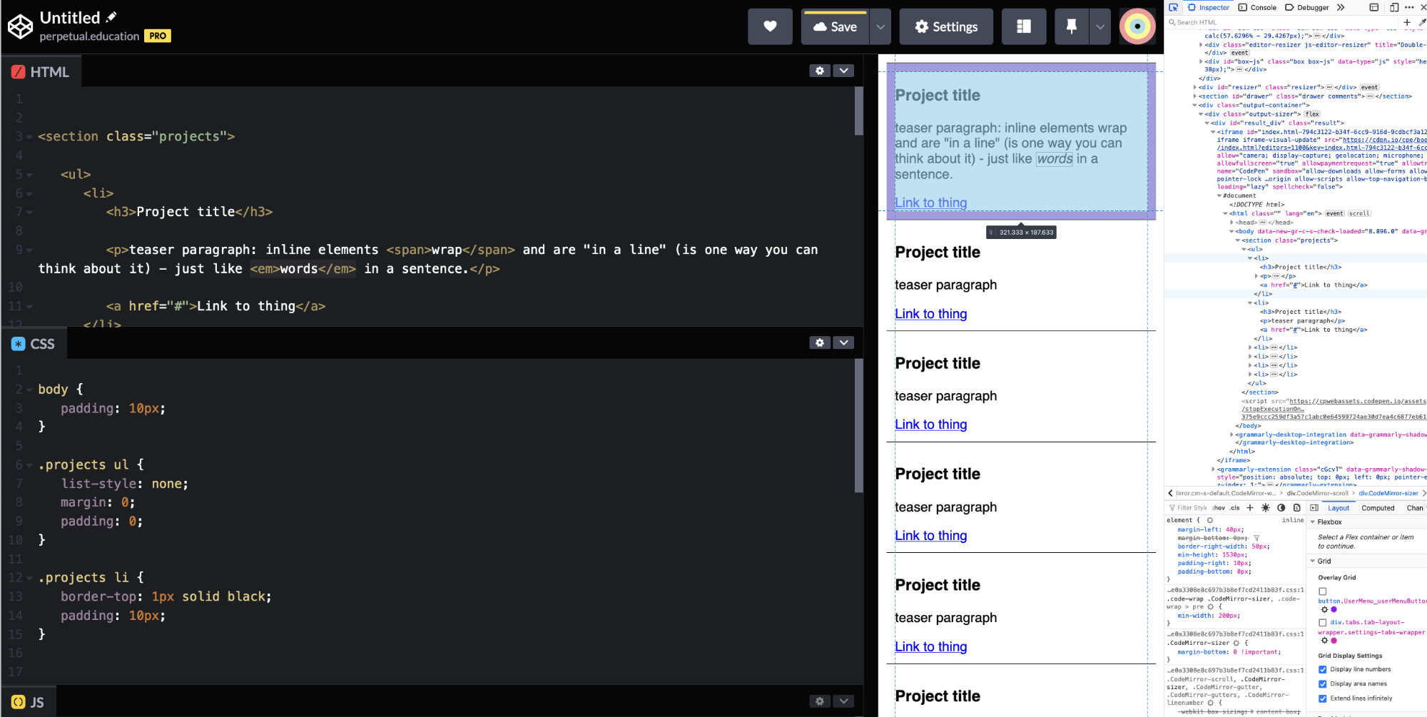
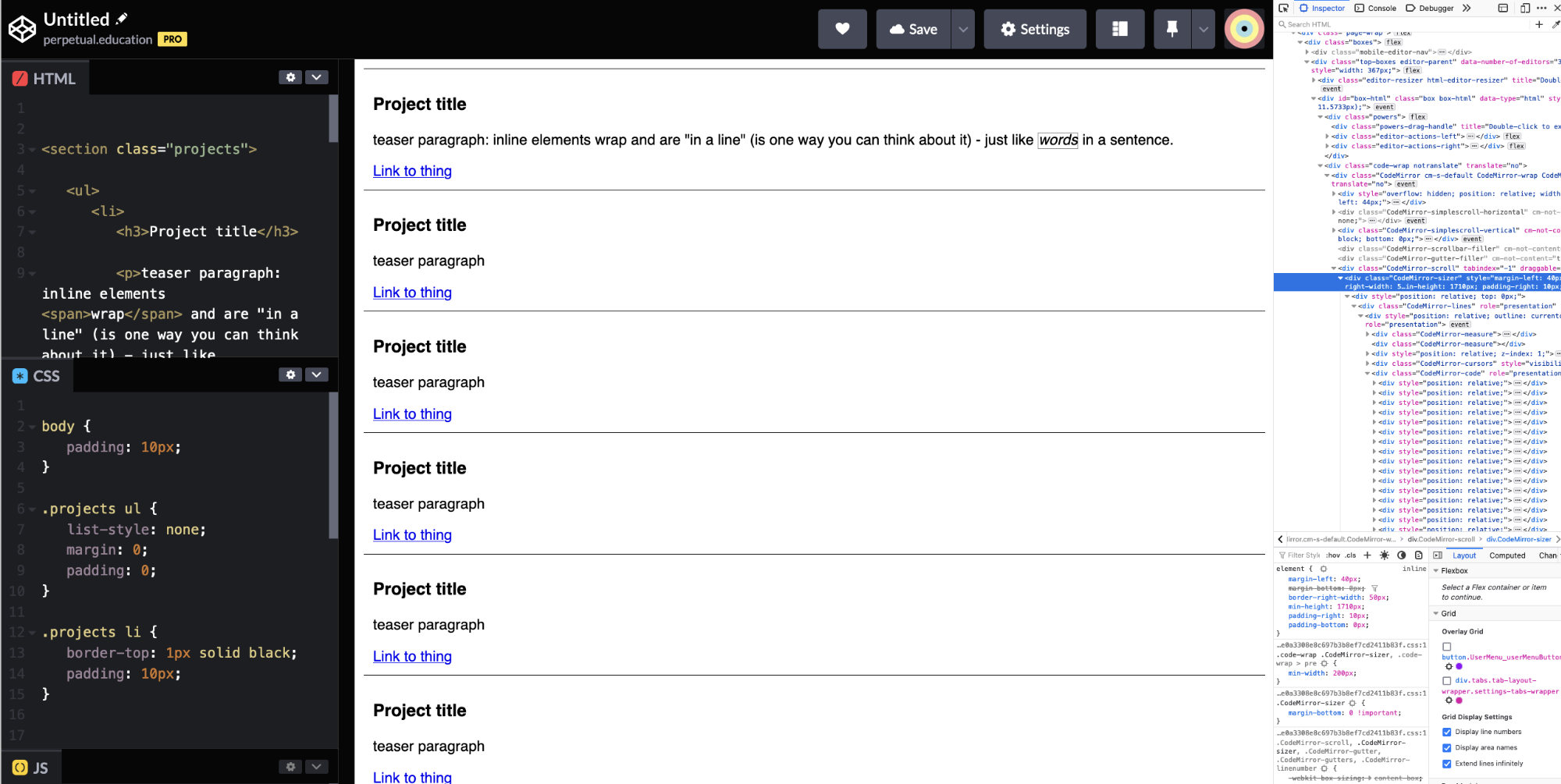
You can try middle and top to see how it goes. See how the blocks wrap and carry down the page just like words in a sentence?
But they are all different heights. Why aren’t they the same. Well – the fact is – they are different sizes. They have different amounts of content. Just like in real life… you can’t fit your car in a shoebox. And some things are just bigger or smaller than other things. Crazy, right?
Uniformity?
Options

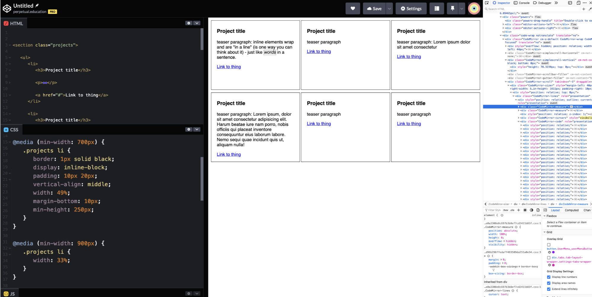
You could try out a minimum height on it or something.
And hey, while you’re at it: You could add yet a second break-point to split the items into thirds.
It’s not fool-proof, but it works OK.
What about space in between them? What about some of the details?
Gutters?
Adding margin – seems to add space – and then it breaks out percentages. You could lower the percentage and then add some percentage margins. It will get tricky though. (but you should try it anyway for fun)
But just adding 20px margin to anything as a form of spacing – isn’t the way to go. Margin is for pushing things away from each other.
Consider this
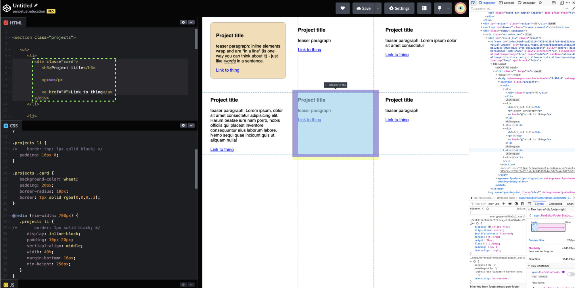
Instead of using the list-item itself as an element to style: what if you just let it be a structural element. Instead, you could create a component that exists inside the list item. This is a separation of concerns. You have a list – and you have a card. The cards go in the list. The list defines the grid. The card defines the card. They are composable components of their own.
We can totally talk about this more
But – since so many people have this same situation – here it is! Carved in digital stone.
Here’s the Pen from above. Play around with it.
Also – something to consider is: is a grid – the best layout to begin with?
and… if you really read this whole thing, and you want to see a little vision of the future, you can look at this Pen.
Exercises
-
Work through this
Whether or not – you ran into this quandary when working, work through it yourself. It will help it stick. We’re not going to make you so your work like it’s 2005 for no reason, but – this is something we feel will help you more thoroughly integrate the display types into your mind.
-
Try creating a grid with floats
You probably tried some floats. But you’ve just learned about @media query rules. So, – give it a shot – and try and create some grids using floats. Make sure you put a border on everything. Anything interesting going on? Wanna talk about it?