Confusing moments with “Web designers”
Hi, there. You're not logged in. So, you must be a visitor. Welcome!
What is this? You are viewing one of our supplemental "Stories." In addition to our core design curriculum, we are constantly building out additional resources. Stories are a collection of real work tasks, design history, UX explorations, and work-throughs. Stories are often off-the-cuff and less concerned with production value.
This is in the works! Would you like to help flesh it out? Let's do it!
The "design"
![](https://perpetual.education/wp-content/uploads/01-3.jpg)
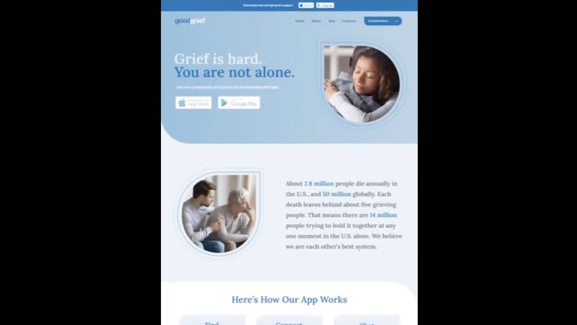
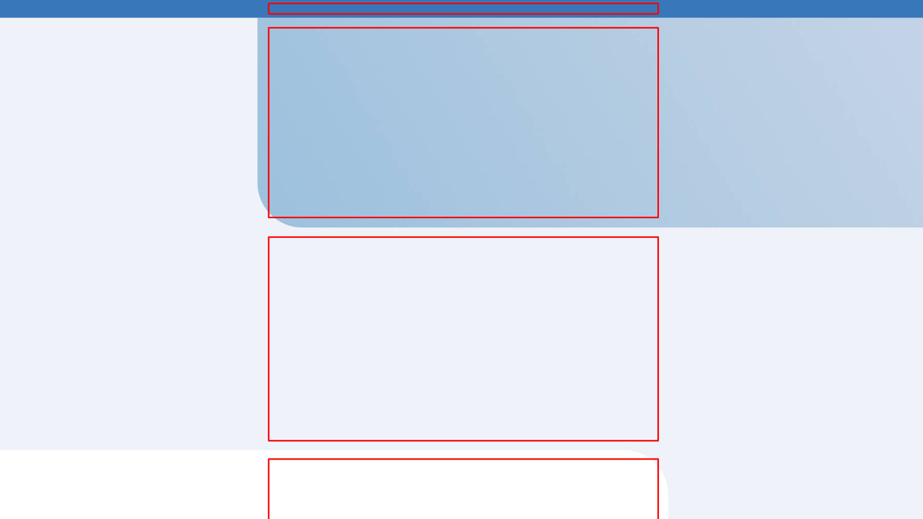
It’s VERY common to be given a “design” like this.
First off – there’s no clarity on what happens on larger screens. And then on top of that, there’s no mobile layouts.
Take a minute and think about how you’d work out that bigger picture page structure in the code.
Option 1: white sides
![](https://perpetual.education/wp-content/uploads/02-3.jpg)
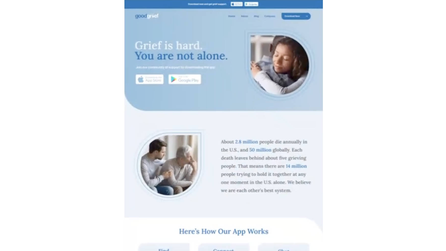
Is is supposed to be like this? With white on the sides?
Option 2: stretch?
![](https://perpetual.education/wp-content/uploads/07-1.jpg)
Wouldn’t this make everything big and weird?
![](https://perpetual.education/wp-content/uploads/03-2.jpg)
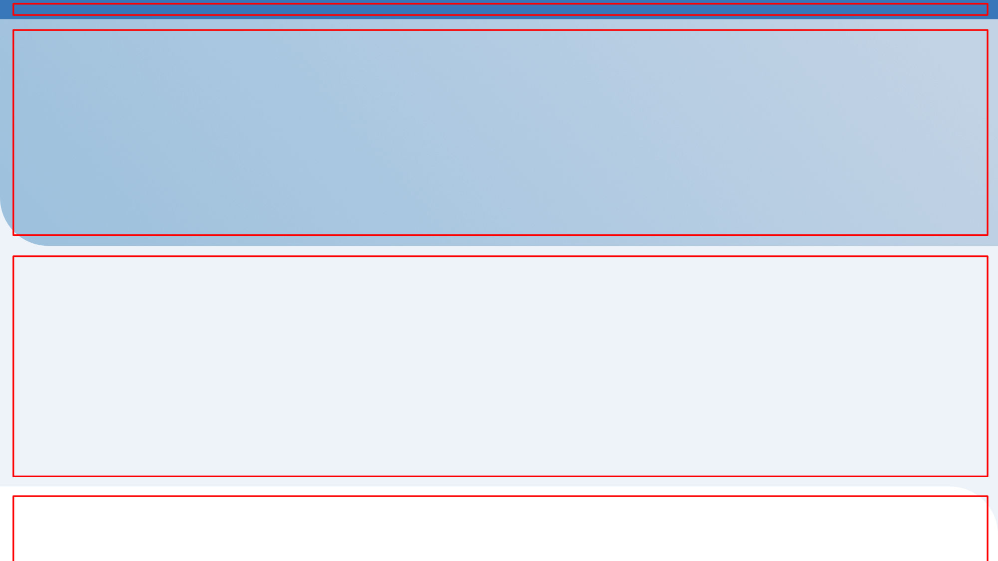
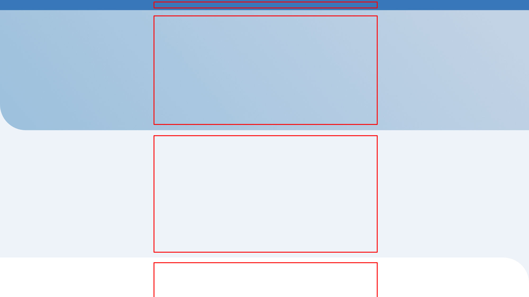
(just taking out the content to see the layout)
Option 4: stretched with centered content
![](https://perpetual.education/wp-content/uploads/06-1.jpg)
Like this?
Option 5: blue background
![](https://perpetual.education/wp-content/uploads/04-1.jpg)
Is is like this?
Option 6: centered with the sides going off
![](https://perpetual.education/wp-content/uploads/05-1.jpg)
Is it like this??
The interesting part – is that (usually) – the visual designers (the one’s who made this) can’t explain it either…