User Preferences
Introduction
Some of these are experimental.
We’ll put them in order of importance. (our take on that)
Font size
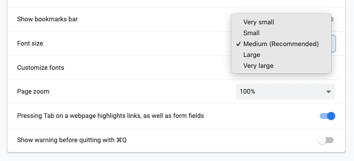
The browser will let you choose a base font size preference. It’s usually something like “small,” “medium,” or “large.”
This is why we suggest taking a look at rem units for body copy and micro copy too.
Reduced motion
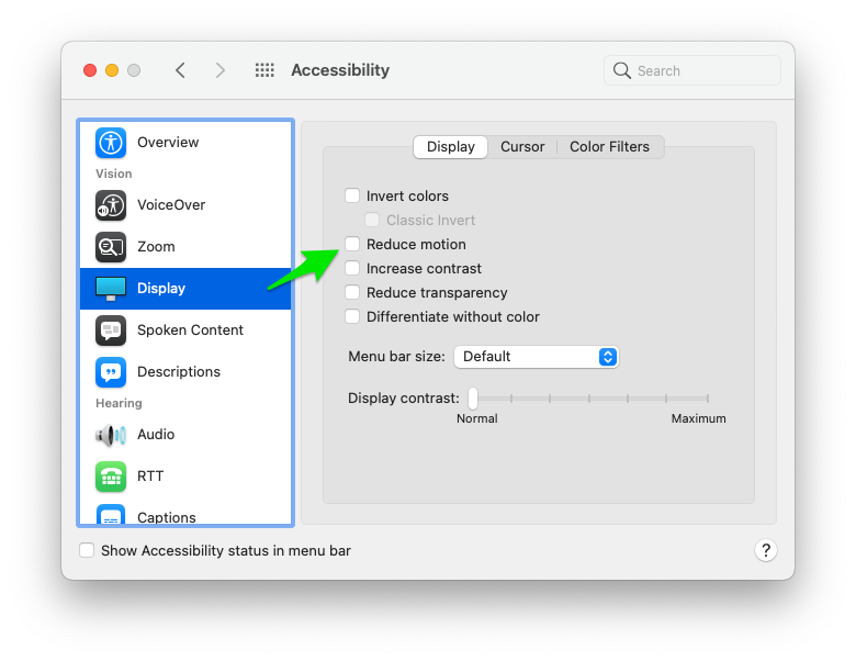
Got a wild animation? Well, not everyone wants to see it. So, you can put it behind a flag. It’ll only do its thing – if the user hasn’t explicitly set their preferences to reduces motion.
Note: you can use window.matchMedia("(prefers-reduced-motion: reduce)"); to hook into these things with JS.
The size of the window / viewport
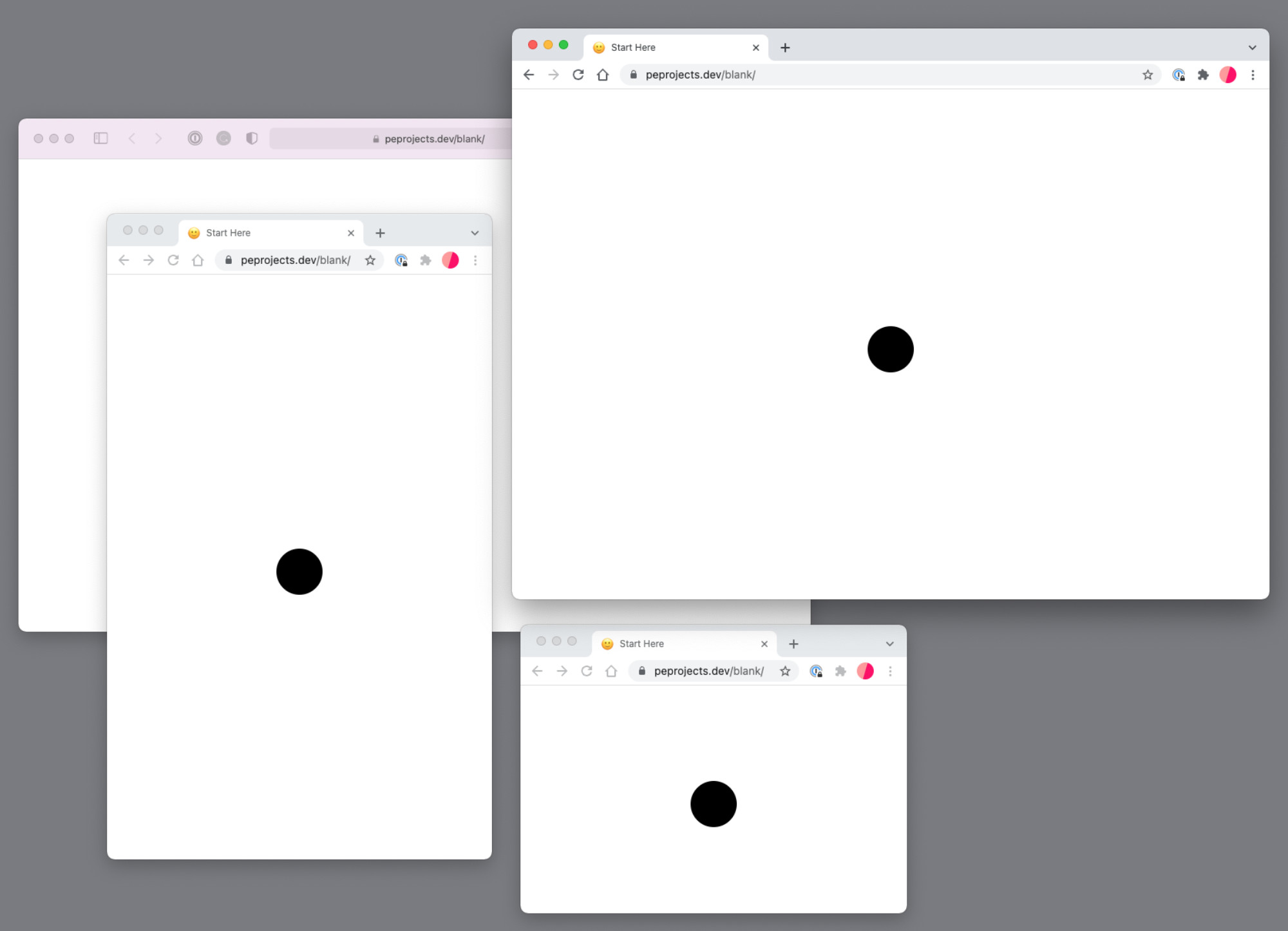
You can’t change the size on all devices – but you’ll have to assume that the user can decide what size the viewport will be.
Sounds obvious, but it’s a user preference – right?
This also includes how many bookmarks and addons and chrome that contribute to the clutter.
Zoom
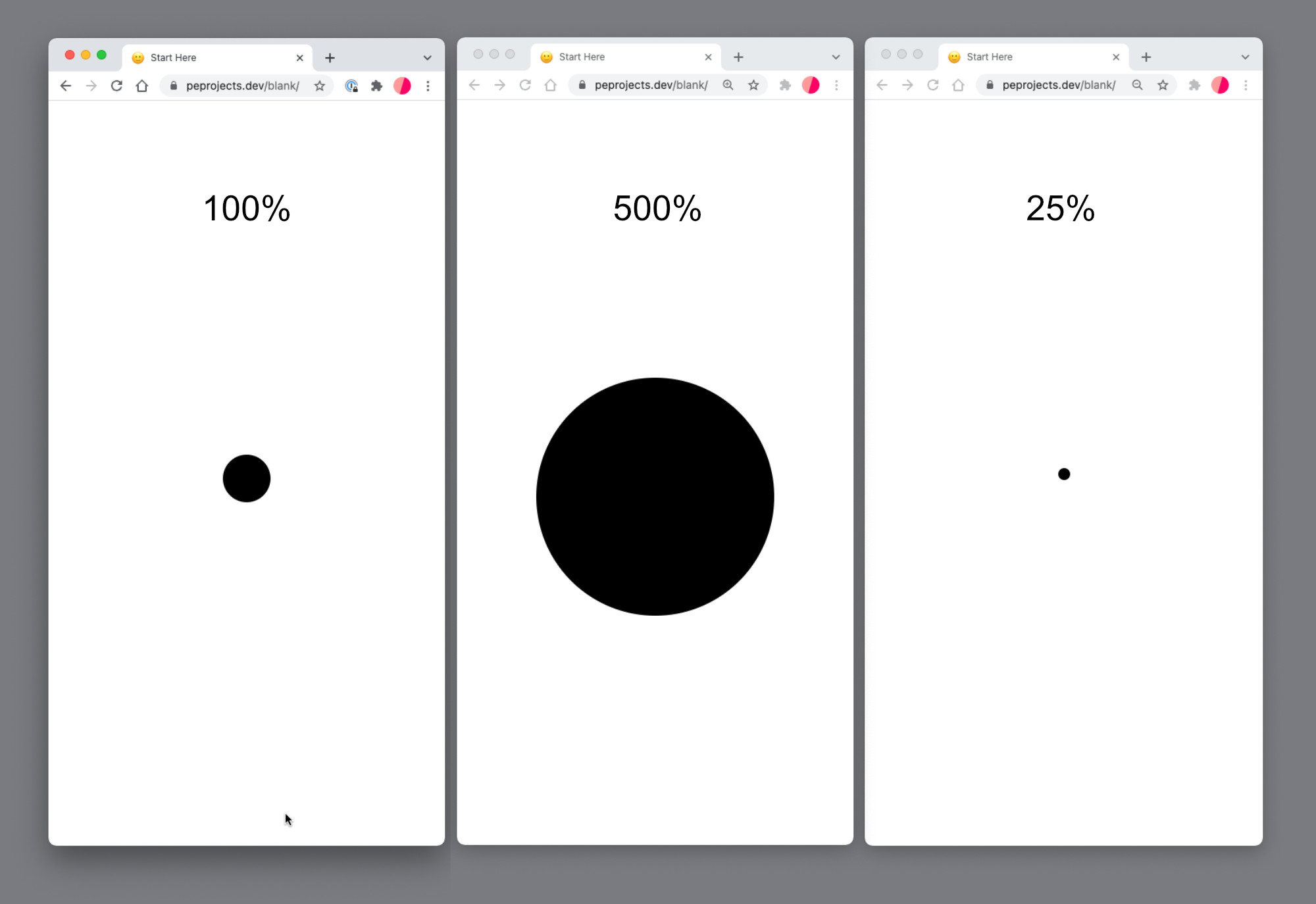
This can be set in preferences or changed on the fly.
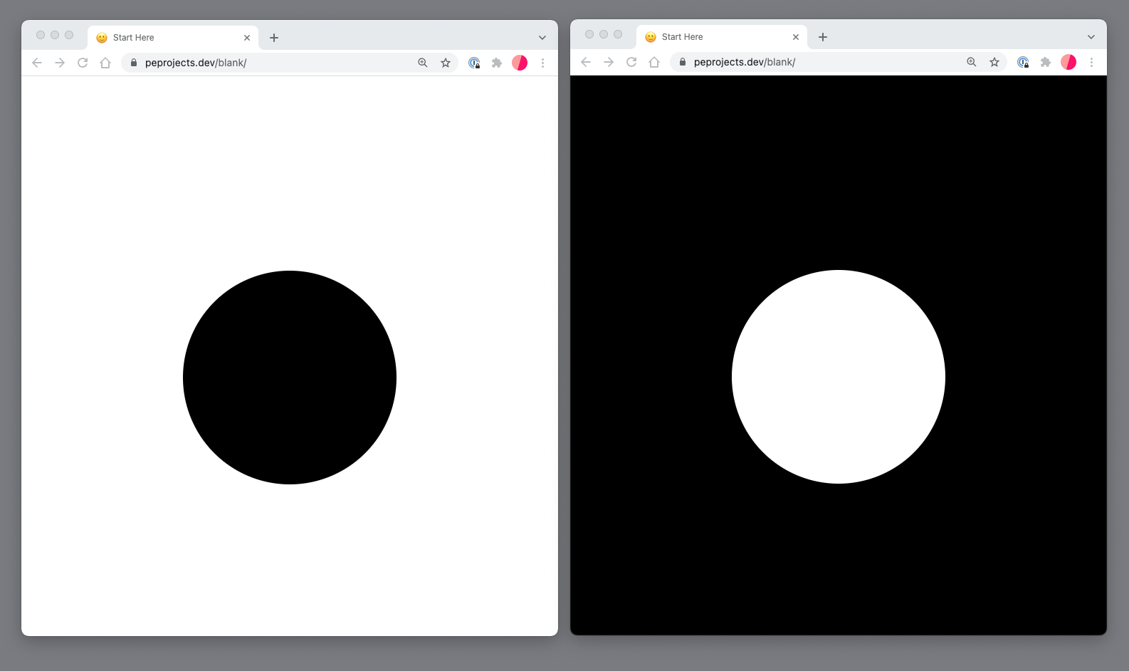
Contrast
Still super new, but – something to consider / and be on top of. Looks like it’s going to happen.
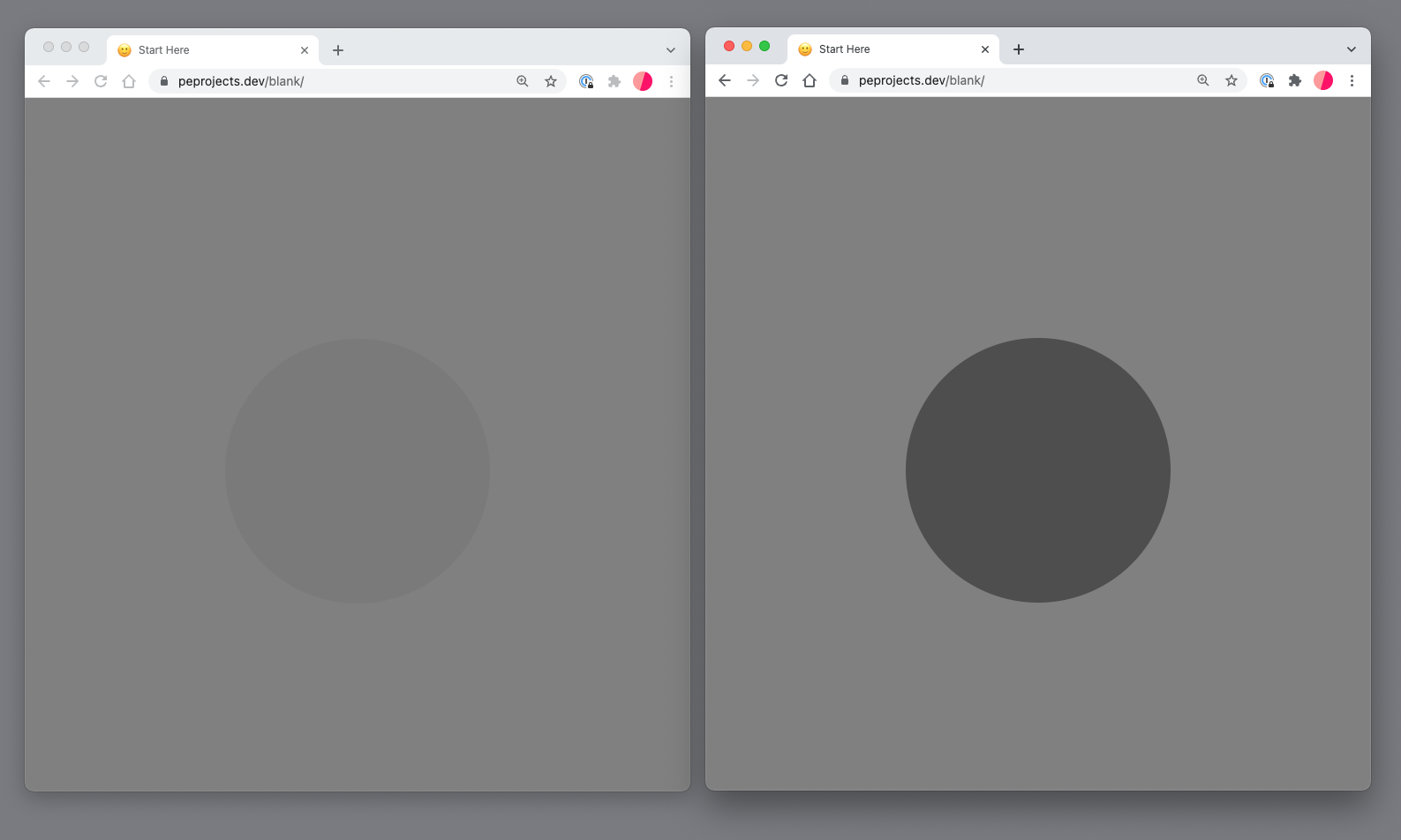
Color scheme
You know that light and dark mode stuff? Users can set this in the larger computer scope.
Not happening yet
prefers-reduced-data,
Any other new things on the horizon? Or things we missed? Let us know!
This is where a video should appear, but no Vimeo ID has been added yet. Paste one in the editor — or want one recorded?