Responsive layout collection
Introduction
You WON! You completed the responsive layout challenge.
Now it’s time to keep adding to it. Let’s see this garden grow!

Find things and copy them


But where do I find modules? Help!?
You can do it.
A first stab at the page
<?php include('header.php'); ?>


<section class="page-header">
	<inner-column>

		<h1 class='loud-voice'>Layout garden</h1>

	</inner-column>
</section>


<section class='section-one'>
	<inner-column>

		<my-cool-layout-one>...

	</inner-column>
</section>


<section class='other-section'>
	<inner-column>

		<my-other-neat-module>...

	</inner-column>
</section>


...and so on...

<?php include('footer.php'); ?>
Create a layout-garden.php page or a /layout-garden folder depending on your folder structure.
(Assuming you’re at the beginning of module-two)
If you’re further along, then you already know all your choices, right? Or if you’re – really further along and want to do this with Vue, ask us about some of the details for that.
Find things and copy them
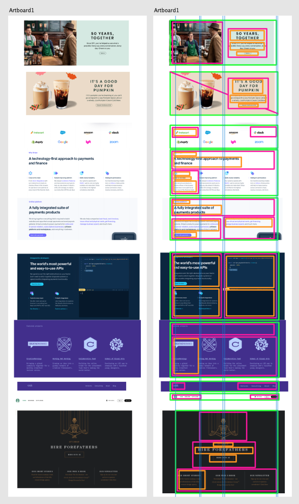
Seriously: You can find them
Right?
Also
Use your typography system. Use the type patterns and use your custom properties and then you’ll get a really solid understanding of how that scales. You probably only need 5 sizes… or do you…
<?php include('header.php'); ?>


<section class="page-header">
	<inner-column>

		<h1 class='loud-voice'>Layout garden</h1>

	</inner-column>
</section>


<section class='section-one'>
	<inner-column>

		<?php include('modules/my-cool-layout-one.php'); ?>

	</inner-column>
</section>


<section class='other-section'>
	<inner-column>

		<?php include('modules/my-other-neat-module.php'); ?>

	</inner-column>
</section>


<section class='other-section dark-theme'>
	<inner-column>

		<?php include('modules/my-other-neat-module.php'); ?>

	</inner-column>
</section>


...and so on...

<?php include('footer.php'); ?>
And consider keeping the module code in their own files.
That way, you can reuse them. And you can style them differently based on their parent context too…