How to design a website
Posted: July 9, 2022 / Last updated: August 20, 2025
The year 2000
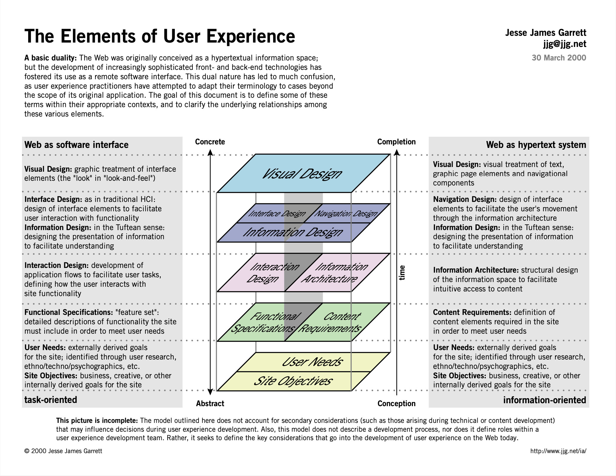
You should 100% definitely read the book. It’s digestible for any skill level and valuable for every role on the team. The Elements of User Experience.
The year 2024 (24 years later)
This is how most agencies do it.
(from the angle of whoever establishes the client or runs the team)
-
See some websites you are impressed by
-
Get into some prospective client meetings
-
Tell them all about how great this website you’re going to make for them is
-
The client isn’t sure
-
You get your top “designer” to spend three 12-hour days mocking out a bunch of website pages that mostly copy those sites you liked with a little twist
-
You present it to the clients and they love it! You tell them it’s amazing and they really like that feeling they are getting
-
You have your design lead and the 2 Jr. designers mock out every single page they can think of to stuff into the project
-
You hire a UX designer to retroactively build out wire-frames because that is part of your deliverables in the contract
-
You go through many rounds of revisions and the client’s family and friends all get a chance to weigh in and remove some of those purple knobs
-
The client loves you and thinks this website they’ve been working on with you is a success!
-
You send it off to the developers to have it “coded” up – and then the mayhem begins
Great! So, what’s wrong with that?
Well, it’s a complete perversion. This is not design.
If you’re actually designing something, then there is a goal. Visual designers ARE designers. But that’s just one layer of the design thought process. In regards to The Web, it’s really a progressive enhancement. Bots don’t care about your typeface. Screen-readers don’t care about your layout. Blind people don’t see your colors.
The goal is not “to make the client feel good.”
The client NEVER wants a website. They want something else. The Web is just a medium they can use to get that thing. And the client’s goals are really to fulfill their client’s goals. They want their users to become badass – because their users want to become badass.
Read Badass: Making Users Awesome by Kathy Sierra. It’s beyond interface design or UX or marketing. It’s the whole concept.
“But it's so confusing!”
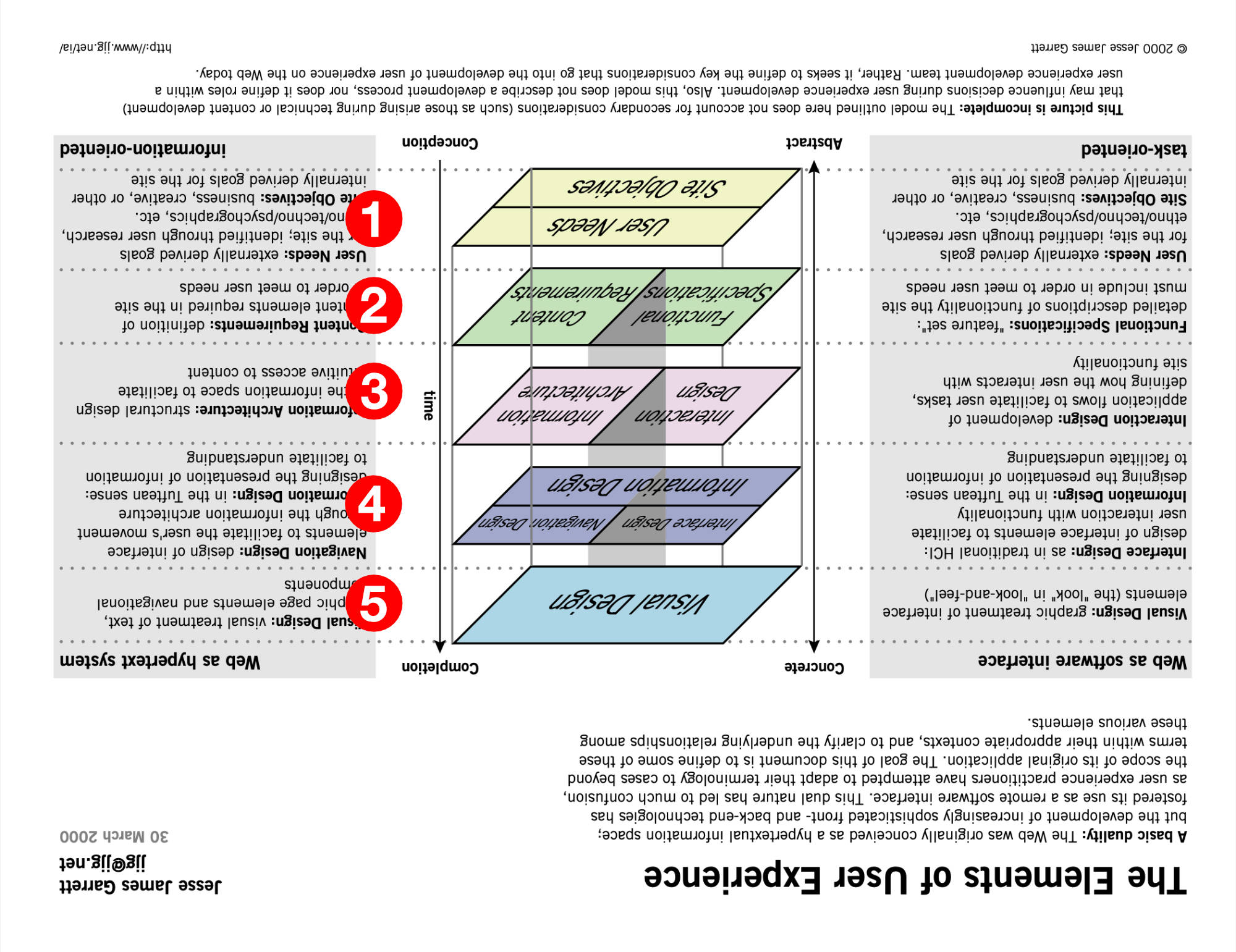
Trying new things is hard. Your body will say “can’t we just do it the way we already do it?”
Try this out. Turn it upside down. Now you have a checklist to follow.
A slightly different view
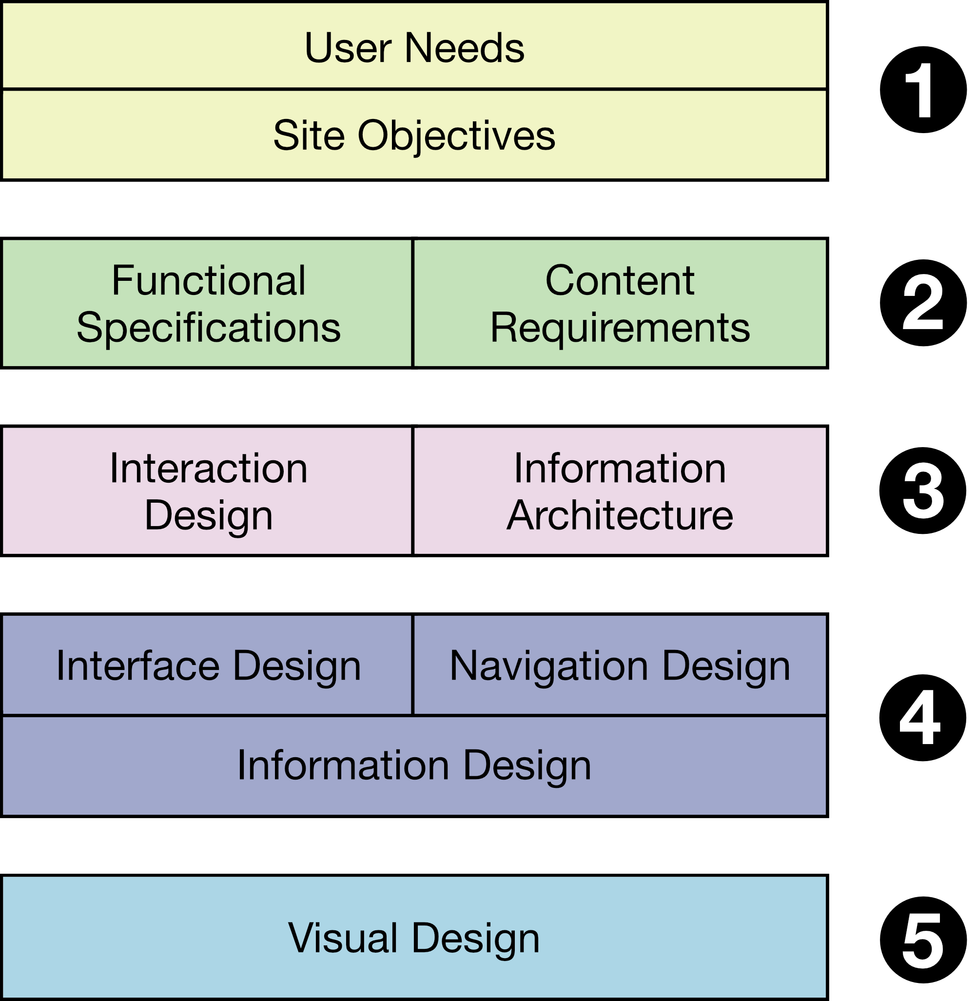
Jesse James Garrett‘s book goes into much more depth than the original diagram, but we can just talk about this version.
If you’re starting your web design project in “An all-in-one design platform” like Figma, you’re doing it wrong.
Does "The Designer" do all of that stuff?
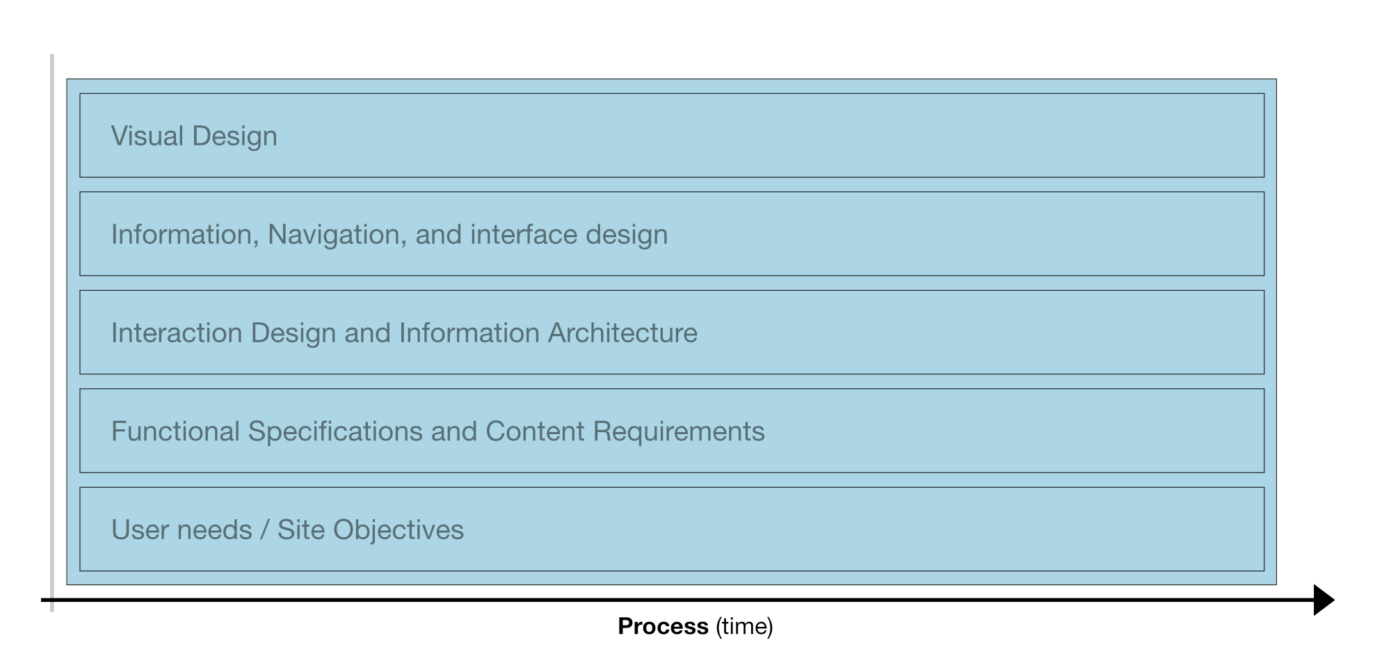
Sometimes you have a small project and you really do end up filling all of these roles.
However, the idea that the “Designer” at your agency is magically doing all of this in a graphics program is ludicrous.
Common workflows
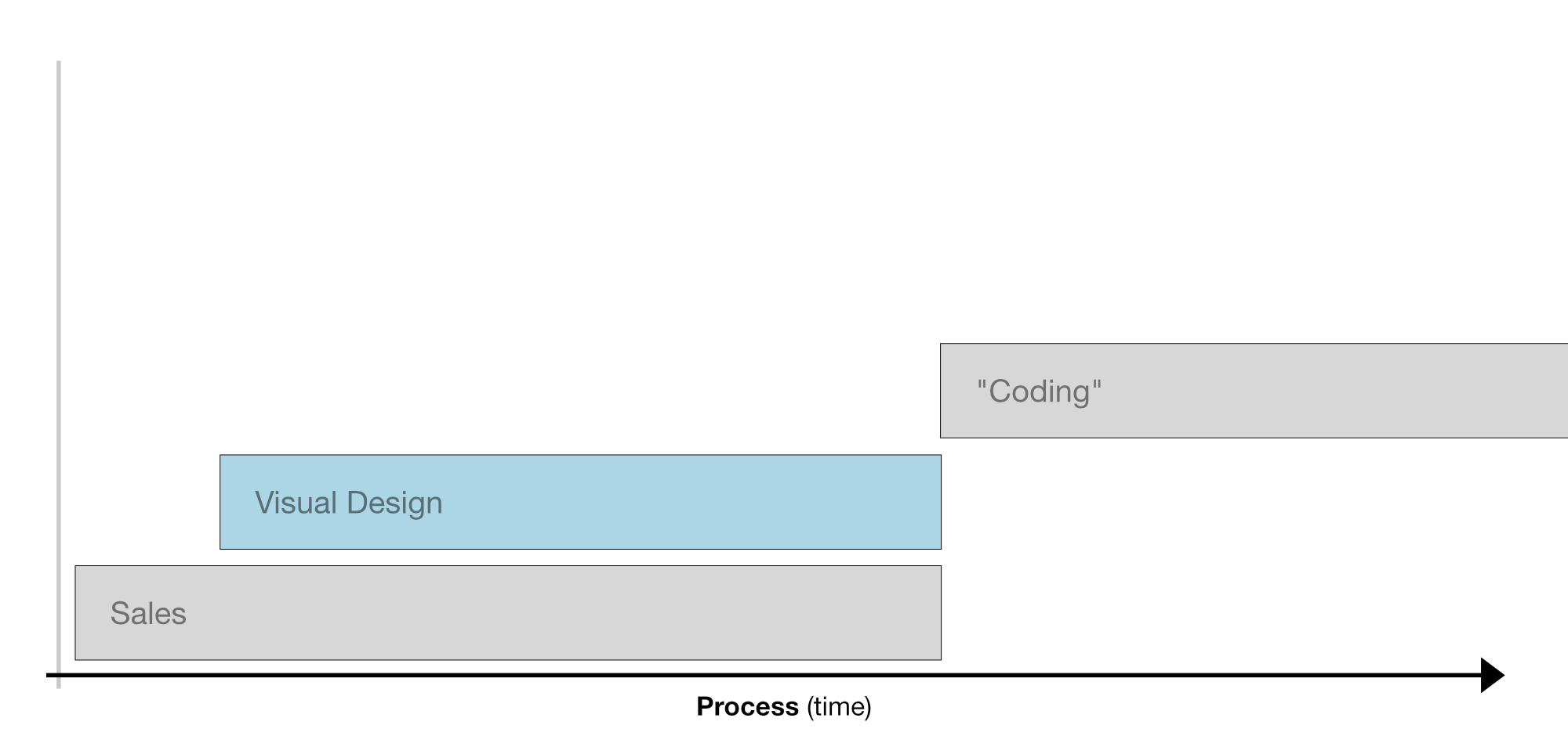
“Waterfall” goes a bit like this.
Sales → Production art → Figuring how to make that visual asset into a website
Reverse waterfall
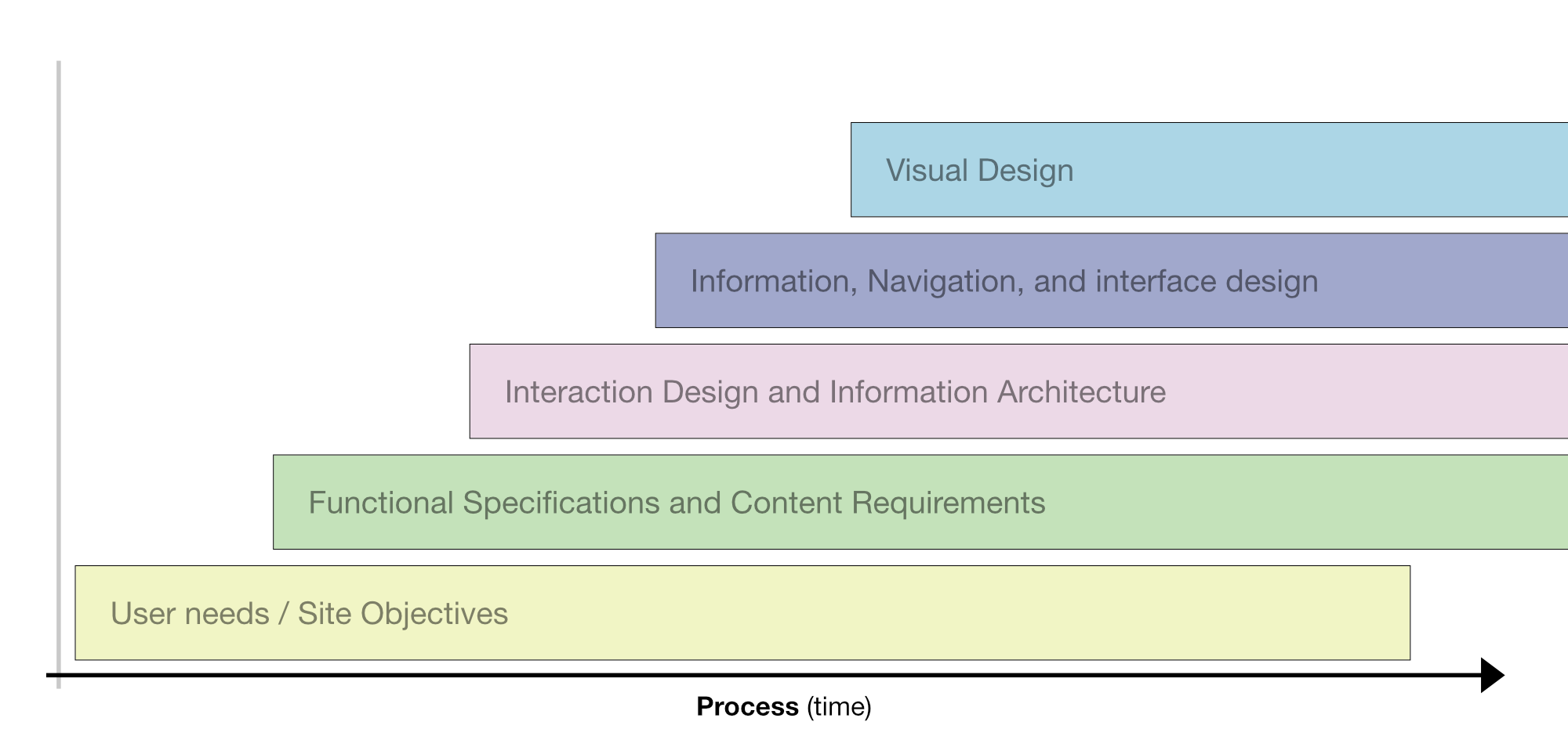
Some people might want to oversimplify it like this.
Objectives → Requirements → Architecture → UX/UI → Visual Language
And this is a fine way to think about it (if you want). It is lightyears ahead of the waterfall shown in the previous figure.
What about this?
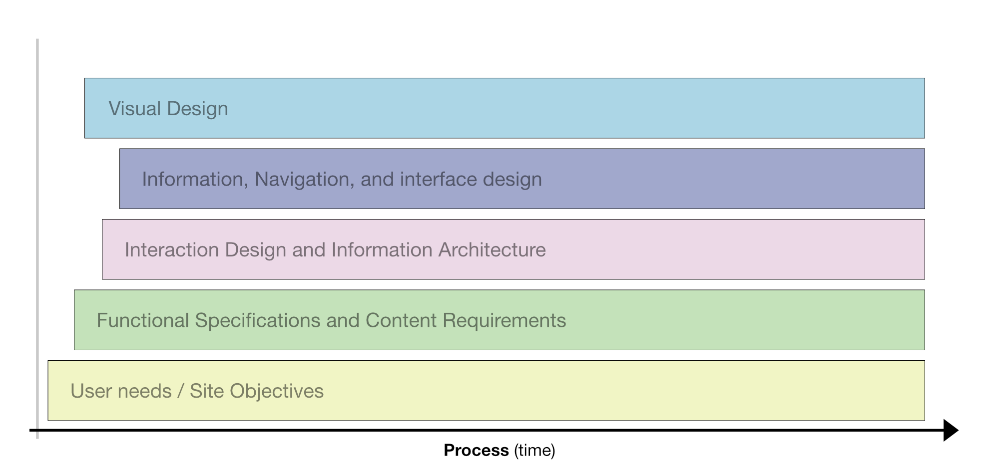
Couldn’t most of these things happen simultaneously?
Form will follow function. The goals will lead the way. The content will decide how it wants to be displayed. If you start with a prototyping mindset, then you’ll have built out the system and the modules long before it’s time to dress them up. But this whole time, the visual-focused designers will be building out and testing that visual language.
It’s entirely possible – to make better products – faster. But it will involve a change in mindset.
Would you like to build better things – more efficiently – with less stress – less money – and have time left over to focus on the most interesting problems?
You can.