Almost all user interface layout comes down to this
Introduction
Developers and designers like to say “it’s not my job” whenever there’s friction. Only a real talent could ever arrange a few objects… right?
But we can see past that…
We know you’re just scared.
If you were to place two items in front of you, you’re likely to put them like this – in the center of the table.
If you can organize things on table, or a sock drawer: then you can learn UI design and CSS. (We haven’t heard a lot of people complaining about how complicated “forks and dishes” are.

You’ve probably seen paintings hung on walls. Or portraits. Or a diagram of a floor plan from above. It’s not that wild, right?
Now: What if we asked you to “spread these out?” Would you be able to do that? What if we said, “align them to the top left – or bottom right.” Would you be able to do that? (we believe in you)


Your free "Layout Master Class"
We know that developers like to believe that they are “left brain” people and that “designers” (often referring to the photoshop/figma production artist) – are “right” brain.
How could a “coder” ever understand how to set some typography – and put a roundy corner on something…?
How could a “creative” ever understand the incredibly complex system of boxes that defines the layout on a web page?
Interface layout?
Well – they can. There’s no such thing as “left-brained” and “right-brained” – and the truth is that whatever you aren’t good at – is because you haven’t practiced it. So, – here’s the secret:
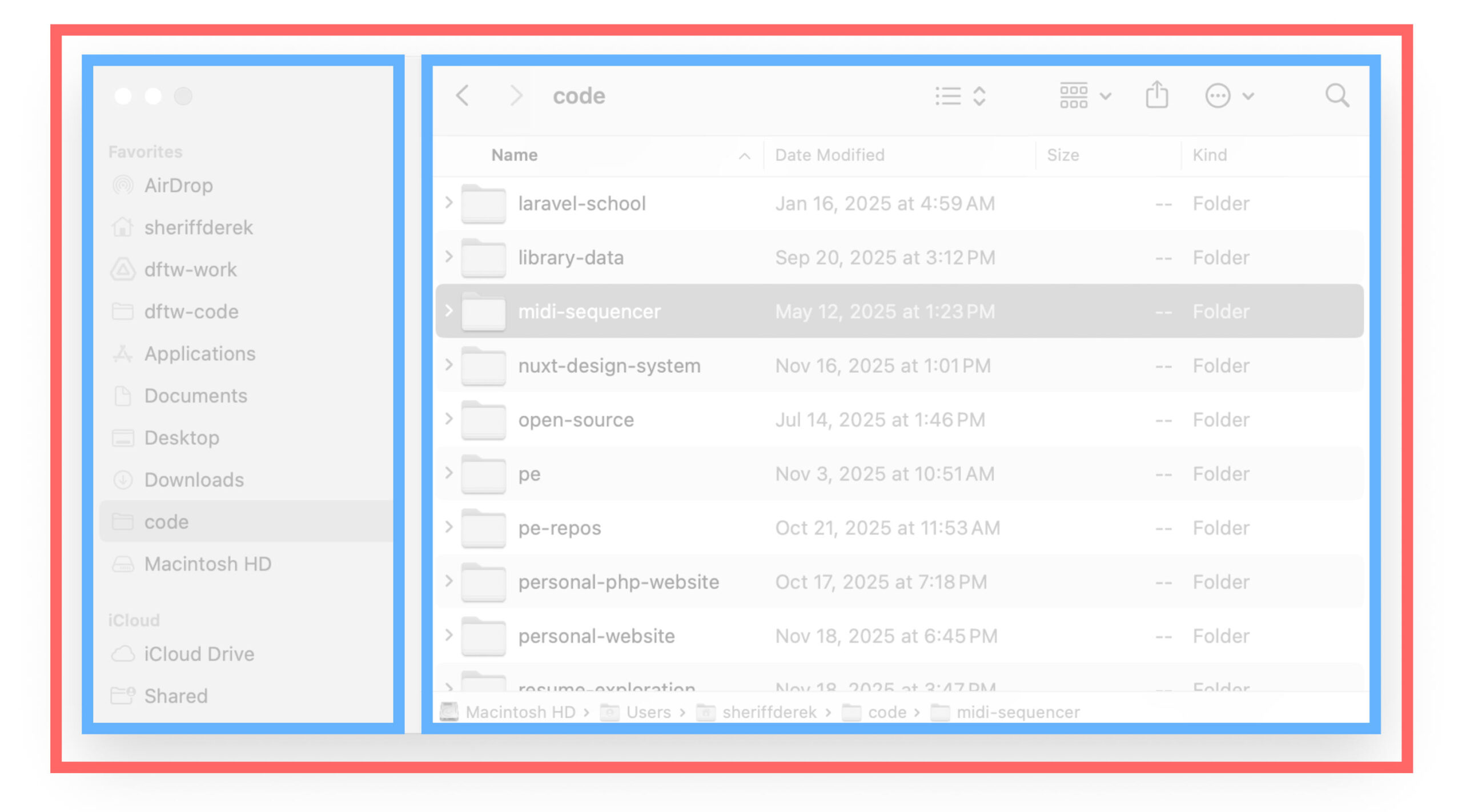
It’s a box.
It’s a box – with two other boxes – inside of it. (almost always) (please feel free to argue with us on this)

OK. Now for the really really confusing code
-
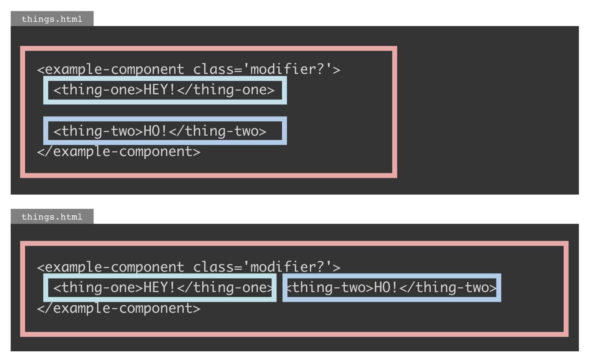
things.html 🔒 <example-component class='modifier?'> <thing-one>HEY!</thing-one> <thing-two>HO!</thing-two> </example-component> -
things.html 🔒 <example-component class='modifier?'> <thing-one>HEY!</thing-one> <thing-two>HO!</thing-two> </example-component>This is the same.
-
things.html 🔒 <example-component class='modifier?'><thing-one>HEY!</thing-one> <thing-two>HO!</thing-two></example-component>This one is also the same. It’s just much less readable.
Use the parent. Children shouldn’t have to know anything about how they are positioned. Always set the position on the context. It’s the parent’s job to organize things. (The child might have some preferences but get the basics down first)
Now only the most spiritually connected people are going to be able to see the pattern here, but you’ll have to take our word for it. If you look really really closely… you can see that the things in the code are things…
Make it easy on yourself
Laying out website/app headers, checkboxes, lists, – and whatever else… comes down to a solid understanding of just a few options.
Key
concept
Modifier key
These keys temporarily modify the normal action of another key. By themselves, modifier keys usually do nothing. Wikipedia reference
When you choose display: inline, block, inline-block, flex, or grid, it behaves like a modifier key. It will change what properties can be used in this new context/scope.
In a column (stacking blocks)
See the Pen In a column (stacking blocks) by perpetual.education (@perpetual-education) on CodePen.
Instead of starting with 200 properties and every option in the universe, start with 1 property.
- Decide which layout system to use (in this case: display type
flex)
(by nature each property needs some type of value, so – inherently there are default values like this example of flex-direction: row;
(and note that properties like gap are only available in in the flex or grid layout system) (So, the layout system will define what is possible)
In a row (in a line)
See the Pen In a row (in a line) by perpetual.education (@perpetual-education) on CodePen.
- Decide which layout system to use
- Decide which directions things flow (
roworcolumn)
Space between things
See the Pen Space between things by perpetual.education (@perpetual-education) on CodePen.
- Decide which layout system to use
- Decide which directions things flow
- Decide how you want the space to be distributed (along the chosen direction)
When things don't fit
See the Pen When things don't fit by perpetual.education (@perpetual-education) on CodePen.
You can’t put a car in your sock drawer. No one is ever confused about that. So – text – that is bigger than a box you shove it in… won’t fit.
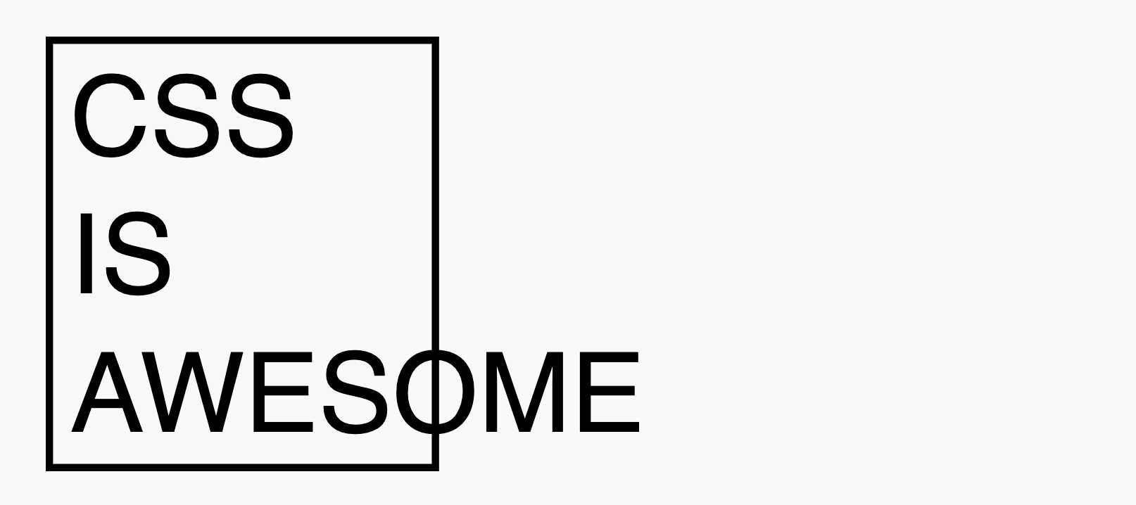
In 2009, Steven Frank shared this image. People think it’s hilarious. But is it? Why would that word fit in there? It doesn’t fit. Do you want physics to just “change” to suite your unconscious feeling that it should be different?
HTML and CSS form the most resilient, adaptable, and cross-platform medium ever created, (rendering across decades of devices, contexts, and constraints)… so, think about that a little.
Wrapping around to the next row (like text) (and Pac-Man)
See the Pen Wrapping around to the next row (like text) (and Pac-Man) by perpetual.education (@perpetual-education) on CodePen.
- Decide which layout system to use
- Decide which directions things flow
- Decide if you want the content to wrap back around along that flow
Stretch as a default
See the Pen Stretch as a default by perpetual.education (@perpetual-education) on CodePen.
- Decide which layout system to use
- Decide which directions things flow
- Decide how you want them to align against that flow
Align center (on the horizontal axis)
See the Pen Align center (on the horizontal axis) by perpetual.education (@perpetual-education) on CodePen.
Putting them together
See the Pen Putting them together by perpetual.education (@perpetual-education) on CodePen.
All together… 1) the display type and 2) gap, are prettty easy to just know once – and forever.
So, you’re really dealing with about 3 properties. Just like in real life: together, apart, across, down, top…. (basic stuff you already know about from regular life)
Grouping
See the Pen Grouping by perpetual.education (@perpetual-education) on CodePen.
From there – – – you can mix an match and next parent/child relationships till the cows come home.
OR – you can just cover your eyes and ears and scream until CSS leaves you alone – and keep on living in the dark for no good reason. Most people choose that.
So, now that you know the secret to UI and front-end dev…
Consider learning real “Design.” Then, this coding stuff can help you build your designs.
Idea came from this Quora question:
Looking to learn CSS like – really good?
We know of a pretty great program. You can check it out.