Content strategy and COVID-19: Tell us how to give you money
Posted: April 3, 2020 / Last updated: July 7, 2020
People FEEL like they want an elaborate or fancy website / because that’s what the salesman is selling… but they don’t.
No one wants a “website“. What they want is something else. They want to tell you about their services and goods – and they want to tell you their story – so you can be a part of it. They want to let the computer handle the boring stuff like money and shipping – so they can do the human stuff.
and if the website isn’t getting you to those goals – then it’s not of any value to you – or the people visiting you. (and it’s probably hurting you)
This matters more than ever right now.
Some things to investigate & make sure your website is doing it’s best – to keep you in business during COVID-19
I’ll provide some case-studies – and some ideas. These things can probably be done in-house.
WORK IN PROGRESS
I’m nowhere near done with this article — but I’m passing it around early to ask for more examples – and to help people start thinking up ideas ASAP. I’ll remove this note when it’s 100% done. : )
An overview of how things have changed
Sure, we weren’t prepared for this – but these are things we wouldn’t have thought of anyway.
-
Suddenly, the messaging on your website doesn’t reflect what has happened. The strategy needs to change because your business has changed.
-
You don’t know how to change it – and you feel like you’re too busy to deal with it – or that it’s a lower priority given the circumstances.
-
The internet is slower than usual – because everyone is streaming TV all day now. So, your flashy website might be loading really really slowly – or just totally broken for some visitors.
-
There are employees with no income / but you’re relying on outsourcing to a 3rd party delivery service to keep things running.
Todo
You can do it. Or – you can pay someone to do it – QUICKLY – so it’s done. They can do it. They might already work for you.
-
Figure out your goals. They’ve probably changed a little – in the short-term
-
Write out the messaging.
-
Update your website to meet your goals – and social channels to help keep the message flowing.
-
Think about some ways to skip the 3rd party middle-men. Sorry, guys… but our current employees are more important than ‘an app.’
-
Got an oven? Got some flour? Maybe you sell bread now too. Can’t make cocktails? Maybe you’re a bottleshop now. Normally only serve dinner? Maybe you serve lunch now too.
-
Is your menu suddenly annoying you? Simplify it. Round up the prices – sell food – and not experiences.
TLDR; This is a LONG article
Would you like to just watch the video instead of reading this? [[ there will be one tomorrow ]].
Also, note that many of the figures/image examples – are from larger screens – and might not read well on your phone. Images are mostly taken from a standard laptop size.
You never know what size or ratio your website will be viewed - The Web is a fluid medium
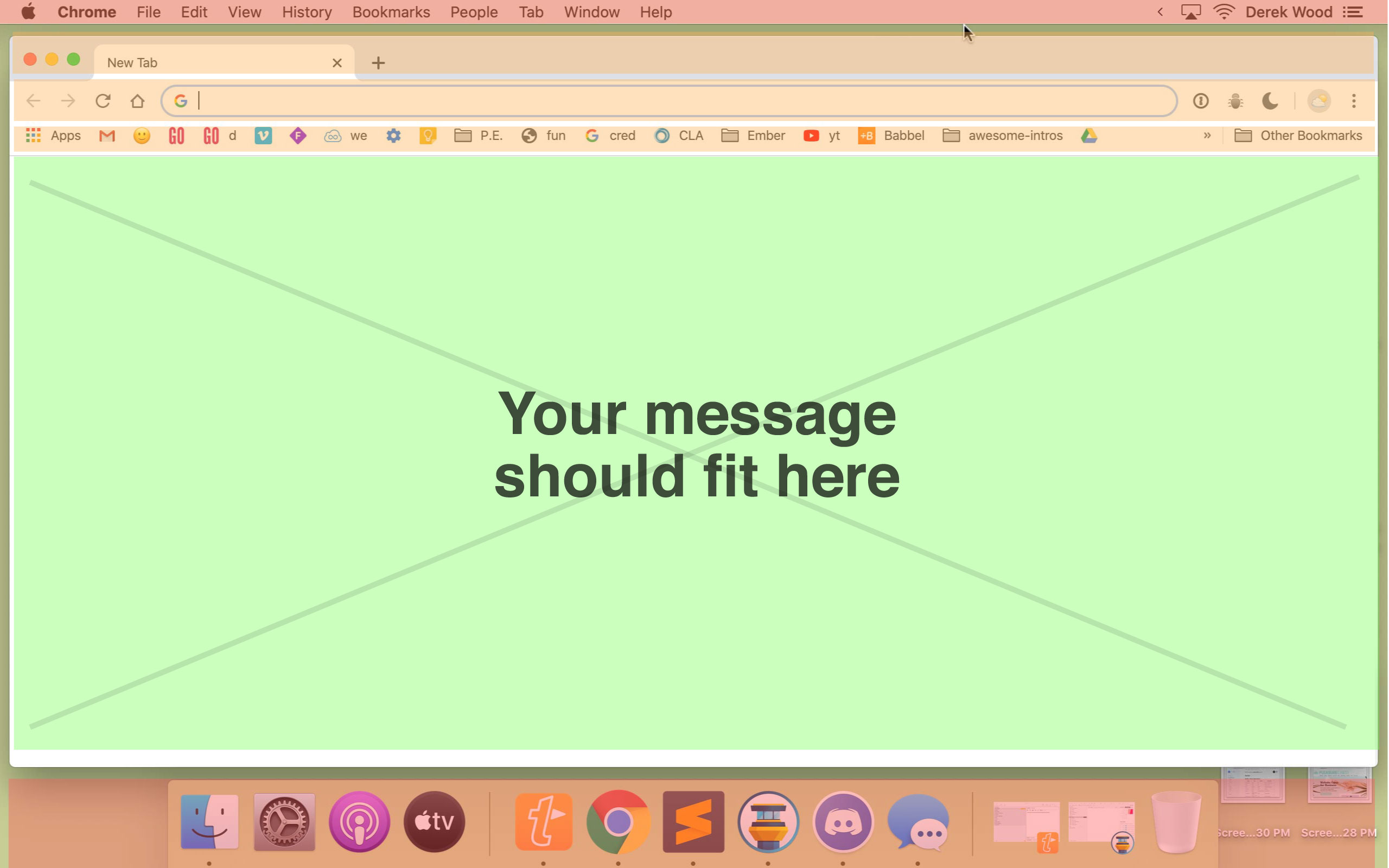
The average person is looking at your website on their phone – or a small laptop. The laptop might have all sorts of other ‘stuff’ on the page / and so you have to plan for the lowest common denominator/worst-case/least amount of room. “Web designers” (the type who feel “creative”) – don’t usually understand this. They design for their ideal situation – which is to make the client happy at the sales meeting.
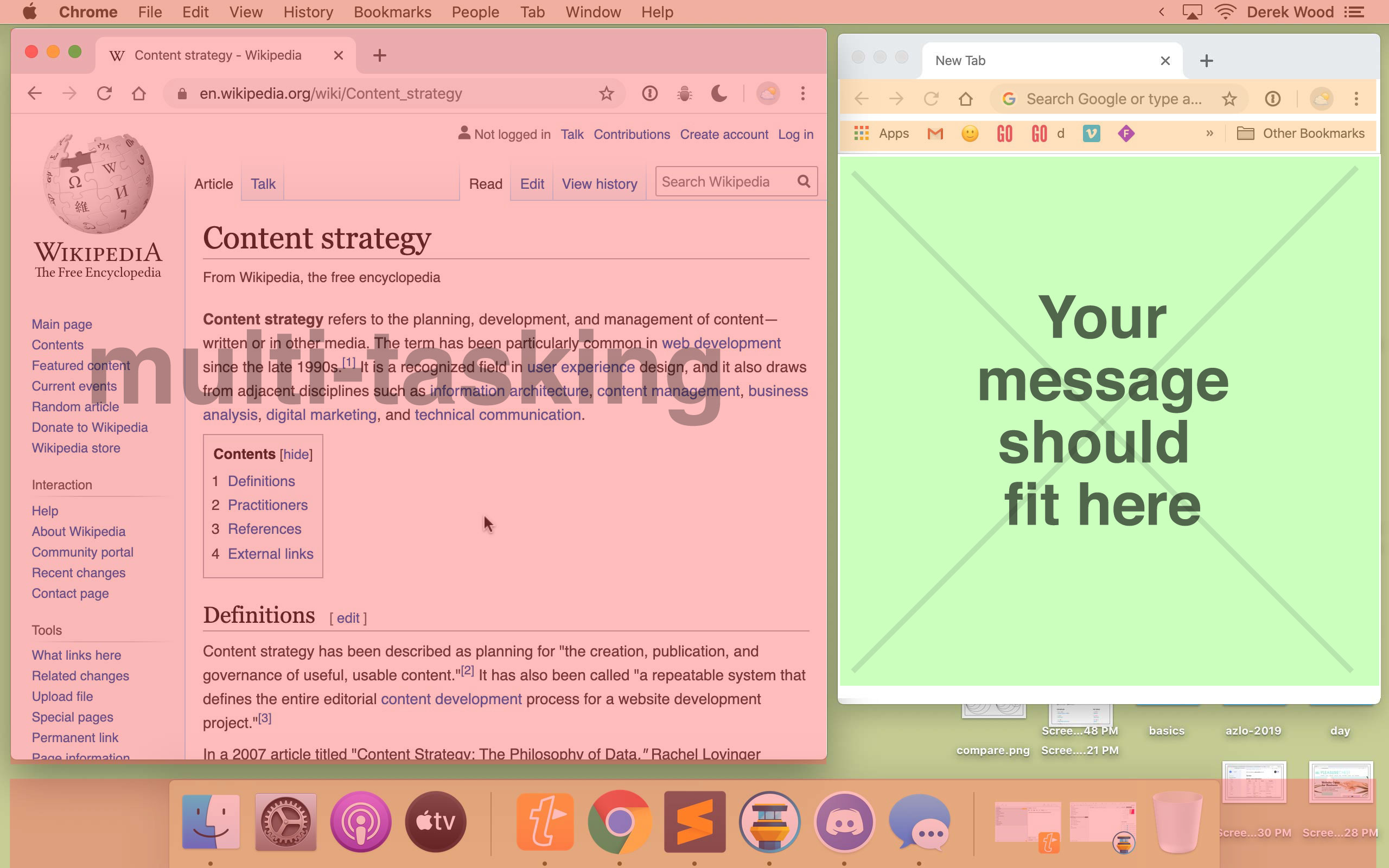
A lot of times – this is where people will see your website. Those two examples are TOTALLY different shapes / and then you have phone and tablets and x-box – and whatever other places things get seen. This isn’t about criticizing people – it’s about remembering what the goal is.
You have a message / and you want that message to be clear – to everyone – in every context. (at least that’s what I hope you want)
It takes the same amount of time and effort to do this wrong – as it does to do this right, so – there’s no logical reason to fight it. (if you have one, please write and tell us about it here.)
It is so common - that it's almost the norm - to put the VITAL content on another page - or below the fold
I don't mean to pick on you, Masa...
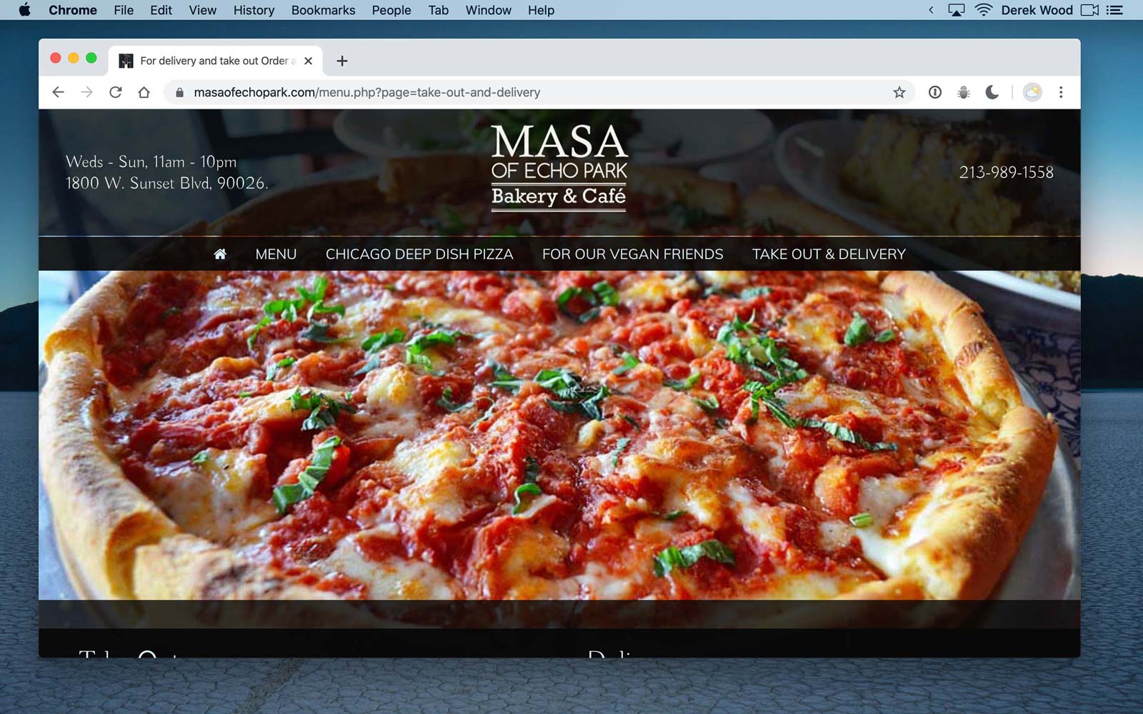
We love Masa. I like going there – and I like picking up food from there. It’s fun. It’s one of the only restaurants that Valentine can remember the name of.
BUT – I often use their website as an example of a common/unfortunate “web design” trend.
If you click on any of these menu items – it just loads another page with this same image of a pizza on it. You ARE on a new page… but – you can’t tell you are – because everything looks the same.
This is bad enough - in regular times / but now (March 2020) it matters even more
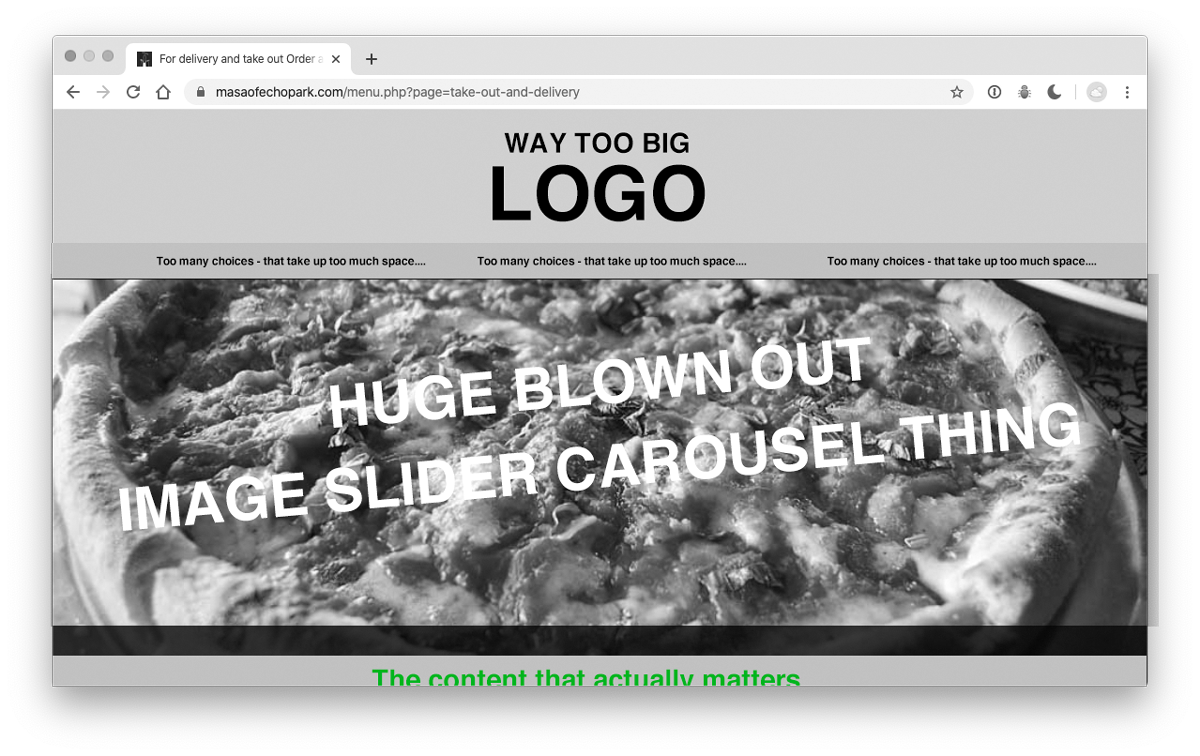
So – this is millions of websites out there. I can see how the big images make people think they are ‘fancy’ – But they aren’t. They are just a distraction from the real information that I want to know. I don’t have time to go into it here – but there are numbers that prove it.
The point is – here’s the chance to tell me all the information I need to know / and it’s not doing that.
I want to keep my favorite businesses - in business. Tell me how.
Ivy has been cooking up a storm here – and she’s an amazing cook / but she needs a break! We took this thing seriously – and have been sequestered for a long time. We’re ready for some beer and some food to get delivered!
But – what’s going on out there? Are you in business? This is what I want to know:
-
Are you open during the pandemic? Are you ok!?
-
Are you doing pick-up / or some form of 1 person at a time policy?
-
What are the hours/rules for that?
-
Are you doing delivery? What are the rules / where is the link? What are the times/rules for that?
-
What precautions are you taking to keep things clean / just something to say you are being careful.
-
Are you selling anything new / or different that usual?
-
How else can I help you? Can I buy merch or a t-shirt or something? What links do you want me to share?
This is what your website needs to say -
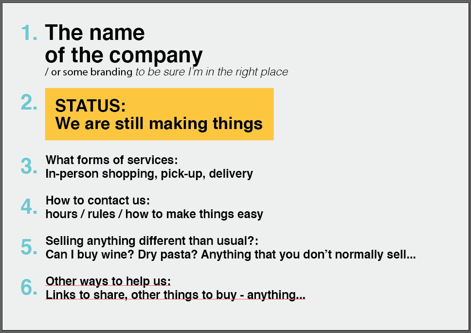
Forget about the website / and instead – think about the message. This is what we want to know. This is the quickest way we can find out how to do business with you. If your website doesn’t have this information on it… I think it should. I know that a lot of people are doing business and maintaining their relationships through Instagram / and in some cases – you might not even have enough services to go beyond what you are already providing. You might be at your max – and so, you think you’re fine. That may be true / however, there might be some services you aren’t thinking of. I’ll touch on those later.
If YOU ARE trying to get more people to buy things from you – then this can be addressed quickly. I’ll provide a template – and directions.
It might make sense to sidestep your regular WordPress/themed website and put up a simple HTML page
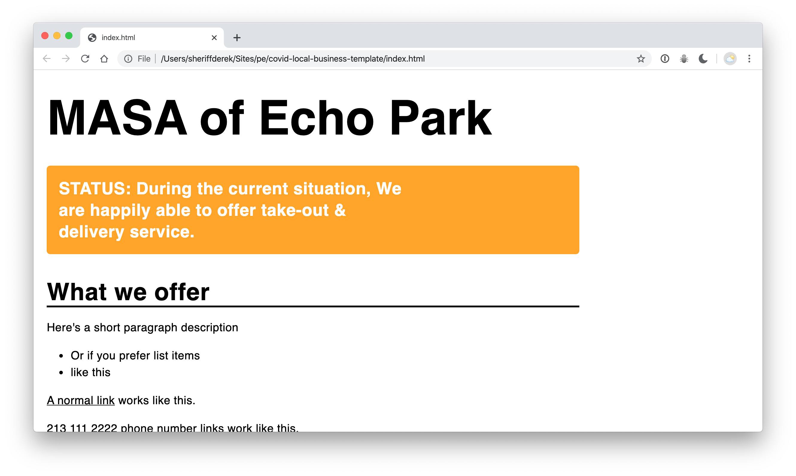
Based on the many many websites that I researched for this article – I would argue – that this type of simple website (just some basic HTML) – will help educate your customers – and get more business flowing – than what most people currently have.
Chances are – that one of your employees already knows how to write some HTML – or can figure it out.
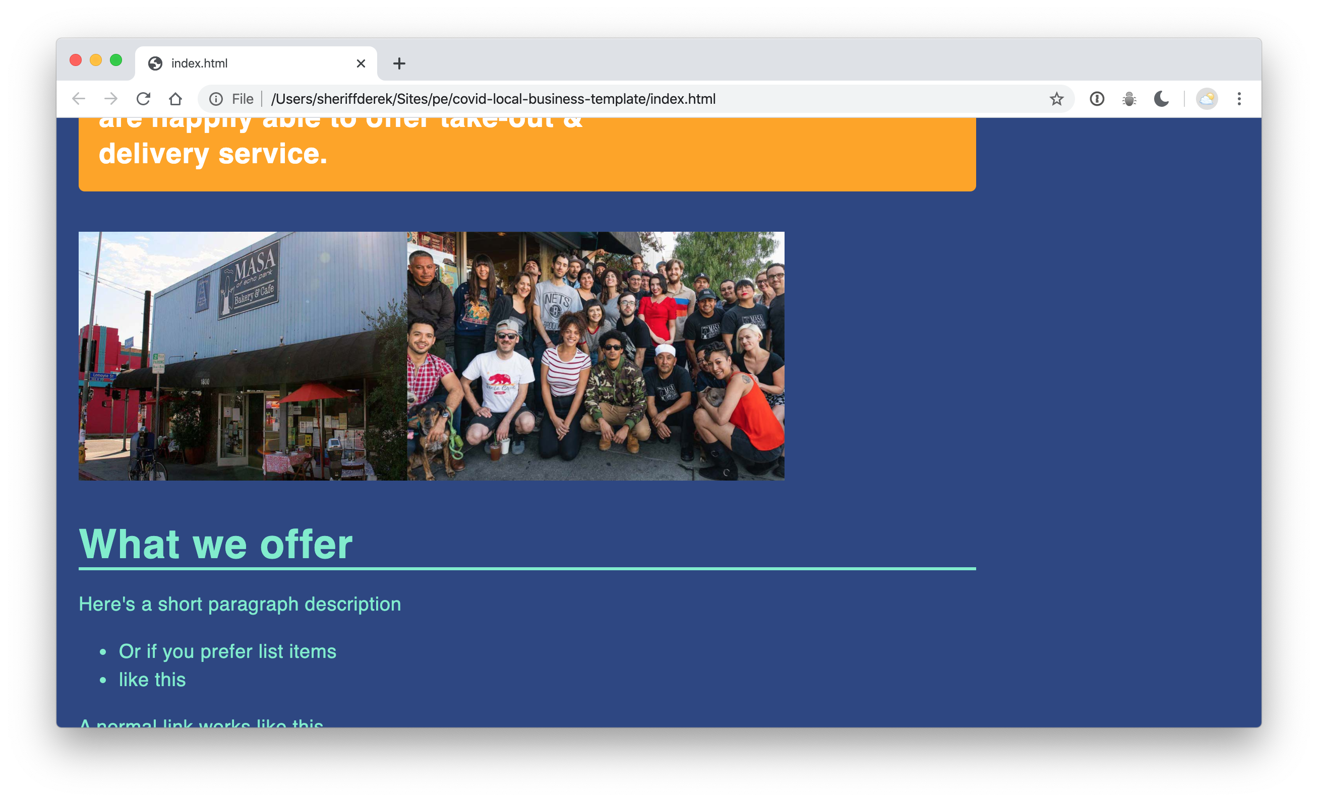
Maybe just an image or 2 – and a little bit of color?
Dropping an informative video here would really take care of business too!
The website is important / but people need to find it first.
When someone shares your website on social media – or on their text messages – what will they see? You have an opportunity to make this more useful. A little tiny bit of code can make a big difference. Here are some examples.
In search engine results
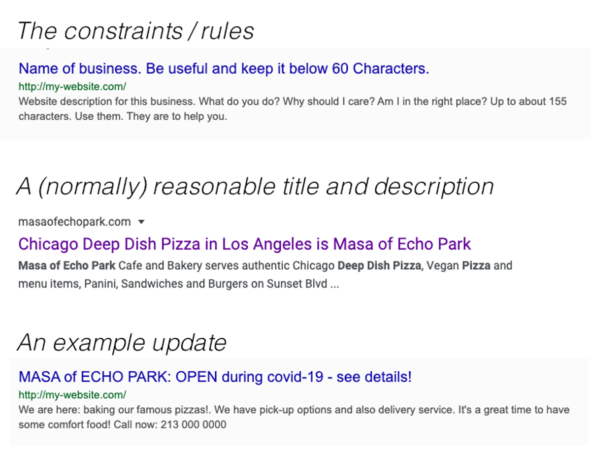
Those “titles” and “descriptions” – are what show up in browsers’ search results. A few rewritten sentences will go a long way.
Page "meta data" - when sharing on social media

So – you have 3 things you can adjust. The TITLE, the DESCRIPTION, and an IMAGE (1200x630px). Whenever you share your website – they’ll try and use these things – if they exist / to try and look as nice as possible (and – this give you more chances to make an impression).
Which one of these ‘share’ messages – as they might appear on Linkedin or Facebook – offer the most useful information? Which one do you want to know more about?
In text messages

Which one of these text messages lets you know that the pizza place is OPEN – and ready to take your order?
For the people writing the code
If this is already your bag, you know what to do. If it’s not – I bet a friend does!
Here’s a starter template with the files from up above.
You can check your work – and make sure that your file is valid here. You can run it through facebook and twitter validators – to make sure that the metadata shows up how you planned. I’ll show an example of how to side-step your current website / without hurting it – in the video. You’ll basically just change the current index.html or index.php – to index-normal.html – or something /and then drop in a temporary index.html file – with your new targeted message. This way – you don’t fuss with anything that is already there.
If you don’t have anyone who can change your page
There are many people out there offering help. Here’s one example: HERE. I’ll add any other I come across – but I also suggest that you try and keep things as simple as possible. As nice as it is for people to offer help / they could very well make an expensive mess… : /
I still think a simple HTML page is the biggest win.
Dough Box
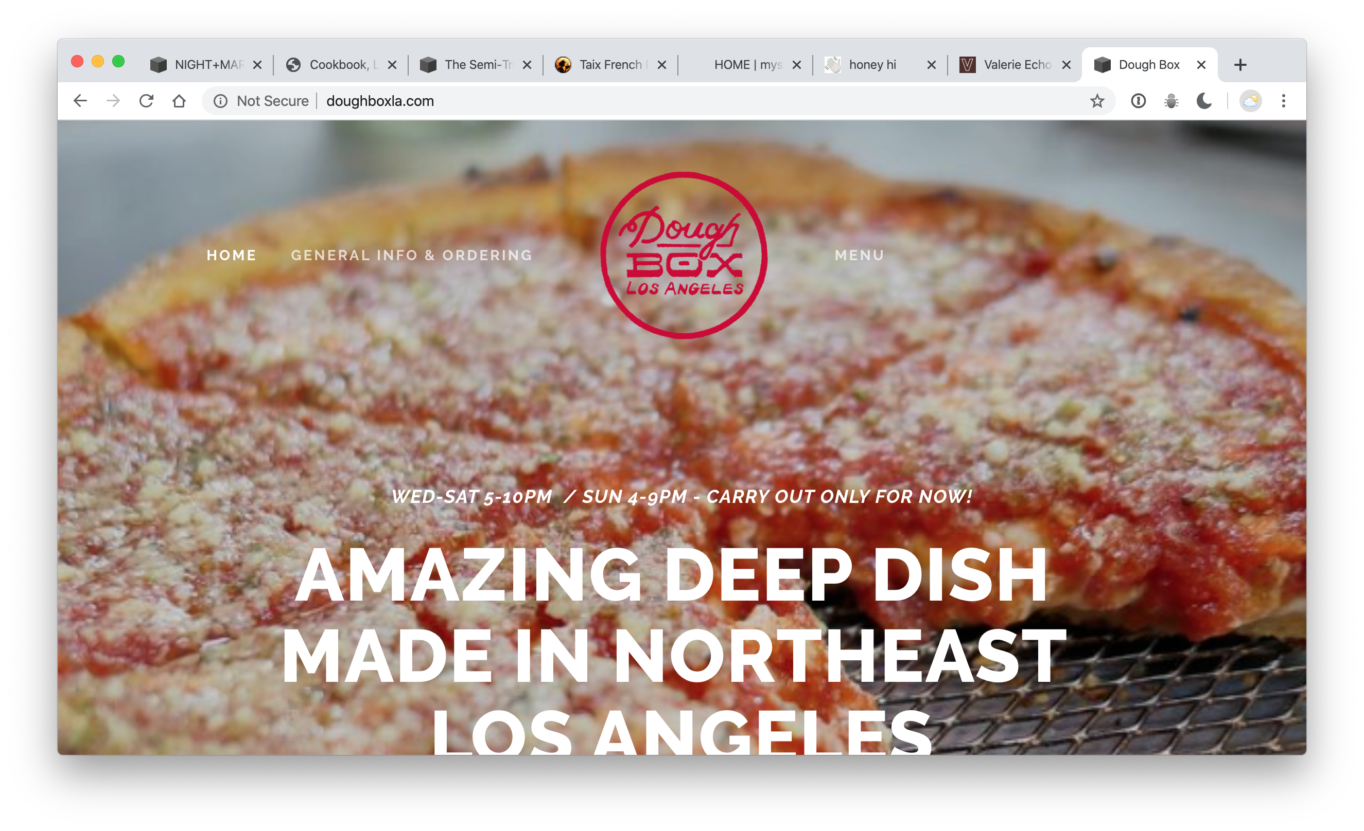
They’re selling out every day – and probably just through some Instagram messaging – So, maybe they don’t need to adjust their website.
But I would buy a breakfast pizza – or a lunch pizza – if they didn’t only sell from 4pm to 9pm. ; )
Maybe whatever hours your business is keeping – could change a little. Of course, it’s not always a good idea — but take the time to think about what resources you have / and how they might be able to be used a little differently.
Zebulon
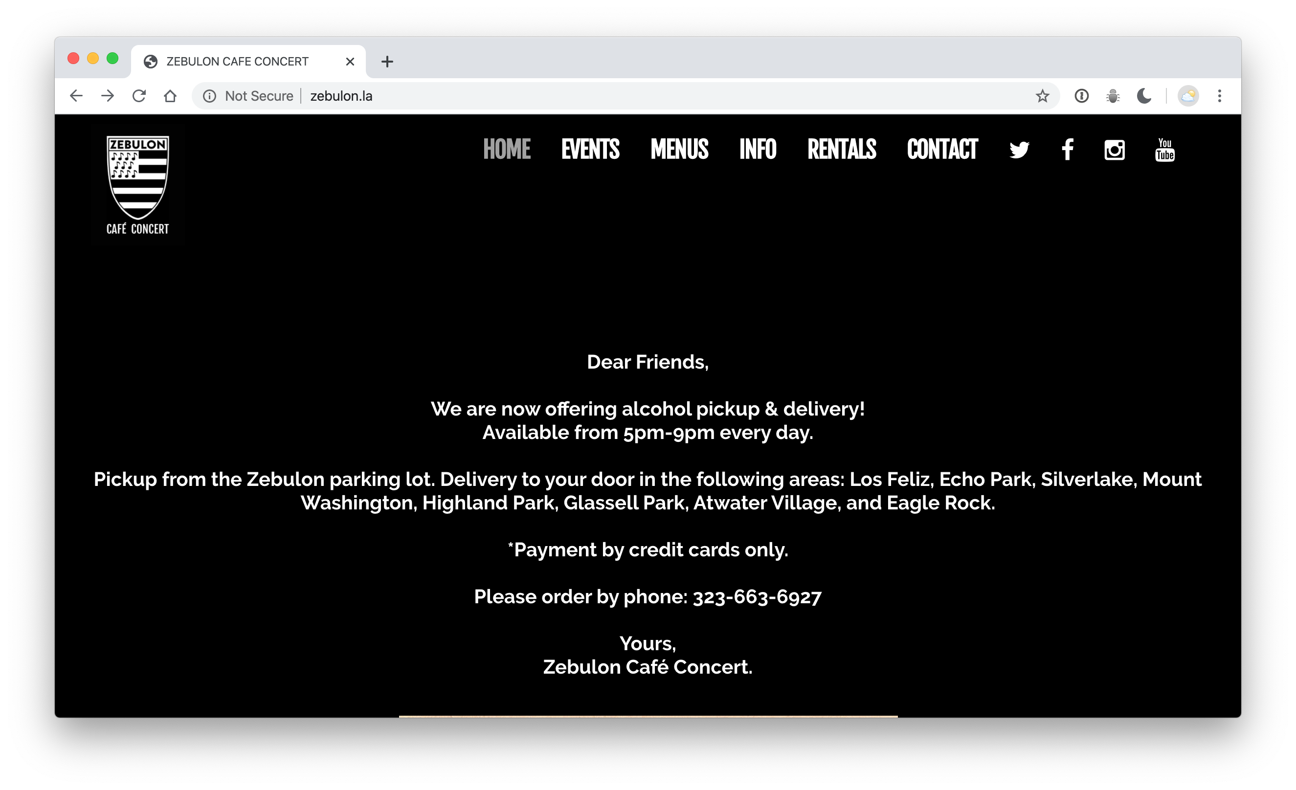
It’s pretty dark – but it’s human! These are the things they can offer – and here’s how it works. Even though this site is a Ticketfly site (which aren’t always set up for new pages) – they’ve managed to get something useful up. It’s right there on the front page – and not hidden in a banner or something.
I could scour the internet for deals / but I’m happy happier to buy local – if they tell me about the option.
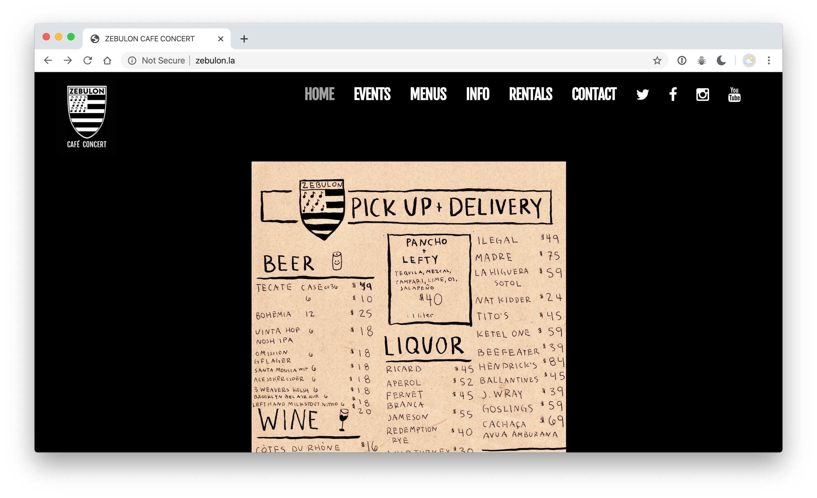
Look at this charming hand-drawn list of the bottles they have on hand. We promptly bought some 3 Weavers Kolshe (only second to Craftsman Poppyfields) – and some tequila. I ordered on the phone and talked to a real person – who actually works there / and is one of the people I want to help get through this rough financial situation. I paid on the phone / Ivy picked it up on an errand – and everything worked – just like they said.
But what happens when you call – and you just get the ol default message with the incorrect hours? Does that mean you’re on the other line? Does it mean you aren’t open today? Should I keep calling back? Or should I give up? Maybe the message on that answering machine could be changed to help explain – either way.
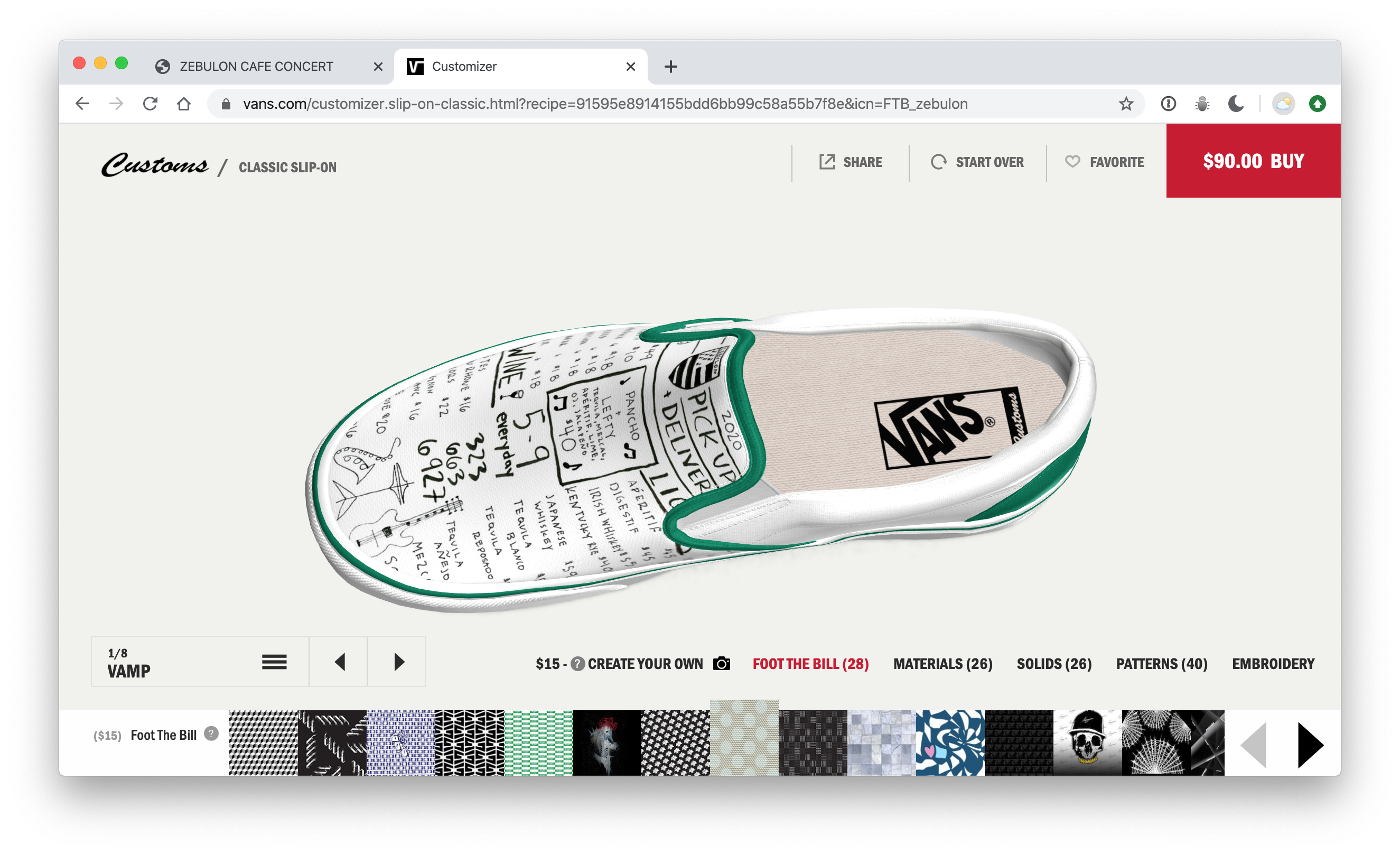
As of April 4th – you can get that charming menu right on pair of shoes here:
Dr. V
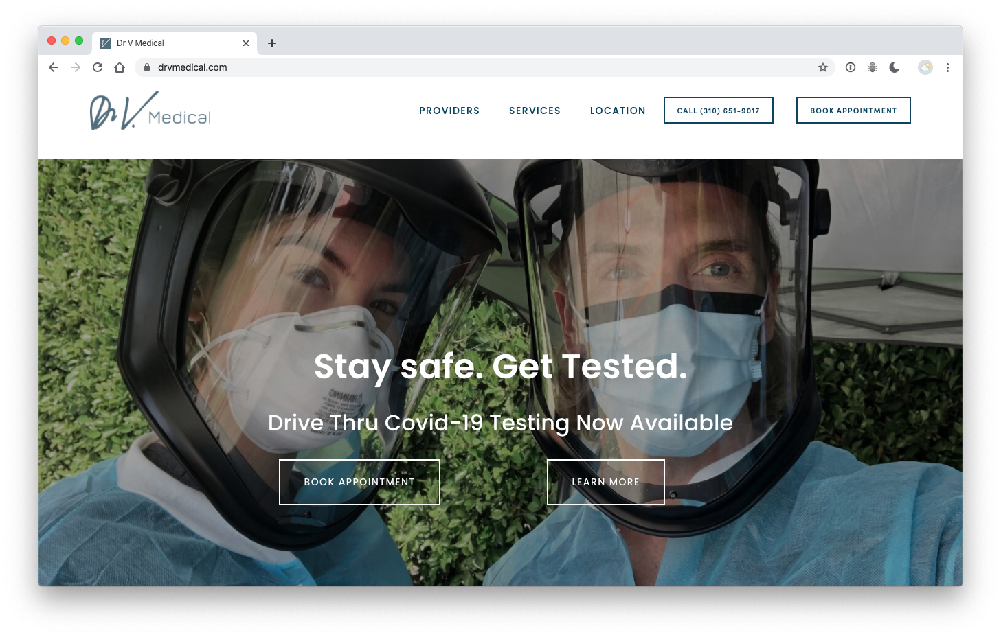
Dr. V – is the coolest… – and it’s no surprise that all of the information on their site is super clear / and even fun! Little kids should want to be this when then grow up.
Artemisia Nursery
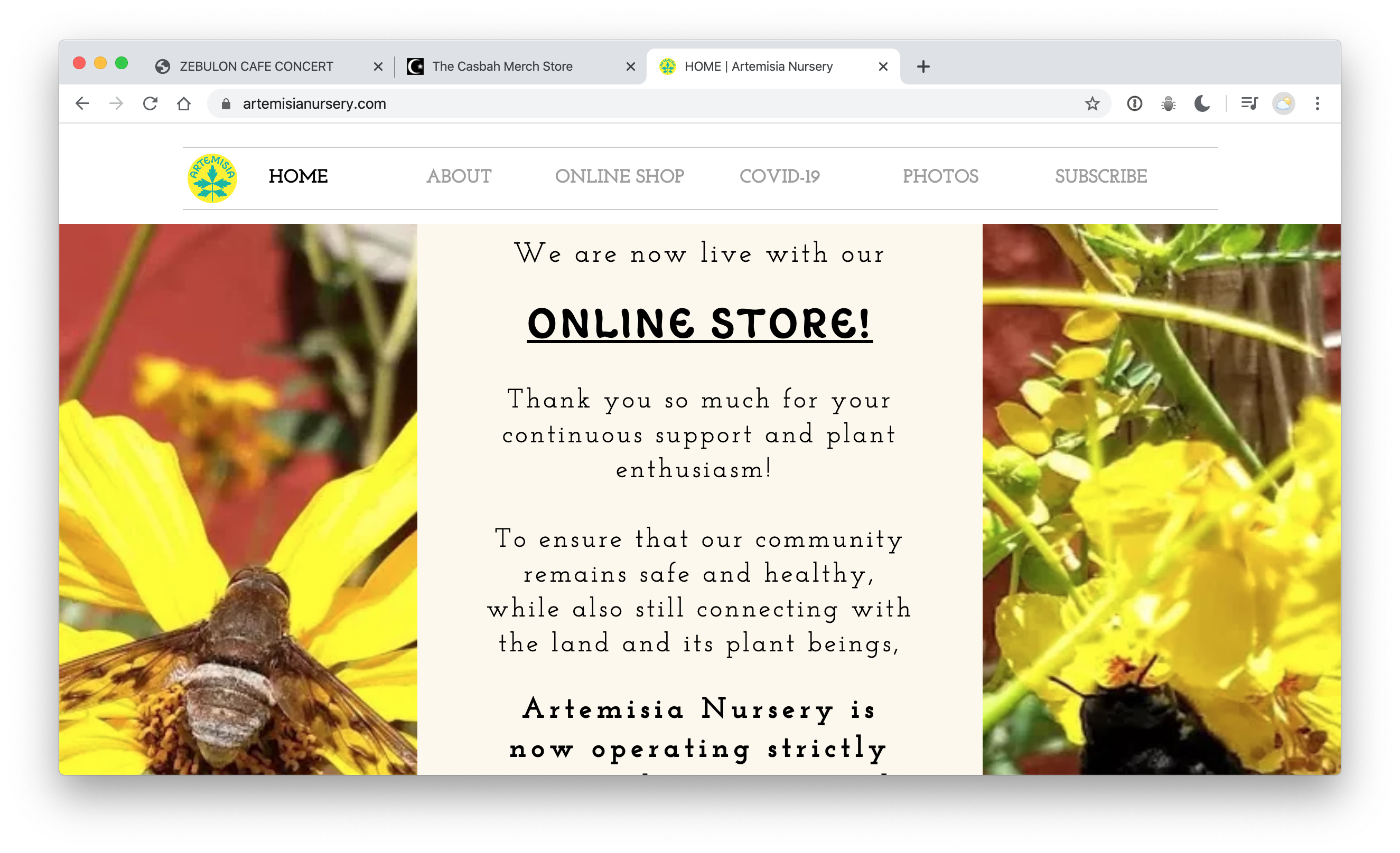
This site is incredibly clear. It gives the impression that there has been a close relationship with the nursery and its patrons – but leaves nothing out for anyone who may not have been following along. They have a rich conversation going through many channels – and have been updating their status regularly as things change. Great job!
They didn’t plan on having an online store… but – they do now! Way to adjust in a flash.
Fun & games & Pizza!
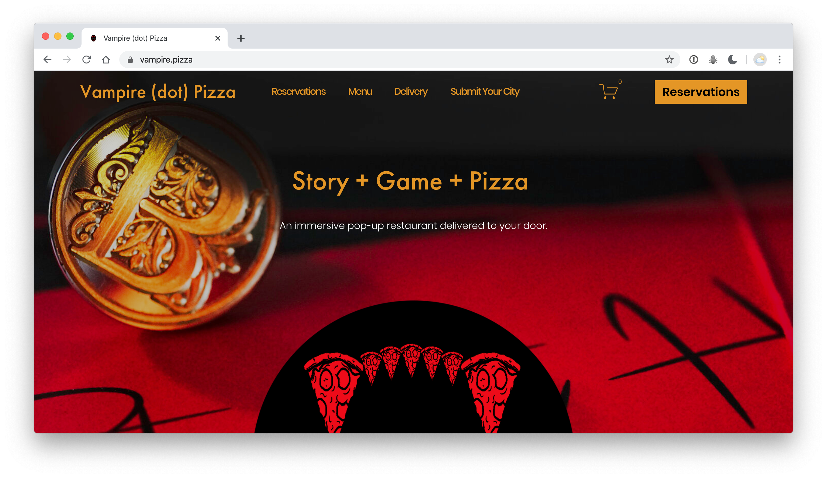
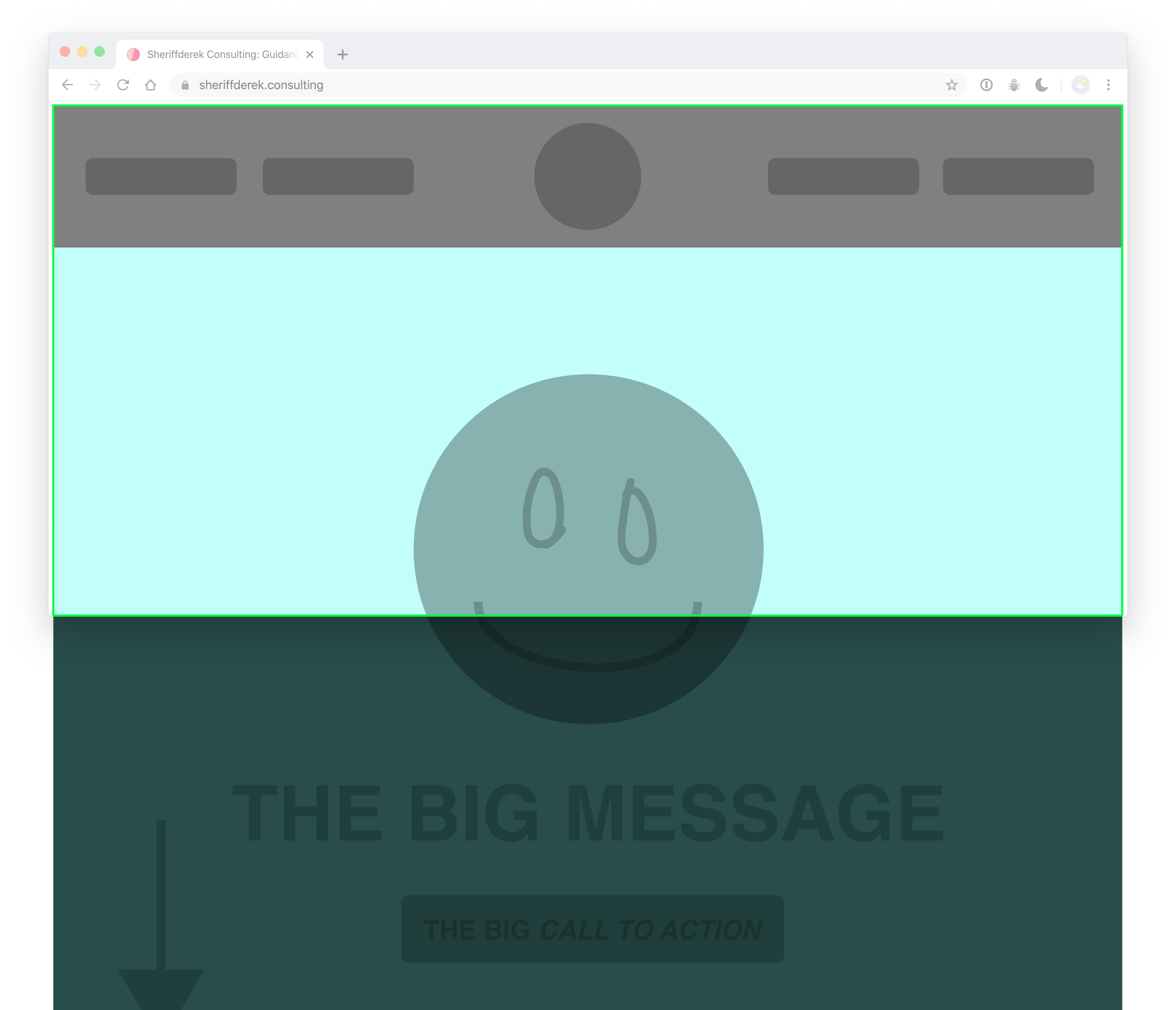
Here’s a quick example of how you can keep everything above the fold with just a little code: https://codepen.io/sheriffderek/pen/dfacda691cb571e59e51cad9ae8deded
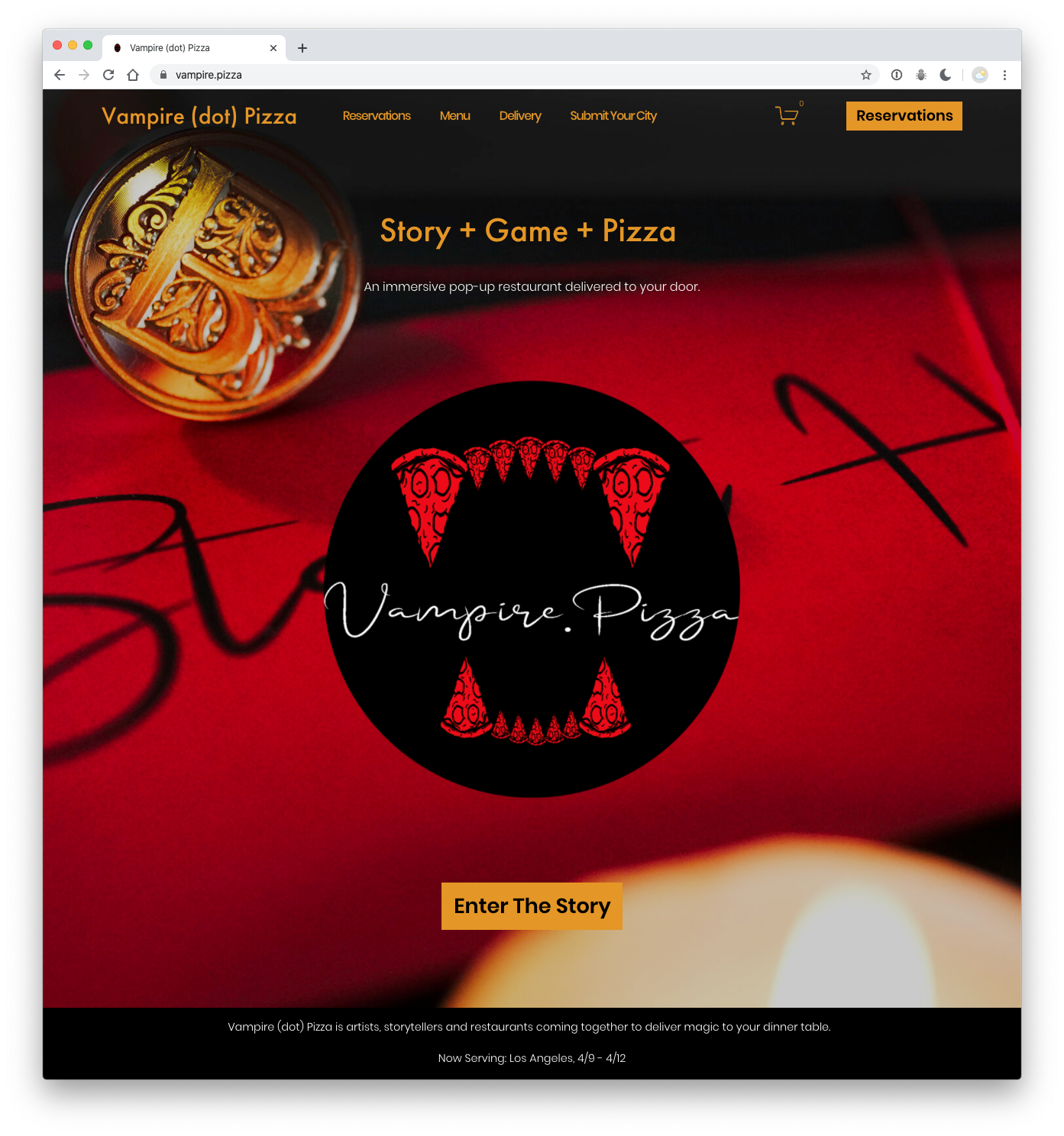
This is just like that first example we drew out at the top!
We found this one on Instagram – and we already ordered!
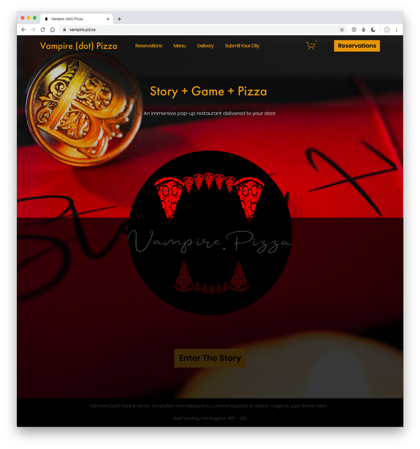
Just to be extra clear (this is what ‘below’ the fold’ looks like). That idea comes from newspapers. You would want your entire headline – above the fold in the paper, right?
Hey Hey
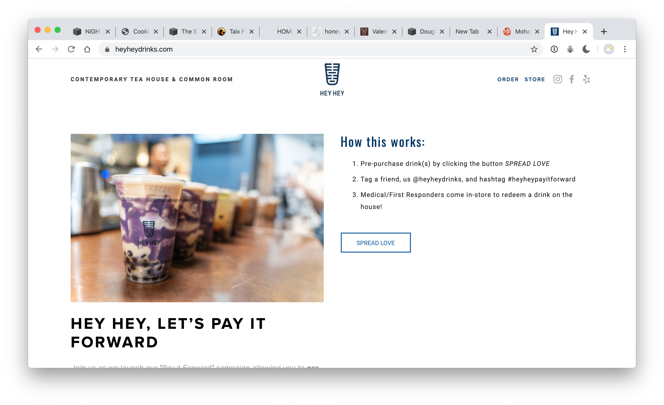
The message voice assumes that this pandemic is nothing new, but here’s an inventive way of keeping people connected.
Join us as we launch our “Pay it Forward” campaign allowing you to pre-purchase a boba drink for the medical and essential service providers working on the front lines against Coronavirus
Guisados
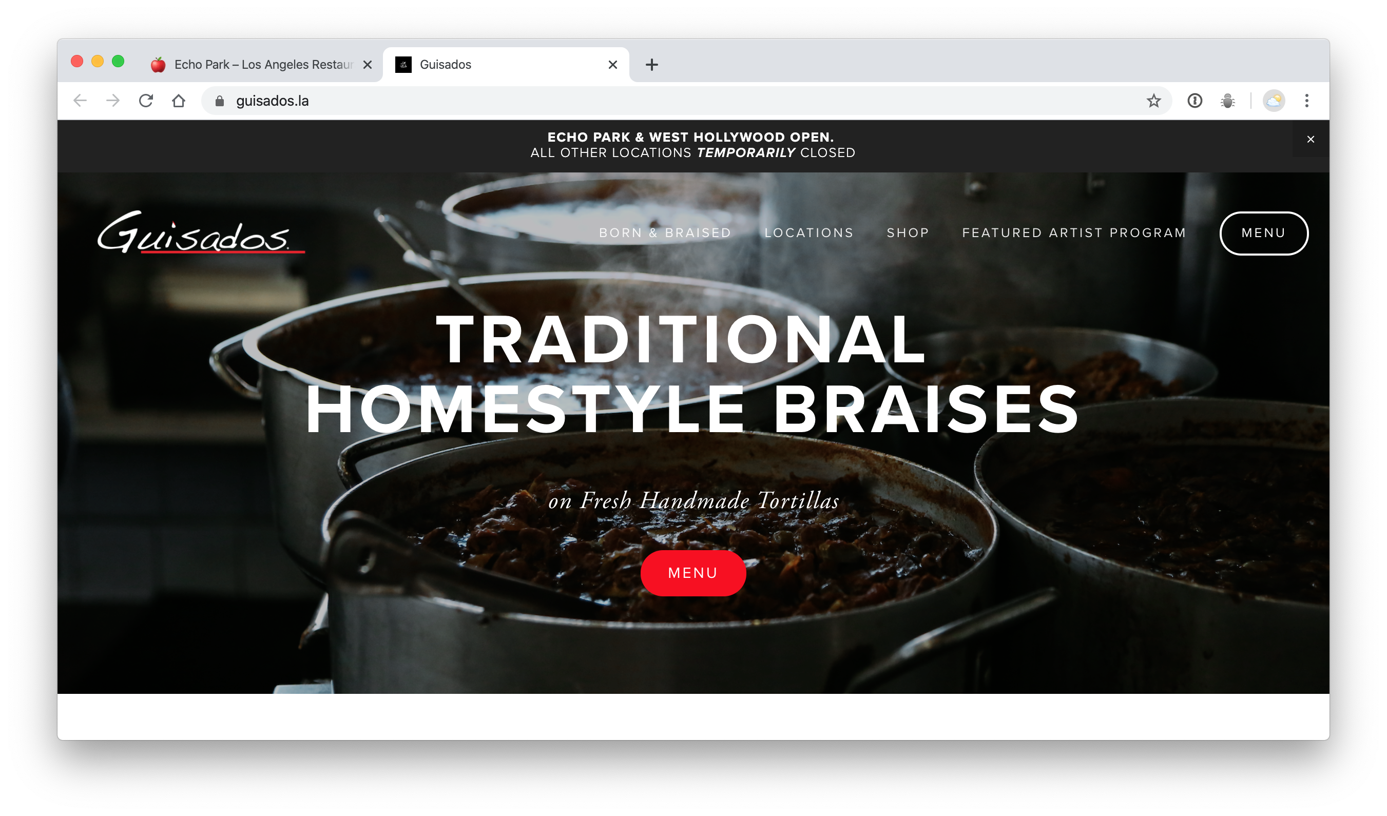
This is another one – with no top-level info to help us out!
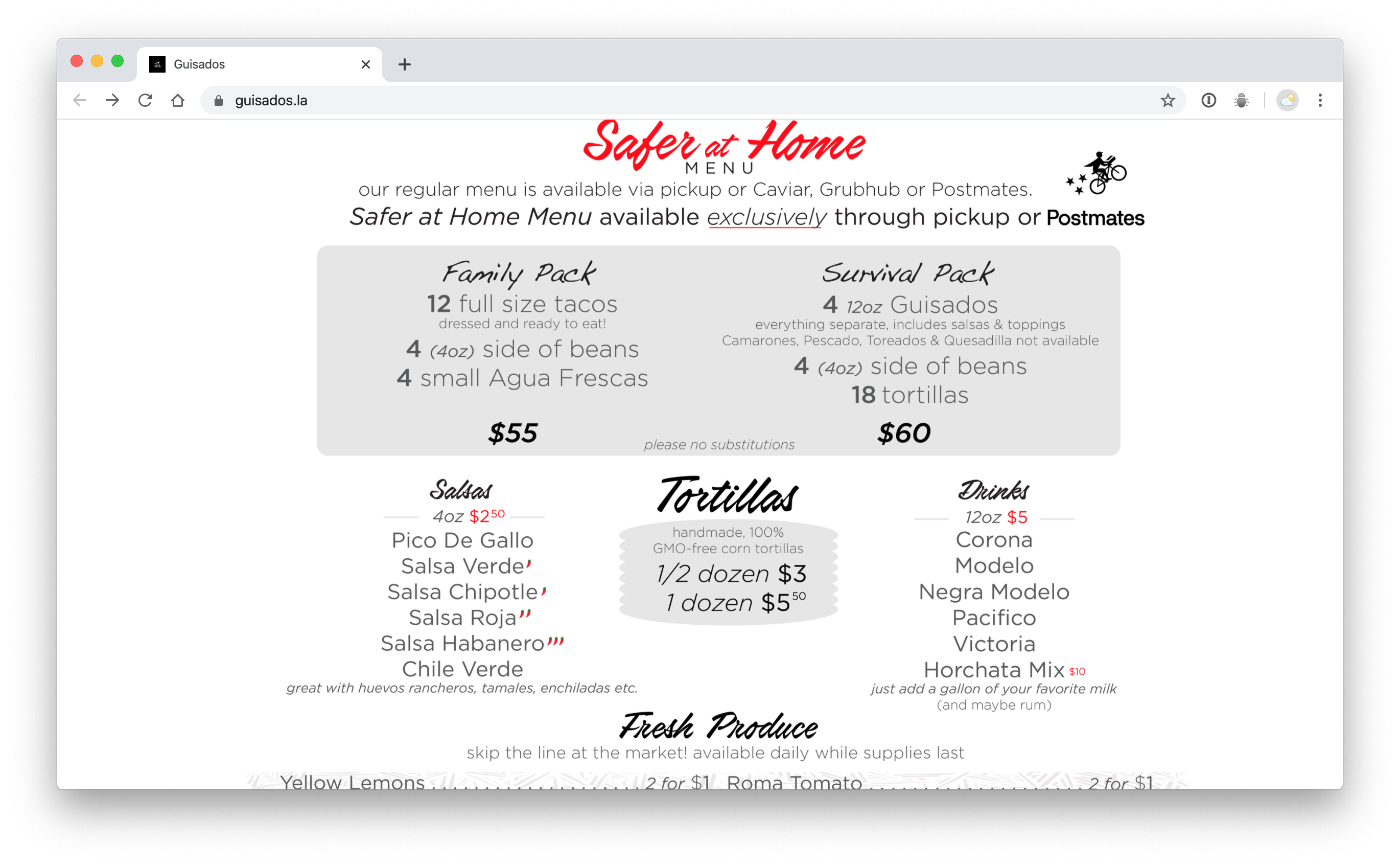
BUT – below the fold / they’ve got all the info – and they have packs that will make it easier on them – and us! I love this. And we really really really needed some Serrano peppers! I would have preferred to pay over the phone… but we’re really excited to pick up this “Survival pack.” Being able to pick it up – means I don’t have to use Caviar, Grubhub, or Postmates.
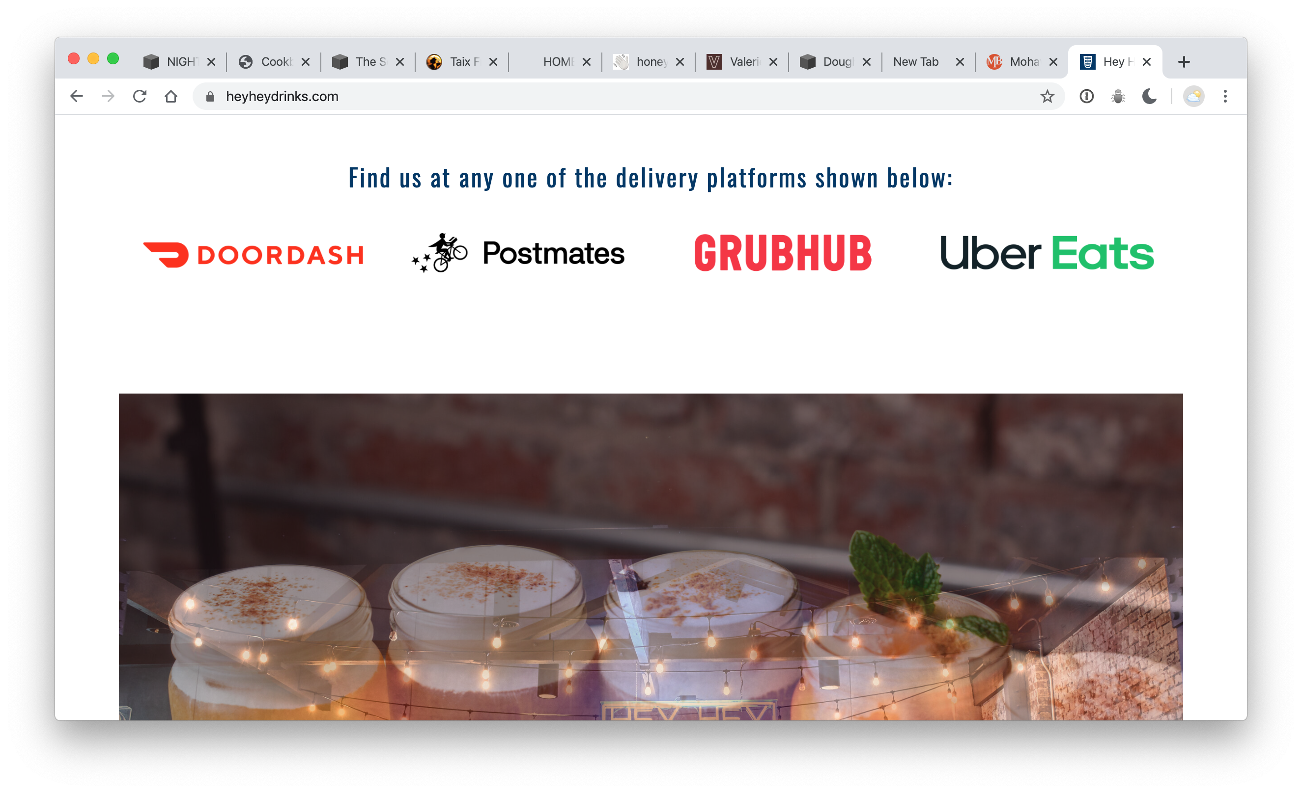
Everything is clearly explained – and all the links are right there.
I also wonder why we can’t just skip these 3rd party companies. This is a great time to ride a bike around – and drop things off on doorsteps like some kind of day-time Santa Claus. I bet a few scooters could keep a few employees busy – for the same markup / or less than these companies charge. I don’t know the numbers… but I’m curious.
Video in the works!
Here’s an overview of this whole article / with more details
If you're not doing business - please just make that clear for us.
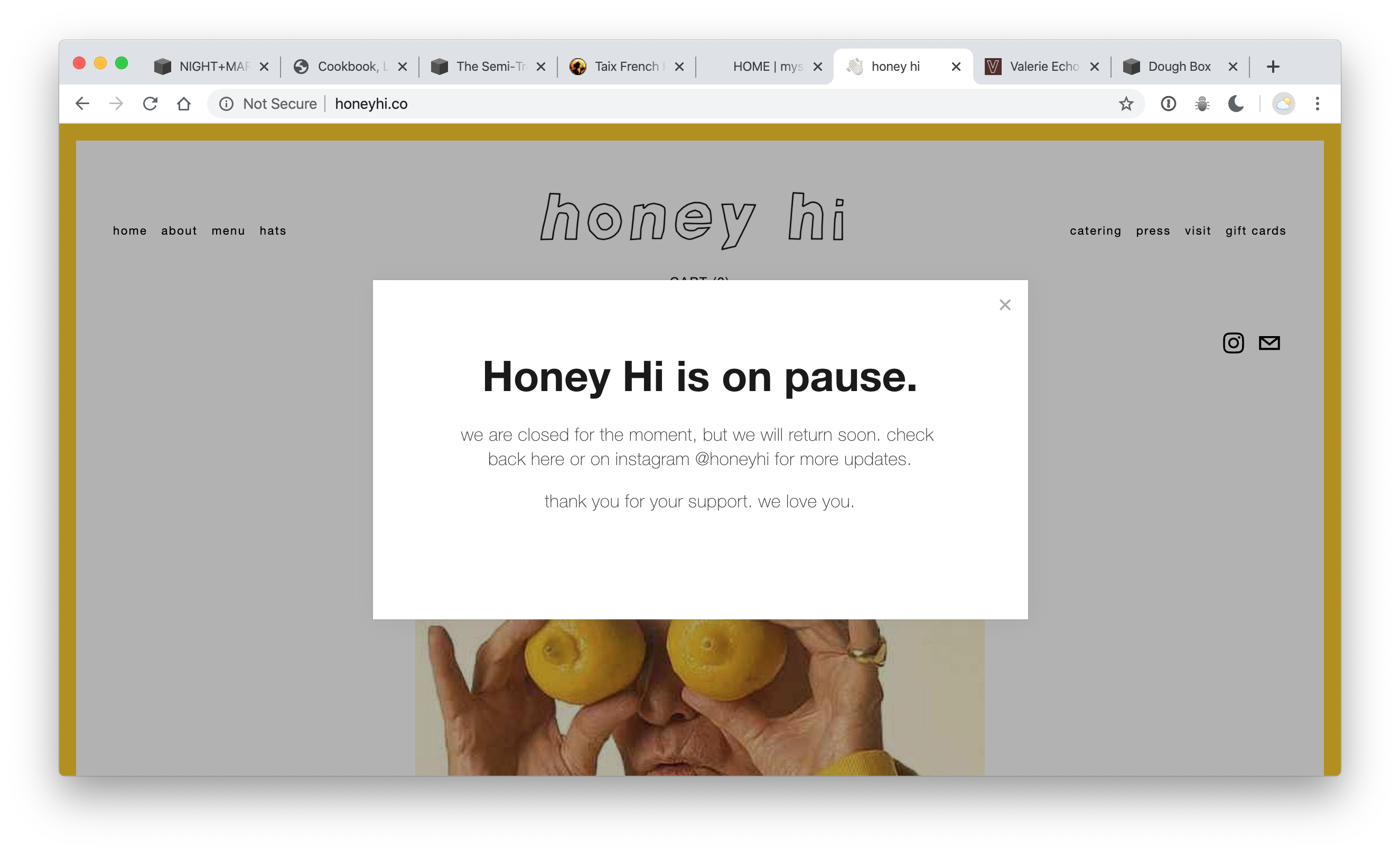
Honey Hi has this clear front-and-center message. It’s the clearest messaging I’ve found.
But there’s a catch. When I click that little X to close it/it’ll register in a cookie that I’ve already closed it – and then – in a week – when Ivy goes to check / that message won’t be there. Same happens on the Silverlake Wine site. It’s not a “page” it’s a pop-up.
Website + they’ve since added an opportunity to donate to their Employee relief fund HERE.
Mowhawk Bend
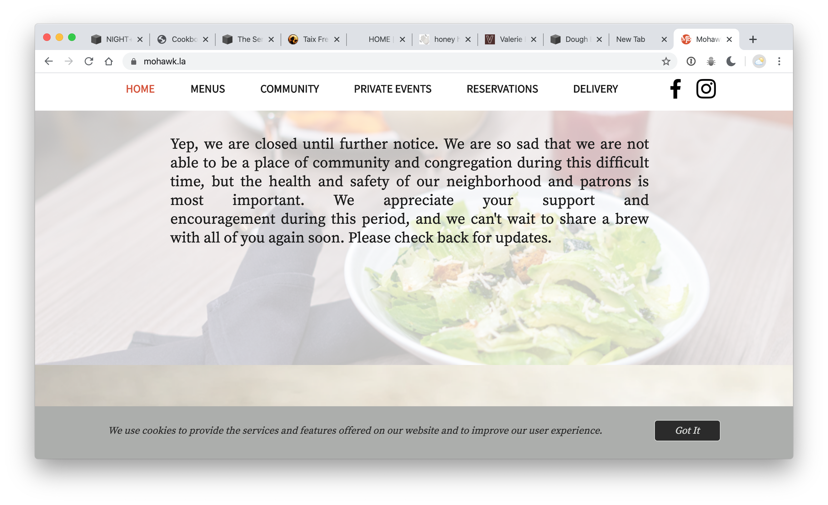
Mohawk bend was probably the clearest about being closed. But – it could have been even clearer — and I’d also say that this was an opportunity to point some business to their friends. I guess they sold Golden Road… but – want to send me some beer? Don’t you have a lot of beer over there? Tell me how to make that cauliflower? Missed opportunity – and it’s fighting for attention with a silly ‘cookies policy.’ Also – this is why you don’t justify text on long lines. ; )
Night Market Song
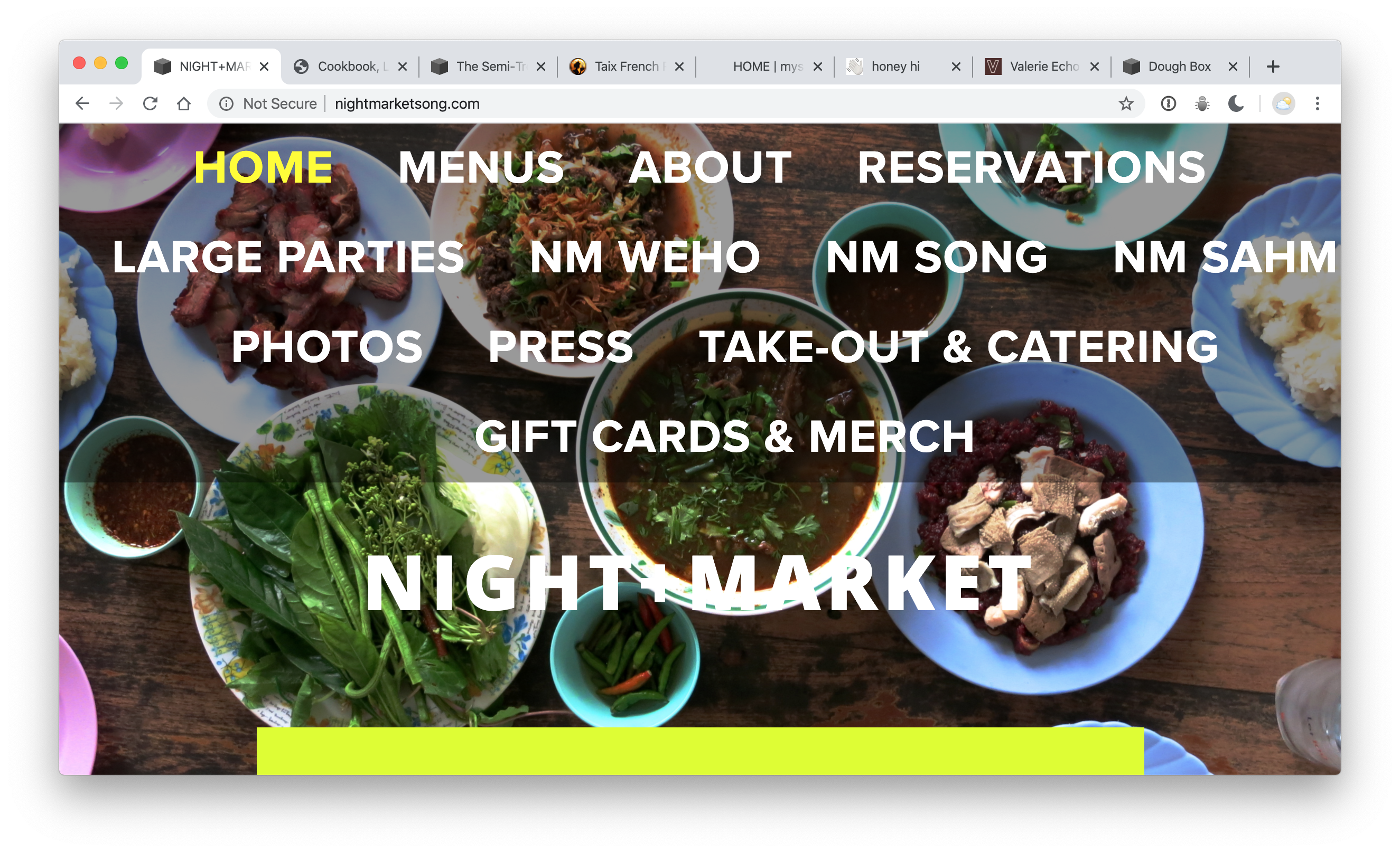
If you scroll down – it does say something about new hours.
We ordered. We got what we expected – the best Som Tom in LA.
We also paid $15 service fee, another $10 fee, and another $10 tip. So, we paid $35 for the delivery of $70 of food. We aren’t going to complain… but that means – that if you just answered the phone… and took the order — that you could pay someone $100 to deliver 3 orders. That’s probably more money than they made before. You could do that – or you could hire 3 drivers – and try and ship on the hour – and, well – I’m curious if you might be able to keep your staff paid – instead of letting that money all go to someone outside of your business.
Side note: but the delivery driver didn’t seem to understand what ‘no contact’ meant / and was pretty tripped out. I mean / it was kinda like a dangerous – drunk Cheech Marin (who I love) showed up… and it just made me think – is there any barrier of entry for these delivery people? Nice guy – but just saying – it makes me wonder…
Glowing Juices
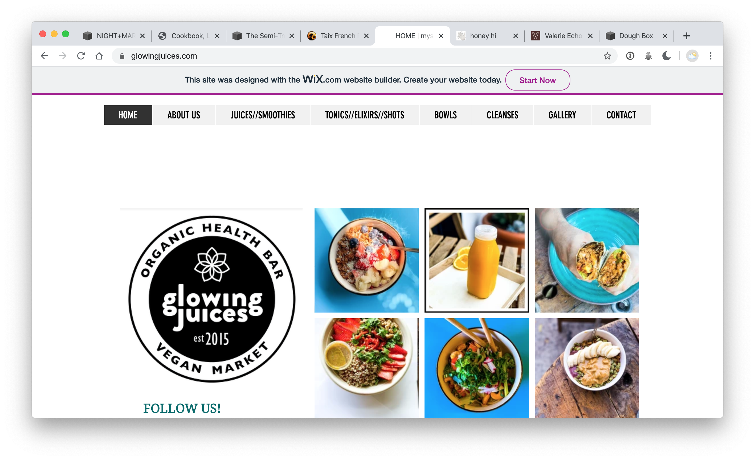
Looks normal. For some reason – when something doesn’t look like it’s changed – I think / we’ll – they just shut down. Which shouldn’t be the conclusion – but that’s what I feel.
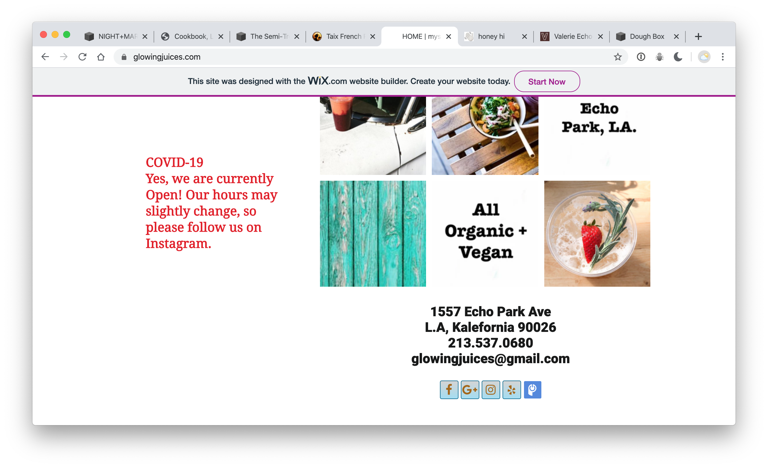
If you scroll down – there’s a message.
I don’t really use Instagram though…
On another note – This website has the same issue as Masa’s – where you click on the menu – but the site just stays the same – because the content is below the fold.
Semi Tropic
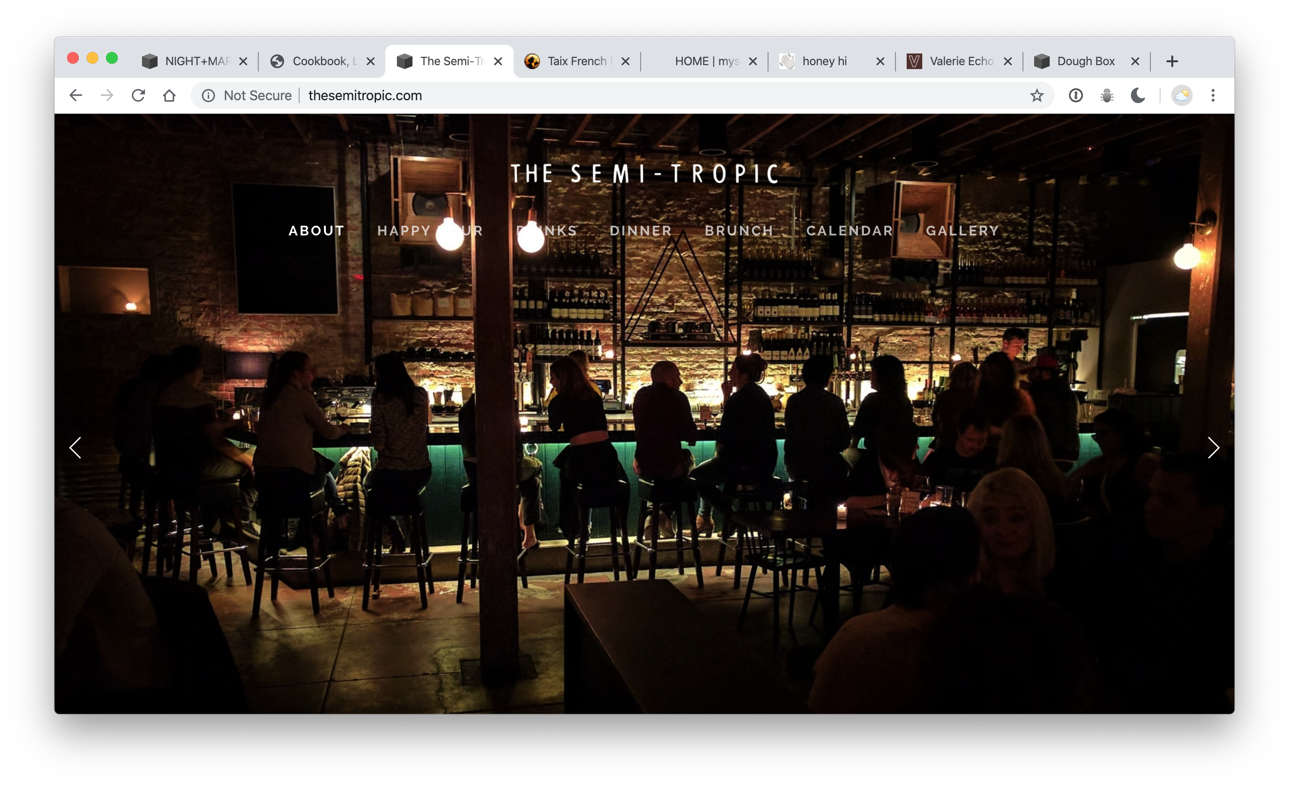
Looks like people are still hanging out in there. (this would have been funny – to replace it with an image where they are empty!)
BUT – my point is… I had heard they were still selling cocktails somehow. I went to look – and I didn’t see any information about that.
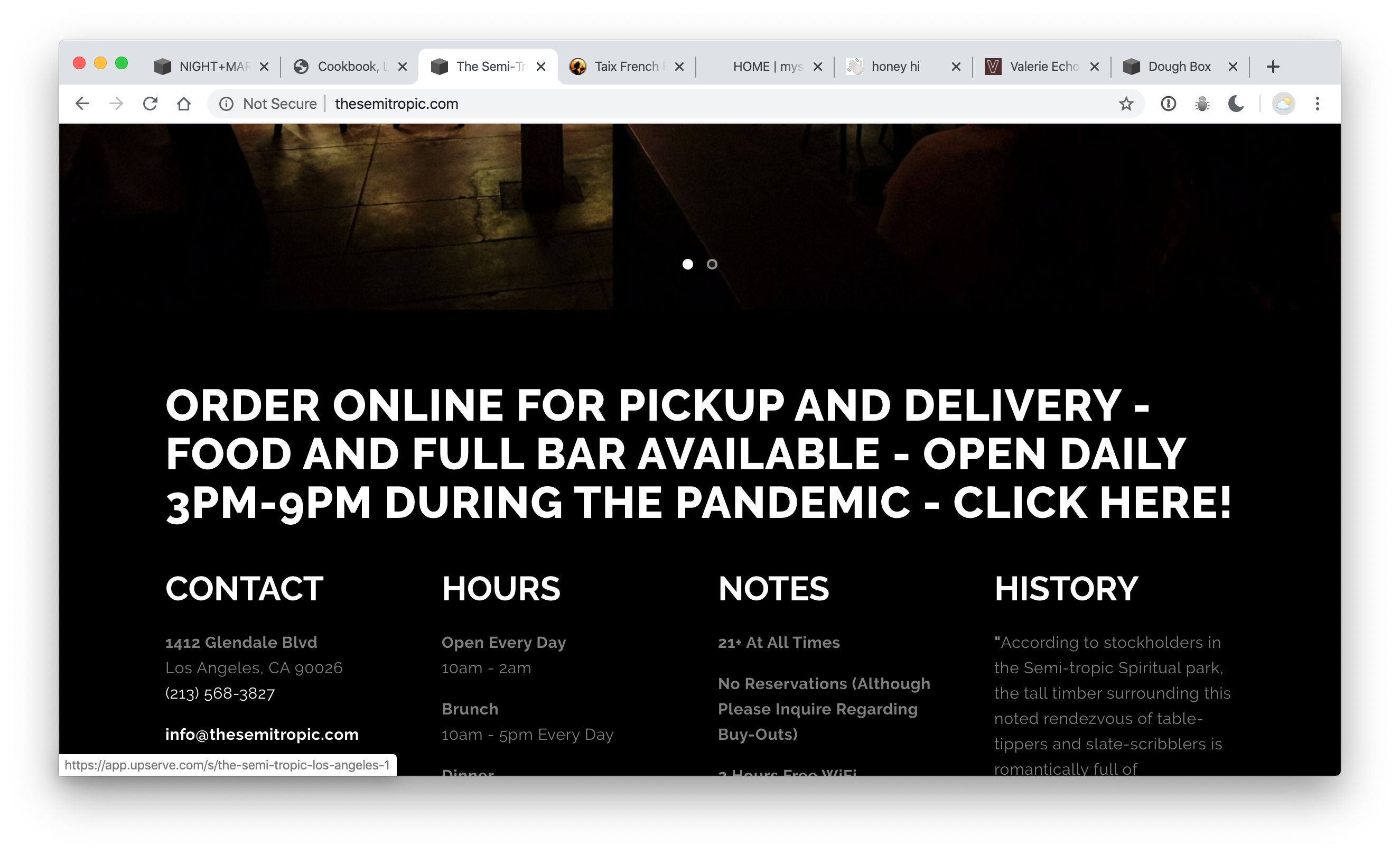
But when I went back to take a screenshot of it / I accidentally scrolled down – and there it was! The information! However – the link could be highlighted – and when I click it – I’m directed to a less-than-exciting menu service.
What if their website just looked like this – and had the content – visible / right away? How many people (I’m mean / I’m a full-time web-design person – and I missed it… ) don’t know then need to scroll down. Really it was the little arrows that threw me off and made if feel like it was a full-page carousel. (another reason not to use carousels)
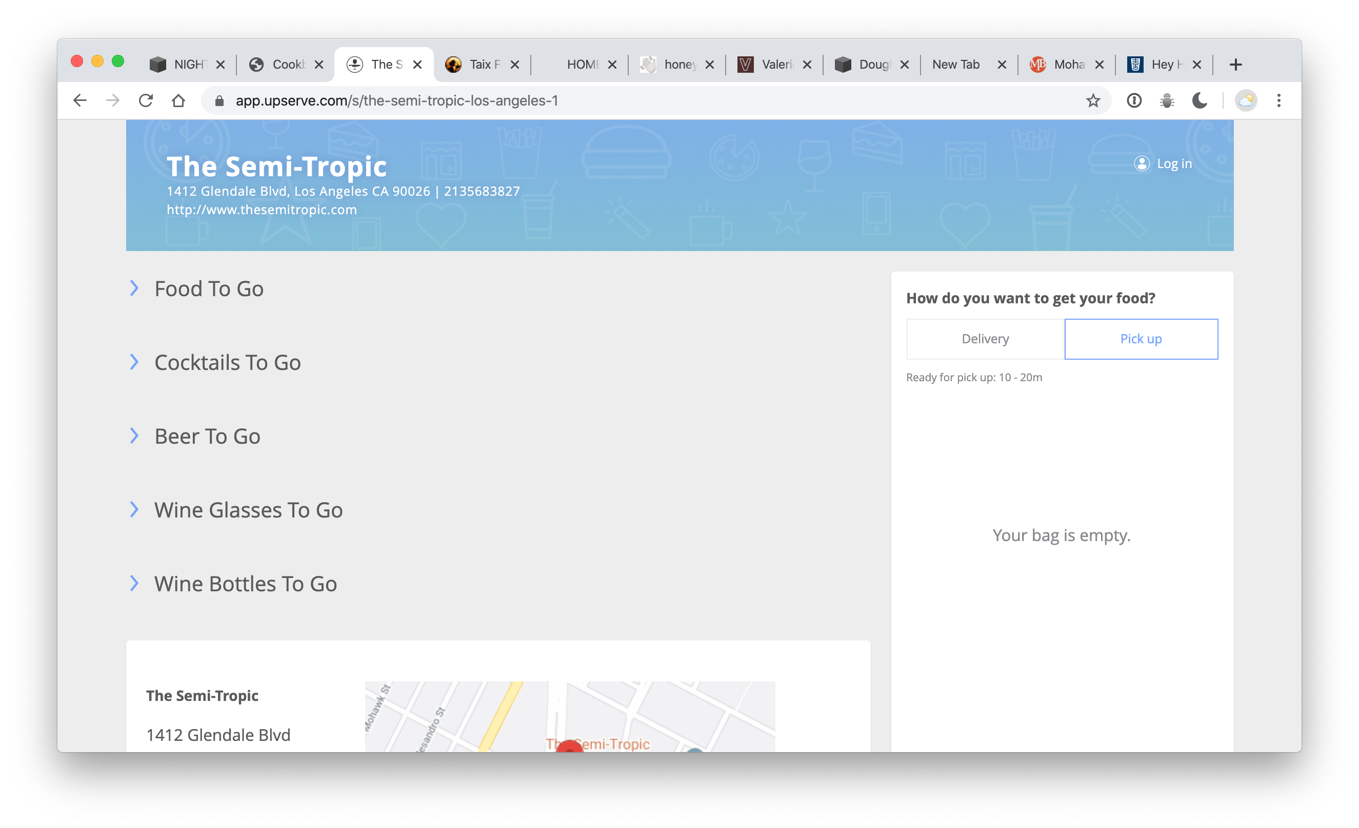
It’s fine. We have to react quickly – and so, this is still great. It’s just not very personal. And if the nice people who work at Semi Tropic were answering the phones – we might have too much fun – and keep them from their work.
L'imprimerie
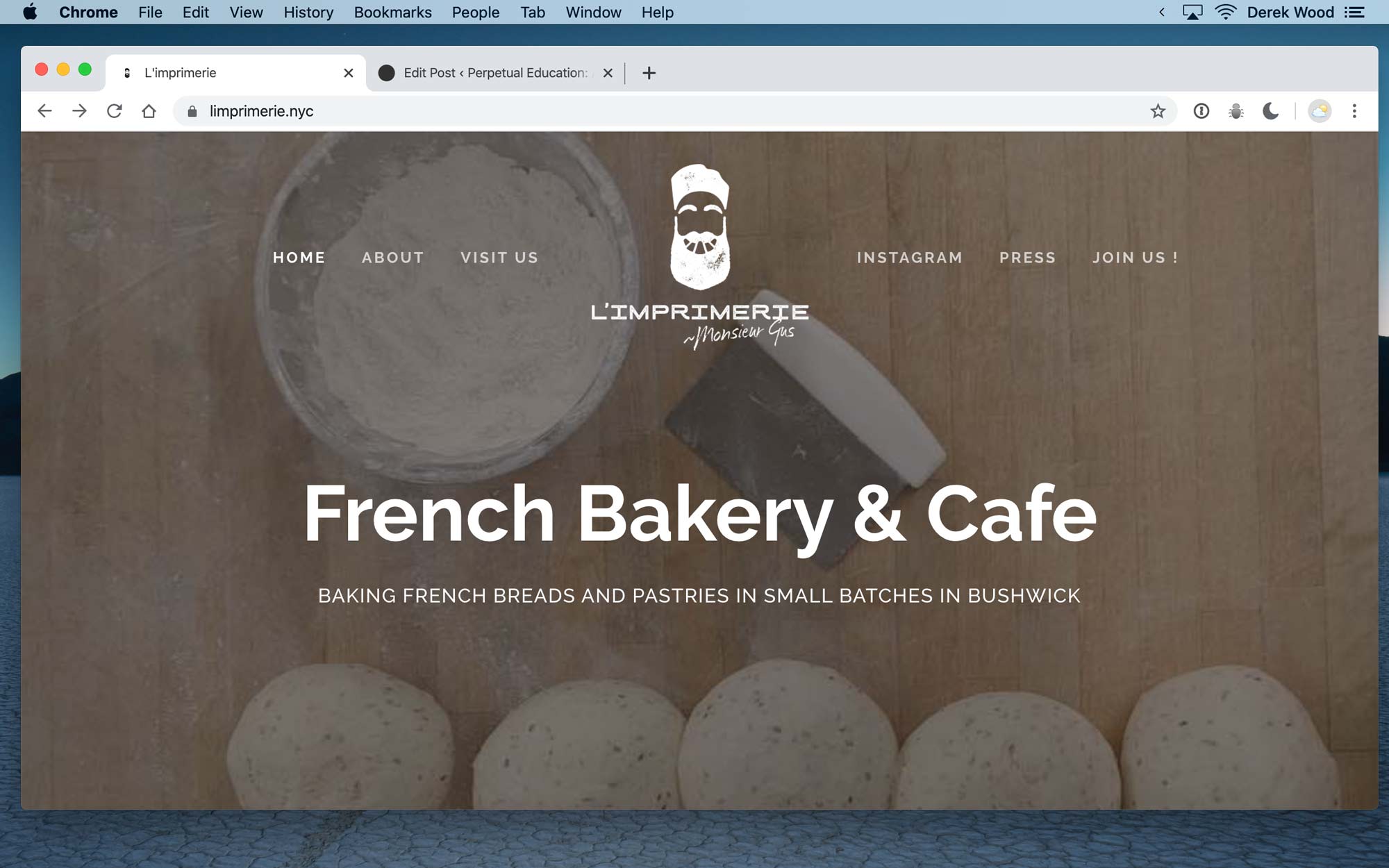
This bakery in Bushwick was offended when I suggested in conversation / that there was no clear ‘COVID-19’ message on their website. They wrote to me saying: “It’s time to get your eyes checked once this is all over.”
People are very defensive about their websites. I can’t imagine why, but they are. There is clearly – no information about COVID – above the fold. I honestly couldn’t figure out where it was. My friend sent me their link and said: “I’m impressed with how this company was selling things to make at home…” So I went to check it out. This is the most common screen size for laptops and phones. It “says online ordering” below the fold – but looks like an ordinary heading. I wouldn’t have thought to click it. I could just be blind or stupid.
Their comment makes me feel like that’s a good way to judge if the message is successful.
If I have to “get my eyes checked” then the message isn’t clear
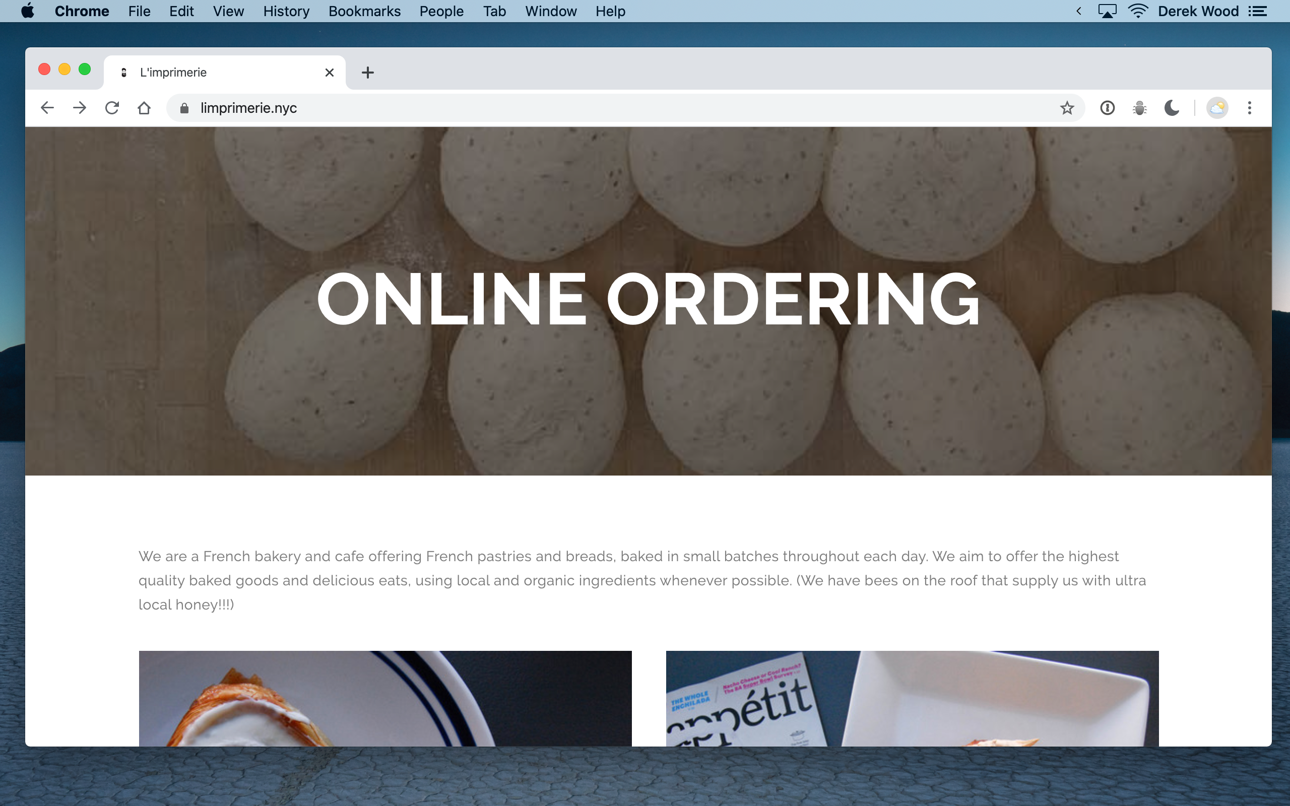
It looks like a heading to me. Why would I ever click that? The messaging all seems like nothing has changed.
Cookbook
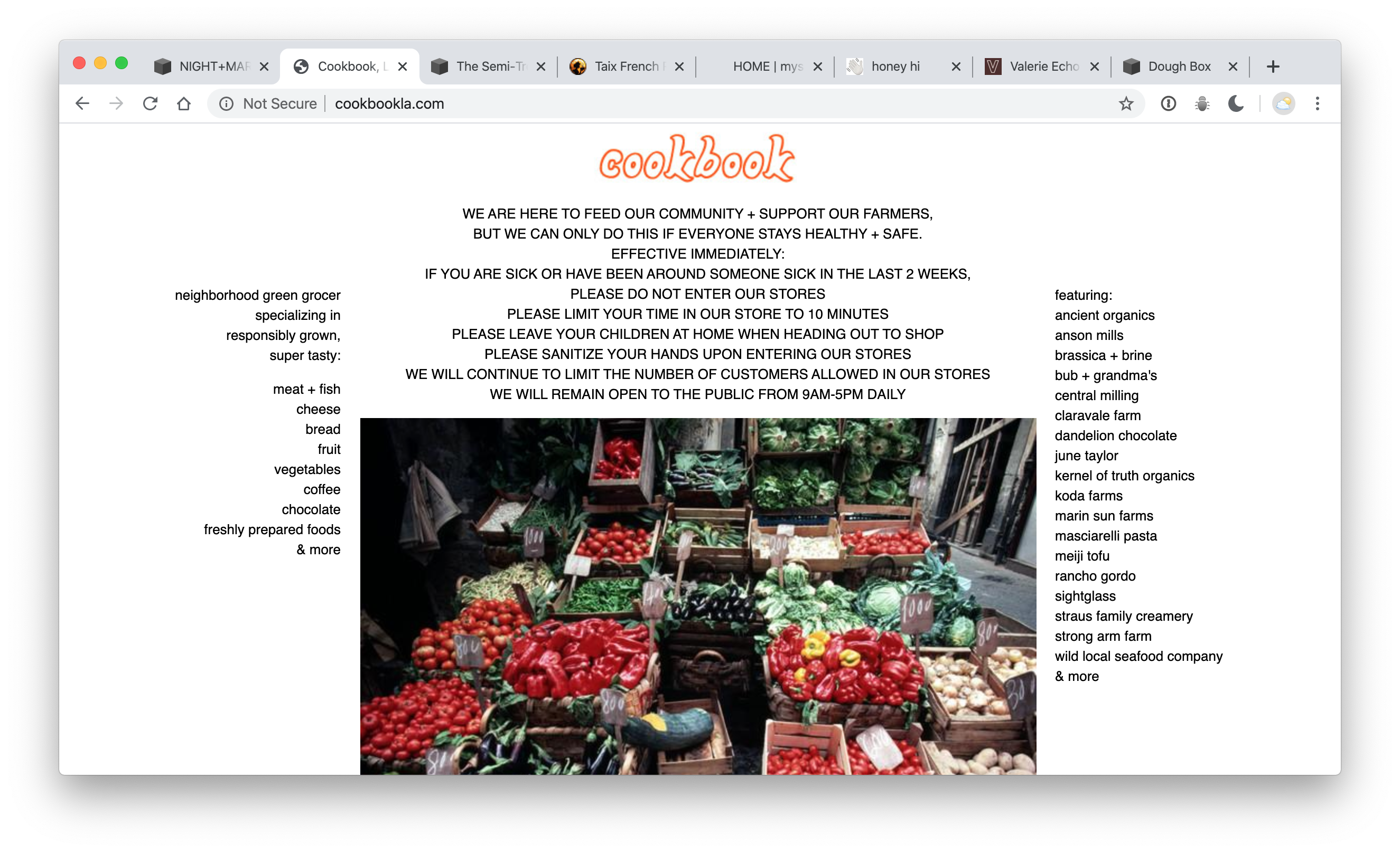
There’s a message! It’s clear! I would much rather just call and pick up my bag of stuff though. A quick photo of each shelf would go a long way / and I could just email them a list. Low-tech. No middlemen. I would also totally just buy a mystery box – to help them keep things moving through the stock. Put together a set of ingredients for a recipe – and I’ll happily take the bag at a premium.
Valerie
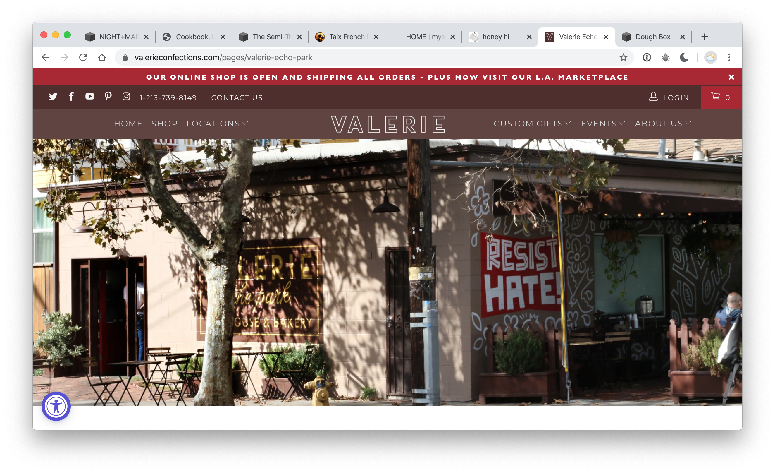
Seems like nothing has changed here.
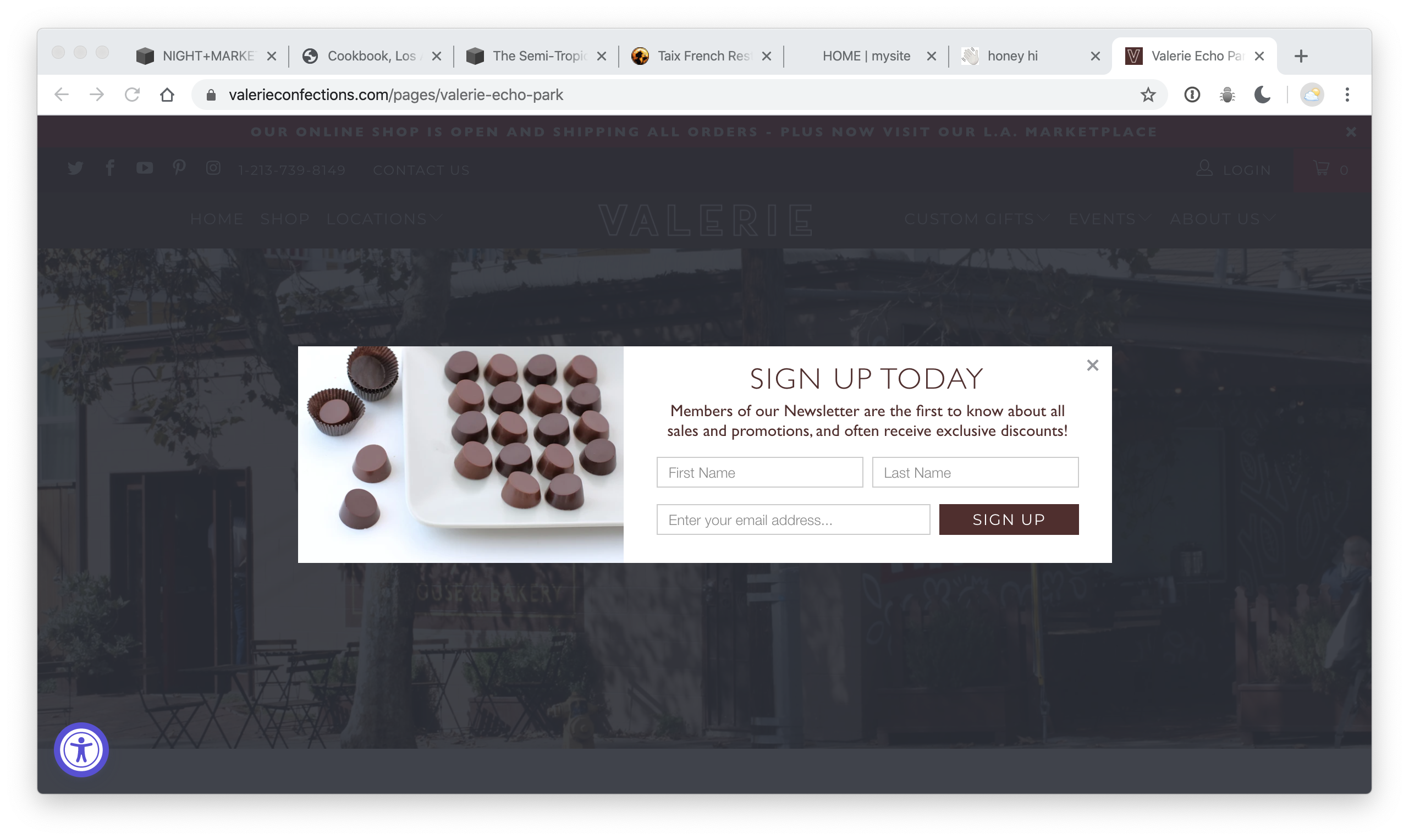
For some reason – pop-ups asking me for stuff seem 4x as annoying when I’m trying to find out if my favorite places are still doing business.
UPDATE
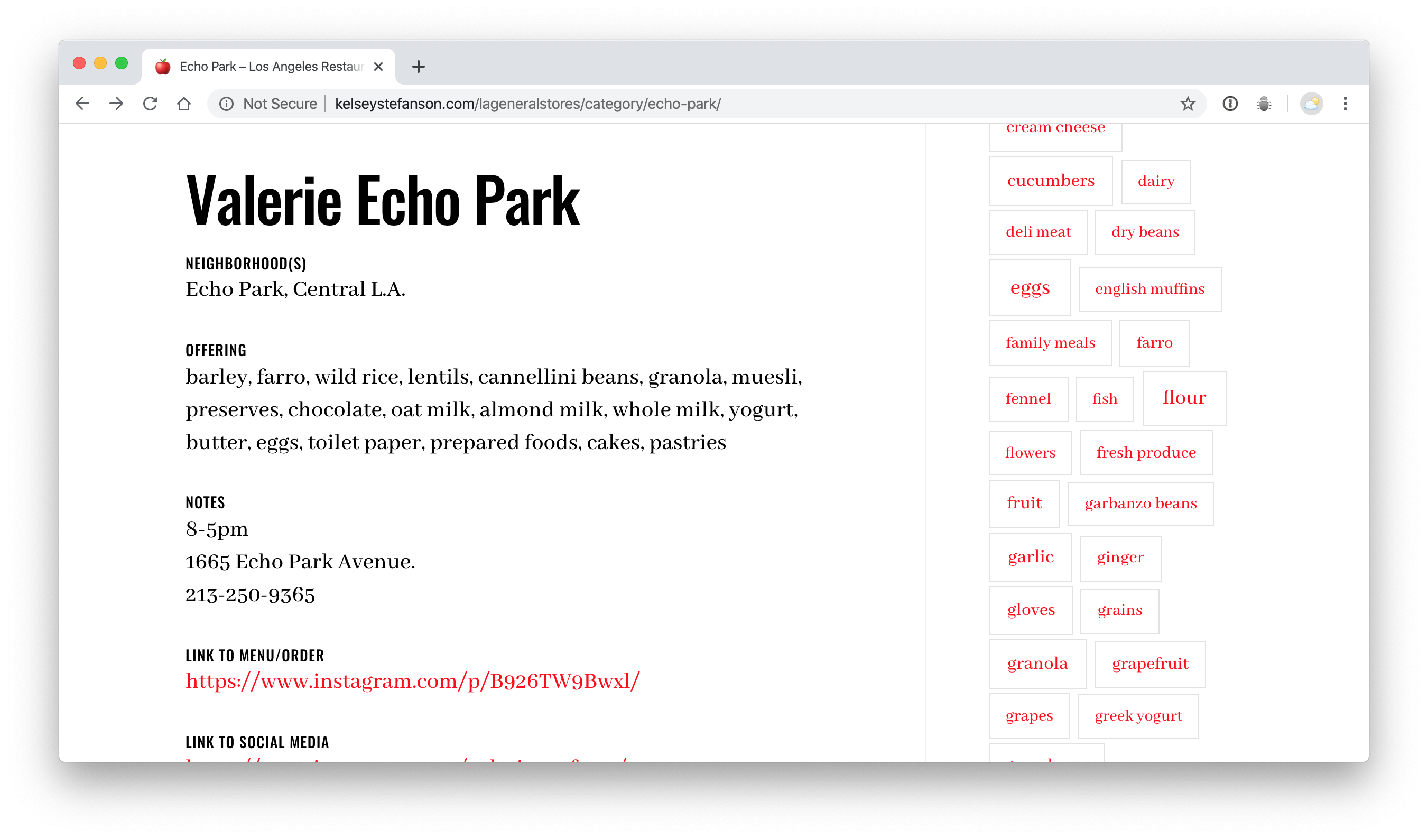
After being turned on to this great collection of businesses acting as general stores here: http://kelseystefanson.com/lageneralstores – you can see that they ARE doing business… and all you have to do – is find the right Instagram post to see the menu. This is further proof that Facebook and Instagram are splitting the internet – and generally destroying it. Why are so many of the links on this list going to Instagram posts? That’s nuts! I guess we can just shut the regular web down…
Taix
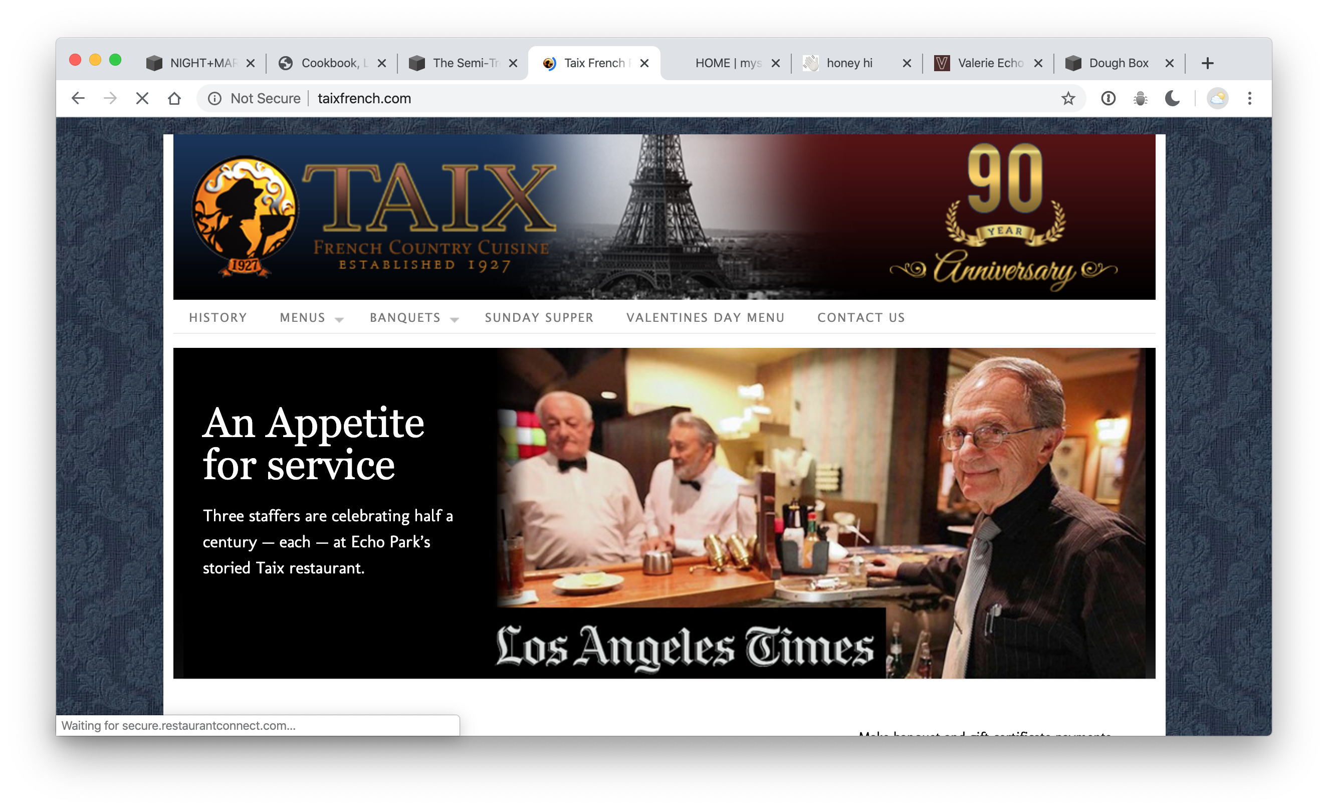
I love you, Taix – but I didn’t really expect you to have a plan here. After a long time with no meat – I would totally buy 2 rotisserie chickens from you – and 4 negronis right now.
E.R. Copies
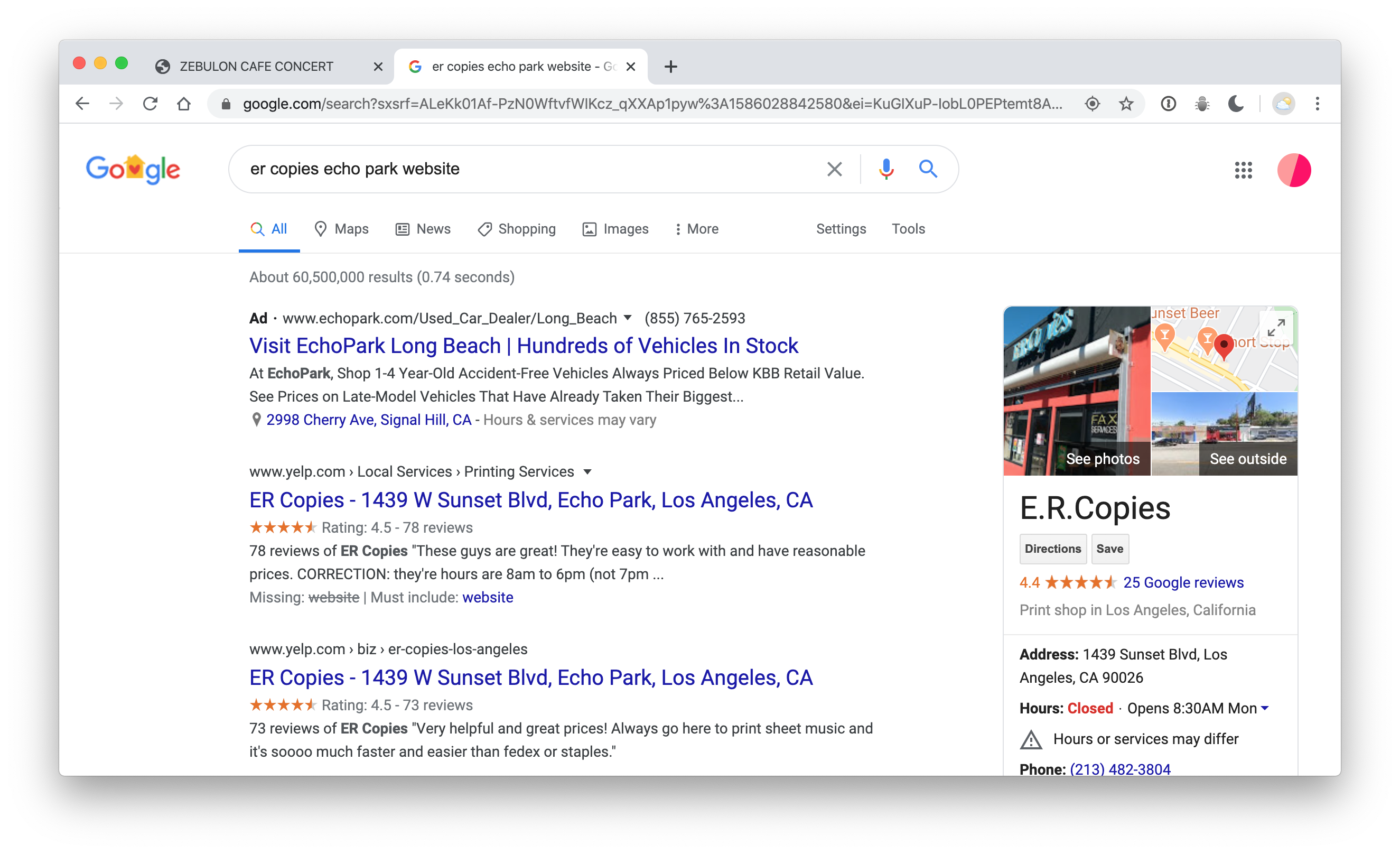
No website to begin with. I’m less likely to need things printed right now, but I do often print eBooks. I can see their phone number and call them.
Silverlake Wine
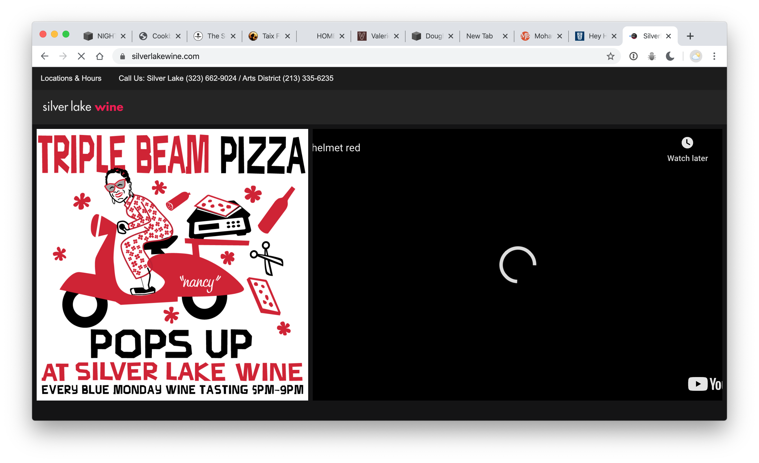
So – Silverlake Wine’s website had a really nice (specific) bunch of information / but it was in a pop-up window. To look at the site – you have to close the pop-up window / and then – a little note is stored in your browser (a “cookie”) – that says – the user already saw this and closed it – so, don’t show it again. So, I can’t see it again (At least not for some set amount of time).
Besides that… the website has tons of videos and images / and I don’t know if it’s just my house – but our internet is slow lately (we suspect everyone is just online – and watching TV). So, the website barely loads. I’ll show it in the video.
An excellent attempt to share clear information! We really need a ‘page’ and not a ‘pop-up.’ (it looks like it returns after 24 hours).
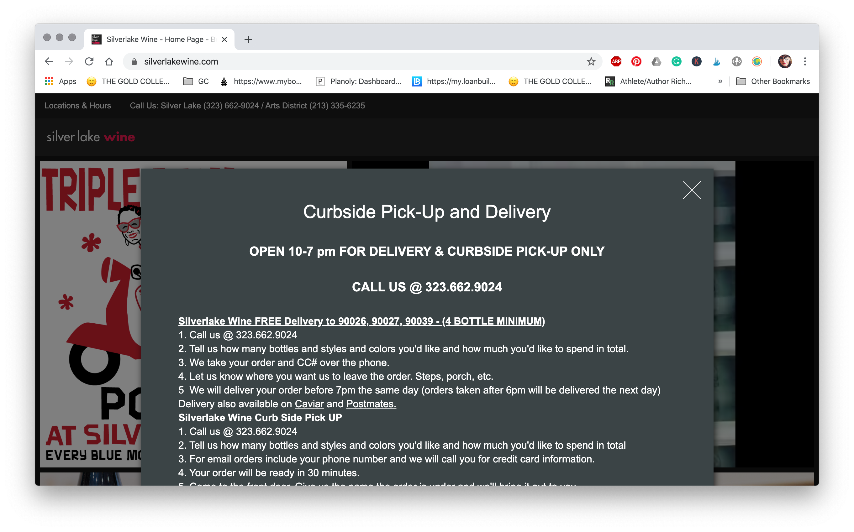
Since I couldn’t see the information anymore / we looked at it on another computer. but again… when Ivy (and she has to) clicks that X button – the information wont appear again. (and it’s some pretty specific information)
I enjoy the
Tell us how many bottles and styles and colors you’d like and how much you’d like to spend in total
But it’s still a barrier in a another way. Can I order beer? What kind? What about tequila? Ivy would have no idea what to say – and might just be too chicken to brave it. I’m sure they’ll talk you through the menu on the phone, but a simplified menu would help the more neurotic of us cut through. What about “a red and a white for $35” mystery packs 0r something to keep it quick and easy. “All the ingredients for Negroni for $X.”
Lassens
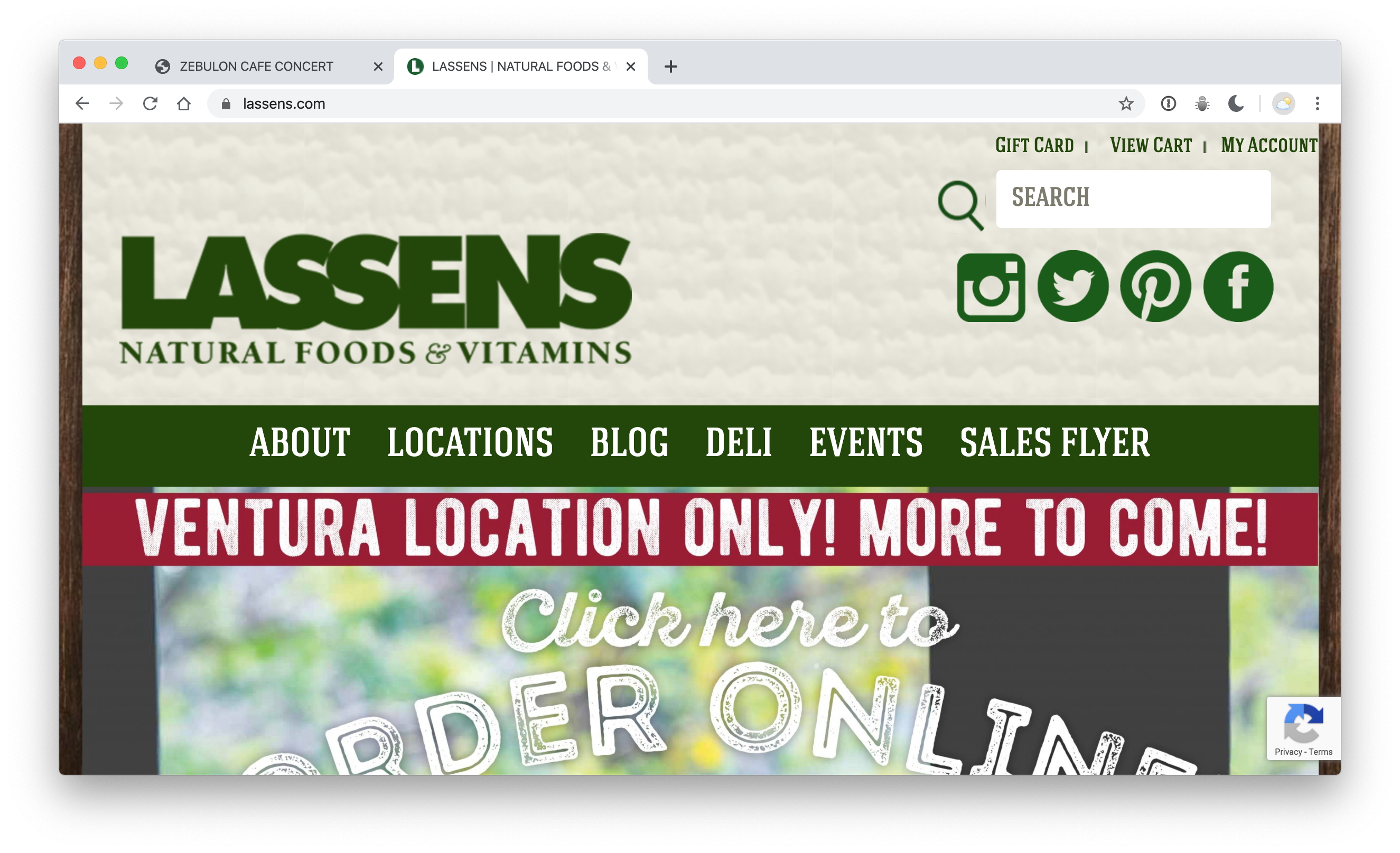
No info / and if you try and scroll with a mouse – there’s something wrong – and you can’t scroll while on top of that image. So, I’d consider this a total loss. Useless.
The Casbah
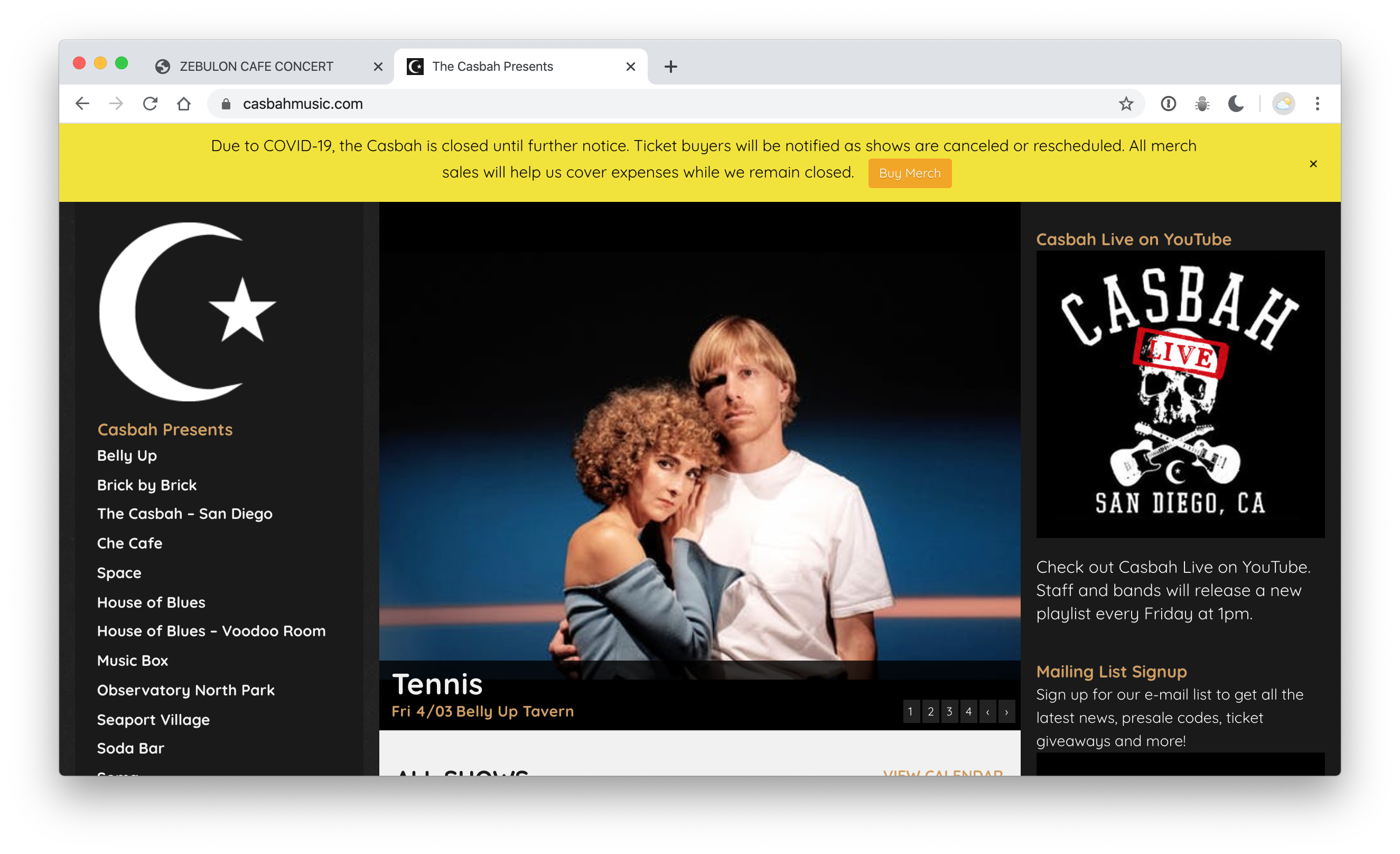
I would opt for an entire page / but working with Tickefly/event bright WordPress themes is a pain – and this little banner is doing a lot of good work. (They could make a standard WP page – and set it to ‘home’ in the settings area – instead of this show index) – but I found the merch!
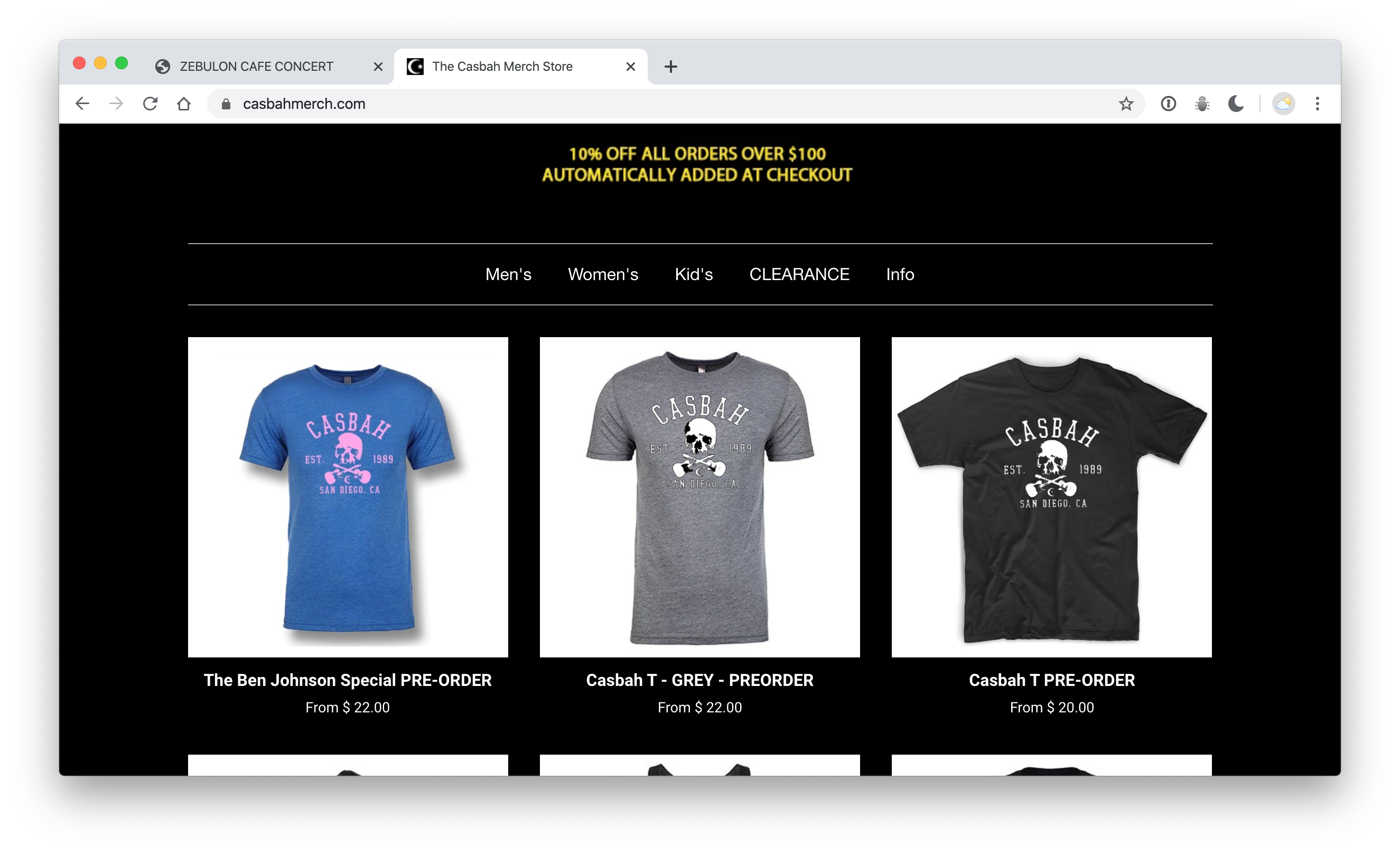
I was supposed to see ‘Holy Fuck‘ – in San Diego at The Casbah – but that didn’t happen. Instead – I got my money credited back to me / and I got an email saying they were making these cool pink on blue shirts. I think the bartender chose the colors – and I thought / I’ll buy one to try and pass those poor bartenders some money. I only wish they’d bumped up the price. I wouldn’t have cared if it was $18.50 or $26.00 – and I wanted to be more helpful. I’m wearing the shirt right now.
I would have bought a shirt from Zebulon too – but the shield is too big / and too close to the armpit for me.
But – my point is… I’m not even in San Diego – and I’m buying stuff from there – and trying to keep the commerce going – because they told me I could.
This shirt is a good one. You gotta wear shirts… so – maybe you should buy one here.
Grá
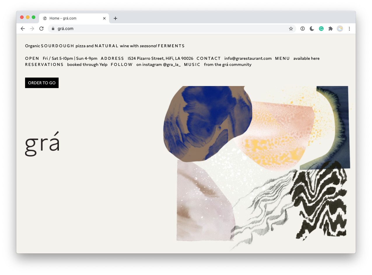
@sheriffderek loves pizza. He spent a few years working at Pizzaiolo, so we clearly (look at this list) want the best pizza places in Los Angeles to continue to be amazing – and to thrive. “Pizza” and business don’t see to align very often.
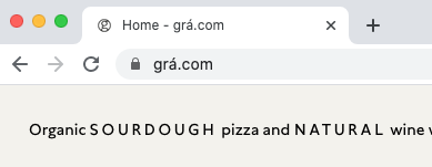
As “cool” as this is… (and as much as we would definitely want to do the same thing…) – this URL isn’t very stable. 3 letter domains area often hundreds of thousands of dollars. They’ve gotten around it with the á – but at what cost?
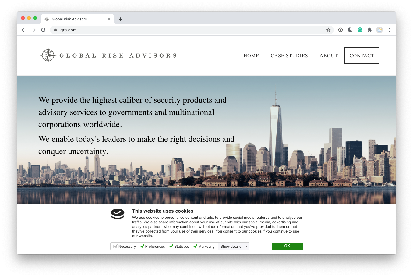
If you type in ‘gra’ dot com – you just get this ^
http://grarestaurant.com/ – leads to grá.com – through some DNS magic… and it’s totally cool – but totally a mess when you are actually trying to find the company. We literally live down the street – and getting info and trying to support this business has been a nightmare on all accounts.
If you have financial backing and this whole collapse of society doesn’t matter… then, great! – but… if you need our help – to stay in business… then you need to help us help you. ASAP.
Hire humans to answer the phone. Keep things simple. Be open – and at normal hours. This is no time to have different hours on Thursday or Friday etc..
This might be the best pizza in the city – but it doesn’t matter – if you can’t buy it.
Recap
Ok. So, there are some problems – but they wouldn’t take much attention to adjust. Here’s what I’ve found.
-
Sites with no Covid-19 specific messaging or updates on their status – at all.
-
Sites with messaging – that is below the fold (off-screen) – or otherwise not visible right away.
-
Messaging that disappears – and doesn’t return on subsequent visits
-
Sites that have too much stuff going on – and just don’t load well when our internet speeds are taxed
In conclusion
I love all of this local bartering and sharing that is happening around town. We’ve been ordering from local farms and buying things from unexpected places. People in town are selling home-made pasta out of their houses – and I think there’s a real sense of neighborly love.
If you own a business – that relies on the internet to spread the word, make sure that you have a dedicated home-page that says exactly what you are doing – how we can do business with you – and make sure the sharing assets extend that message and try to make things as fun and as clear as possible.
Think outside the box a little. Are you sure you can’t have one of your employees do the delivery? Is there a way to keep the service fees local? If you don’t feel like making glass-noddle egg roll things right now… then don’t! Adjust the menu to make things streamlined. Make some pies – or something you don’t usually make. Use that oven to make bread at off-hours. Spend the time cleaning all that dust off of your tchotchke filled walls / or the weird net of hats in your rafters. Maybe your servers who are out of work – can deliver things. Maybe there’s something you can think of that will right the ship. Share your ideas. Make a video about it. Teach us how to make that dish we miss. Keep in touch.